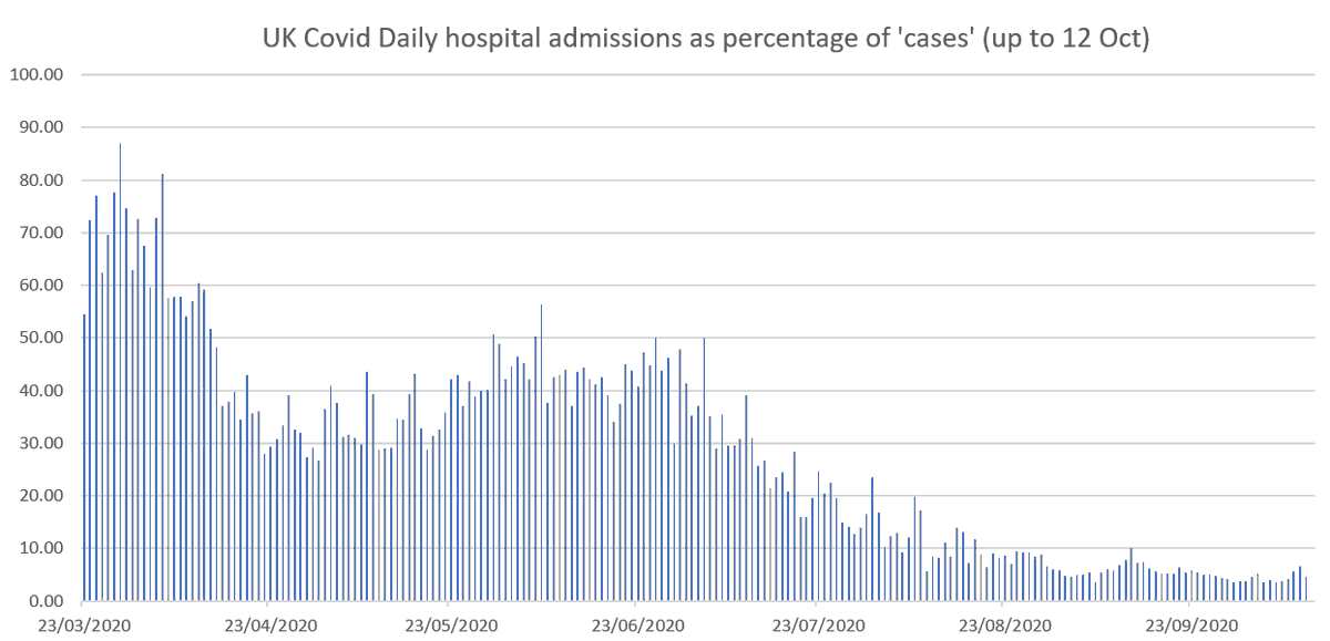
1/3. The UK #COVID19 testing data since September by different regions reveals a very close correlation between number of people tested and the proportion who test positive (i.e. the positivity rate)....
2/3 ...not clear what if any causal explanation there is to such a close correlation. But indications are that an increasing positivity rate may not be due to an increase in underlying infection rate... A full discussion is here .. probabilityandlaw.blogspot.com/2020/12/uk-cov…
3/3 ... and lockdown decisions could result purely from decisions to increase testing. All the usual caveats apply (and in this case this analysis has been done in a hurry to get it out, as the results seem so unusual and could not be seen from looking at the overall UK data)
@ClareCraigPath This possibly provides support for the hypothesis that when testing increases so does the false positive rate
Many of the people commenting on this thread clearly did NOT bother to read the article: probabilityandlaw.blogspot.com/2020/12/uk-cov…

• • •

Missing some Tweet in this thread? You can try to force a refresh
 

Keep Current with Prof Norman Fenton

Prof Norman Fenton Profile picture

Stay in touch and get notified when new unrolls are available from this author!

Read all threads

This Thread may be Removed Anytime!

PDF

Twitter may remove this content at anytime! Save it as PDF for later use!

Try unrolling a thread yourself!

how to unroll video
  1. Follow @ThreadReaderApp to mention us!

  2. From a Twitter thread mention us with a keyword "unroll"
@threadreaderapp unroll

Practice here first or read more on our help page!

More from @profnfenton

17 Oct
1. Some people taking issue with my earlier plot of daily new covid hospital admissions as % of new cases don't seem to understand the fundamental limitations of ALL the analyses based on the daily data provided by the government - as summarised in this graphic...
2. They thought I didn't understand that the April peak was largely explained because then it was mainly hospitalized people being tested. As I work on CAUSAL modelling and analysis we were highlighting this very problem back in March ... theconversation.com/coronavirus-co…
We have produced numerous reports exposing the flaws of much published statistical analysis on Covid because of the failure to account of causal factors and explanations. My blog post from last week provides some context and links to much of this work. probabilityandlaw.blogspot.com/2020/10/why-we…
Read 6 tweets
17 Oct
1. (This is a corrected version of tweet I just deleted). Some perspective on #CovidUK hospital admissions. Here's an update of another graph (using data from coronavirus.data.gov.uk) that never seems to be shown. Daily number of new covid admissions as % of new cases.
2. So 87% of 'cases' at March peak resulted in hospital admissions. Now it's just 4.6% and is actually decreasing. And that's despite: increased repeat hospital testing now (so more false positives), and hospital admissions always go up in October.
3. And note: a person entering hospital with a non-Covid condition who, for example, tests positive after 3 weeks and several negative tests, is counted as a Covid admission.
Read 8 tweets

Did Thread Reader help you today?

Support us! We are indie developers!


This site is made by just two indie developers on a laptop doing marketing, support and development! Read more about the story.

Become a Premium Member ($3/month or $30/year) and get exclusive features!

Become Premium

Too expensive? Make a small donation by buying us coffee ($5) or help with server cost ($10)

Donate via Paypal Become our Patreon

Thank you for your support!

Follow Us on Twitter!