So I have a theory on this. And if I'm right, there's bad news about that acceleration in the overall case trend, and possibly good news about vaccines in the over-80s. WARNING: This is going to be another long, maths-y thread (involving cubic coefficients this time!)
https://twitter.com/BristOliver/status/1355187197180334084
the theory isn't new or original, but I think I've got some data to back it up now. The idea is that there was a single day of strong mixing on 4th Jan, as a result of schools going back for 1 day before the full lockdown came into force, which caused a 'bump' in the case data
I floated this in my thread yesterday (see below). but the unanswered question was: could this plausibly cause an effect of the right size, to create the changes in trend that I'm seeing in my data, and that @bristoliver is seeing in his log plot?
https://twitter.com/JamesWard73/status/1354802938409963523?s=20
so I built a small 'toy model' to test this out. this isn't designed to fit real data, just to illustrate the point. it builds up infections in December at a rate of 4% growth per day, and then drops them in January, also at 4% per day 
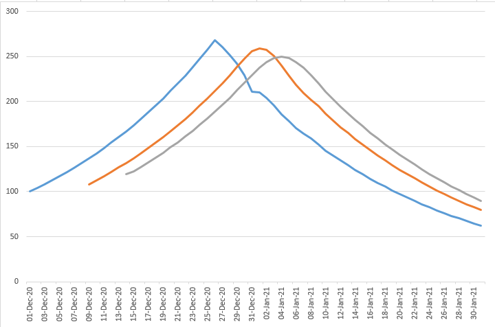
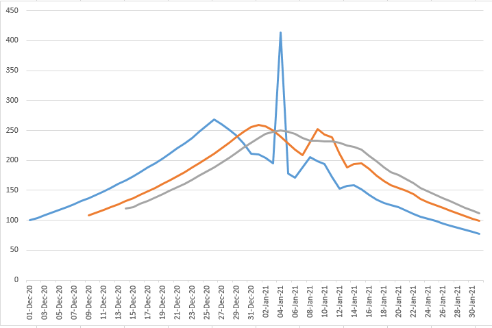
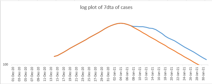
what you're seeing there is infections in blue, which translated into cases (on specimen date) in orange a few days later, and then a 7-day trailing average of the case data in grey, which is a bit smoother
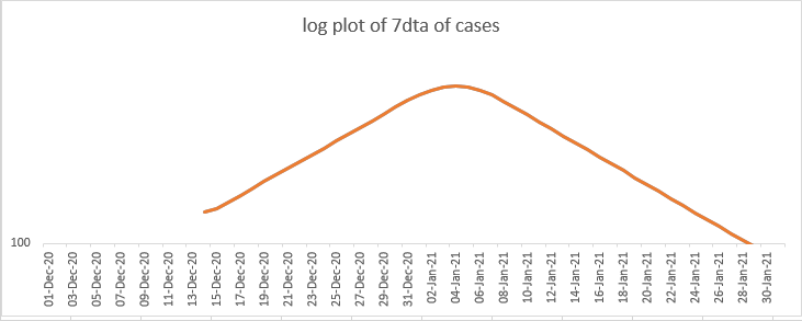
and then we take a log plot of the 7day trailing average of the case data, which mimics the analysis that we're doing in reality. this one's a bit dull, but it's here to provide a baseline for what happens next.
ok. now's the fun bit. we insert a "party day" into the model with a temporary boost to R. let's make R increase by 1 just for that day (this is unrealistically large, but it will make the effects easier to spot - we'll come back and change this later). what happens?
well, infections go through the roof on that 'party day', unsurprisingly. but the cases see a 'double peak' (because they smooth out the infections a bit), and then the trailing average smooths things a bit further - you get a peak and then a long 'shoulder'
and what about the log plot? I left the old line, without the party day, on the chart in orange - the new one is in blue. so again you can see the shoulder extending to the right
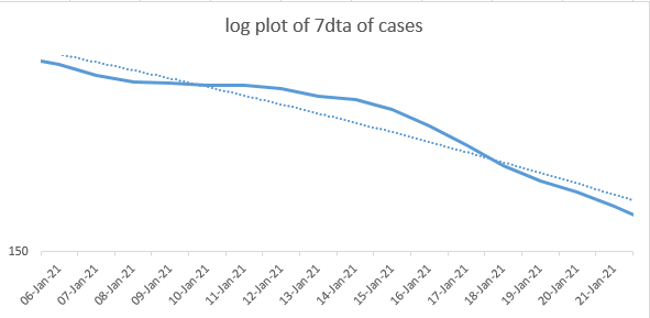
now let's focus on the new (blue) line, and zoom in a bit, focusing on the period in mid-January. we can see that there's effectively a 'bump' of cases superimposed on what would otherwise be a nice linear picture on the log plot (i.e. constant rate of exponential decline)
and now zoom in again. this explains what I think might be happening on @bristoliver's plot. we're taking a set of data points - flagged here in orange - which are actually on the top of the 'bump', and establishing a trend - the dotted orange line. and then our data...
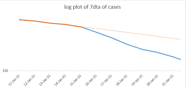
...is deviating away from that trend, with an apparently accelerating rate of decline. and we're celebrating: steepening growth! we're winning! is it the vaccine? (no). is it herd immunity? (no). is it better lockdown compliance? (probably not).
if I'm right, it's just the right-hand side of the 'bump' in cases. and we'll be able to tell if this is correct in a few days, because my toy model predicts what should happen next: it should stop steepening, flatten slightly, and resume a more linear trend
Now recall I used too large a value for the spike in R on our day of mixing, to exaggerate the effects. Opinions differ on the impact of opening schools, but a value of 0.3-0.5 might be plausible - better views/data very welcome. Using 0.5 for now, the log plot looks like:
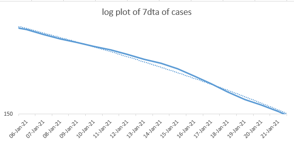
now, I'm just eyeballing this, and there's probably a better way to do it (a job for tomorrow), but this looks not a million miles away from the degree of twist I'm getting in the log plot of the real case data - see below

I need to explain a discrepancy in the dates. going back to our earlier log plot, we saw a divergence from a linear trend around 16th Jan - whereas @bristoliver was getting divergence I think around 21st Jan. But a) his plot is for report cases, not specimen date - which....
...will add 2-3 days delay, and b) on reflection I made the delay from infection to case a bit too short in my toy model - I had allowed 4-6 days for symptoms to develop, but should have allowed another day or two for someone to actually book and take a test. So I think that's OK
Right. so far this is mostly bad news: the steepening of growth is quite possibly an artefact of a 'bump' in the case data, and is unlikely to keep going. but let's talk about the age group analysis, and (eventually) vaccines.
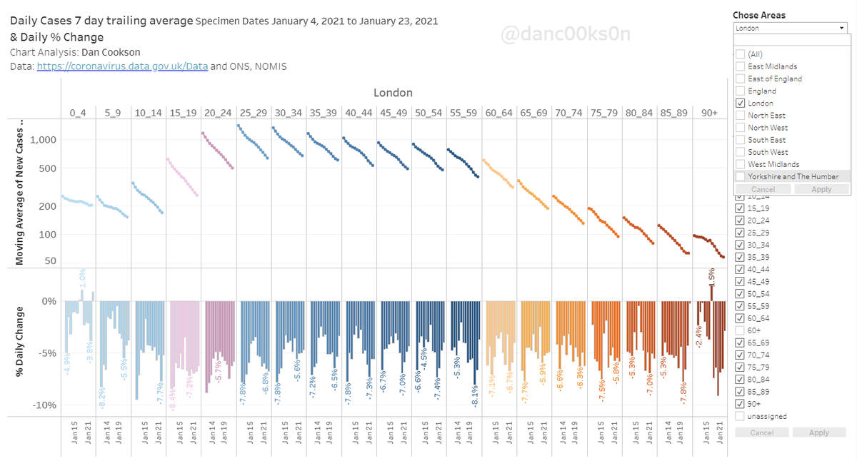
the 'bump' we're seeing in the actual data isn't consistent across the age groups. @danc00ks0n and @jburnmurdoch have both posted graphs illustrating this, for example:
https://twitter.com/danc00ks0n/status/1355227976712015875?s=20
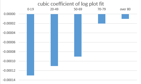
as we can see, there is a lot of 'twist' in the data for children, not so much for working-age adults, and hardly any in the over-70s. I've quantified this by putting a cubic fit on the log plots for the different age groups, and then charting the coefficient of x^3 from each:
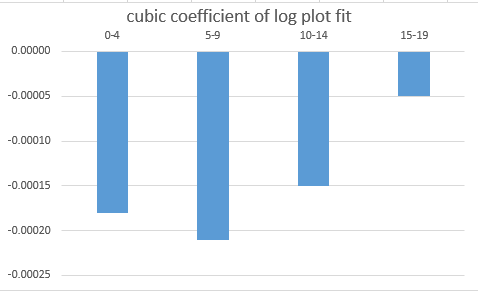
and looking within the under-20 age group we have:
I think this is broadly consistent with what we'd expect to see from a single-day of school opening i.e. a sizeable bump in the case data for children, not much effect on the 20-30s (I didn't plot that - but you can see it in Dan's graph linked earlier), a weak effect in the...
...30-60s who are the parents of the children (mixing at the school gate / in coffee shops? or just catching it from the kids?), and hardly any direct effect in the over-60s
I'd probably expect the effect in the 15-19s to be a bit stronger than it is - and I'm not sure why it's so strong in the 0-4s. Did a lot of kids go into nursery, and then come back out when their siblings were pulled out of school and the parents had to stay at home??
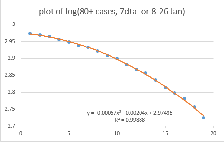
But overall the theory feels a reasonable fit to the data. And that's the good news. Because if we think we can explain roughly what's going on in the data for the under-80s, then we're just left with an unexplained consistent quadratic trend on the log plot for the over-80s
and I can only think of one good explanation for that, and it starts with a 'v'
I think I'm going to leave it there for now - it's late, and I'd welcome views on:
a) does the 'case bump' theory explain the patterns we're seeing in the data so far, in aggregate and by age group?
b) if it does, can we be more confident in linking over-80s trends to vaccines?
a) does the 'case bump' theory explain the patterns we're seeing in the data so far, in aggregate and by age group?
b) if it does, can we be more confident in linking over-80s trends to vaccines?
Also I do still want to look at the regional picture. Some regions may have less of a 'bump' than others, which would be interesting. And we know some regions (London) have vaccinated more slowly than others - which may be visible in the data if we look closely enough
A good suggestion here (see below). I don't have Scottish data in the right format to hand, but maybe someone else would like to do that analysis?
https://twitter.com/ve3hw/status/1355313518497693698?s=20
And another one here; I'll take a look at this in the morning if no-one gets there first, but my memory is that London had a 'cleaner' fall in its case curve in January, which would fit with this
https://twitter.com/JAHingston/status/1355315789822357504?s=20
couldn't resist (and thanks to @danc00ks0n for his tableau which makes this easy to do); London certainly looks to have less of a 'twist' in its data by age group, although there's still some in the younger kids. I still want to run this through the cubic-fit model tomorrow...
• • •
Missing some Tweet in this thread? You can try to
force a refresh