I've had a lot of positive comments on this theory, and some helpful challenges. The most common of which was: surely a single-day effect wouldn't be big enough to cause the 'twist' in the data that we're seeing in those age groups? So I set out to find out if it was (thread)
https://twitter.com/JamesWard73/status/1355301881564815360
This is one of those university / job interview 'order of magnitude' estimation problems. So feel free to disagree with any or all steps on my logic chain, and please explain why - it will help improve / refine (or falsify) the analysis.
So let's focus on the primary-school-age kids as that's where the effect is strongest. We have 3.5m 5-9 year-olds in England. I don't know how many were in school on 4th Jan - we know some regions (London / Kent etc.) didn't go back, and a lot of schools had INSET days etc
So I'm going to make a wild guess and say 40% were in school on that day. Better ideas (particularly if backed by data) very welcome. So that's about 1.4m children in school
Now ONS tells us that about 1.5% of that age group would test positive for coronavirus in early January. So that's about 20,000 kids with the virus heading into school.
(I've ignored the regional skew here - London would have higher prevalence and they weren't in school. But there are possibly some socio-demographic effects that cut the other way, so I think it's probably not that far out)
Now not all of those 20k are actually infectious - we know that ONS surveys using PCR can pick up people on the 'downslope' of viral load, past the point at which they can transmit. I have no good data here but am going to guess that 50% are potentially infectious - so 10k
So we have 10k infectious kids in school, surrounded by their classmates. How many will catch it? This is the hard bit, and I'm well outside my area of expertise. So I'm going to look at some other data which suggested secondary attack rates in households of c. 20%
i.e. if one of your housemates gets the virus, you have a 20% chance of catching it. If people are infectious for c. 10days, that's about 2% per day.
And I'm going to assume that a primary school classroom is about as good a place to pass on the virus as a household, with not much social distancing, lots of sharing stuff, sneezing and coughing, no masks etc.
So with 30 kids in the classroom, each with a 2% chance of getting it, we'd expect 0.6 of a child to catch it on that day, for each previously-infectious child (I've ignored the small possibility that there's more than one infectious child in a classroom)
and 0.6*10k= 6k new infections. But we know that children are a lot less susceptible to catching the virus than adults - probably around 25-30% from earlier studies I think. So those attack rates are too high. So let's scale down our new infections to maybe 1.5-2k.
And of course, not all infections turn up as cases in the gov.uk dashboard data. So we need to scale that down a bit further. Let's say to maybe 500-1000 new cases we'd expect to see in the dashboard (spread over a few days).
The question is: is that enough to cause the 'twist' in the curve that we've seen? And the answer is: yes, it is.
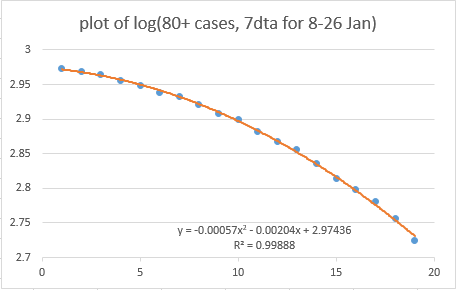
we can work this out by going back to our log plot for the 5-9 year olds, building a linear trend off the first few days, and then measuring the number of cases under the 'bump' 
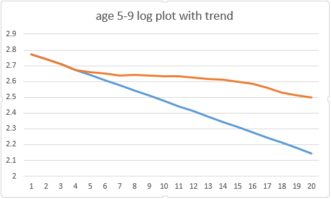
It may help to know that the average daily case rate for this age group is only about 400 per day in England (in early/mid Jan), so you don't need a lot of cases to shift it. And if you add up the cases under the first week of the 'bump' then it's about 600
(it gets messy after the first week, because you start to get fast secondary cases mixed up with delayed primary cases, given the 7day averages we're using, so I think the first 7 days is a reasonable period to look at - views welcome)
so we needed about 600 cases to generate the 'bump' that creates the cubic twist in our log plot. and I've shown a logic as to how a single-day-mixing effect could plausibly create around 500-1000 new cases on the dashboard, spread over a few days
As I say, feel free to disagree with the numbers or logic. but our shared intuition (mine, too, before I started doing this analysis) that a single-day effect couldn't produce a noticeable pattern in the case data might just be wrong /end
• • •
Missing some Tweet in this thread? You can try to
force a refresh