I have updated my analysis of potential vaccine effects in over-80s cases with today’s latest dashboard data. I am increasingly confident that this does show an actual impact of vaccines, for the following reasons: (THREAD)
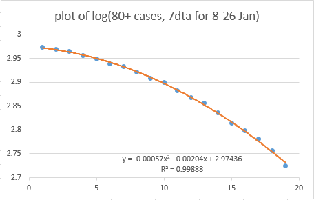
1) The trend is continuing to follow a clear quadratic curve, as per @BristOliver's prediction
2) The implied rate of rate of protection from that curve matches almost exactly with the NHS vaccination data, if you assume a 2-week lag to protection, and a 50% rate of protection from the first dose: both come to ~0.6% of the over-80s age group getting protection per day
The first-dose protection would be higher if you assume a 3-week lag (as there were slightly fewer vaccinations in the earlier weeks). this may be closer to reality as per latest Israeli data showing (I think) a 18-19 day lag in this age group - then protection works out to ~70%
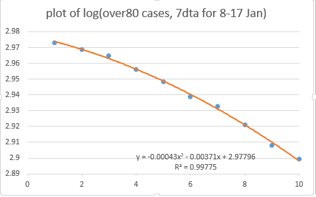
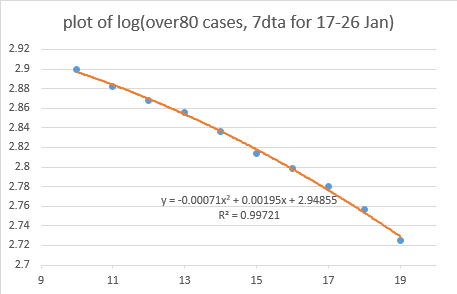
3) Splitting the period we have into two, the implied rate of protection in the second half (17-26 Jan) is slightly stronger than in the first half (8-17 Jan) – which fits with a slightly faster rate of vaccination in early Jan than in late Dec
4) I haven’t heard any other plausible reason to create such a quadratic trend in the over-80s (and not other age groups); for example the rate of natural infection in this age group is way too low to create this pattern
5) Although there is a similar steepening in the overall case data –as per @bristoliver’s daily plot based on report-date cases, or @ThatRyanChap’s similar plot of specimen-date cases- if you look back a bit in the history, this is clearly a different shape: cubic, not quadratic
And the cubic shape is only happening in some age groups: most strongly in primary-age kids and (more weakly) their parents’ generation, and hardly at all in the 15-30 year-olds or in the 60-80s.
I think we have some plausible reasons why this might be happening – e.g. see my thread below. Some have challenged that a 1-day effect doesn’t intuitively seem big enough to cause this effect, but I think they might be wrong – I’ll post more on this later
In any event, you don’t have to believe that 1-day mixing effect is what’s causing the cubic shape in primary-age children and their parents, you just have to think it’s a different effect to what’s going on in the over-80s. and I’m pretty sure it is.
6) (although this isn't really a reason, more an observation) I have also looked at the regional and age-splits within the over-80s, to see if there might be some interesting patterns there.
the regional data is quite noisy, and some regions had later peaks than others (due to Tiers being different etc) which makes things tricky. and the regional rates of vaccination are not sufficiently different to be able to pick them up reliably in the data at this stage.
On the age splits, again it’s a bit noisy, particular as the over-90s had a late peak in cases so it’s hard to separate the vaccine effect from the curvature of the peak. But there are some patterns in the data which could indicate a shift in focus...
...from vaccinating the over-90s towards the 85-89s and then the 80-85s in early January. I’m cautious about this (and hence not posting graphs) as I think there’s a real risk of over-interpretation / confirmation bias. Time will tell.
But taking a step back, and looking at the over-80s group as a whole, I think it’s now staring us in the face: the quadratic trend on the log plot that @BristOliver predicted is clearly present, and is showing the positive effect of vaccines. /end
this is the 'later post' for those reading the replies...

• • •

Missing some Tweet in this thread? You can try to force a refresh
 

Keep Current with James Ward

James Ward Profile picture

Stay in touch and get notified when new unrolls are available from this author!

Read all threads

This Thread may be Removed Anytime!

PDF

Twitter may remove this content at anytime! Save it as PDF for later use!

Try unrolling a thread yourself!

how to unroll video
  1. Follow @ThreadReaderApp to mention us!

  2. From a Twitter thread mention us with a keyword "unroll"
@threadreaderapp unroll

Practice here first or read more on our help page!

More from @JamesWard73

31 Jan
I've had a lot of positive comments on this theory, and some helpful challenges. The most common of which was: surely a single-day effect wouldn't be big enough to cause the 'twist' in the data that we're seeing in those age groups? So I set out to find out if it was (thread)
This is one of those university / job interview 'order of magnitude' estimation problems. So feel free to disagree with any or all steps on my logic chain, and please explain why - it will help improve / refine (or falsify) the analysis.
So let's focus on the primary-school-age kids as that's where the effect is strongest. We have 3.5m 5-9 year-olds in England. I don't know how many were in school on 4th Jan - we know some regions (London / Kent etc.) didn't go back, and a lot of schools had INSET days etc
Read 19 tweets
29 Jan
So I have a theory on this. And if I'm right, there's bad news about that acceleration in the overall case trend, and possibly good news about vaccines in the over-80s. WARNING: This is going to be another long, maths-y thread (involving cubic coefficients this time!)
the theory isn't new or original, but I think I've got some data to back it up now. The idea is that there was a single day of strong mixing on 4th Jan, as a result of schools going back for 1 day before the full lockdown came into force, which caused a 'bump' in the case data
I floated this in my thread yesterday (see below). but the unanswered question was: could this plausibly cause an effect of the right size, to create the changes in trend that I'm seeing in my data, and that @bristoliver is seeing in his log plot?
Read 31 tweets
28 Jan
You may be wondering why @bristoliver rather cryptically RT’d a chart that I posted last night. The answer is not just that he loves quadratic fits on log axes, but that this chart may –and I stress may– hint at a vaccine effect amongst the over 80s THREAD
WARNING: this is a long thread, and it’s a bit of a roller-coaster. We find some apparently strong patterns in the data, and then start to unpick them a bit. So if you start getting excited half way through you might find you’re less excited at the end. But we’ll see…
First we first have to go back a bit. @bristoliver posted a thread a few days ago explaining why, with a constant vaccination rate, a log plot of cases should show a quadratic form. In other words, it should fit an equation like: a + b.x + c.x^2
Read 51 tweets
25 Jan
Taking a short break from modelling ‘vax & relax’ strategies, I have updated my model of infections at local level (MSOA) in England, looking for any evidence of impact on infection rates in Wave 3 (Dec & Jan) from accumulated immunity across Waves 1 & 2 (Mar-Nov) THREAD 1/n
TL;DR: there’s a similar pattern to before, with some evidence of high (>15%) attack rates in Waves 1 & 2 leading to slightly more muted attack rates in Wave 3. But there still isn’t any sign of local areas approaching ‘herd immunity’ levels. 2/n
As before, the data is simply aggregated weekly cases per MSOA across England, taken from the gov.uk dashboard. Big thanks to @ArtySmokesPS for lending me his multipliers for case ascertainment, which enable me to estimate actual infections in each area 3/n
Read 17 tweets

Did Thread Reader help you today?

Support us! We are indie developers!


This site is made by just two indie developers on a laptop doing marketing, support and development! Read more about the story.

Become a Premium Member ($3/month or $30/year) and get exclusive features!

Become Premium

Too expensive? Make a small donation by buying us coffee ($5) or help with server cost ($10)

Donate via Paypal Become our Patreon

Thank you for your support!

Follow Us on Twitter!