Here's a little #Tweetorial of my presentation at @SCCM #CCC50 earlier today (available on demand!)
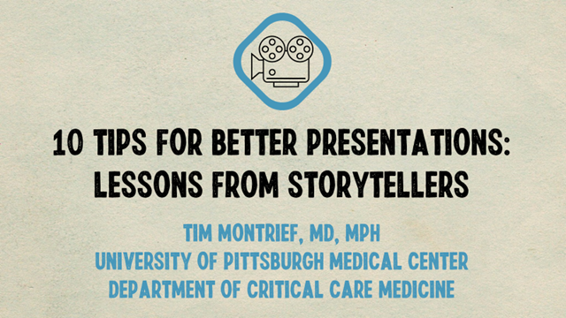
Here are "10 Tips for Better Presentations: Lessons from Storytellers" that can help improve your #MedEd, #Research, #Academic, & #Professional #presentations
#FOAMed #htdap
Here are "10 Tips for Better Presentations: Lessons from Storytellers" that can help improve your #MedEd, #Research, #Academic, & #Professional #presentations
#FOAMed #htdap
Our presentations suck. Period.
Presentations are fundamental to medical education. High volumes of information are “delivered” in lecture halls and medical conferences, but the uncomfortable truth is that very little of that information is actually retained.
Presentations are fundamental to medical education. High volumes of information are “delivered” in lecture halls and medical conferences, but the uncomfortable truth is that very little of that information is actually retained.

Some reasons why:
- Our lecturing style has remained stagnant despite the fact that our understanding of how people learn has changed.
- Most presentations make the supportive media (i.e. slides) the focus of the presentation without thought about the story or the delivery.
- Our lecturing style has remained stagnant despite the fact that our understanding of how people learn has changed.
- Most presentations make the supportive media (i.e. slides) the focus of the presentation without thought about the story or the delivery.
As clinicians we need to construct presentations that facilitate learning rather than data delivery.
"An overload of facts does not equal an abundance of learning." -@ffolliet
Luckily, we have one group that provides many examples of engaging presentations- the movie industry!
"An overload of facts does not equal an abundance of learning." -@ffolliet
Luckily, we have one group that provides many examples of engaging presentations- the movie industry!
The most effective storytellers, movie directors & presenters engage their audience and display enthusiasm for their message.
That's why audiences can sit engaged in a movie with very little dialogue (WALL-E) for over 90 minutes, but can't stay awake for your lecture!
That's why audiences can sit engaged in a movie with very little dialogue (WALL-E) for over 90 minutes, but can't stay awake for your lecture!

First Tip: Go analog! 📝
A fundamental mistake people make is preparing their content while sitting in front of a computer screen.
Before you design your presentation, you need to structure your presentation- take this time to see the bigger picture!
A fundamental mistake people make is preparing their content while sitting in front of a computer screen.
Before you design your presentation, you need to structure your presentation- take this time to see the bigger picture!

There is something powerful and natural about using paper and pen to sketch out rough ideas in the analog world that leads to more clarity and better, more creative results when we finally get down to representing our ideas digitally.
So go ahead and grab the pad and paper!
So go ahead and grab the pad and paper!

Tip 2: Know your audience.
You need to focus on your audience because if they don’t engage, or if you don’t make it relevant to them, it doesn’t matter how nice your slides are, or how polished your delivery is- they won’t be listening!
You need to focus on your audience because if they don’t engage, or if you don’t make it relevant to them, it doesn’t matter how nice your slides are, or how polished your delivery is- they won’t be listening!

“We should help people to see themselves as the hero of the story, whether the plot involves beating the bad guys or achieving some great business objective. Everyone wants to be a star, or at least feel the presentation is addressing them personally” -Chad Hodge 

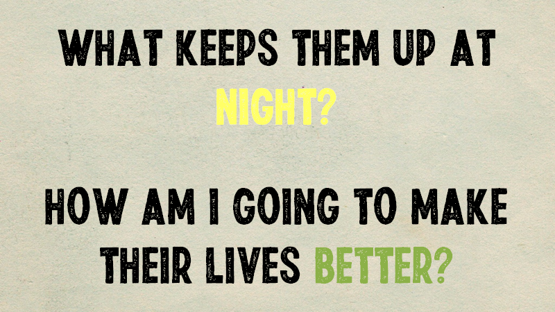
How do you get to know your audience? Well, ask these two simple questions before brainstorming!
The audience is the one who will do all the heavy lifting and incorporate your message into their practice. You’re simply one voice helping them get unstuck on their journey.
The audience is the one who will do all the heavy lifting and incorporate your message into their practice. You’re simply one voice helping them get unstuck on their journey.
Tip 3: Identify your message
The more details that you include and the more complex your talk, the more you must be very clear on what it is you want your audience to hear, understand, and remember.
You should be able to summarize your talk in 2 – 3 sentences!
The more details that you include and the more complex your talk, the more you must be very clear on what it is you want your audience to hear, understand, and remember.
You should be able to summarize your talk in 2 – 3 sentences!

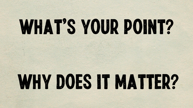
So, what are those critical things your learners need to take away from your presentation? Every great talk is judged by these two questions- what's your point & why does it matter? 
Tip 4: Craft the Narrative
Presentations have the potential to hold an audience’s interest just like a good movie. But, one of the reasons presentations are dull is because they have no identifiable story patterns. There’s no structure, no narrative, just a collection of facts!
Presentations have the potential to hold an audience’s interest just like a good movie. But, one of the reasons presentations are dull is because they have no identifiable story patterns. There’s no structure, no narrative, just a collection of facts!

Tip 5: Storyboard
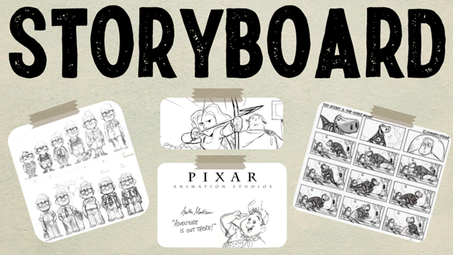
Storyboarding’s an excellent way to visualize the structure of your presentation.
Constraining your ideas to a small space forces you to use simple, clear words and pictures as proof of concept before creating slides in presentation software. 1 idea per slide
Storyboarding’s an excellent way to visualize the structure of your presentation.
Constraining your ideas to a small space forces you to use simple, clear words and pictures as proof of concept before creating slides in presentation software. 1 idea per slide
Believe it or not, most great presentations follow the same structure.
We all know that each great presentation or story should have a beginning, middle, and end punctuated by a few “turning points”.
We all know that each great presentation or story should have a beginning, middle, and end punctuated by a few “turning points”.

The beginning is just like the beginning of any movie or story- setting the stage. You’re describing the audience’s ordinary world and setting the baseline of “what is”. You should strive to engage the audience by putting them in familiar situation or one they’ve struggled with 

The first turning point to occur in a presentation is the “call to adventure”, which signals a significant shift in the content. The call to adventure asks the audience to jump into a situation that, unbeknownst to them, requires their attention and action. But how? 

To create the call to adventure, put forth a memorable big idea that conveys what could be. This is the moment when the audience will see a stark contrast between what is (the problem their facing) and what could be (the solution, or information your providing). 
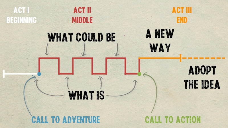
The middle of the presentation is made up of various types of contrast. People are naturally drawn to contrast because life is surrounded by it. Day and night. Male and female. Up and down. Love and hate. Your job as a presenter is to create and resolve tension through contrast. 

The second turning point, the call to action, clearly defines what you’re asking the audience to do, or what to take away from your presentation. Successful presentations help their audience change, and it is important to clearly state exactly how you want the audience to change. 

The ending should leave the audience with a sense of what could be and a willingness to adopt your idea. The ending should repeat the most important points and deliver inspirational remarks encompassing what the world will look like when your idea is adopted. 

Tip 6: Edit Mercilessly
This applies to the content of your talk and the visuals you use (if any).
Cutting information is one of the hardest things to do because when we are close to the topic, as most presenters are, it *all* seems important.
This applies to the content of your talk and the visuals you use (if any).
Cutting information is one of the hardest things to do because when we are close to the topic, as most presenters are, it *all* seems important.

Tip 7: Be authentic
A willingness to take a risk and be vulnerable was a necessary condition for authenticity. There are no formulas. Vulnerability is what makes us human and engages the audience.
A willingness to take a risk and be vulnerable was a necessary condition for authenticity. There are no formulas. Vulnerability is what makes us human and engages the audience.
Tip 8: Use emotion
Storytellers—filmmakers, novelists, etc. — know that it is emotion which impacts people most profoundly. Yes, facts, events, structure are important, but what people remember—and what is more likely to push them to act—is the way the narrative made them feel.
Storytellers—filmmakers, novelists, etc. — know that it is emotion which impacts people most profoundly. Yes, facts, events, structure are important, but what people remember—and what is more likely to push them to act—is the way the narrative made them feel.

Tip 9: Rehearse
Practice until you are comfortable with the information in a talk (i.e. Imagine the power goes out and you have to give your presentation without your slides). Then, rehearse some more!
Practice until you are comfortable with the information in a talk (i.e. Imagine the power goes out and you have to give your presentation without your slides). Then, rehearse some more!
Tip 10: Actively seek feedback
Bounce ideas off friends (i.e. Buddy System)
Record yourself speaking and give it a listen or ask a friend to listen
Have someone in the audience who you trust to give you specific feedback on your talk (i.e. delivery, performance, slides, etc.)
Bounce ideas off friends (i.e. Buddy System)
Record yourself speaking and give it a listen or ask a friend to listen
Have someone in the audience who you trust to give you specific feedback on your talk (i.e. delivery, performance, slides, etc.)
• • •
Missing some Tweet in this thread? You can try to
force a refresh
