For this piece, I tried to gather together some thoughts about the serosurvey data coming out of India. There is a great deal of this data, and the messages are important but not always clear. Longish #thread. 1/n
scroll.in/article/986097…
First, to see the bogus narratives you can construct when you ignore serosurvey data, you just have to look at Chapter 1 of the recent "Economic Survey". (This thread took just one example, but there are many.)
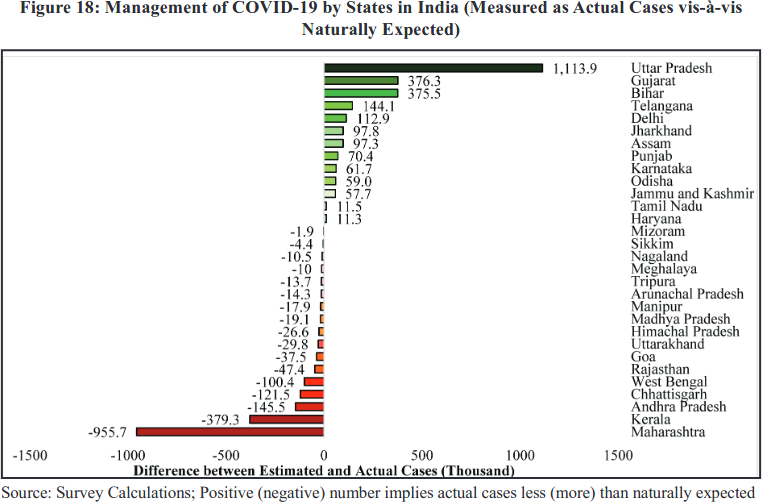
Key message from the serosurveys? Extremely variable surveillance of infections *and probably deaths*. In some places, a decent proportion of infections are picked up; in others a tiny fraction. Some areas have seen a huge number of infections, but almost no recorded deaths.
If a region sees high spread (according to a serosurvey), but reports almost no fatalities, is it more likely that:
- people were magically spared?
- fatalities were not recorded?
science.thewire.in/health/bihar-c…
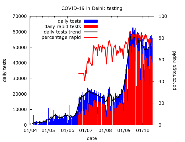
Testing is also now something of a game. The number of tests does not necessarily tell us how good detection is. The tests may be mistimed (e.g., test mainly after the wave has passed), or focussed on groups at low risk of infection.
We should be wary of interpreting falling test positivity as improving detection. Although this may *in general* be true, it is not necessarily the case. I tried to explain why in my recent piece for The Wire.
science.thewire.in/health/third-n…
It may seem counterintuitive, but it's quite possible for the following all to occur:
- detection goes up in urban areas
- detection goes up in rural areas
- detection falls nationwide.
(I'll leave this one as a puzzle!)
When interpreting serosurvey data we should consider that old infections may be missed. E.g. analysis of Delhi's first 4 surveys here. (The recent survey 5 used a more sensitive test and effectively confirmed that earlier surveys were missing infections.)
The serosurveys show consistently that housing poverty is strongly connected with rapid spread in urban areas. But the data doesn't tell us why. Poverty, discrimination and marginalisation can accelerate spread in many different ways and we need to disentagle these.
More generally, analysis of COVID data in India has shied away from tackling how COVID has interacted with inequality and marginalisation. The serosurveys only give us hints about this. (Chatted with @Rukmini about this here).
When interpreting the results of the surveys it's also important to keep an eye on details. How was sampling done? What could the biases be? Were these corrected for in the headline figures? This information is often missing...
...because of poor transparency. There's usually little technical detail until months later (if ever). Sometimes no info about how a population was sampled, or which test was used. Instead govt/private bodies drip feed the media bits of information heavily laced with propaganda.
There can be explicit political interference, as in the case of missing containment zone data from the first national serosurvey. Many of us still want to see this data. It is key to the story of the early epidemic.
economictimes.indiatimes.com/industry/healt…
Mainstream media is too often content to parrot official claims without verification. It may also add some misinformation of it's own. E.g. the absurd claim that the first national serosurvey showed 69% of rural Indians had been infected with COVID!
zeenews.india.com/india/69-4-peo…
Main suggestions for those reporting on the surveys?
Ask:
- how was the population sampled?
- what test was used?
- were corrections done for sampling/test properties?
- breakdown by geography, housing, occupation, etc?
- implications for case detection/fatality rates?
Final thoughts: the potential value of serosurvey data would be improved if more information was gathered (e.g., occupation, income, travel, access to info) + key technical info was shared rapidly. No need for a preprint right away - a technical report + raw data will do. n/n

• • •

Missing some Tweet in this thread? You can try to force a refresh
 

Keep Current with Murad Banaji

Murad Banaji Profile picture

Stay in touch and get notified when new unrolls are available from this author!

Read all threads

This Thread may be Removed Anytime!

PDF

Twitter may remove this content at anytime! Save it as PDF for later use!

Try unrolling a thread yourself!

how to unroll video
  1. Follow @ThreadReaderApp to mention us!

  2. From a Twitter thread mention us with a keyword "unroll"
@threadreaderapp unroll

Practice here first or read more on our help page!

More from @muradbanaji

5 Feb
My piece in The Wire on the third national serosurvey. The headline (~21% prevalence) is probably not a major underestimate. Apparently the antibody test used was less vulnerable to missing old infections than the one used in the second serosurvey. 1/6
science.thewire.in/health/third-n…
The increase in prevalence from 2nd to 3rd survey is roughly consistent with the increase in cases over this period.

The breakdown of prevalence suggests that disease was moving towards rural areas even as daily cases peaked and declined nationally (September). 2/6
Weaker rural surveillance of infections and deaths could explain a moderate drop in detection, and a more noticeable drop in the naive infection fatality rate (recorded deaths over estimated infections) between 2nd and 3rd national serosurveys. 3/6
Read 6 tweets
1 Feb
Chapter 1 of the Economic Survey 2020-21 (indiabudget.gov.in/economicsurvey/): a glowing report on the govt's handling of the COVID crisis, and a case study in what happens when science is abandoned for propaganda. Page after page of spin and dishonesty, but here's just one example... 1/5
...These two pictures show "actual vs. expected" cases and deaths for different states. Bihar does well (green) and Chhattisgarh does badly (red). Why? Because Bihar has fewer recorded COVID cases and deaths than "expected", and Chhattisgarh more than "expected". But... 2/5
I'd earlier examined data from Bihar and Chhattisgarh quite carefully for a piece in The Wire Science - measured cases, recorded deaths and, crucially, serosurvey data. The basic conclusions of this analysis were simple. In the surveyed districts... 3/5
science.thewire.in/health/bihar-c…
Read 5 tweets
31 Dec 20
Mumbai #COVID19 update. Things have improved - daily recorded cases and deaths are at about a quarter of second wave peak values. But there is still a steady stream of new infections. Mumbai's data forces us to ask: could reinfection be more common than we think? 1/10 Image
The recent picture:
- the second wave receded steadily, apart from a small post-Diwali blip
- daily cases, daily deaths and test positivity have all been declining
- but the epidemic is still not dying away. Image
Each day there are about 600 new cases. If we (optimistically) assume 1 in 10 infections are detected, and each infection is "active" for 10 days, that's 600X10X10 = 60,000 active infections = about 0.5% of the city. Low compared to May or September, but still surprisingly high.
Read 10 tweets
19 Oct 20
How many have had #COVID19 in Delhi? What % of infections have been detected? What is the fatality rate?

A (longish) #thread on Delhi's epidemic, with some analysis of its three serosurveys + other data. Details in a technical document linked at the end. (1/11)
First, Delhi's current surge (which may be winding down) is real - not just about better detection. But the actual surge in infections has been considerably smaller than in June - detection has increased a lot, making it seem larger. (Similar story to Mumbai - more later.) 2/
Prevalence estimate: by mid-August between 37% and 49% of Delhi people had had COVID. By mid-September: between 43% and 60%. The wide range reflects many uncertainties. When the October serosurvey results are out, we'll know more. (bloombergquint.com/coronavirus-ou…) 3/
Read 11 tweets
11 Aug 20
Some general thoughts (in random order) on COVID-19 death undercounting in India following the recent article in The Hindu (thehindu.com/opinion/op-ed/…) by @giridar100 and collaborator, and the response from @oommen (orfonline.org/expert-speak/f…). 1/
The documented instances of COVID-19 death undercounting are too many and too major in scale to be treated as aberrations. Many have followed similar patterns - for example omitting deaths from "comorbidities" and suspected deaths.
The "urban areas have high MCCD coverage" argument is something of a red herring. Delhi, with its high MCCD coverage, saw *huge* undercounting before subjected to pressure. Mumbai too added in lots of missed COVID-19 deaths in June (~1700).
Read 11 tweets
31 Jul 20
I took a look at Mumbai's #COVID19 data by age and came to some worrying conclusions. I'd encourage people celebrating seemingly low IFR values to look more closely. I used: Spain's IFR data; and Mumbai's age pyramid, age-structured fatality data, and seroprevalence data. 1/6
Naive IFR from Mumbai's seroprevalence and fatality data is ~0.12% (not, I think, 0.05-0.1% as is widely quoted).

An "expected IFR" for Mumbai, using Mumbai's age pyramid and Spain's age-dependent IFR is ~0.22%.

These two values hide a more complicated story. 2/6
IFR in some age groups, particularly 40-60, appears to be quite a lot higher (about 60% higher) in Mumbai than in Spain, even *assuming no death undercounting*. If there is death undercounting in this age group, then IFR goes up further. This should be a cause for concern. 3/6
Read 6 tweets

Did Thread Reader help you today?

Support us! We are indie developers!


This site is made by just two indie developers on a laptop doing marketing, support and development! Read more about the story.

Become a Premium Member ($3/month or $30/year) and get exclusive features!

Become Premium

Too expensive? Make a small donation by buying us coffee ($5) or help with server cost ($10)

Donate via Paypal Become our Patreon

Thank you for your support!

Follow Us on Twitter!