Narrative: "COVID cases are going down because more people are staying home!"
Reality: According to the USC Dornsife "Understanding America" study, the percentage of people in the US staying home except for essential activities/exercise has remained around 40-45% since June
Narrative: "COVID cases are going down because less people are gathering at each others' homes!"
Reality: The percentage of people in the US that have had visitors at their residence has remained between roughly 40 and 50% since May
Narrative: "COVID cases are going down because more people are wearing masks!"
Reality: The percentage of people in the US that have worn masks has remained around 90-93% since July
Narrative: "COVID cases are going down because more people are keeping their distance!"
Reality: The percentage of people that have had close contact with non-coresidents has remained between 60-70% since June
• • •
Missing some Tweet in this thread? You can try to
force a refresh
Trisha is really going double down on this? Let’s see the mental gymnastics required to argue joggers and cyclists are a real problem with the spread of COVID
“Risk of transmitting outdoors is an order of magnitude less than indoors”
“When jogging or cycling contacts tend to be rare and fleeting”
“Exercising outdoors is one of the few freedoms people in England still have”
Off to a good start making her case so far
“The WHO is adamant that people should NOT wear masks when exercising...but there are strong arguments that challenge the WHO’s advice such as NHS hospitals are overwhelmed.” Huh?
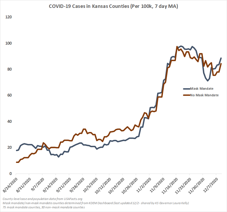
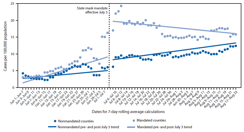
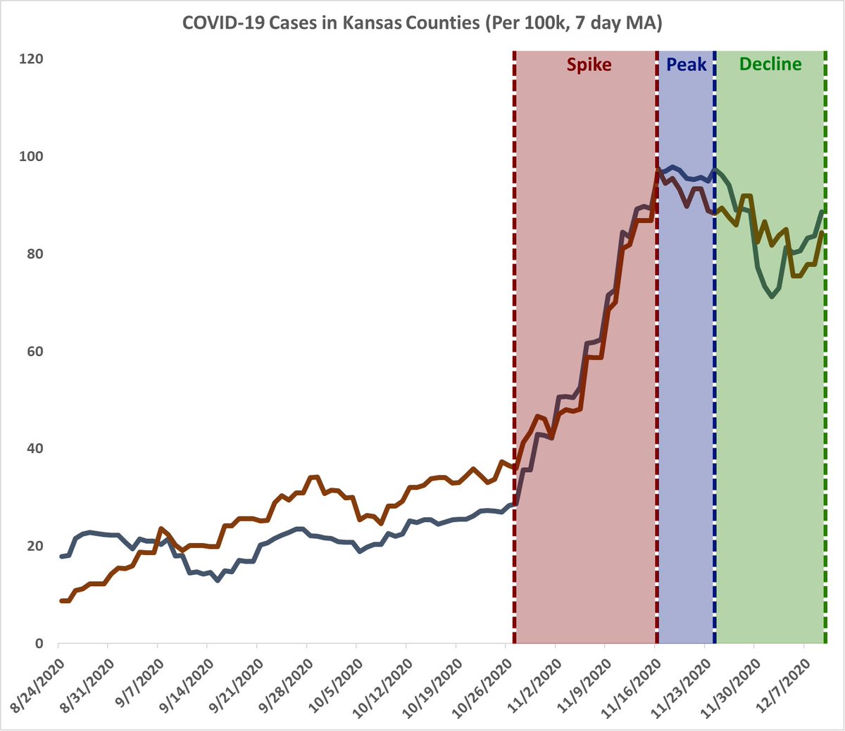
Tired of seeing the same flawed #COVID19 Kansas mask study being shared as proof of "masks working", so I used similar methods + the same dataset and tracked what happened in mandate/non-mandate counties after their study's end date. Pretty different from what the CDC found.
The original observation in the study shared widely by the CDC was that daily cases in mask mandated counties fell while non-mask mandated counties rose. Of course, the conclusion falls apart when you re-run their experiment when SARS-CoV-2 was much more prevalent in Kansas.
Cases rose, peaked, and fell at the exact same time. Sure, the non-mask mandate counties were higher prior to the peak, but this graph does not account for counties' testing levels, and when case prevalence is so low (basically a baseline) there is a lot of room for noise.
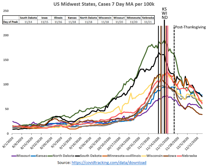
Tom claims COVID spread is entirely because of noncompliance with COVID measures, but he’ll never explain how 9 Midwest states peaked within one week of each other despite having completely different COVID policies, or how South Dakota managed to be the first to peak among them
Tom just hand-waves California’s terrible COVID numbers with “places in CA haven’t masked and distanced”. Really? Where? When? How? Do you have studies? Anything? California has some of the highest mask compliance numbers in the country. Can you be more specific, @DrTomFrieden?
If Tom were actually scientifically-minded he’d show a real interest in how California continues to spike despite having very drastic measures, or how all these Midwest states follow the exact same trajectory. That can’t be explained by 40 million people all complying at once.
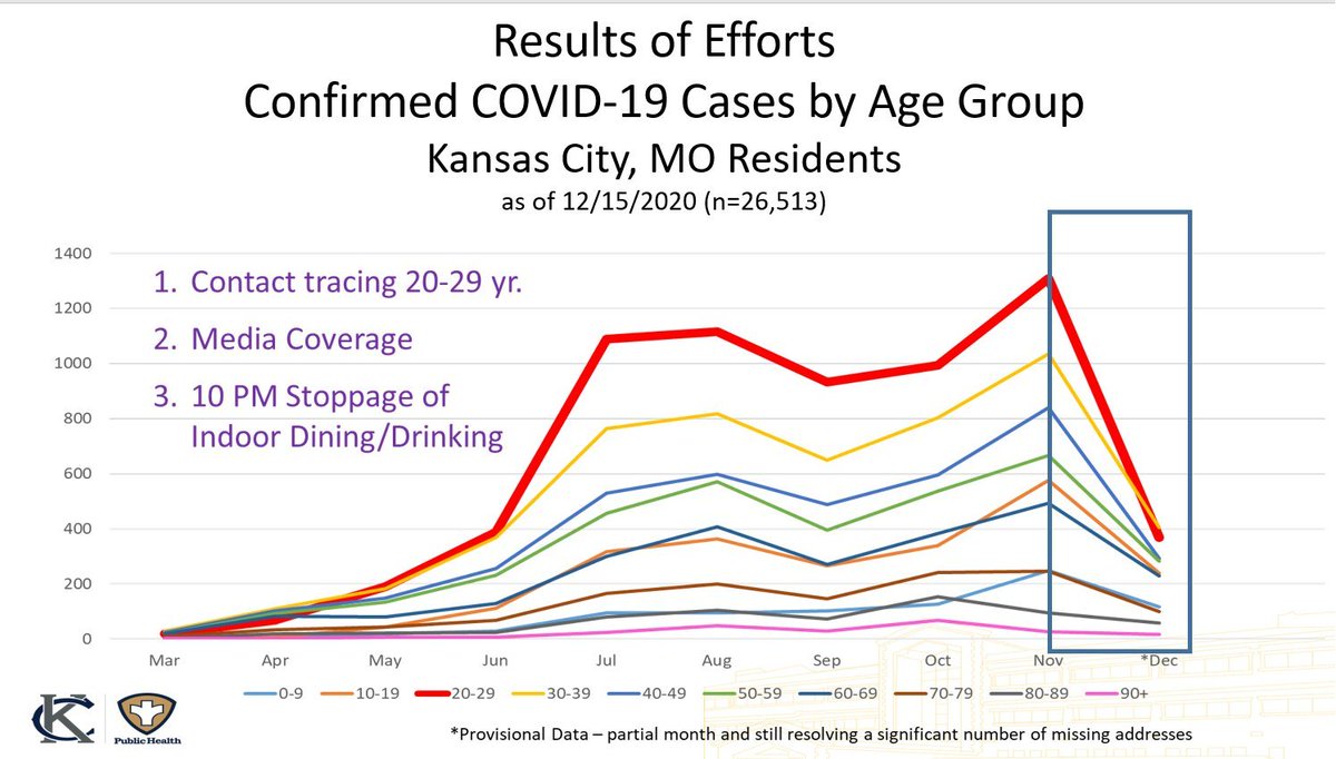
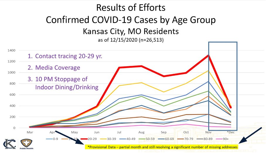
1/ I really want to highlight how this #COVID19 graph from @KCMOHealthDept is a masterclass in either incompetence, narrative-spinning, or both. This is a bit niche with it being KC but I think it applies to health depts across the US. This is lying with graphs at its finest.
2/ First, the graph itself. They have it broken out as cumulative counts per month, as of 12/15. December is half over, so you can't compare it to other months, yet they highlight how far cases have fallen in all groups since November with a tiny blink-and-you-miss-it disclaimer.
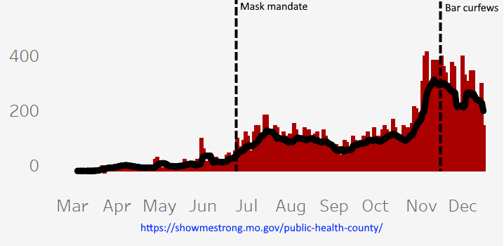
3/ They wouldn't be wrong in assuming cases will be down in December though. But their argument falls apart when they credit 10 PM bar closures for the decline. The curfew was announced 11/16. Cases peaked 11/10 - 20 DAYS before we would see any meaningful effect from the curfew.
3 weeks removed from when people started gathering for Thanksgiving, let's see how those #COVID19 "surge upon a surge" predictions by Fauci etc panned out for those of us in the Midwest. Colored lines indicate each state's peak. They all occurred within one week of each other.
2/ The "surge upon a surge" narrative has no basis in reality. COVID outbreaks are clearly regional, regardless of the restrictions put in place by a particular state. This is perfectly obvious when you break out the regions one at a time vs. nationally.
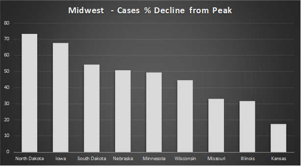
3/ 4 states with some of the most lax COVID restrictions of this group of 9 have the highest decreases from their peak - ND, IA, SD and NE. Some of these states introduced new restrictions, mandates etc. but none of them align with when they peaked. Many came after.