THREAD on COVID and DEPRIVATION:
As cases recede nationally, some areas remain stubbornly high. Many have been persistently high for months. Deprivation is an important aspect of this.
This is a tour of deprivation & covid & what it means
(21 tweets but pls read).
As cases recede nationally, some areas remain stubbornly high. Many have been persistently high for months. Deprivation is an important aspect of this.
This is a tour of deprivation & covid & what it means
(21 tweets but pls read).
2. First, how is deprivation measured? Usually by the "Index of multiple Deprivation". This assigns a value to every neighbourhood (~7000 people) based on 7 domains of deprivation.
arcgis.com/apps/Cascade/i…
arcgis.com/apps/Cascade/i…

3. All neighbourhoods (technically MSOAs) are then ranked in order of deprivation and split into 5 equally sized groups ("quintiles"). Every person in population can then be assigned to one deprivation quintile from most deprived to least deprived based on where they live.
4. There are roughly the same number of people in each deprivation quintile - so the population is split into 5 equal-ish sized groups.
Impact of deprivation shows up when look at other outcomes by deprivation which will not be equally sized by deprivation.
So...
Impact of deprivation shows up when look at other outcomes by deprivation which will not be equally sized by deprivation.
So...

5. If we look average case rates per 100,000 people per week by deprivation in England since September, we see that the more deprived communities have markedly higher case rates. 

6. This disparity gets *worse* in lockdowns, as people from more deprived areas remain much more exposed to covid as they go out to work, have kids in school, can't self isolate etc... 

7. People in deprived areas are also more likely to get *sicker* if they catch Covid. We can see an even starker gradient in who needs intensive care for Covid from ICNARC data. 

8. Looking at population, cases and ICU together, this progression is clear. Cases are more skewed to deprivation and ICU admissions more still.
We know ethnicity and deprivation big risk factors.
theguardian.com/world/2021/feb…
We know ethnicity and deprivation big risk factors.
theguardian.com/world/2021/feb…

9. What is contributing to this? Partly it's that key workers (inc taxi drivers, security guards etc) are more likely to get covid. They are also more likely to come from deprived & BME communities & have other health problems.
oem.bmj.com/content/early/…
ons.gov.uk/peoplepopulati…
oem.bmj.com/content/early/…
ons.gov.uk/peoplepopulati…

10. Partly it's that people on low incomes or in poor housing cannot isolate - and that also prevents people getting tested!
bmj.com/content/372/bm…
bmj.com/content/372/bm…

11. Housing is also a big issue - we know from REACT study that lots of people living in the same house is a big risk factor. Poor housing is also associated with other health conditions making severe illness from Covid more likely
health.org.uk/news-and-comme…
health.org.uk/publications/l…
health.org.uk/news-and-comme…
health.org.uk/publications/l…
12. We also know that people in deprived areas have worse access to green spaces. This will matter more & more as we head into summer & more outdoor activities. Not only are green spaces good for mental health, but also for avoiding riskier indoor spaces.
blogs.bmj.com/bmj/2020/07/03…
blogs.bmj.com/bmj/2020/07/03…
13. So how is this playing out as the 2nd Covid wave recedes?
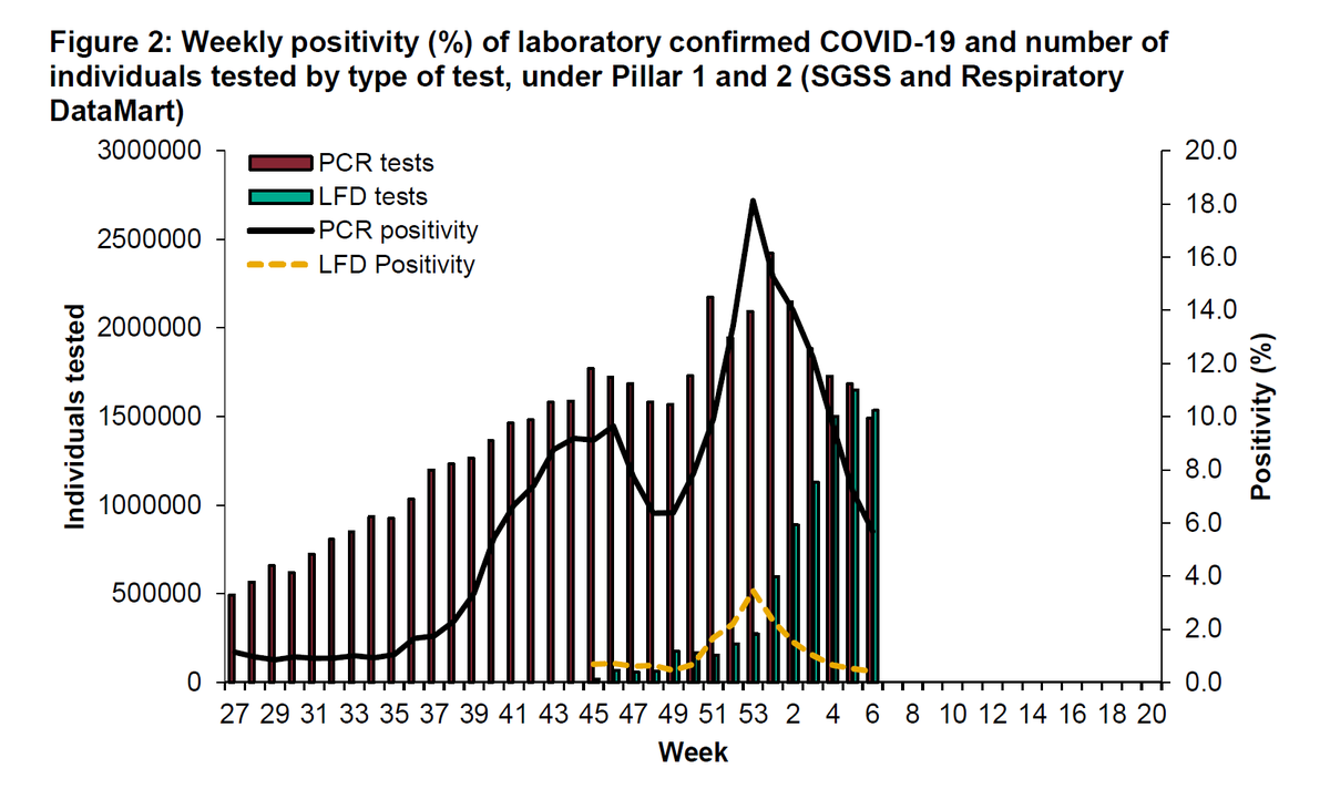
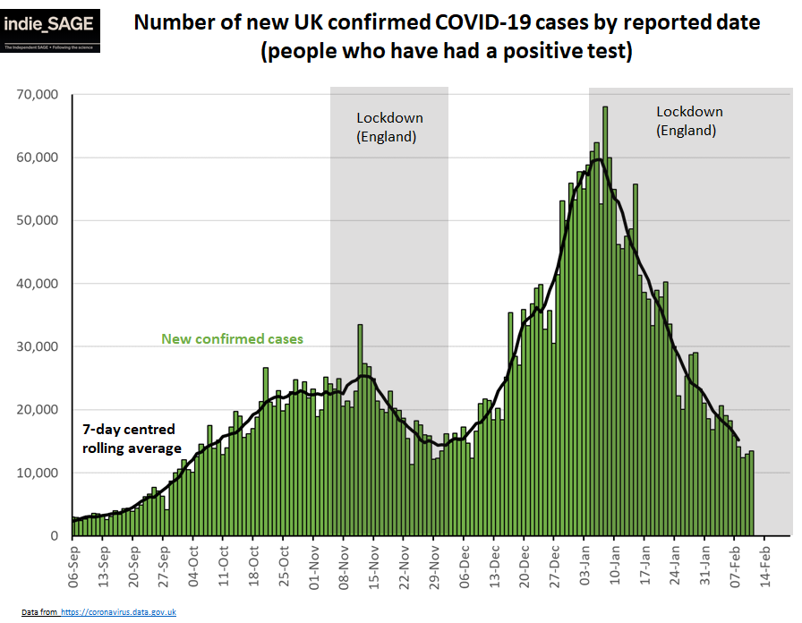
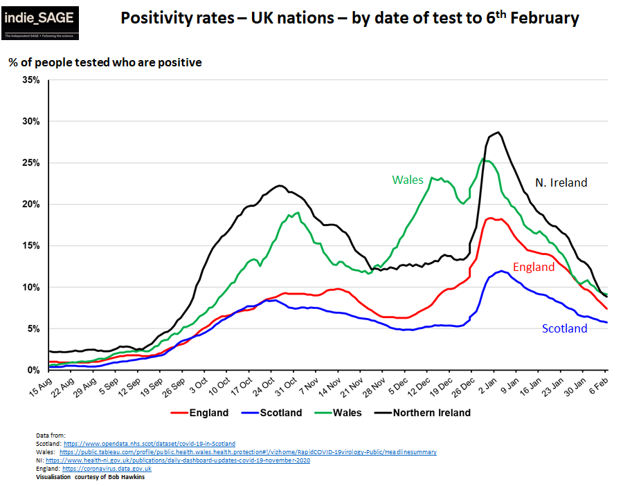
14. Cases and positivity rates are coming down in all nations, but are flattening off in Scotland, England & Wales. This is mirrored in more local data. E.g. in Scotland positivity rates are rising in many areas. 


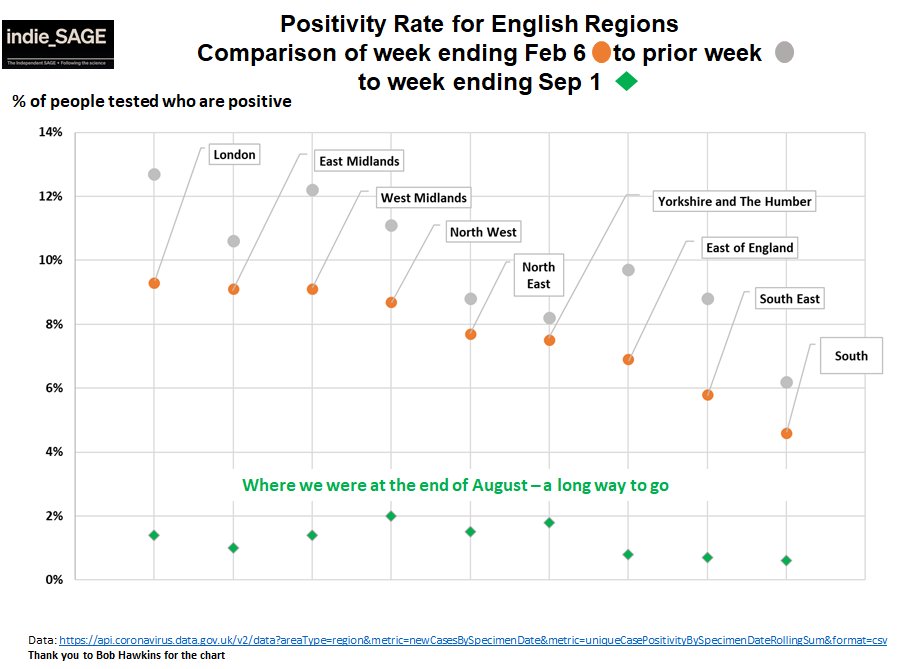
15. In England, a divide is again emerging with higher rates in the North & Midlands which are flattening off compared to London, East & South. 

16. Surprise Surprise, the regions in England with the highest resideual rates of Covid are also those with more deprived areas. 

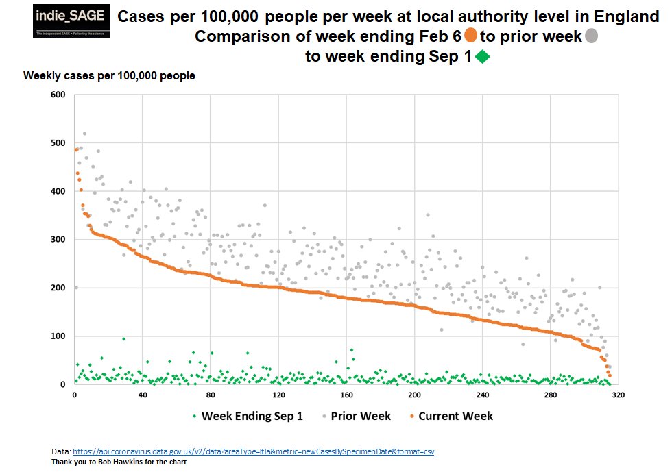
17. If we look at top 30 local authorities who have been persistently above 200 cases / 100K people / wk since September, most of them are again in the top 40 local authorities now (orange rows). 

18. It's a similar picture in Scotland (top 15 local authorities with persistently high cases and ones that are in the top 15 places now). 

19. So we are seeing persistently high cases in many of the same areas that saw increased restrictions and cases all last autumn.
Worse, people in deprived areas are also less likely to have had a vaccine dose.
Worse, people in deprived areas are also less likely to have had a vaccine dose.

20. Although, for vaccine uptake, ethnicity is a bigger driver than deprivation (although there is a lot of overlap between the the two).
news.sky.com/story/covid-19…
This might explain why London is lagging so much.
news.sky.com/story/covid-19…
This might explain why London is lagging so much.

21. As we emerge from lockdown, we MUST tackle these issues.
It's not only very unfair for Covid to become a "disease of poverty", it also risks continued large outbreaks & emergence of new vaccine-resistant variants.
As a lancet editorial said:
thelancet.com/journals/lanin…
END
It's not only very unfair for Covid to become a "disease of poverty", it also risks continued large outbreaks & emergence of new vaccine-resistant variants.
As a lancet editorial said:
thelancet.com/journals/lanin…
END

• • •
Missing some Tweet in this thread? You can try to
force a refresh


