1/n Since last May, Ontario's for-profit long-term care sector has said its far higher COVID-19 death rate has nothing to do with ownership.
With Wave 2 subsiding, we tested the claim.
It's not what we found.
New from me, @KenyonWallace & @BKennedyStar
thestar.com/news/investiga…
With Wave 2 subsiding, we tested the claim.
It's not what we found.
New from me, @KenyonWallace & @BKennedyStar
thestar.com/news/investiga…
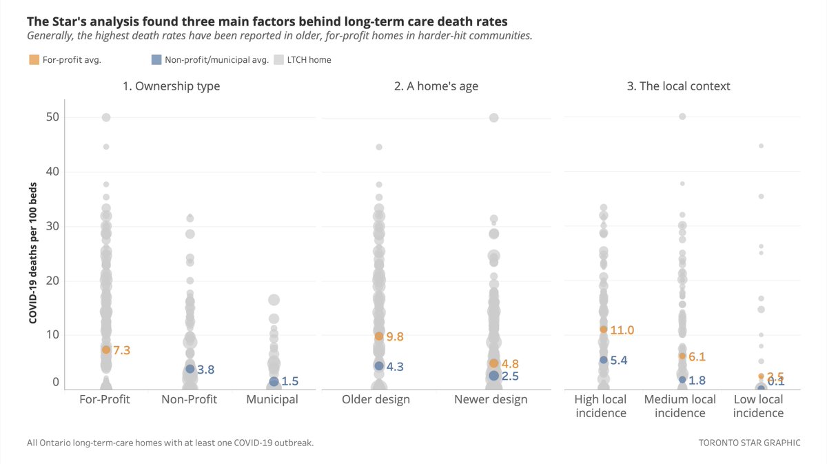
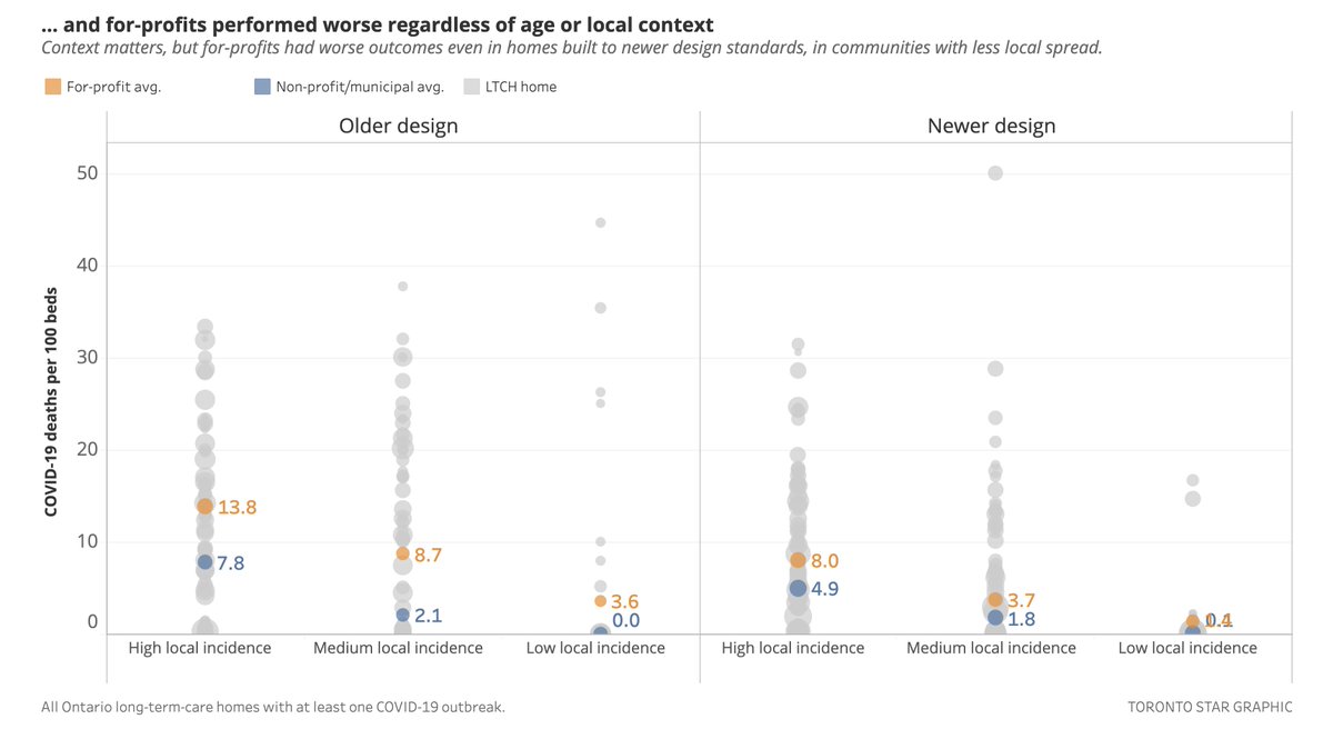
2/n For-profits have, in fact, reported higher death rates even accounting for factors the industry says explain the difference: Their homes’ older design & community infection rates.
Older or newer, hard-hit cities or no, for-profits saw more deaths per capita across the board.
Older or newer, hard-hit cities or no, for-profits saw more deaths per capita across the board.
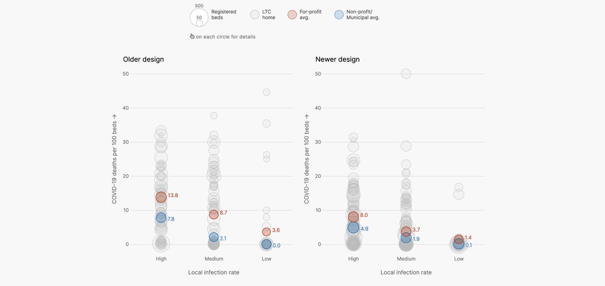
3/n To be clear, older homes and those in areas with higher infection rates have *clearly* seen elevated death tolls.
We don't dispute that.
But: For-profits had worse avgs. than non-profits & municipal homes across virtually every combination of factors we looked at.
We don't dispute that.
But: For-profits had worse avgs. than non-profits & municipal homes across virtually every combination of factors we looked at.
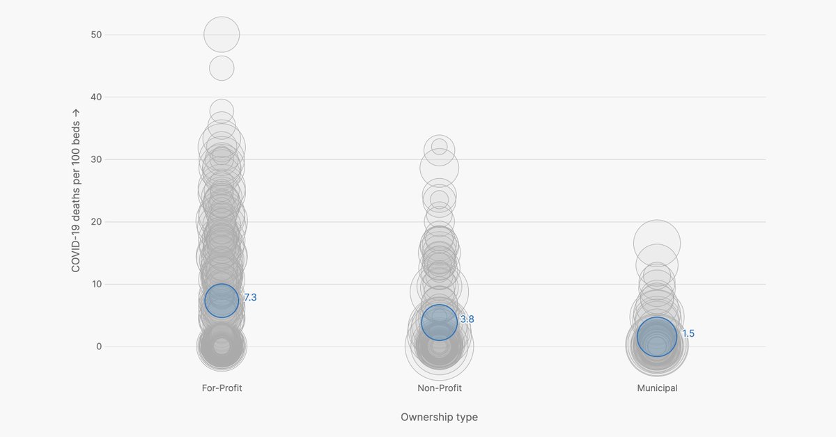
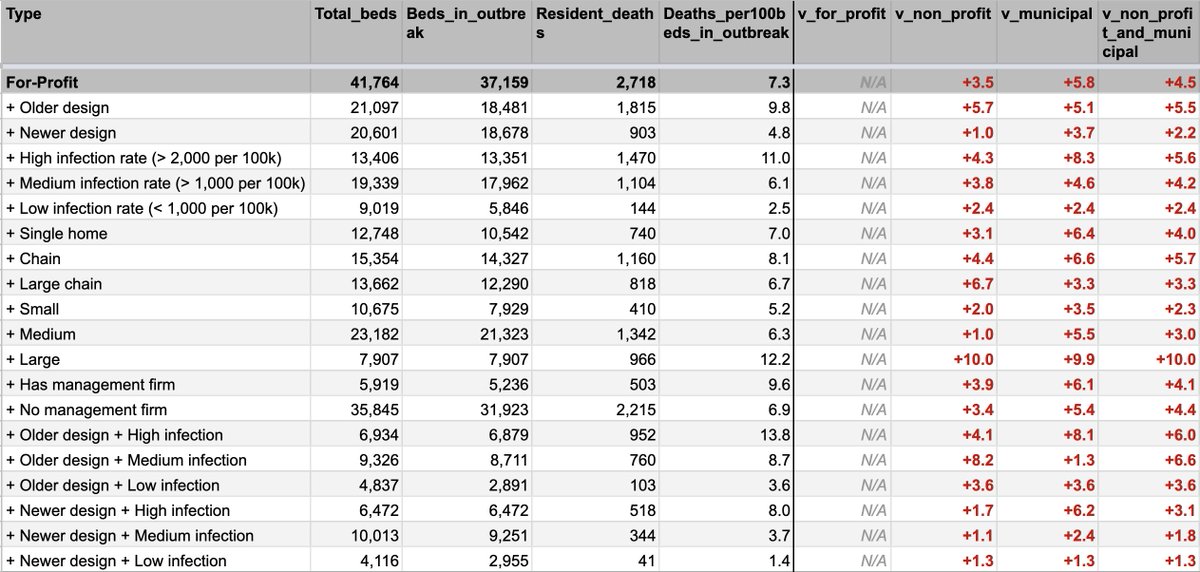
4/n Our analysis compared every Ontario nursing home's reported deaths against 6 factors: Ownership, design age, local spread, whether they're chain-owned, facility size, and if the home has an outside manager.
For-profits saw more deaths per capita in 78 of 81 combinations.
For-profits saw more deaths per capita in 78 of 81 combinations.
5/n The industry and experts also cautioned that we should consider outliers in the data, particularly places like Roberta Place, where B.117 ran rampant.
We tested that.
Even excluding Ontario's 10 worst-hit homes by per capita deaths, for-profits were consistently worse.
We tested that.
Even excluding Ontario's 10 worst-hit homes by per capita deaths, for-profits were consistently worse.
6/n The Ontario Long Term Care Association — which represents 70% of Ont. LTC homes, including most for-profits — disputes our findings.
They say they lack context & don't include "a range of factors experts agree increase the likelihood and magnitude of a COVID-19 outbreak.”
They say they lack context & don't include "a range of factors experts agree increase the likelihood and magnitude of a COVID-19 outbreak.”
7/n The OLTCA reiterated that the most important risk factor was the daily incidence of COVID-19 infections in the surrounding community + the age of buildings and number of beds per room.
(We tested against age and community spread, we don't have data on beds per room)
(We tested against age and community spread, we don't have data on beds per room)
8/n On Feb. 19, the Ministry of Health presented research to the LTC Commission that found for-profit ownership was a significant factor in increased mortality in Wave 2, although not using data for the full pandemic.
That study's here:
ltccommission-commissionsld.ca/presentations/…
That study's here:
ltccommission-commissionsld.ca/presentations/…
9/n The MOH study follows work by @NathanStall (who is quoted in our story) on Wave 1.
He found that although for-profit status was associated w. more deaths, that could be explained by the effect of other factors.
That study is here: cmaj.ca/content/192/33…
He found that although for-profit status was associated w. more deaths, that could be explained by the effect of other factors.
That study is here: cmaj.ca/content/192/33…
10/n All that to say: We believe our analysis is valid and has found an undeniable trend, and we're being transparent about other's people's findings, and our own.
Here: Here's a link to our database.
docs.google.com/spreadsheets/d…
Here: Here's a link to our database.
docs.google.com/spreadsheets/d…
• • •
Missing some Tweet in this thread? You can try to
force a refresh