1/n There are a few things we couldn't get into in our story this morning on the higher death rates in for-profit LTC homes, including the extent to which Wave 2 was relatively much *worse* in for-profits.
So, here's a thread of some extra charts:
thestar.com/business/2021/…
So, here's a thread of some extra charts:
thestar.com/business/2021/…
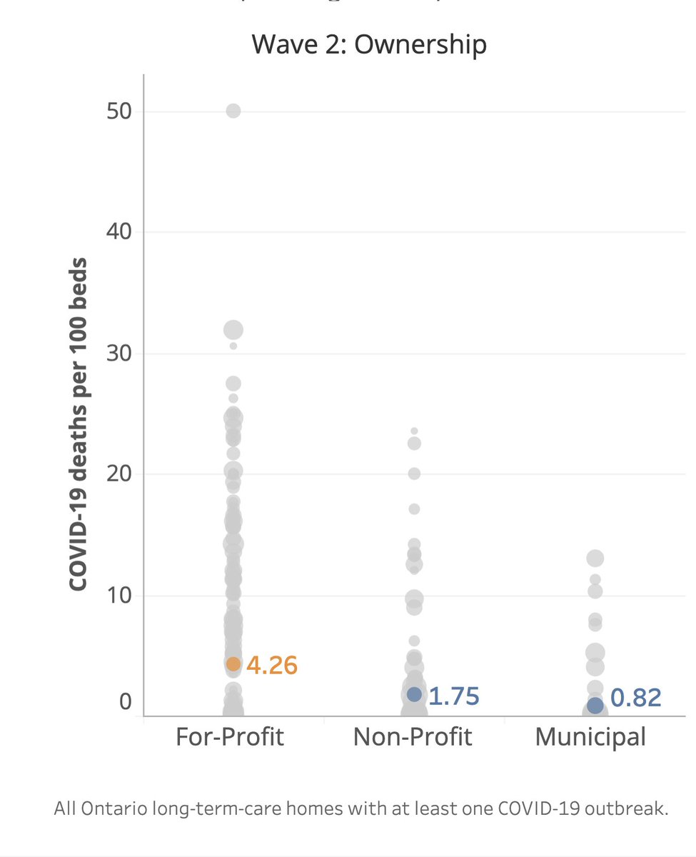
2/n Here are three factors that stood out the most in our analysis:
1. Ownership type
2. A home's age (based on the age of design standards)
3. The local infection rate.
Orange is for-profit. Blue the rest.
Higher = more deaths per 100 beds.
1. Ownership type
2. A home's age (based on the age of design standards)
3. The local infection rate.
Orange is for-profit. Blue the rest.
Higher = more deaths per 100 beds.
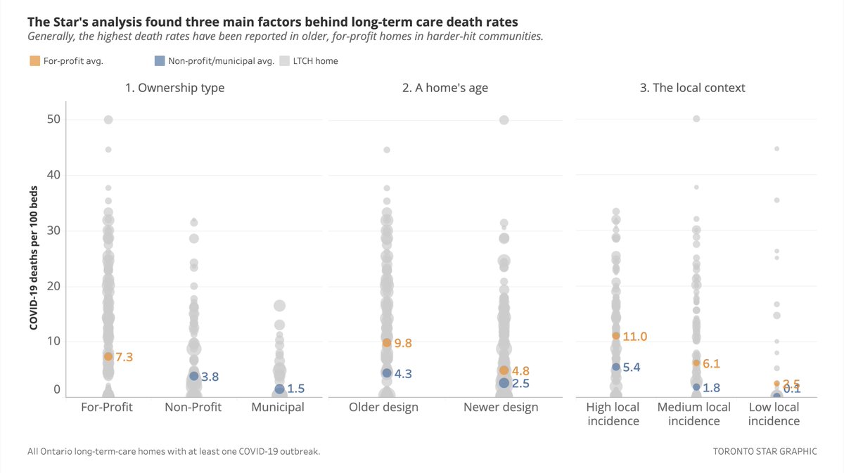
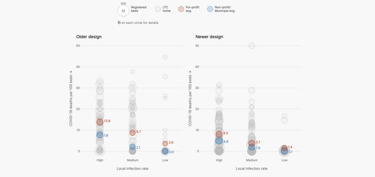
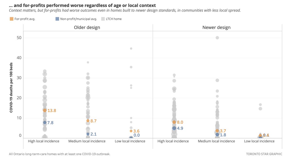
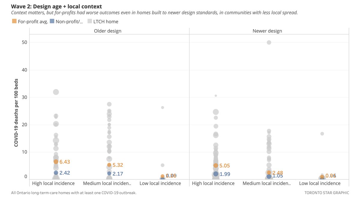
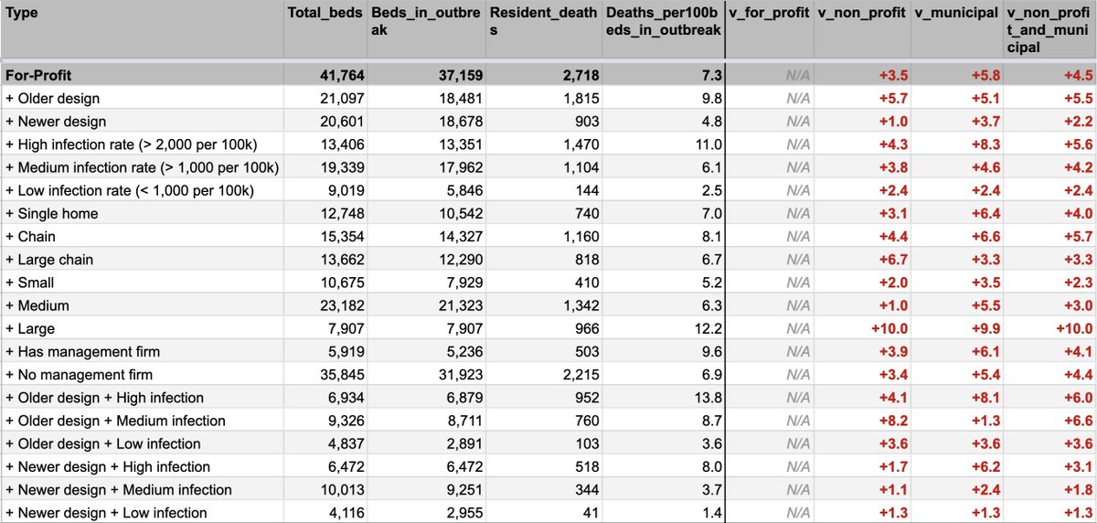
3/n You can see home age and infection rate are clearly correlated with mortality — but of course ownership type matters, too.
You can see that when you compare across the 3 factors.
This was the key graphic in our story.
(It's what the industry said we didn't do last May.)
You can see that when you compare across the 3 factors.
This was the key graphic in our story.
(It's what the industry said we didn't do last May.)
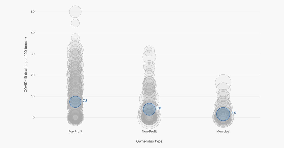
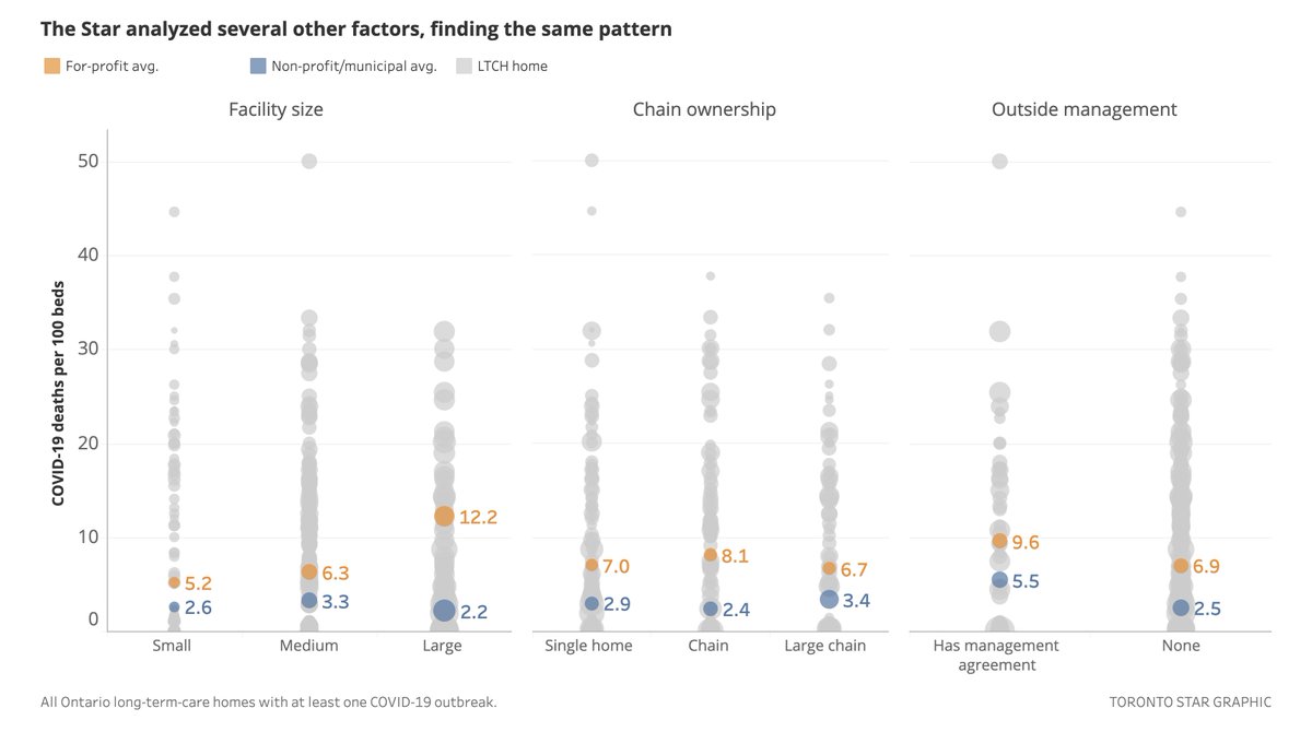
4/n We looked at other factors too. Those — home size, chain ownership and the presence of an outside management agreement — don't seem to have such a large correlation.
But, the for-profits were still *clearly* worst:
But, the for-profits were still *clearly* worst:
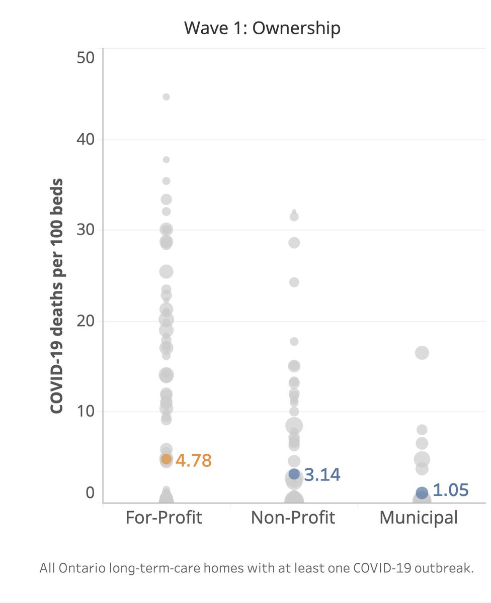
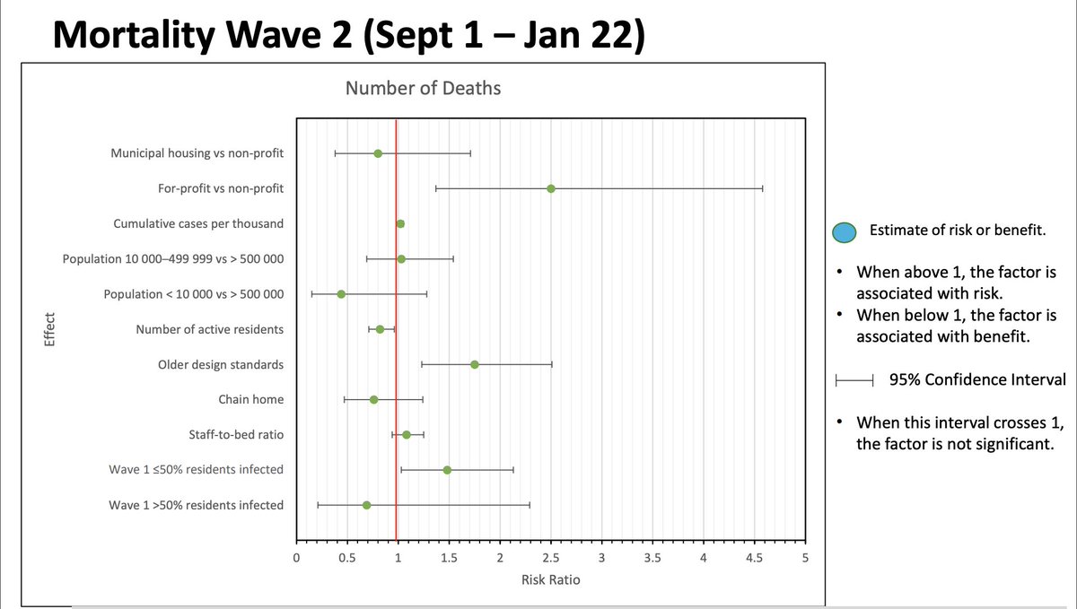
5/n One interesting thing is we found the difference between for-profits and the rest was narrower in Wave 1 than Wave 2.
Left is Wave 1. Right is Wave 2.
About 50% higher mortality than non-profits in Wave 1, more than 2x in Wave 2.
Left is Wave 1. Right is Wave 2.
About 50% higher mortality than non-profits in Wave 1, more than 2x in Wave 2.
6/n I found this interesting (and validating) because although academic work done on Wave 1 agreed with the finding of higher-mortality, it found that design age and local context were a strong explanation for that difference.
Here's that study:
cmaj.ca/content/192/33…
Here's that study:
cmaj.ca/content/192/33…
7/n If we found that Wave 2 was not clearly different than Wave 1 in our analysis, we would expect that academic method to find the same thing all over again.
Instead: We found a much larger for-profit difference in Wave 2.
2-3x higher, in every combination of age + context.
Instead: We found a much larger for-profit difference in Wave 2.
2-3x higher, in every combination of age + context.
8/n And indeed, as we were getting ready to publish, the Ministry of Health repeated @NathanStall's research, this time including Wave 2.
Like us: Their research found a significant ownership effect on mortality in Wave 2.
Like us: Their research found a significant ownership effect on mortality in Wave 2.
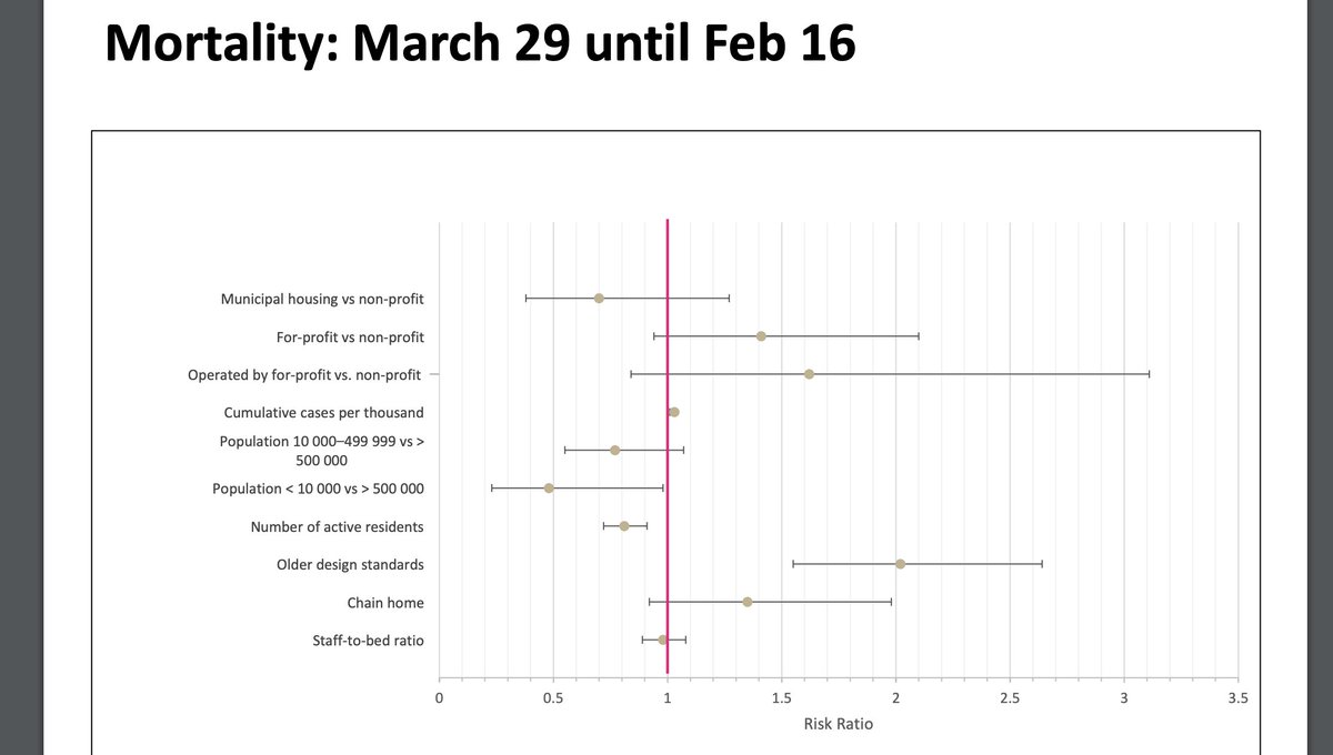
10/n That research is at the link here. Have a look:
The ministry's study did not find a significant ownership effect looking at the full pandemic.
(This means the confidence range of the for-profit effect — second from top — included the null result)
ltccommission-commissionsld.ca/presentations/…
The ministry's study did not find a significant ownership effect looking at the full pandemic.
(This means the confidence range of the for-profit effect — second from top — included the null result)
ltccommission-commissionsld.ca/presentations/…
11/n None of these studies can really address the question of "why" for-profits have reported disproportionately more deaths.
Ours is no different.
We've been v. cautious not to overstate what we've found, and we're emphatically not arguing for any particular policy solution.
Ours is no different.
We've been v. cautious not to overstate what we've found, and we're emphatically not arguing for any particular policy solution.
12/ But. I strongly believe the first step to finding a solution is to acknowledge a problem.
On that, I think our work is undeniable.
You can see our database here. I encourage you to look: docs.google.com/spreadsheets/d…
On that, I think our work is undeniable.
You can see our database here. I encourage you to look: docs.google.com/spreadsheets/d…
13/ I also strongly encourage you to read the Ontario Long-Term Care Association's response to our work, below.
The OLTCA is the body that represents about 70% of Ontario LTC homes, including most for-profits.
They dispute our findings.
The OLTCA is the body that represents about 70% of Ontario LTC homes, including most for-profits.
They dispute our findings.
https://twitter.com/OLTCAnews/status/1365445979495936001?s=20
• • •
Missing some Tweet in this thread? You can try to
force a refresh