Ed Tubb Profile picture
18 Mar, 5 tweets, 2 min read
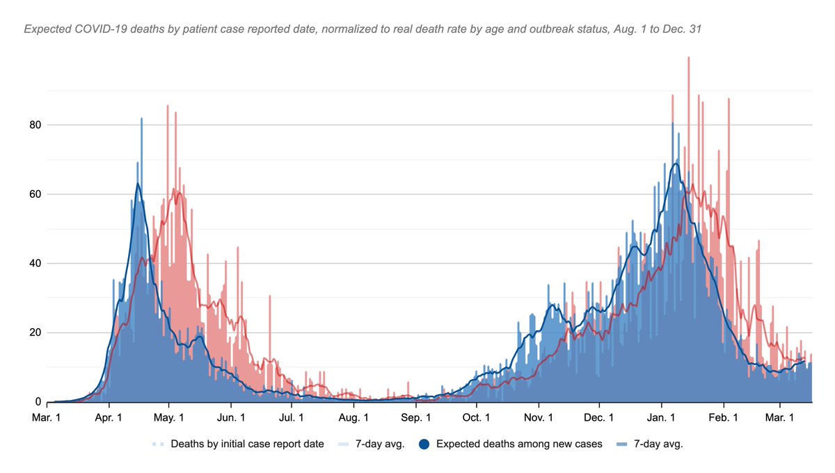
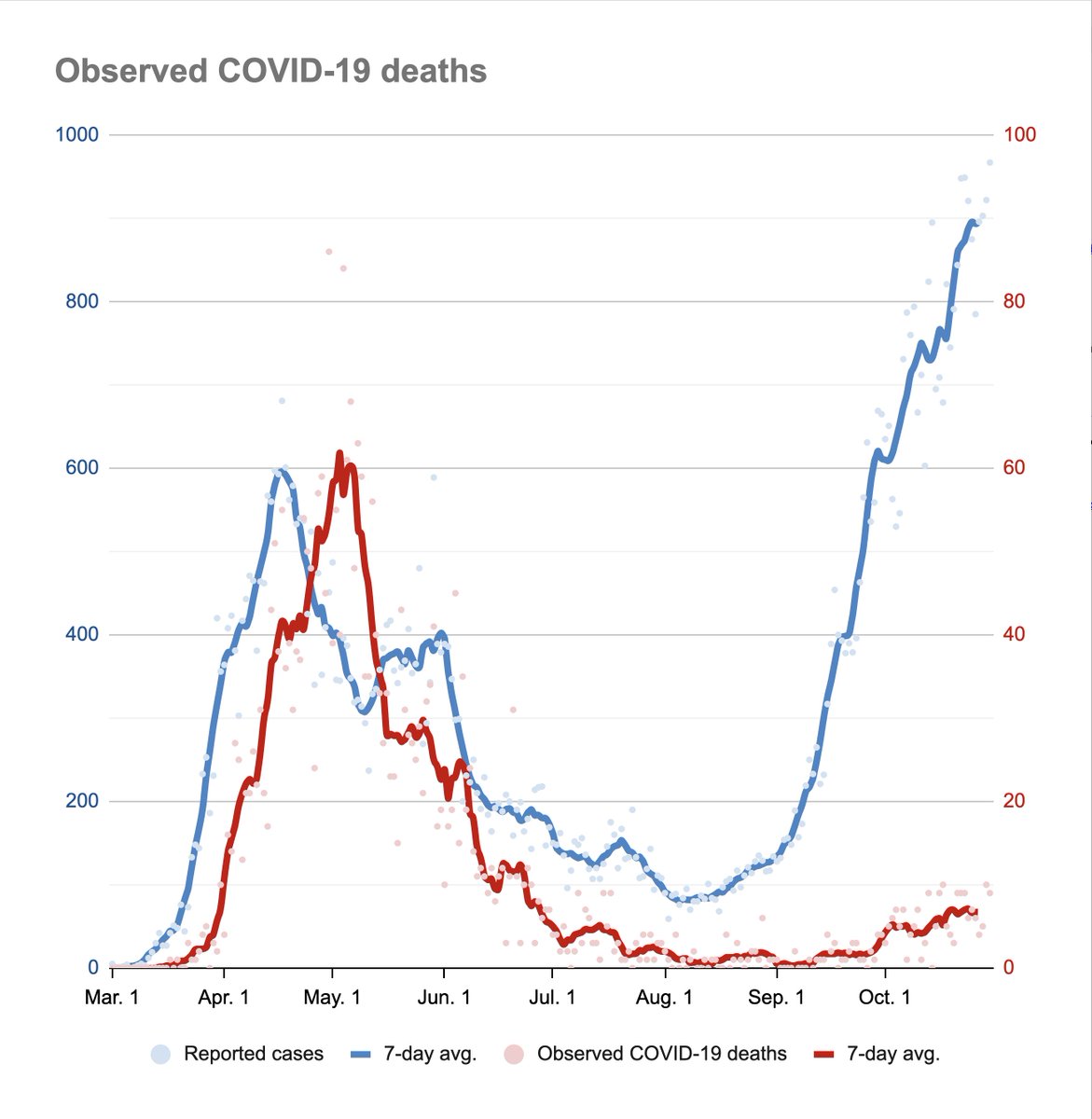
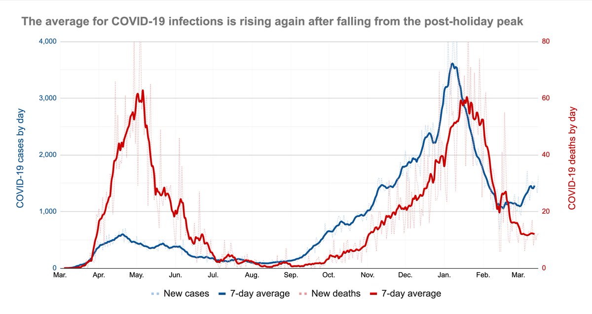
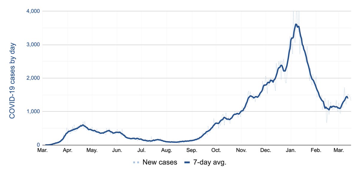
Here's a fun game: The blue line here is Ontario's 7-day avg. of reported COVID-19 cases.

After March 2020, where on this is line is the growth the fastest?
To make it easier, let's remove the deaths curve, so you can see it clearer.
(I'll reply with the answer in the morning.)
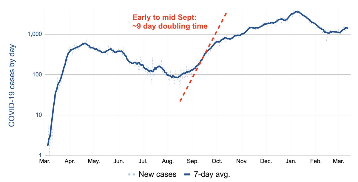
The answer: A roughly 10-day period in early-to-mid Sept., when Ontario had a ~9 day doubling time, easily seen here using a log-scale.

Side note: The end of this period of growth roughly coincides with the first major intervention of Wave 2 — closing bars early.

• • •

Missing some Tweet in this thread? You can try to force a refresh
 

Keep Current with Ed Tubb

Ed Tubb Profile picture

Stay in touch and get notified when new unrolls are available from this author!

Read all threads

This Thread may be Removed Anytime!

PDF

Twitter may remove this content at anytime! Save it as PDF for later use!

Try unrolling a thread yourself!

how to unroll video
  1. Follow @ThreadReaderApp to mention us!

  2. From a Twitter thread mention us with a keyword "unroll"
@threadreaderapp unroll

Practice here first or read more on our help page!

More from @EdTubb

19 Mar
1/n Haven't done this one for a while: This is the number of expected deaths, blue, in Ontario's daily case mix, based on the avg. observed mortality from Aug. thru Dec. 31., overlayed on the reported number, red. Image
2/n As older people get vaccinated, the mix should avg. less deadly, and you'd expect this blue line to become increasingly disconnected from the overall trend in daily cases.

Ie: As cases get younger, there should be fewer expected deaths within those cases.
3/n So far, the blue line *is* rising, which suggests the Wave 3 rise in cases is happening a bit faster than the improvement in the case mix.

Short term: Since the blue line has led the red one by a couple weeks or so, I wouldn't expect Ontario's death numbers to keep falling.
Read 4 tweets
27 Feb
1/n There are a few things we couldn't get into in our story this morning on the higher death rates in for-profit LTC homes, including the extent to which Wave 2 was relatively much *worse* in for-profits.

So, here's a thread of some extra charts:

thestar.com/business/2021/…
2/n Here are three factors that stood out the most in our analysis:

1. Ownership type
2. A home's age (based on the age of design standards)
3. The local infection rate.

Orange is for-profit. Blue the rest.

Higher = more deaths per 100 beds.
3/n You can see home age and infection rate are clearly correlated with mortality — but of course ownership type matters, too.

You can see that when you compare across the 3 factors.

This was the key graphic in our story.

(It's what the industry said we didn't do last May.)
Read 12 tweets
26 Feb
1/n Since last May, Ontario's for-profit long-term care sector has said its far higher COVID-19 death rate has nothing to do with ownership.

With Wave 2 subsiding, we tested the claim.

It's not what we found.

New from me, @KenyonWallace & @BKennedyStar

thestar.com/news/investiga…
2/n For-profits have, in fact, reported higher death rates even accounting for factors the industry says explain the difference: Their homes’ older design & community infection rates.

Older or newer, hard-hit cities or no, for-profits saw more deaths per capita across the board.
3/n To be clear, older homes and those in areas with higher infection rates have *clearly* seen elevated death tolls.

We don't dispute that.

But: For-profits had worse avgs. than non-profits & municipal homes across virtually every combination of factors we looked at.
Read 10 tweets
13 Jan
First, it was an emergency. They shut schools and the border was closed. But not at Pearson (and we went on March break.) They closed parks for the cherry blossoms. We lined up outside grocery stores. Then it was Stage 1, 2 and 3. Then it was “modified stage 2”.
We were told not to dine indoors — but you still could. They said "everyone can get tested," then it was only a few of us. Then appointments only. We all had our bubbles. Then there was colour coding. Then they changed the colours. And grey was worse than red.
Then there was “grey +” which was also a “lockdown” (but for most of us only after Boxing Day). The border was still closed, but you could fly to Cancun. Still can. Our kids went to school during the lockdown, then they didn’t. They will again soon. Probably.
Read 5 tweets
9 Dec 20
1/n I know I post a count literally every evening — but this is worth saying:

You get the most accurate sense of the pandemic by focusing less on the bumps in this line and instead squinting at the general shape of it.

The picture won't be precise — but the data isn't either.
2/n The problem is that all the ups and downs in these lines strongly suggest *narrative* — but for the most part, the data doesn't have anywhere near that fidelity.

Big turnarounds happen in pandemics, yes, but you won't know for sure you've had one until weeks later.
3/n Think of all the times we've heard about flattening, or a plateau, or a spike after some holiday.

You can see those moments clearly in the ups and downs of the fall wave.

At the same time: You can also draw a remarkably straight line through the same curve.
Read 7 tweets
2 Nov 20
1/2 Here's this "expected deaths" curve overlayed with the province's cases by day, left, and the observed deaths tally, right.

The "expected" curve peaks on April 17 (when nursing home outbreaks peaked by cases).

The real curve peaks May 4.
2/2 You see what looks like a similar match with a peak on the downside of the "expected" curve at May 14-15 with one on the real curve around May 27.

So... ballpark: If it's predictive, this "expected deaths" number could be a look ahead by 10 to 14 days.
Testing this:

On Oct. 1 "expected deaths" hit a 7-day avg. of 5.5 deaths a day; we passed that 15 days later (on Oct. 16.)

On Oct. 16 "expected deaths" was at a 7-day avg. of 8.0; we passed that 17 days later (today.)

That's pretty good — maybe a bit longer than the spring?
Read 4 tweets

Did Thread Reader help you today?

Support us! We are indie developers!


This site is made by just two indie developers on a laptop doing marketing, support and development! Read more about the story.

Become a Premium Member ($3/month or $30/year) and get exclusive features!

Become Premium

Too expensive? Make a small donation by buying us coffee ($5) or help with server cost ($10)

Donate via Paypal Become our Patreon

Thank you for your support!

Follow Us on Twitter!