Thread: Since the UK has just released its latest data on greenhouse gas emissions, this feels like as good a time as any to look at the numbers and ask: what’s really going on? The broad picture is v promising (see these headlines from earlier): emissions falling fast.
Before we go any further, this is not a thread about “the science”. It’s not a debate abt climate change. Feel free to debate that elsewhere. This is abt the DATA. And while there are some interesting question marks over the data, the overarching aim of govt right now is v simple
The UK has committed, in law, to get greenhouse gas emissions down to zero in net terms by 2050. If you consider the starting point for that effort to be 1990, it’s now nearly (but not quite) halfway there. This is quite something…
You might be wondering: in that case why did a lot of newspapers report last week that we were ALREADY halfway there? They were basing that on an estimate by the brilliant @DrSimEvans. But since then BEIS have revised a lot of their data. So actually we’re not quite there yet.
414 million tonnes of emissions in 2020. Where did they come from?
Intuitive answer is: power stations. But these days they are only 19% of UK GHG emissions (vs 33% a decade ago; more & more power coming from renewables vs fossil fuels).
More emissions come from TRANSPORT. 🚙🚌⛴
Within a few years domestic greenhouse gas emissions (mainly our boilers) will prob be higher than those from power stations.
Note which lines are going down and which ones aren’t. This is why getting to net zero will be tricky. Power generation, it turns out, was the easy bit.
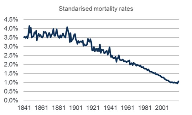
Actually domestic UK emissions have been falling for a long time. They peaked in the early 1970s and have been falling ever since. Partly this is because we’re genuinely getting cleaner: cars more efficient, more renewable energy, better boilers, less coal being burned etc
But partly it reflects something else
Our manufacturing sector shrank
Our mining sector pretty much ended
We went from making our own goods in our own factories to shipping them in from overseas.
Some would argue, with reason, that we shouldn’t just look at DOMESTIC emissions…
This chart tells the story. The red bit is domestic emissions, broadly the numbers govt was announcing today. Those other segments show you emissions used to produce goods that we then IMPORT. A more comprehensive picture of UK emissions shd prob consider them too
Consider all GHG emissions inc those embedded in what we import and the net zero outlook is less promising. Far from reducing emissions by a third we’ve reducing them by barely more than half that (NB different dataset & time period, hence the % fall is different to the BEIS one)
You see the situation: Britain is doing brilliantly at reducing its emissions. That partly reflects genuine reform and “greening” but it partly reflects deindustrialisation. The more factories we shut, the closer we get to zero. Which is an odd incentive to bake into the economy.
But as I say, the UK is doing v well. Reducing emissions by more than Germany, France, Italy. Some will argue this is as much because we’ve shut down manufacturing faster than them. Even so: the picture across much of Europe is of emissions falling & falling. Hurrah, right?
Zoom out and it’s a v different picture. Emissions in Western Europe might well be falling but they represent a teeny tiny sliver of global emissions, which are climbing higher and higher, with China now making up by far the biggest slice. UK et al are statistically irrelevant
With the UK set to host COP26 this year, we’ll soon be hearing a lot more big promises and big claims, all founded in data. So let’s not forget that actually a simple number often isn’t quite as simple as it seems. Especially when it comes to climate/energy.

• • •

Missing some Tweet in this thread? You can try to force a refresh
 

Keep Current with Ed Conway

Ed Conway Profile picture

Stay in touch and get notified when new unrolls are available from this author!

Read all threads

This Thread may be Removed Anytime!

PDF

Twitter may remove this content at anytime! Save it as PDF for later use!

Try unrolling a thread yourself!

how to unroll video
  1. Follow @ThreadReaderApp to mention us!

  2. From a Twitter thread mention us with a keyword "unroll"
@threadreaderapp unroll

Practice here first or read more on our help page!

More from @EdConwaySky

25 Mar
Short answer?
Because the population was ageing in that period. It's DEMOGRAPHY!
I'm a big fan of @dannydorling but he's got this one wrong.
As @ActuaryByDay will tell you, once you age adjust the death rates you'll see they kept falling from 2012 to 2019. This is important.
Here are some charts that illustrate the point.
First off is simple deaths per year (England & Wales).
Yes, deaths crept up post 2010, reversing a long trend of falls.
But now recall that a) the population is ageing and b) these demographic trends matter enormously
More old people in a bigger population means, all else equal, that deaths will tend to rise each year. Because older people are more likely to die than younger people. That's why actuaries age adjust their data. And if you age adjust the data here's what it looks like:
Read 4 tweets
23 Mar
Since it’s a year on from lockdown and the second wave of excess mortality now seems to be over, a few datapoints on #COVID19 mortality in the UK.
Starting with this: we’re now at 149k deaths according to the @ONS measure (deaths where COVID mentioned on certificate)
Important to note this isn’t the only measure though: excess deaths, which is deaths from ALL causes vs 5yr historical average, puts the toll at 123k. We’ll get to why there’s a big difference in a moment. Even so: however you measure it we’re talking about high numbers of deaths
Strikingly, on the basis of the most comprehensive @ONS #COVID19 figures, total #COVID19 deaths (149k in total). The second wave was far bigger than the first wave. 91k in the latest wave vs 58k in the first.
Read 7 tweets
21 Mar
Something to ponder as you fill in the census. We’re currently in the midst of the most dramatic fall in the UK population since 1941, as three forces collide to push down the number of people living in this country news.sky.com/story/the-thre…
Incidentally a few people have understandably asked whether the fall in migrants last year might have been a Brexit effect. But while this might have contributed at the margin it doesn’t seem to be the main explanation. Anyway, the exodus was both EU and non-EU workers
That last chart is from this piece migrationobservatory.ox.ac.uk/resources/comm…. The phenomenon of enormous migrant outflows was first pointed out by @StrongerInNos and @jdportes ukandeu.ac.uk/estimating-the…
Read 5 tweets
19 Mar
One year on, how big a deal was the furlough scheme? Short answer: a v v v big deal.
I think we sometimes underplay this.
It has pervaded our lives in a way few if any other economic policies have and had all sorts of unintended consequences - good & bad. thetimes.co.uk/article/d724c3…
Comparable data on this isn’t especially easy to come by but the last time the @OECD had a look (turn of the year), UK had more people on furlough than any other country. Think about that for a second. And note we didn’t have either the most cases or toughest lockdown back then
When you think about it it’s pretty remarkable. Britain was unusual in Europe in not having a job retention programme (short time working) before #COVID19. But the generosity of the furlough scheme, and the enthusiasm with which it was taken up exceeded most of Europe.
Read 9 tweets
9 Feb
New: according to the @ONS the total UK #COVID19 death toll has now surpassed 125k.
Was 126,023 as of 29 Jan.
Note these are deaths where #COVID19 was mentioned on the certificate. Of those deaths, around 91% were caused by #COVID19, according to the @ONS.
Another way of calculating the death toll is excess deaths, which is deaths from all causes vs the five year average.
This was 111,540 across the UK between March 2020 and late Jan 2021.
Total deaths from all causes in week 4 of 2020 (the latest week) were higher than in the corresponding week of ANY year going back to 1970.
That’s still true even after adjusting for population.
31 deaths per 100k in week 4
Previous worst week 4: 28 per 100k in 1985
Read 5 tweets
22 Jan
I’m dearly hoping govt releases some actual data on the lethality of the new variant.
Holding a press conference to announce this ominous news alongside vague caveats about uncertainty is not a functional way to share this news
Nor was leaking it to journalists ahead of the event
There’s an irony here: @uksciencechief just told us to be a bit wary of the reports coming out of Israel warning abt the efficacy of single dose #COVID19 vaccines.
Why? Because of a lack of data.
Yet here he is making equally significant claims without providing the data.
Argh!
This episode underlines a deeper problem: a culture of data secrecy in Whitehall & NHS.
There are vast datasets that are never publicly released. Sometimes secrecy is justified to protect privacy.
Rest of the time there’s no justification for it.
This is public data. OUR data.
Read 7 tweets

Did Thread Reader help you today?

Support us! We are indie developers!


This site is made by just two indie developers on a laptop doing marketing, support and development! Read more about the story.

Become a Premium Member ($3/month or $30/year) and get exclusive features!

Become Premium

Too expensive? Make a small donation by buying us coffee ($5) or help with server cost ($10)

Donate via Paypal Become our Patreon

Thank you for your support!

Follow Us on Twitter!