I’m dearly hoping govt releases some actual data on the lethality of the new variant.
Holding a press conference to announce this ominous news alongside vague caveats about uncertainty is not a functional way to share this news
Nor was leaking it to journalists ahead of the event
There’s an irony here: @uksciencechief just told us to be a bit wary of the reports coming out of Israel warning abt the efficacy of single dose #COVID19 vaccines.
Why? Because of a lack of data.
Yet here he is making equally significant claims without providing the data.
Argh!
This episode underlines a deeper problem: a culture of data secrecy in Whitehall & NHS.
There are vast datasets that are never publicly released. Sometimes secrecy is justified to protect privacy.
Rest of the time there’s no justification for it.
This is public data. OUR data.
Ah: good news (well, not “good” exactly):
NERVTAG have released this paper on B117 severity which provides some detail. Seems to be a summary of a number of other papers which presumably have more granular data.
Here’s hoping they will be released too assets.publishing.service.gov.uk/government/upl…

I should have hat-tipped @fact_covid for that last link
On one hand it’s good that govt released some data on its findings on the lethality of the new variant.
On the other, this table is a data crime of enormous proportions.
Most of these measures are not comparable in the slightest
No context or explanation.
Hard to make sense of…
Broad message such as I can make out: most of these initial studies do show higher lethality
Confidence intervals are big, as you’d expect
2 outliers: Exeter thinks far higher CFR.
One PHE study thinks CFR unchanged, poss even a lower CFR in new variant.
But all v v uncertain
• • •
Missing some Tweet in this thread? You can try to
force a refresh
Here's a short story about numbers, #COVID19, the scientific process and the misuse of science. And how it affects all of our lives. But it begins with these blokes, sitting in a wood-panelled room in the heart of the City of London. These are the men who decided the "gold fix".
For nearly a century the gold price was set in London in the room in a building on St Swithin's Lane. Twice a day the five men would meet in that room, call their trading rooms and, between them, settle on the price of the precious metal lbma.org.uk/assets/blog/al…
There's a long tradition of seemingly definitive numbers actually being decided in backroom meetings. Another example: LIBOR, product of a bankers' conference call (u know how that story ended).
Lesson: Most ppl pay attention to the number.
Far fewer to the process of forming it
My @thetimes column about the most important economic issue no-one is talking about: the collapsing fertility rate. Not long ago the UK had one of the highest fertility rates in Europe. Not any more. This could have ENORMOUS consequences... thetimes.co.uk/article/bed703…
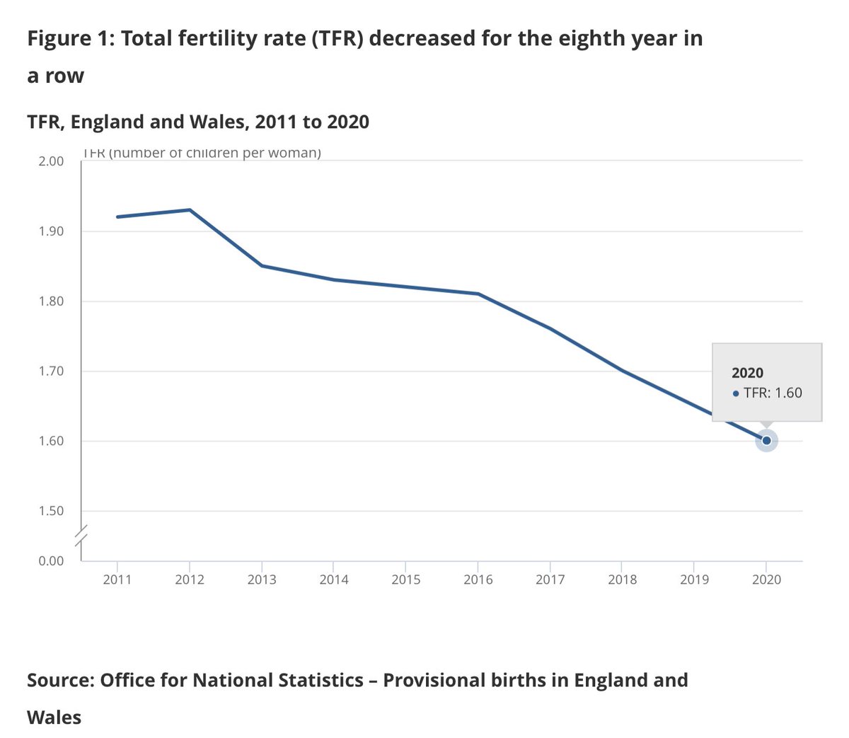
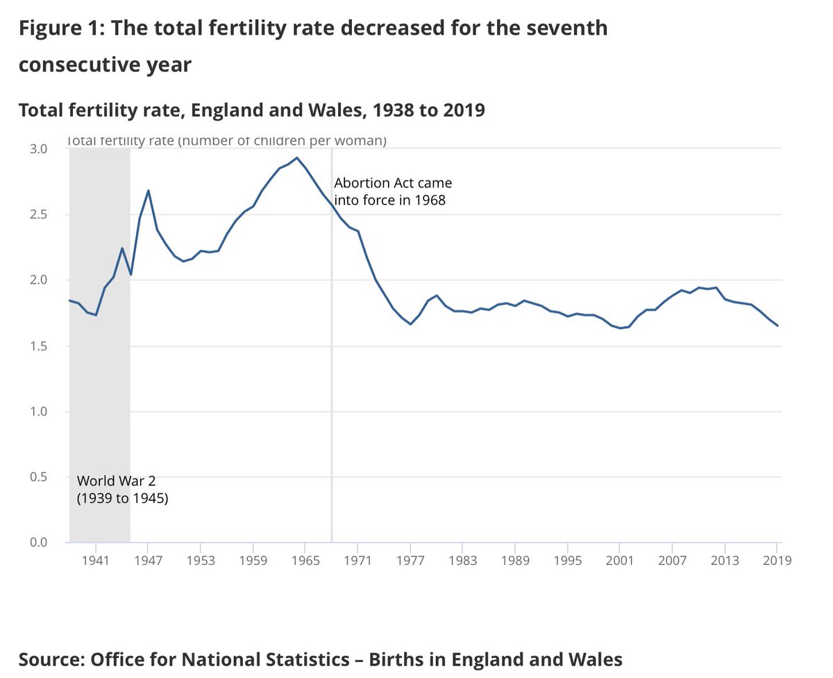
These two @ONS charts tell you the story. Up until 2012 the total fertility rate (eg no of children per woman on avg) was just under 2. By late 2020 it was 1.6. It has NEVER been that low. This pre-dates #COVID19. It is a trend. But one which v few seem to have taken on board.
Sidenote: it’s quite plausible that 2020 is the first year since the 1970s (and one of the only on record) that deaths outnumber births in England & Wales. We won’t know for a bit but both look like being just over 600k. Depressing milestone.
Where does #COVID19 rank in the most depressing league table of all - the one comparing historic pandemics? We won't know for sure until the pandemic is over but we do now have enough data to draw some early conclusions. I've done some digging into the numbers:
I should say that I began this process unsure of what I'd find. Back in the spring I looked back at historical weekly deaths figs and found that while the 2020 levels were horribly high (and unprecedented seasonally) some weeks of Hong Kong flu were worse.
The weekly deaths numbers only go back so far. But we now have data for the 52 weeks of 2020 up to Christmas Day, which is enough to make a conservative estimate of how 2020 compares with history. And we have nearly two centuries of data to compare it to…
Duncan is right. Lockdown rules are slightly softer. More key workers. More COVID-compliant workplaces.
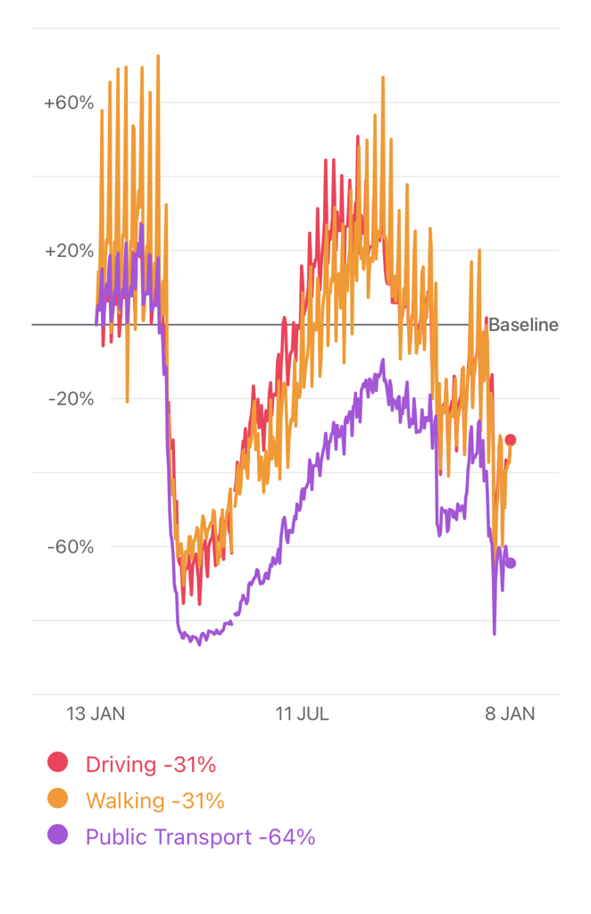
It feels v plausible there’s less compliance this time around but is that really clear cut from mobility data alone?
Also worth bearing in mind in lockdown 1 there’s lots of evidence that many households & businesses went above & beyond the rules. Eg key workers not sending children to school even tho they could. Firms (esp construction) shuttering tho rules said they could continue working…
When I take a (completely unscientific but perhaps no less unscientific than some of the hot takes out there) glance at the data I’d say: less movement than autumn lockdown but more than last spring. That doesn’t seem too far detached from the severity of the rules themselves
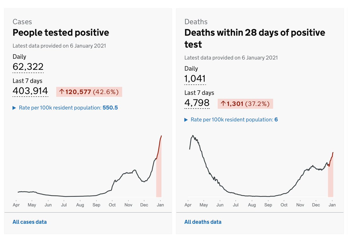
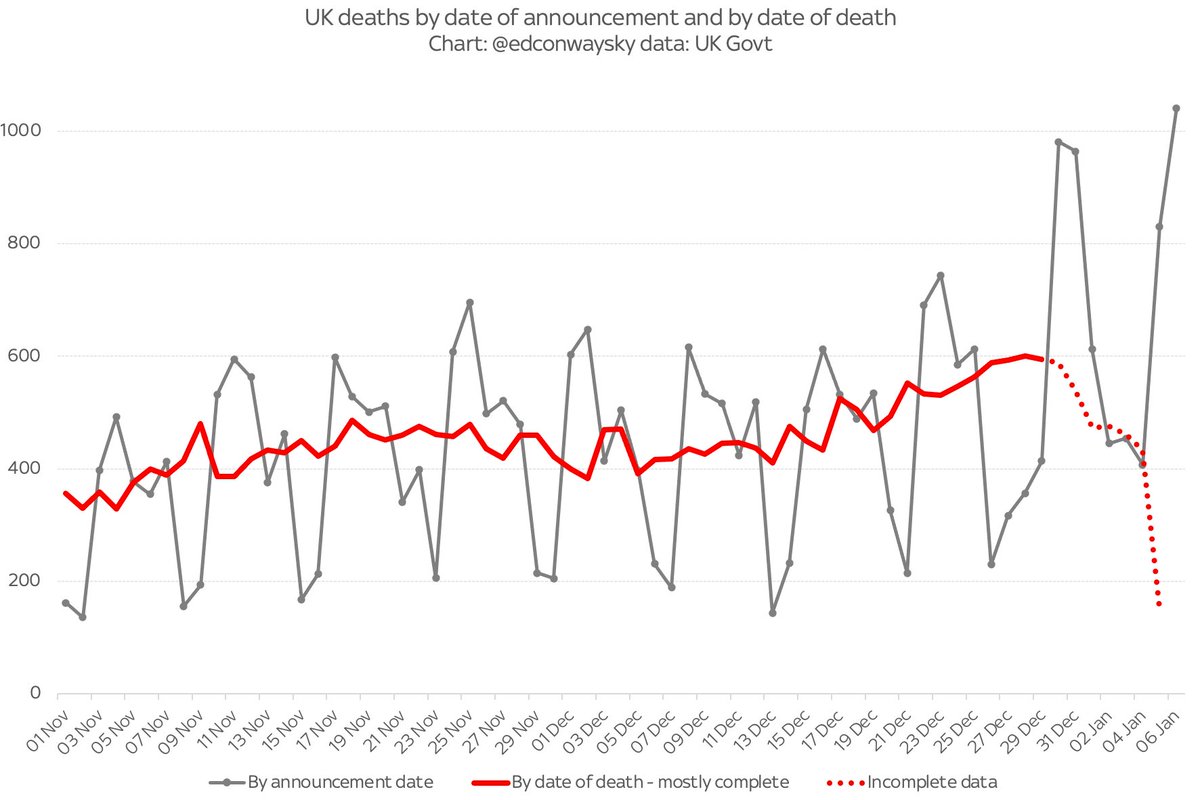
There will doubtless be lots of attention on this number tonight: 1k #COVID19 deaths for first time since last spring.
Now, a lot of people are dying, the number is mounting and this is clearly awful news.
BUT be cautious about this fig. It comes back to the bank holiday effect…
As I said yday, testing and deaths registration is affected by xmas and new year - and that’s happening with this data. The 1k deaths figure is not deaths happening in the past 24 hours but deaths REPORTED in that period. An important distinction when gauging #COVID19 spread
In the case of tonight’s 1k deaths figure, almost one in four of them happened more than a week ago: there’s a big backlog of registrations which are only now being processed. The real picture is the red line in this chart. Not the grey line (where that 1k fig comes from)
I’m diving back into the #COVID19 data.
I’d rather hoped I wouldn’t have to but the stats are, once again, scary.
However, I hope I can provide some context, since I see there are still plenty claiming this is either the end of the world or nothing to fear at all.
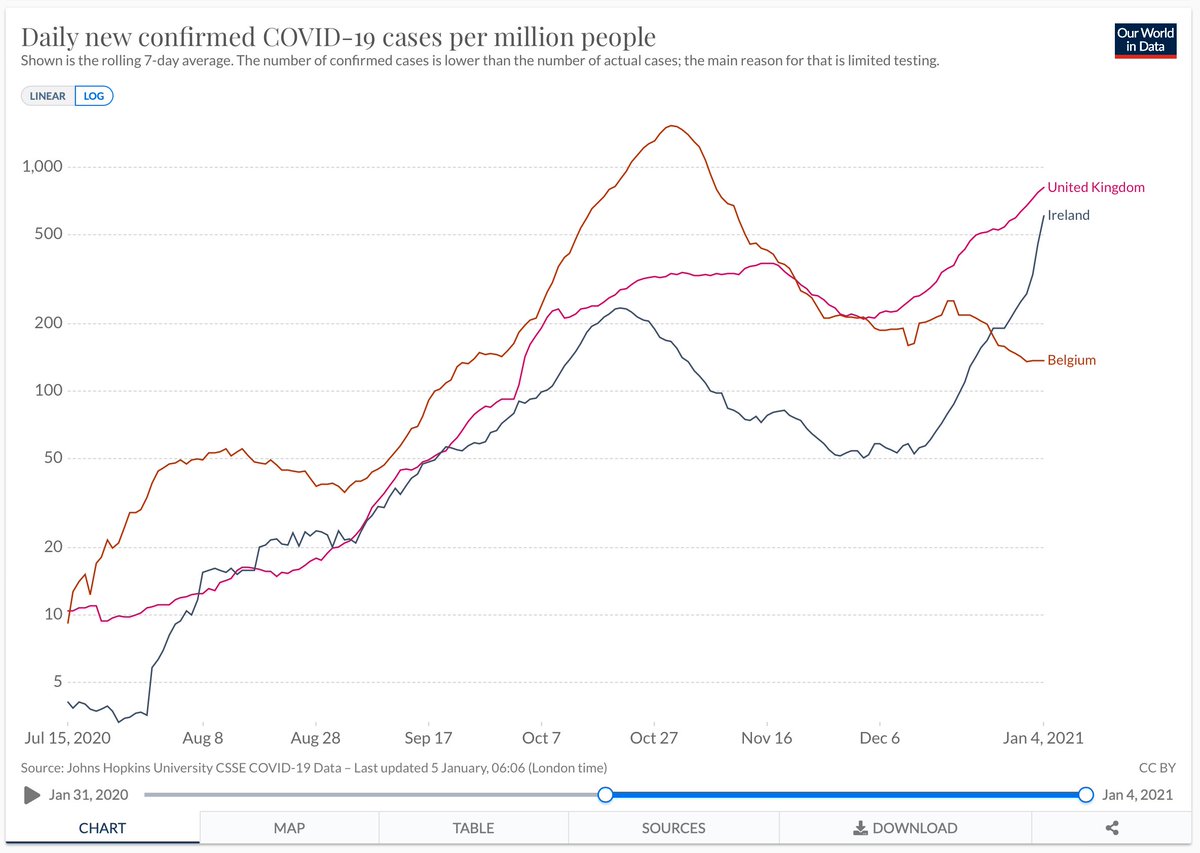
A case in point is tweets like this. George is right that the curve is almost vertical, but this is precisely why it makes sense to use logarithmic axes and provide some cross-country comparisons. You might, to look at this, have assumed the UK faces a unique crisis, but no:
Convert it to a log axis and add a couple of countries it’s a different story. Yes the UK rise recently is fast, but actually Ireland’s looks faster - though still at slightly lower levels than in UK. Compare UK to Belgium and you see it had a considerably worse outbreak in Oct