Remember when the PM announced the easing of lockdown it was going to be about data not dates? Well now we’ve had a bit more data in this feels like as good a time as any to see how we’re doing (Thread)
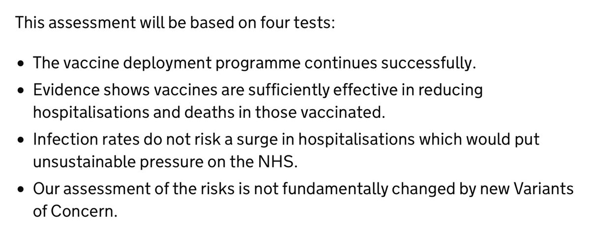
Strictly speaking “data not dates” meant a few crucial datapoints, as laid out in the documents at the time. In particular, there were four tests, roughly as follows:
1. Are enough people being vaccinated?
2. Are vaccines “working”?
3. Are infections surging?
4. New variants 😱
Test one: Are vaccines being deployed successfully?
Seems to be going very well. Over 90% of those aged over 70 have been vaccinated which is beyond what many expected. Over 80% for all but those aged over 100 interestingly
But there are concerns about vaccine coverage among some ethnic groups. While the % of those vaccinated aged over 70% is over 90% for White British, it’s 69% for Black Caribbean and 59% for Black African ethnicities. So while test 1 is prob a pass, it’s not without some concerns
Test 2 is whether those vaccinated are seeing a fall in hospitalisations and deaths. And here too the news is encouraging. This chart shows you the change in hospitalisations from the peak. Rate at which over-65 hospitalisations is falling faster than under-65s
And have a look at this chart: the change in #COVID19 cases for those aged over 70 vs the aged under 70. Both lines have fallen (as you’d expect during lockdown) but look at the divergence in recent weeks.
Very, very promising indeed.
So tests one and two look to have been passed. How about test 3: that we should guard against a rise in infection rates? In broad terms cases in the UK are still very low indeed. But given this is all about “data not dates” let’s drill more closely into the data
One concern among public health officials was that schools would reopen and that would push up cases. Has that happened? The white lines here are school/university age groups, the black lines are “grown ups”. Some of those white lines seem to have turned. BUT not all.
It’s hard to know how concerned to get about this. These lines are really modelled estimates from the @ONS so they may change shape next week quite markedly, due to modelling effects. In short, this might be noise rather than a signal. But worth keeping a close eye on…
Other measures on cases look v encouraging. The UK has gone from having the highest level of #COVID19 among major European countries (the grey lines here) to having one of the lowest levels. I’ve highlighted Sweden because, well, everyone always asks about Sweden
The fourth & final test was about new variants. Are there any we should be concerned about? Short answer, not really. The bars here show you how everything else is utterly dwarfed by the Kent variant. (B.1525, the next biggest, had only 55 cases in the past few days)
In short, if we’re looking specifically at “data not dates” the data is looking pretty reassuring right now on those four tests (though we should keep a close eye on cases in the coming weeks). But good news. Hurrah!
Finally, you might recall that back when @BorisJohnson announced the easing of lockdown we got a lot of documents illustrating what *might* happen under certain different easing scenarios. This was one of the charts, based on Imperial’s modelling. Quite scary!
I’ve superimposed the latest hospitalisation data onto the Imperial projections.
Warning: this is rough & ready.
But it suggests we may be doing somewhat BETTER than even the best case scenarios in these models suggested. (1: latest data, 2. original Imperial chart)

• • •

Missing some Tweet in this thread? You can try to force a refresh
 

Keep Current with Ed Conway

Ed Conway Profile picture

Stay in touch and get notified when new unrolls are available from this author!

Read all threads

This Thread may be Removed Anytime!

PDF

Twitter may remove this content at anytime! Save it as PDF for later use!

Try unrolling a thread yourself!

how to unroll video
  1. Follow @ThreadReaderApp to mention us!

  2. From a Twitter thread mention us with a keyword "unroll"
@threadreaderapp unroll

Practice here first or read more on our help page!

More from @EdConwaySky

25 Mar
Short answer?
Because the population was ageing in that period. It's DEMOGRAPHY!
I'm a big fan of @dannydorling but he's got this one wrong.
As @ActuaryByDay will tell you, once you age adjust the death rates you'll see they kept falling from 2012 to 2019. This is important.
Here are some charts that illustrate the point.
First off is simple deaths per year (England & Wales).
Yes, deaths crept up post 2010, reversing a long trend of falls.
But now recall that a) the population is ageing and b) these demographic trends matter enormously
More old people in a bigger population means, all else equal, that deaths will tend to rise each year. Because older people are more likely to die than younger people. That's why actuaries age adjust their data. And if you age adjust the data here's what it looks like:
Read 4 tweets
25 Mar
Thread: Since the UK has just released its latest data on greenhouse gas emissions, this feels like as good a time as any to look at the numbers and ask: what’s really going on? The broad picture is v promising (see these headlines from earlier): emissions falling fast.
Before we go any further, this is not a thread about “the science”. It’s not a debate abt climate change. Feel free to debate that elsewhere. This is abt the DATA. And while there are some interesting question marks over the data, the overarching aim of govt right now is v simple
The UK has committed, in law, to get greenhouse gas emissions down to zero in net terms by 2050. If you consider the starting point for that effort to be 1990, it’s now nearly (but not quite) halfway there. This is quite something…
Read 14 tweets
23 Mar
Since it’s a year on from lockdown and the second wave of excess mortality now seems to be over, a few datapoints on #COVID19 mortality in the UK.
Starting with this: we’re now at 149k deaths according to the @ONS measure (deaths where COVID mentioned on certificate)
Important to note this isn’t the only measure though: excess deaths, which is deaths from ALL causes vs 5yr historical average, puts the toll at 123k. We’ll get to why there’s a big difference in a moment. Even so: however you measure it we’re talking about high numbers of deaths
Strikingly, on the basis of the most comprehensive @ONS #COVID19 figures, total #COVID19 deaths (149k in total). The second wave was far bigger than the first wave. 91k in the latest wave vs 58k in the first.
Read 7 tweets
21 Mar
Something to ponder as you fill in the census. We’re currently in the midst of the most dramatic fall in the UK population since 1941, as three forces collide to push down the number of people living in this country news.sky.com/story/the-thre…
Incidentally a few people have understandably asked whether the fall in migrants last year might have been a Brexit effect. But while this might have contributed at the margin it doesn’t seem to be the main explanation. Anyway, the exodus was both EU and non-EU workers
That last chart is from this piece migrationobservatory.ox.ac.uk/resources/comm…. The phenomenon of enormous migrant outflows was first pointed out by @StrongerInNos and @jdportes ukandeu.ac.uk/estimating-the…
Read 5 tweets
19 Mar
One year on, how big a deal was the furlough scheme? Short answer: a v v v big deal.
I think we sometimes underplay this.
It has pervaded our lives in a way few if any other economic policies have and had all sorts of unintended consequences - good & bad. thetimes.co.uk/article/d724c3…
Comparable data on this isn’t especially easy to come by but the last time the @OECD had a look (turn of the year), UK had more people on furlough than any other country. Think about that for a second. And note we didn’t have either the most cases or toughest lockdown back then
When you think about it it’s pretty remarkable. Britain was unusual in Europe in not having a job retention programme (short time working) before #COVID19. But the generosity of the furlough scheme, and the enthusiasm with which it was taken up exceeded most of Europe.
Read 9 tweets
9 Feb
New: according to the @ONS the total UK #COVID19 death toll has now surpassed 125k.
Was 126,023 as of 29 Jan.
Note these are deaths where #COVID19 was mentioned on the certificate. Of those deaths, around 91% were caused by #COVID19, according to the @ONS.
Another way of calculating the death toll is excess deaths, which is deaths from all causes vs the five year average.
This was 111,540 across the UK between March 2020 and late Jan 2021.
Total deaths from all causes in week 4 of 2020 (the latest week) were higher than in the corresponding week of ANY year going back to 1970.
That’s still true even after adjusting for population.
31 deaths per 100k in week 4
Previous worst week 4: 28 per 100k in 1985
Read 5 tweets

Did Thread Reader help you today?

Support us! We are indie developers!


This site is made by just two indie developers on a laptop doing marketing, support and development! Read more about the story.

Become a Premium Member ($3/month or $30/year) and get exclusive features!

Become Premium

Too expensive? Make a small donation by buying us coffee ($5) or help with server cost ($10)

Donate via Paypal Become our Patreon

Thank you for your support!

Follow Us on Twitter!