Having spent a good chunk of yesterday going through the recent SPI-M papers including the latest models from Warwick, Imperial and LSHTM, and then come back up for air, what have I learned? Here’s my summary of ten important messages: 1/14
1. While the headlines have once again been full of doom-laden reports of a huge ‘exit wave’ when we unlock in the summer, the reality is that both Warwick and Imperial models are now predicting a much smaller wave with only 15-20k deaths in their central scenarios. 2/14
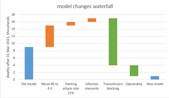
2. Looking at the Warwick model in more detail, the change from previous iterations is mostly due to improved (more optimistic – or in my view, realistic) assumptions for vaccine rollout, vaccine take-up, vaccine efficacy vs. severe disease, and efficacy vs. infection. 3/14
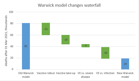
[Note my comparison is to the Warwick paper thelancet.com/journals/lanin… not the previous SPI-M model. The intermediate steps are calculated using my model to mimic Warwick's, which is not a perfect replica, but seems to be very close (to within +-2k deaths at the endpoints)] 4/14
3. Comparing the Warwick model to mine, they’re now very much in the same ballpark (i.e. predicting a small exit wave, within NHS capacity). The remaining difference is explainable by two missing factors in the Warwick model: transmission reduction, and seasonality. 5/14
4. The Imperial model does include seasonality, and has a slightly lower central case than Warwick (15k deaths, vs 19k). They have also run a sensitivity that includes a partial transmission reduction (down by 30% after 2 doses of vaccine) – this reduces deaths to only 9k. 6/14
5. I haven’t focused so much on the LSHTM model, as they themselves note that their work is “…preliminary and makes pessimistic assumptions about the impact of [the final stage of unlocking] which require further work to refine”. 7/14
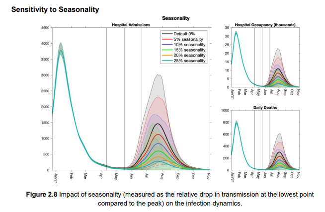
6. The Warwick team do a separate analysis on seasonality, which shows how it may neatly squash our summer exit wave, and buy us time to complete the vaccination programme (including 2nd doses), so that the expected rebound in the winter never happens, or is very small. 8/14
7. Both Warwick and Imperial also provide some insight from the regional structure of their models. This implies that while London and the Midlands might have very small exit waves, these could be much larger in the NE & Yorkshire, and in the South West. 9/14
8. Both models stress the importance of baseline controls such as TTI, masks etc. for reducing transmission after unlocking in June. As my model is more optimistic, it makes a weaker case for retaining them – but I expect the govt will do so, to limit downside risks. 10/14
9. There is still a lot of uncertainty in all of the models – including mine – and a small change in assumptions can produce a large change in outcomes. Hence the need for caution and for watching the data closely. Variants remain the biggest unmodelled risk factor. 11/14
10. Overall, there’s a lot of impressive work in these papers. I know we all love to dump on the modellers, and I’ve had my own criticisms of them in the past, but they’re doing a difficult job, and these latest models have addressed a lot of issues I raised previously. 12/14
To conclude, I’ve attached a more detailed review and commentary on the model assumptions, comparing mine to those of Warwick and Imperial – for those who like that kind of thing. We’re a lot closer than before, but there’s still a few important differences. 13/14
And finally here’s the page with links to all the papers, if you want to read more: gov.uk/government/pub… /end
@RDann15 this one (above) is for you - it's worth reading the detail in the Warwick paper (p22) if you haven't seen already

• • •

Missing some Tweet in this thread? You can try to force a refresh
 

Keep Current with James Ward

James Ward Profile picture

Stay in touch and get notified when new unrolls are available from this author!

Read all threads

This Thread may be Removed Anytime!

PDF

Twitter may remove this content at anytime! Save it as PDF for later use!

Try unrolling a thread yourself!

how to unroll video
  1. Follow @ThreadReaderApp to mention us!

  2. From a Twitter thread mention us with a keyword "unroll"
@threadreaderapp unroll

Practice here first or read more on our help page!

More from @JamesWard73

2 Apr
After yesterday’s model update () a few people have asked: so if there’s no exit wave, or just a small one, does that mean we could open up earlier? And the answer is: maybe, but it’s complicated. If you’re interested in the details, read on… 1/n
All of yesterday’s modelling assumed that we follow the government’s roadmap to 21st June, when we remove all remaining restrictions and controls, and behaviour returns to normal. (note that point: all controls removed on 21st June, it will become important later on). 2/n
But what happens if we vary this date? I’ve adjusted this in the model, bringing it back 1 week at a time up to 5th April, and also extending it the other way to 26th July, for completeness. As you can see (from blue line below), opening on 21st June looks OK, and you could 3/n
Read 15 tweets
1 Apr
I’ve updated my model for recent news, and after a series of assumption changes that mostly net out, it still predicts a very small exit wave with ~4k additional deaths (reduced from 9k previously) – and with a small added dose of seasonality, no exit wave at all. 1/n
The key changes in the model are shown in the waterfall chart below, and explored in more detail in the thread that follows this summary. 2/n
This conclusion feels more solid than before, as no single-factor sensitivity (within plausible ranges of uncertainty) takes the exit-wave deaths over 10k- see 1st chart. To get significantly higher deaths I have to move multiple assumptions at the same time– see 2nd chart. 3/n
Read 17 tweets
24 Mar
I’ve spent a lot of time over the last 2 days going through the most recent paper thelancet.com/action/showPdf… from the Warwick modelling group that feeds into SAGE, and trying to work out why it predicts a large exit wave, when my model (mostly) doesn’t. My conclusions are: 1/12
1. Their model in fact doesn’t guarantee an exit wave: with fast vaccine rollout (4m per week) and high (85%) transmission blocking, and either high (85-95%) vaccine uptake or high (94%) protection vs. severe disease, there is no material exit wave - see the orange line 2/12
2. Their choice of central assumptions is (imo) consistently on the pessimistic side. In fact, my central assumptions frequently correspond closely to their “optimistic” upside scenario. To avoid a very long thread I’ve built a table that compares their assumptions to mine 3/12
Read 13 tweets
23 Mar
My “don’t panic” tweet from yesterday got a lot of traction – but today I’m going to recover my corona-centrist credentials by being more concerned. Again, this is mostly a story about LFDs and schools, and I’m not quite sure yet what to make of it. 1/n
Let’s start by looking at the short-term growth rates in different age groups, so we know where to drill down. They show a clear spike in 5-9 and 10-14 year olds, and maybe a hint of upwards pressure in their parents (35-40s). Cases are falling nicely in the over-80s. 2/n Image
Looking at the 5-9 year olds, we can see the spike on the 15th March which has then tailed away since – so as per my recent tweets, I’m getting less worried about this. We need to keep an eye on it, but it’s not an obvious problem right now. 3/n Image
Read 11 tweets
21 Mar
As it’s the weekend, I’m allowed to have some fun. So here’s the latest in my series of spurious-but-interesting political/covid correlation analyses. Last time we had: vote Labour, get covid. This time it’s: vote Conservative, get vaccinated! 1/n Image
(and please don’t @ me, I do realise why this is). In fact please take this as a subtweet of other analysis showing that vax rates are negatively correlated with covid infection levels, deprivation, or non-white ethnicity: if it’s not corrected for age, it’s meaningless. 2/n
Of course, what’s happening is that the vaccination rate is a near-perfect (92% correlation) proxy for average age. And the Conservative vote % is also strongly correlated (69%) to the average age of the constituency. 3/n ImageImage
Read 7 tweets
17 Mar
Lots of people asking: what does your model say about the delayed vaccine schedule? Can we still unlock on the planned dates?? So here goes with an emergency model update. Summary: don’t panic, it will be OK. 1/n
So just a reminder of my current model ‘base case’ (with R0 for the new variant now set to 4, following comparison with the Warwick/Imperial models). This has a relatively small ‘exit wave’ next winter, with ~10k deaths. 2/n
If we knock 10m doses out of the vaccine schedule in April (reducing my expected 4m per week estimate to 2m per week), we get a slightly stronger and earlier ‘exit wave’. But total deaths after March are not much higher at ~13k. 3/n
Read 13 tweets

Did Thread Reader help you today?

Support us! We are indie developers!


This site is made by just two indie developers on a laptop doing marketing, support and development! Read more about the story.

Become a Premium Member ($3/month or $30/year) and get exclusive features!

Become Premium

Too expensive? Make a small donation by buying us coffee ($5) or help with server cost ($10)

Donate via Paypal Become our Patreon

Thank you for your support!

Follow Us on Twitter!