1/6 Ontario is going to see new COVID-19 modelling at 1 p.m. today.
If anyone tells you the takeaways are a surprise: They've lied to themselves, they can't read numbers, or they think you can't.
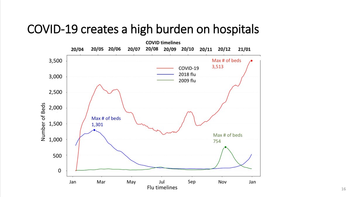
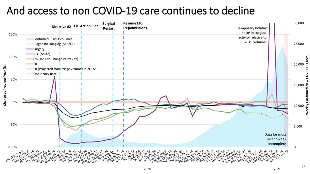
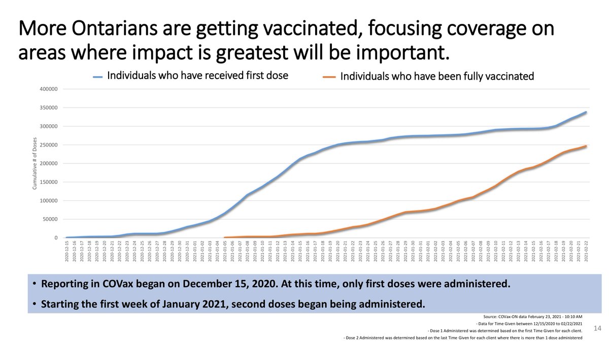
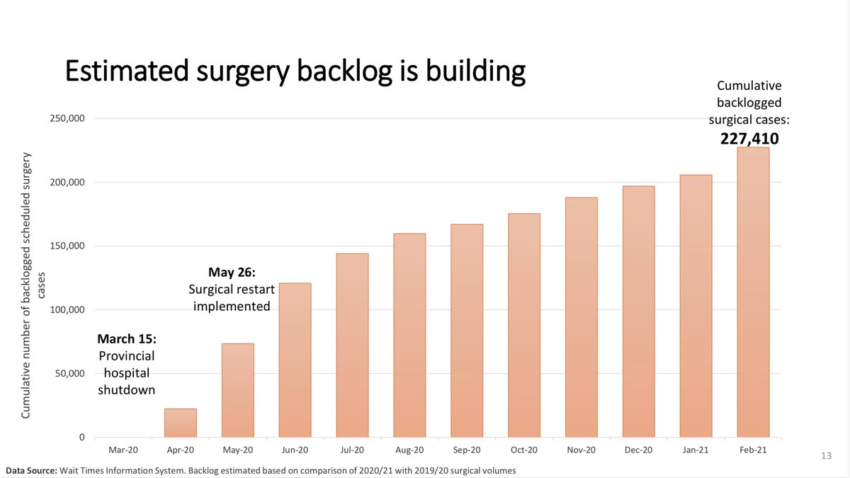
These slides are from Jan. 28:
They highlight every problem we're seeing now.
If anyone tells you the takeaways are a surprise: They've lied to themselves, they can't read numbers, or they think you can't.
These slides are from Jan. 28:
They highlight every problem we're seeing now.
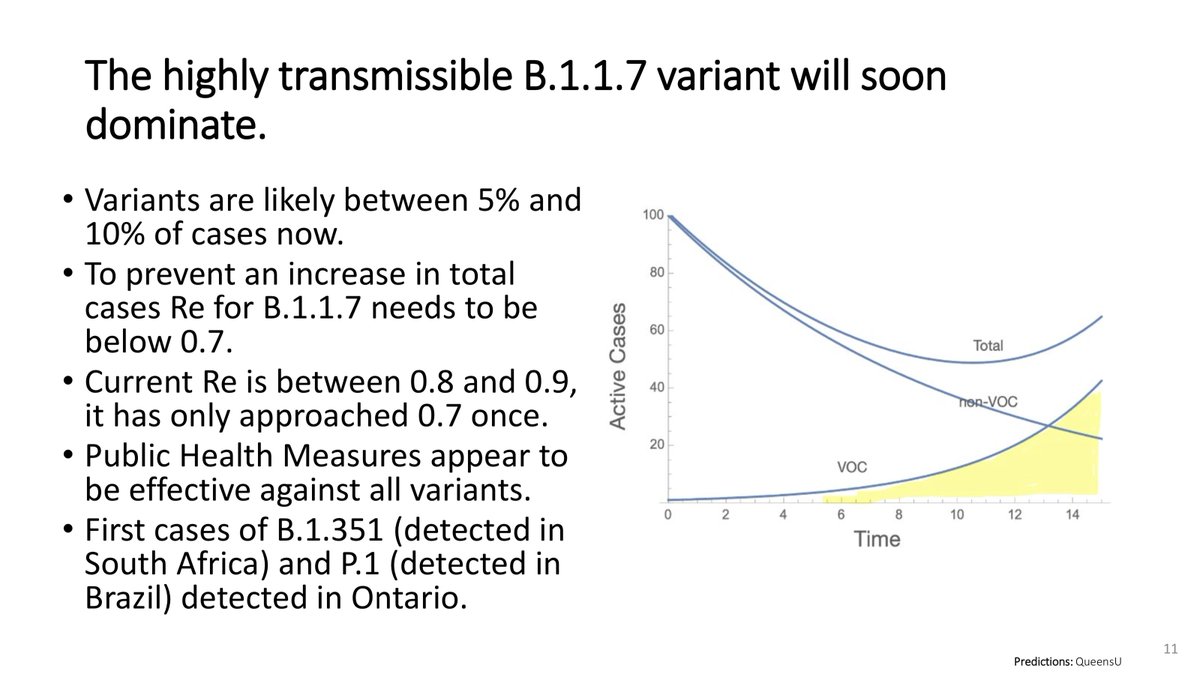
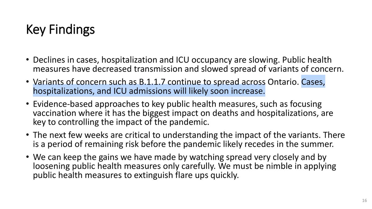
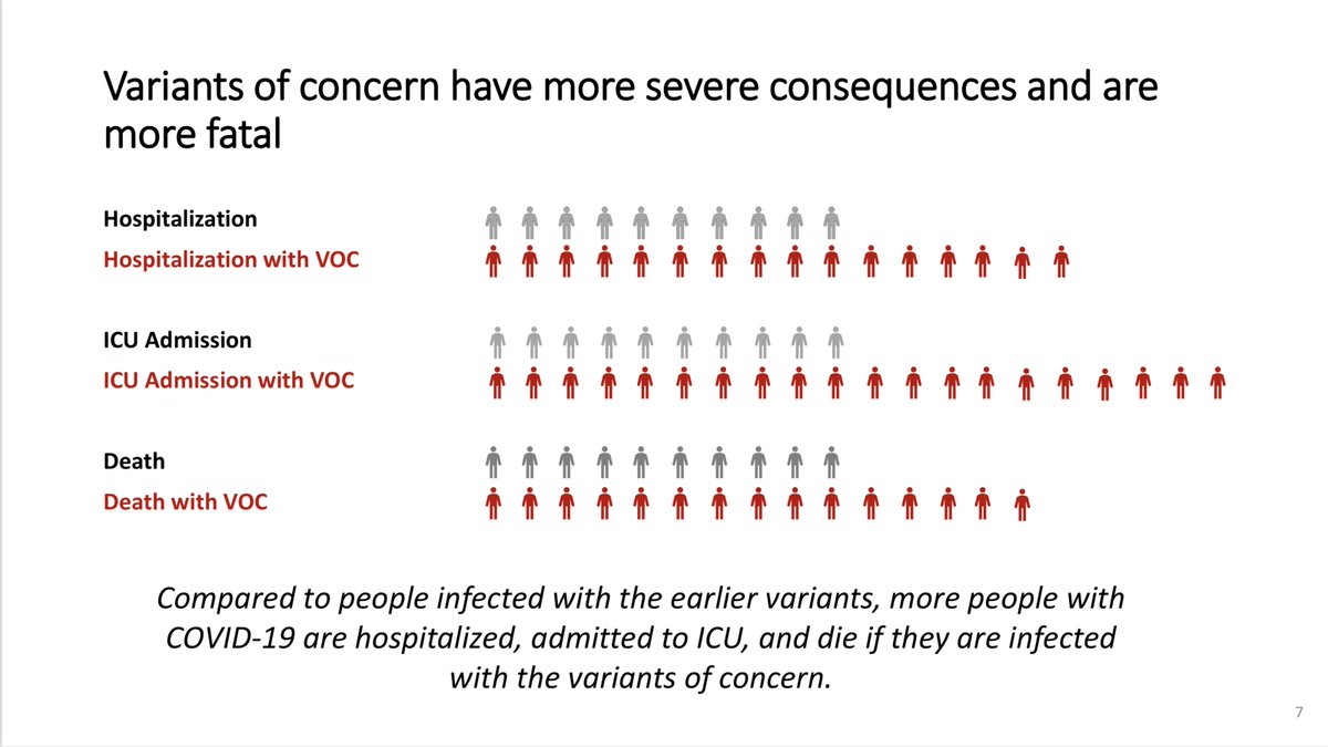
2/6 And these are from Feb. 11.
They *clearly* warn of the extreme risk posed by the COVID-19 variants that were, at that time, running rampant in other countries.
They also tell us what we have to do to prevent that from happening here: suppress R, harder than we have done.
They *clearly* warn of the extreme risk posed by the COVID-19 variants that were, at that time, running rampant in other countries.
They also tell us what we have to do to prevent that from happening here: suppress R, harder than we have done.
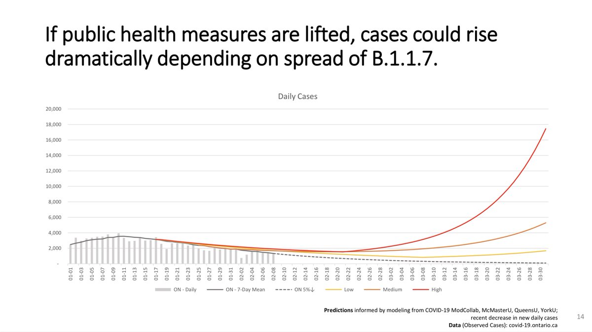
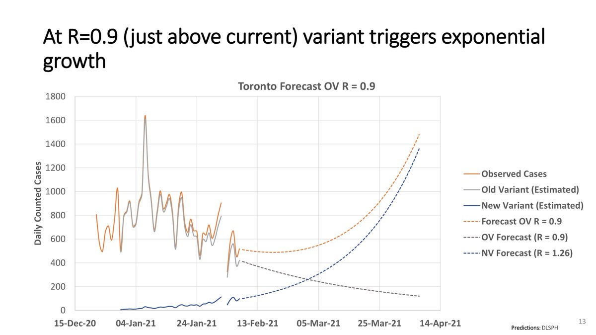
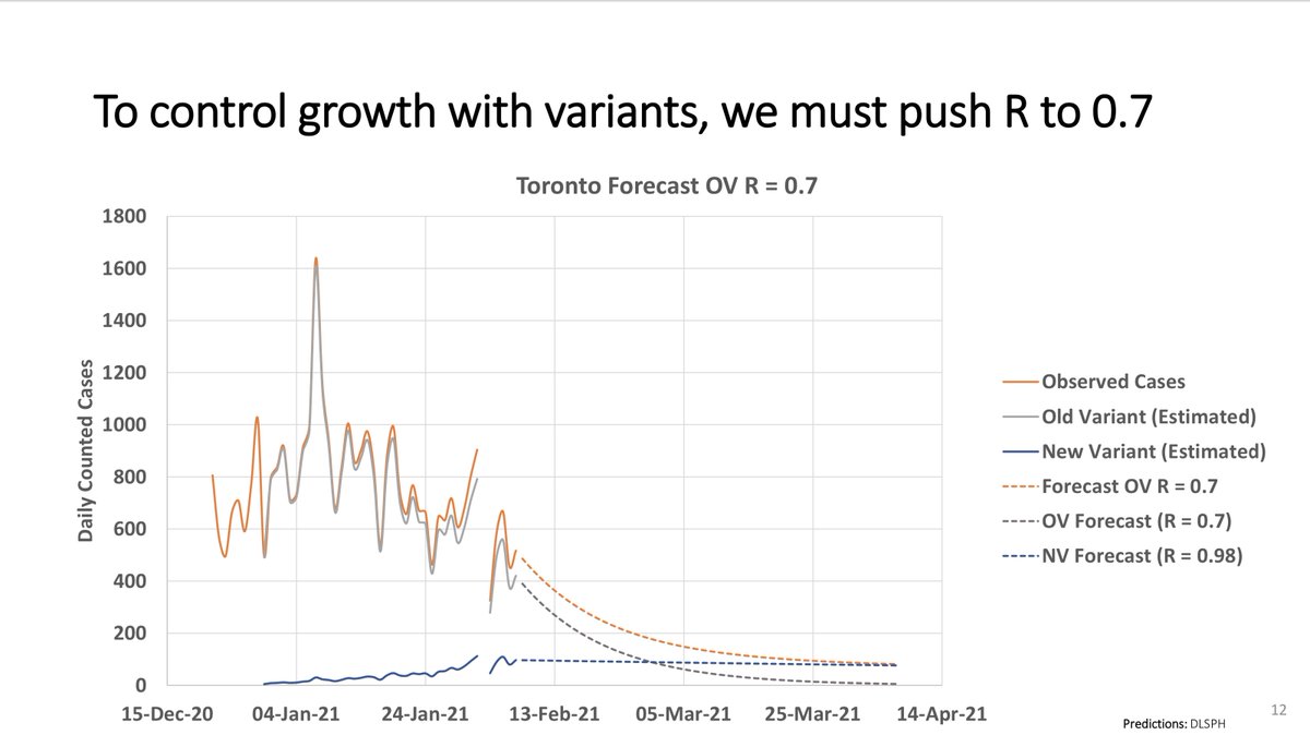
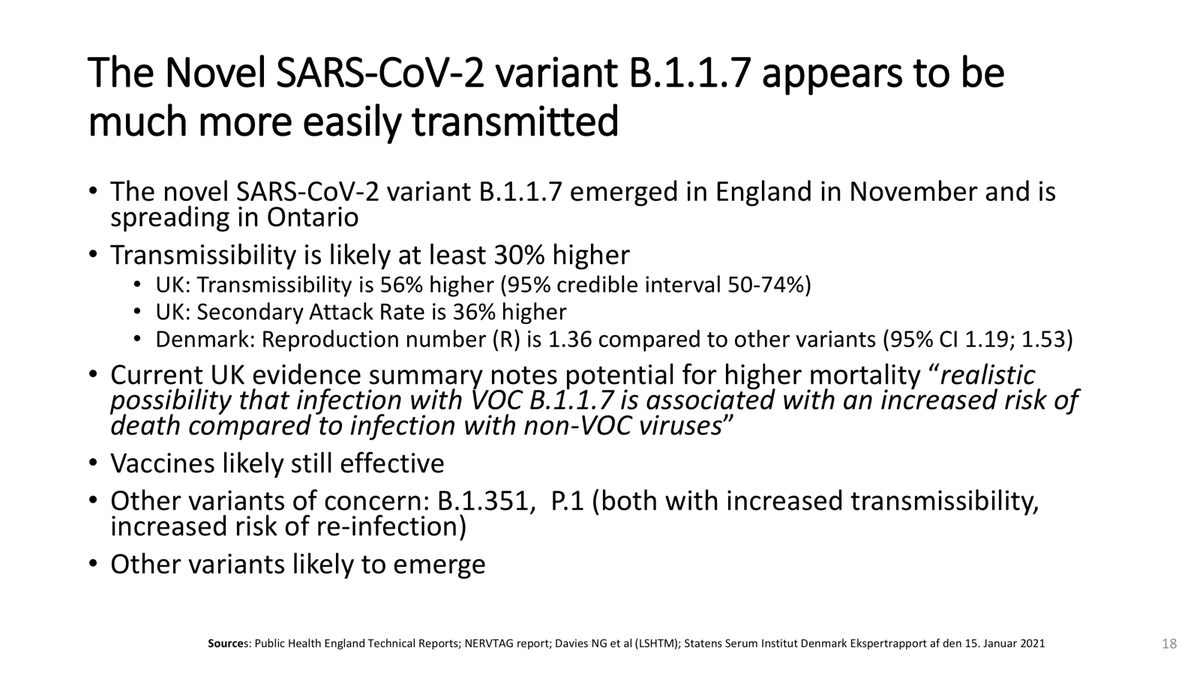
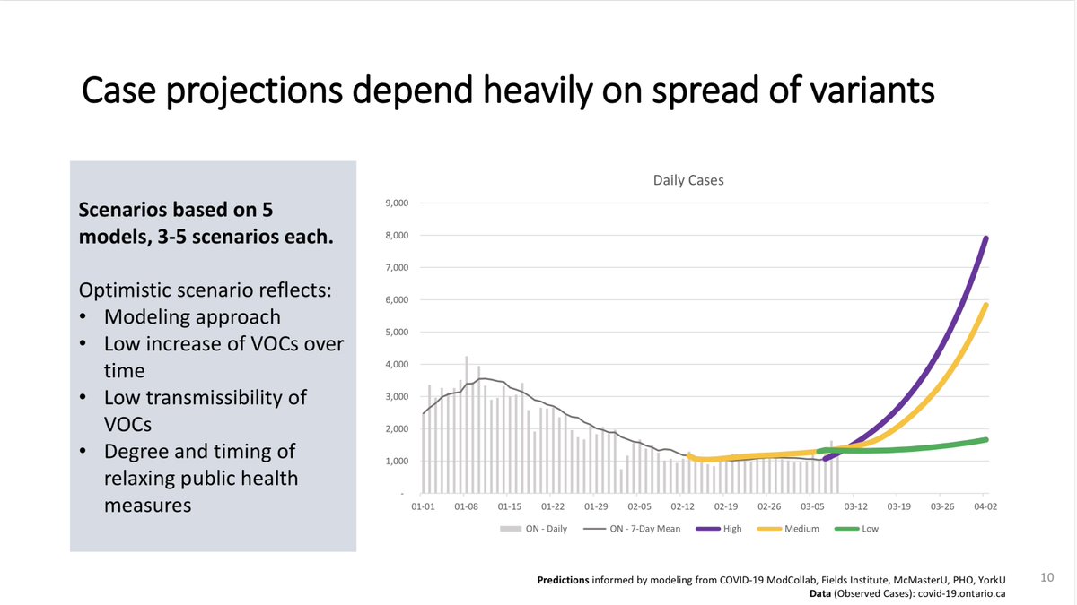
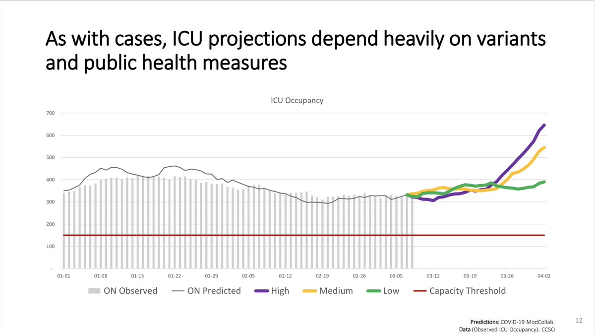
3/6 And these are from Feb. 28.
They clearly and correctly warn of coming exponential growth in cases and hospitalizations due to the growth in the U.K. variant B.117.
This, of course, happened.
They even told us how important it is to focus on vaccinating hard-hit places.
They clearly and correctly warn of coming exponential growth in cases and hospitalizations due to the growth in the U.K. variant B.117.
This, of course, happened.
They even told us how important it is to focus on vaccinating hard-hit places.
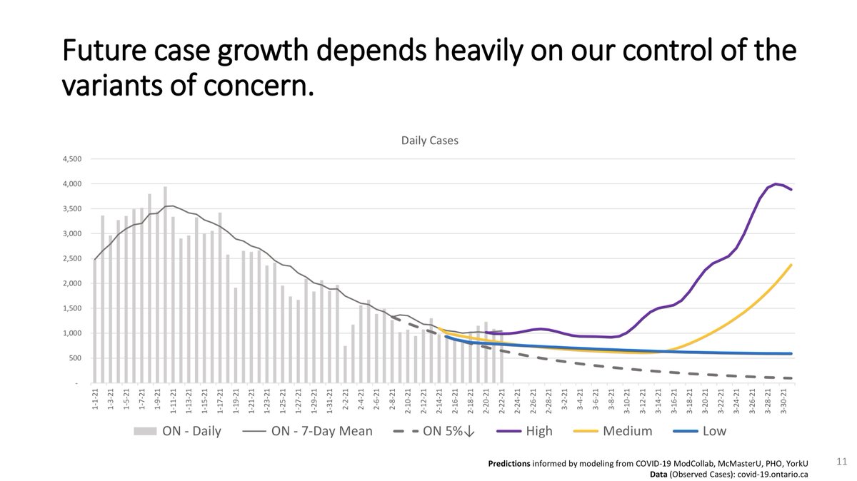
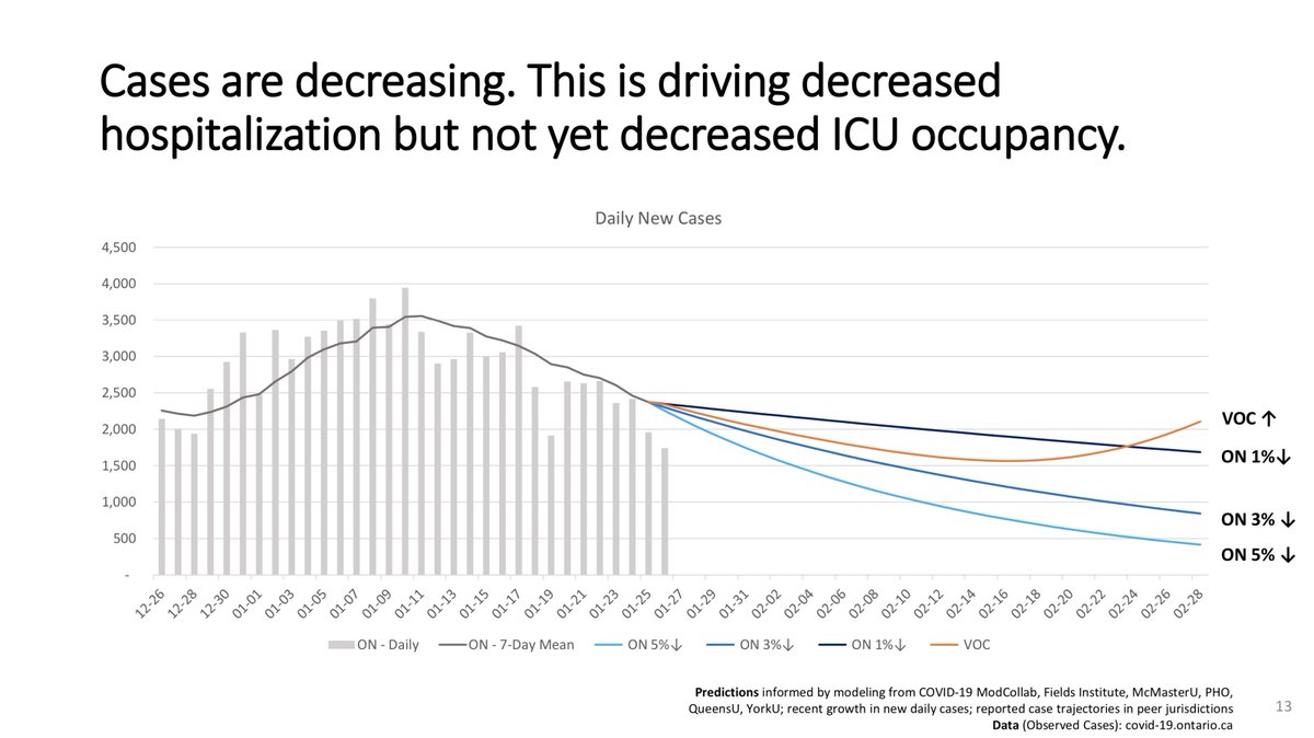
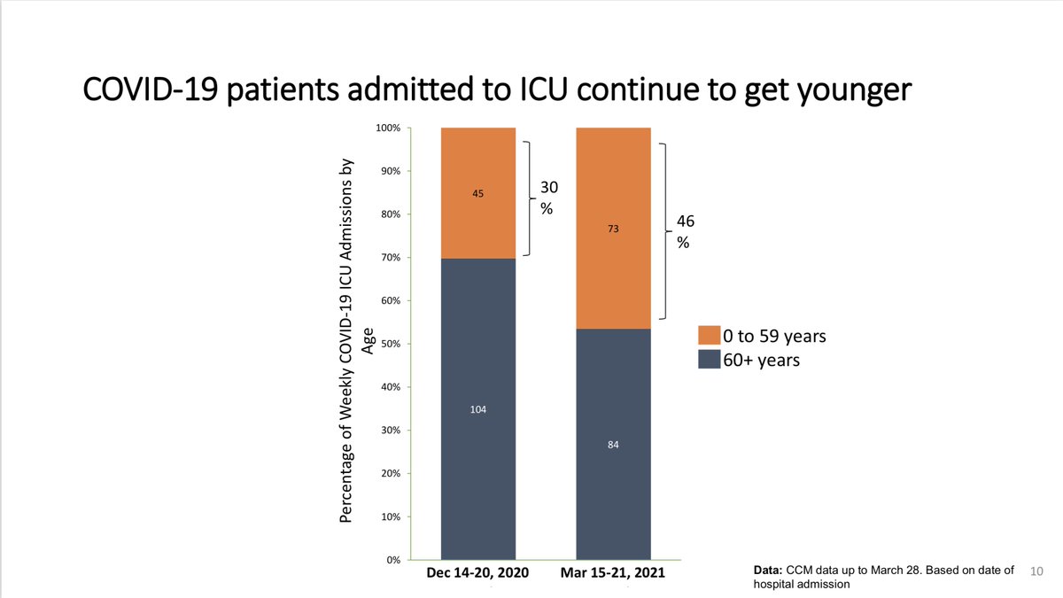
4/5 These are from Mar. 11.
Here, the threat from the variants isn't hypothetical — this is now Ontario data.
And it matches everything we were warned about, repeatedly.
The *incredibly bad* trend in Ontario hospitals since Mar. 11 is no worse than what we see in these slides.
Here, the threat from the variants isn't hypothetical — this is now Ontario data.
And it matches everything we were warned about, repeatedly.
The *incredibly bad* trend in Ontario hospitals since Mar. 11 is no worse than what we see in these slides.

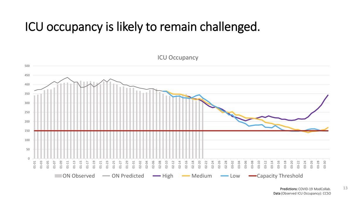
5/6 And these are from the last modelling package, on April 1.
These have more local data on the variants: we learned they're causing worse outcomes in our hospitals — something we knew to expect from overseas.
And again: Our ICU trend since this is no worse than these slides.
These have more local data on the variants: we learned they're causing worse outcomes in our hospitals — something we knew to expect from overseas.
And again: Our ICU trend since this is no worse than these slides.


6/6 I strongly encourage you to watch the modelling presentation we're going to hear today.
It's streaming live starting now:
It's streaming live starting now:
• • •
Missing some Tweet in this thread? You can try to
force a refresh