Confirmed cases are always only a fraction of all cases as not every infected person is tested and diagnosed.
The question is, how large of a fraction?
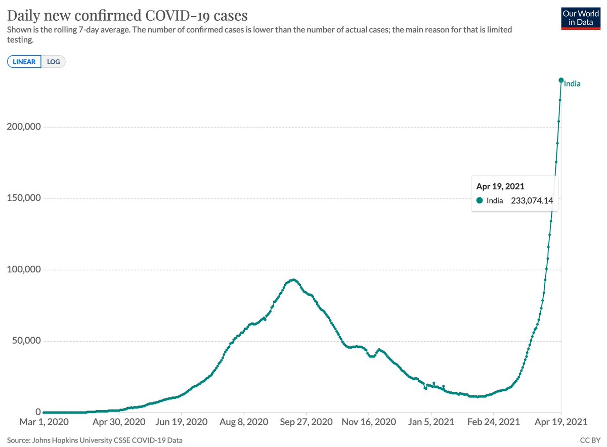
The IHME model for India suggests that the number of total cases is 29-times higher than the number of confirmed cases.
As you’ve seen in the chart above the latest data from the model is for April 11.
If the ratio between confirmed cases and total cases has stayed at 29, then the 233,074 cases that India confirms now correspond to 6.76 million cases daily.
(233,074*29=6.76M)
All these epidemiological models, including the IHME model, are far from perfect and that's important to keep in mind.
This is how it compares with global estimates:
The IHME model was estimating 6.7 million daily cases for April 11 for the *world as a whole*.
If this is true, then the number of total daily cases in India is now higher than the number of total global cases just 9 days ago.
• • •
Missing some Tweet in this thread? You can try to
force a refresh
To understand a global pandemic we need global data.
But even more than one year into the pandemic some of the most basic international data on COVID is missing.
Just because there is no international organization that brings this data together.
A thread.
To make it concrete, let's consider one set of measures for which international data is missing.
Cases, hospitalizations, & deaths *by age* would be very useful measures for decision makers, for epidemiologists, and really for everyone who wants to understand what is happening.
For a disease like COVID – for which the severity of the outcome is so dependent on the age of the infected person –, these metrics are absolutely key.
(e.g. differences in the mortality rate accross countries are to a good part due to different age profiles)
Two months ago India confirmed 11,300 cases per day.
This shows the rise of confirmed cases since then.
A straight line on a logarithmic axis tells you that you are looking at exponential growth with a constant growth rate.
Now India confirms more than 200,000 cases a day.
This is how the rate of positive tests changed in that same period.
A strongly rising positive rate tells us that the testing efforts are not keeping up with the size of the outbreak.
This thread is more personal than most of the things I share here, but I’m at my limit with Jason Hickel.
I want to explain why I dislike him so much and how we got here.
This is a personal story over several years so it’ll take a bit of time.
Jason Hickel is an anthropologist who wrote many articles and tweets about me, my motivations, and my work in the last couple of years.
I’m sure there are good points among them, where he is right and I’m wrong. But some of his big claims against my work are false.
One such big claim he put forward in an article in The Guardian. It was about my work on global poverty and he claimed that it “couldn’t be more wrong” to say that global poverty has declined.
A new study that asks: How has extreme poverty changed in the last 2 centuries?
The authors estimate poverty in many ways.
Their main innovation is to rely on 'a cost of basic needs approach' based on Bob Allen’s recent work.
👇 thread
The authors write that in 1820 roughly three-quarters of the world "could not afford a tiny space to live, food that would not induce malnutrition, and some minimum heating capacity.”
As you see in the chart above, the huge majority of the world was extremely poor in the past.
Since 1820 the share in extreme poverty across the globe declined to 10%, "the lowest level ever achieved", according to this study.
But of course more recently the share in extreme poverty has unfortunately increased.