To understand a global pandemic we need global data.
But even more than one year into the pandemic some of the most basic international data on COVID is missing.
Just because there is no international organization that brings this data together.
A thread.
But even more than one year into the pandemic some of the most basic international data on COVID is missing.
Just because there is no international organization that brings this data together.
A thread.
To make it concrete, let's consider one set of measures for which international data is missing.
Cases, hospitalizations, & deaths *by age* would be very useful measures for decision makers, for epidemiologists, and really for everyone who wants to understand what is happening.
Cases, hospitalizations, & deaths *by age* would be very useful measures for decision makers, for epidemiologists, and really for everyone who wants to understand what is happening.
For a disease like COVID – for which the severity of the outcome is so dependent on the age of the infected person –, these metrics are absolutely key.
(e.g. differences in the mortality rate accross countries are to a good part due to different age profiles)
(e.g. differences in the mortality rate accross countries are to a good part due to different age profiles)
Right now – as the vaccinations are rolled out by age – data by age would help us understand the impact that the vaccinations have on the pandemic.
We do this for Israel for example, but obviously it would be relevant for every country in the world.
We do this for Israel for example, but obviously it would be relevant for every country in the world.
https://twitter.com/redouad/status/1384868020150054912
For many countries *this data exists* – it's just that no institution brings the international data together on a regular basis.
It wouldn't require much work or much funding. Based on our experience here I think one dedicated person could do this job for the entire world.
It wouldn't require much work or much funding. Based on our experience here I think one dedicated person could do this job for the entire world.
That it doesn't take much funding or work is key.
I think better international data would be a cost-effective way to improve the understanding of the pandemic – and hopefully the response to the pandemic.
I think better international data would be a cost-effective way to improve the understanding of the pandemic – and hopefully the response to the pandemic.
Look how this contrasts with scientific publications on COVID.
These are estimates for the number of publications up to early December last year.
nature.com/articles/d4158…
(On top of it: Much of this research would likely also be better with better international data.)
These are estimates for the number of publications up to early December last year.
nature.com/articles/d4158…
(On top of it: Much of this research would likely also be better with better international data.)

There are many other crucial datasets that are missing.
COVID hospitalizations and ICU cases for example are brought together for European countries by the @ECDC_EU.
But no institution brings this data together for the rest of the world.
COVID hospitalizations and ICU cases for example are brought together for European countries by the @ECDC_EU.
But no institution brings this data together for the rest of the world.
And many more simple metrics are missing.
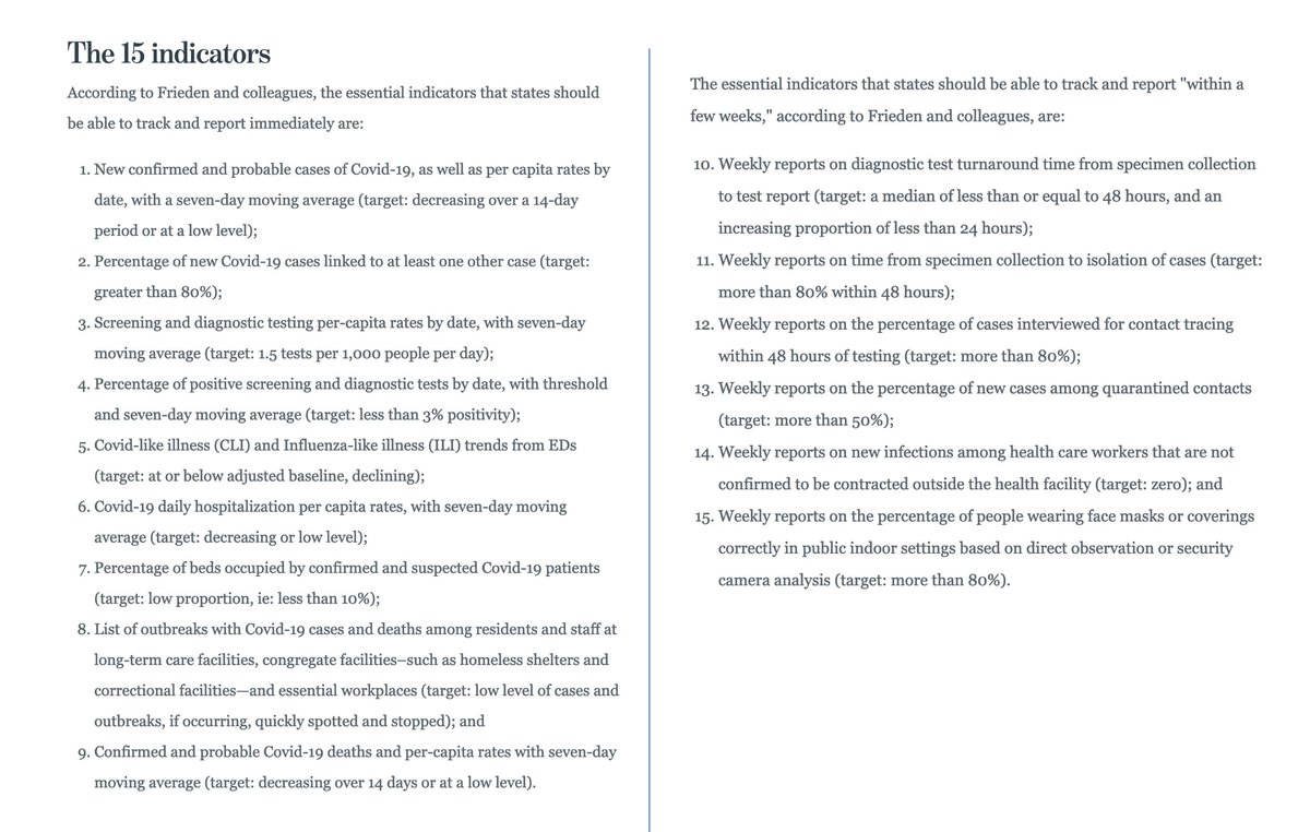
Last July @DrTomFrieden published a list of metrics that would be needed to understand the pandemic: advisory.com/en/daily-brief…
Last July @DrTomFrieden published a list of metrics that would be needed to understand the pandemic: advisory.com/en/daily-brief…
At @OurWorldInData we've done this for some international data.
Since last February we bring together the data on testing (cause only when you know how many tests are done can you make sense of the data on cases and deaths).
We published it in @Nature:
Since last February we bring together the data on testing (cause only when you know how many tests are done can you make sense of the data on cases and deaths).
We published it in @Nature:
https://twitter.com/OurWorldInData/status/1315690107341606913
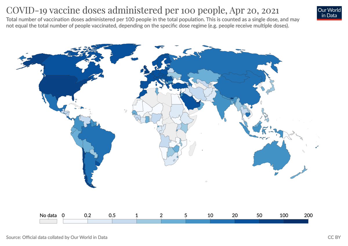
And since December we bring together the data on vaccinations for COVID.
→ ourworldindata.org/covid-vaccinat…
(The scientific peer-reviewed publication is forthcoming.)
→ ourworldindata.org/covid-vaccinat…
(The scientific peer-reviewed publication is forthcoming.)
These datasets we bring together are cited thousands of times every week.
All major media organizations in the world rely on it, the WHO too.
The returns to this work are very high. This work is needed by many.
All major media organizations in the world rely on it, the WHO too.
The returns to this work are very high. This work is needed by many.
https://twitter.com/OurWorldInData/status/1380431580997488641
And this is case more broadly, much of the international data on COVID that does exist was published by very small teams of researchers and often volunteers.
https://twitter.com/maxcroser/status/1330165437791875076
I don't think this pandemic is going to be over very soon, and so if someone reads this and wants to take the initiative – a lot of good work can still be done.
And more broadly and for the future, I think it is important for the health of people around the world that large global health institutions do better.
To respond to global problems we need global data.
To respond to global problems we need global data.
• • •
Missing some Tweet in this thread? You can try to
force a refresh