Over the past couple decades, US labor share of GDP has decreased to being well below trend (left chart), while US corporate profits as a percentage of GDP have increased to being above-trend (right chart).
A thread.
In addition to being partly due to technology/automation, another part of this is due to structural US trade deficits.
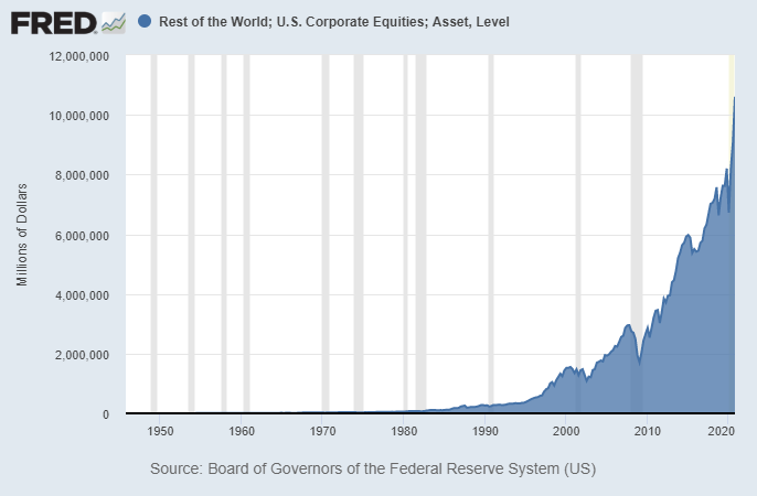
The US exported large portions of our supply chains overseas, and foreigners took those dollars and reinvested them back into US equities.
Since the top 1% own 53% of US equities, and the bottom 50% own less than 1% of US equities (and many of them had jobs/wages impacted by offshoring/automation), this trend of declining labor and increasing profits/valuations has favored wealth concentration.
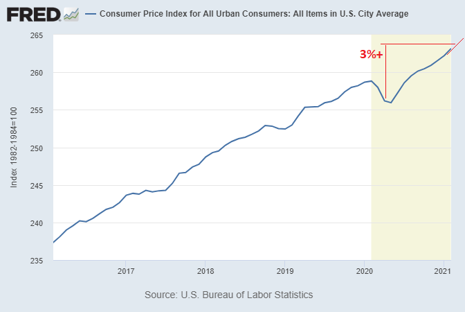
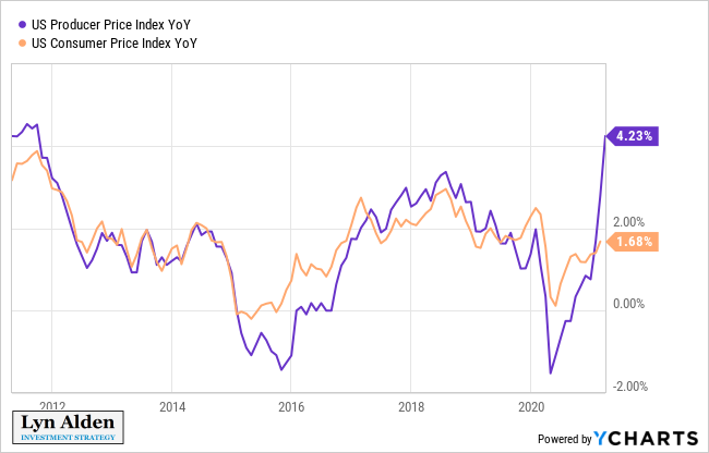
In April and May, there will be various easy comps from low base effects that will make some year-over-year numbers look quite high.
Official CPI for example is likely to hit over 3% year over year:
The producer price index for March is already over 4% year-over-year, and could very well hit over 7% in April or May thanks to low base effects and fiscal-driven reflation:
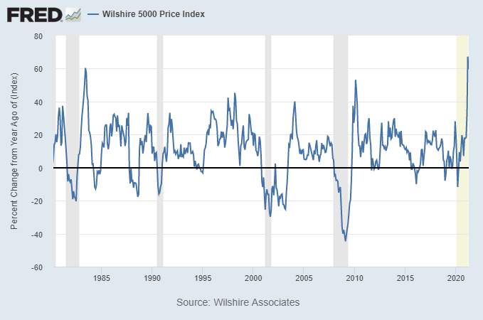
These unusual base effects already occurred for March 2020 vs March 2021 for asset prices, since asset prices bottomed before economic indicators.
For example, the Wilshire 5000 had its best year-over-year increase ever:
The next few years are going to test how much deflationary capacity there is in the US and global economy from technology, debt, and demographics to absorb the inflationary increase in broad money.
A thread.
In terms of overall fiscal and monetary policy, including the wartime-like fiscal response that we’ve seen over the past year, the 2020s so far have structural similarities to the 1940s.
Here’s the long-term debt cycle, for example:
During the 1930s, monetary policy hit the limit of what it can do against the prospect of a private debt bubble, and so it was then a massive fiscal response in the 1940s, forced by external factors (the war), that pumped inflation:
Like with a company, it takes a ton of work to make a good software product (equipment, staff, time, etc).
But then, it takes minimal work to send that software to 1,000,000,000 users compared to 10,000 users.
High base cost for it to exist + tiny cost per marginal user.
Bitcoin's overall energy usages does go up with adoption as a store of value as its market cap grows, but in a nonlinear way as it matures. It needs to be secure to function, but from there, its marginal cost per user is efficient. swanbitcoin.com/bitcoin-fee-ba…
Congrats to @JanBlachowicz for his successful title defense. Commentators were pretty biased against him during the fight but he had a near-perfect conservative approach. The champion was the betting underdog and even during the fight, he didn't get enough respect. #UFC259
There's a lesson in here about markets somewhere, probably around the topic of bias.
Imagine a fight where one person objectively lands more hits in every round (and bigger/harder), and yet commentators and viewers think the other person is winning.
Partly this is from charisma/narrative momentum going into the fight, and then also how they "look" while fighting, with one looking crisp (but getting hit more lol) and never really putting the other in danger, and the other looking slower (but hitting more, and harder).
Unless Yellen changes plans, then during the next several months, over $1T from the Treasury General Account is going to pour into bank reserves.
Despite massive T-bill issuance, there is actually a shortage of T-bills out there now relative to capital (complete opposite problem of late-2019 repo spike).
Short end of the Treasury curve is falling due to collateral shortage, while long end is rising.
For example, after the 2019 repo spike, the problem was too many t-bills vs cash. The Fed's transition from repo support to outright QE (T-bill buying) in was predictable a couple weeks in advance.