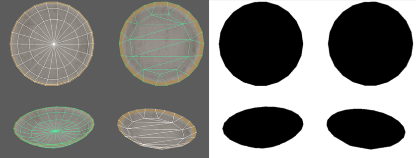
I was was aked what asset packs I am using to demonstrate horror story examples of bad optimization. Actually I am NOT going to say avoid them. I am gonna say you SHOULD buy them, open them, look inside, see the horrors within. They are a great lesson.
The pack is Archteria3D Manor Interior Mega Pack.
Speaking as a professional, it is one of the worst examples of how to make game assets I have worked with.
Speaking as a teacher, you must get this pack. Everything you can possibly do wrong, they have done.
Speaking as a professional, it is one of the worst examples of how to make game assets I have worked with.
Speaking as a teacher, you must get this pack. Everything you can possibly do wrong, they have done.
So it is both an endorsement and a caveat emptor.
Buy it, but so help you if you put the assets into your game.
Buy it, but so help you if you put the assets into your game.
We are talking bad naming conventions, bad modelling, bad atlasing, shredding meshes into lots of tiny UVS, expensive shadows, expensive collisions, untiled textures, bad bakes... the list goes on.
They look great.
And therein lies an important lesson.
They look great.
And therein lies an important lesson.
So I am going to endorse the product. If they have beef with me, I can demonstrate here.
I wish the artist or artists well, and hope they grow and learn and become masters not just of the visual, but the technical.
But, this isn't how you do game assets folks.
I wish the artist or artists well, and hope they grow and learn and become masters not just of the visual, but the technical.
But, this isn't how you do game assets folks.
Example? None of the meshes have a name in the kitchen set. They are all called Kitchen Probes, and are numbered. Lots of objects share an atlas- also not named, which means you cant just use a few without pulling all of the textures into the memory.
I want to be absolutely clear, I will fucking kick the ass of anyone mocking the artists or bullying them online. We all start somewhere, and we all make mistakes. Just because some bitch online says the work is inefficient, you treat them with respect.
Buy the product.
Buy the product.
You are gonna learn a lot from the time they spent on these. Pay for their time.
Speaking of which, if you are an artist hesitating to put your assets onto the store because a pro will judge you... we don't actually look up the things you put on the asset store. Don't let me scare you. Your time is worth their money. You can always fix later.
• • •
Missing some Tweet in this thread? You can try to
force a refresh


