56% of all web visits happen on a phone.
I studied 100s of mobile landing pages and found 21 golden tips.
Read to get more conversions:
I studied 100s of mobile landing pages and found 21 golden tips.
Read to get more conversions:
Tip:
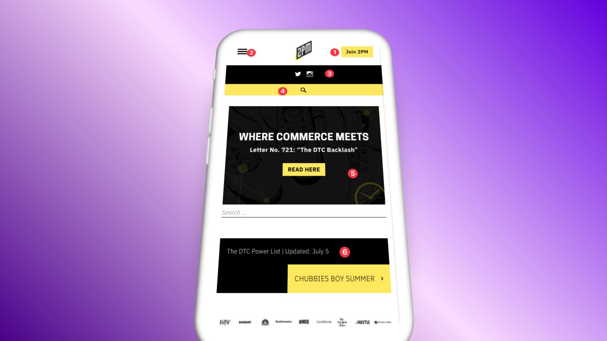
Make everything easily clickable
Explanation:
Reachability is a huge problem on mobile. If your items are all in the middle, or all too far to the left, it can be harder to click them. Make it easy to take action.
Example:
@2PMinc
Make everything easily clickable
Explanation:
Reachability is a huge problem on mobile. If your items are all in the middle, or all too far to the left, it can be harder to click them. Make it easy to take action.
Example:
@2PMinc
Tip:
Give me quick context
Explanation:
This is huge for eComm especially. If you have key info, display it above the fold. Don't make me scroll or guess to find out what I need.
Example:
@WearAtoms
Give me quick context
Explanation:
This is huge for eComm especially. If you have key info, display it above the fold. Don't make me scroll or guess to find out what I need.
Example:
@WearAtoms

Tip:
Don't hide social proof
Explanation:
Sometimes logos and testimonials get hidden on mobile sites. NO! You need this on all formats to help you convert.
Example:
@Buffer
Don't hide social proof
Explanation:
Sometimes logos and testimonials get hidden on mobile sites. NO! You need this on all formats to help you convert.
Example:
@Buffer

Tip:
Get me to the magic moment
Explanation:
Give direct invitations to take action that make sense and meet me where I'm at. The quicker I see the product, the more likely I fall in love.
Example:
@Carrd
Get me to the magic moment
Explanation:
Give direct invitations to take action that make sense and meet me where I'm at. The quicker I see the product, the more likely I fall in love.
Example:
@Carrd

Tip:
Use highly legible fonts
Explanation:
If no one can read your site, no one will convert. Avoid fancy fonts and stick to accessible designs.
Example:
@databoxHQ
Use highly legible fonts
Explanation:
If no one can read your site, no one will convert. Avoid fancy fonts and stick to accessible designs.
Example:
@databoxHQ

Tip:
Let imagery shine
Explanation:
Visuals add immense value on mobile. Make them crisp and high quality. Bonus points for adding photos of humans using your product.
Example:
@feat_clothing
Let imagery shine
Explanation:
Visuals add immense value on mobile. Make them crisp and high quality. Bonus points for adding photos of humans using your product.
Example:
@feat_clothing

Tip:
Optimize feature sections
Explanation:
Make sure your features section isn't cramped on mobile. Use simple blocks to show your product features in an easy, can't-miss way.
Example:
@gumroad
Optimize feature sections
Explanation:
Make sure your features section isn't cramped on mobile. Use simple blocks to show your product features in an easy, can't-miss way.
Example:
@gumroad

Tip:
Categorize your content
Explanation:
Adding categories like "Mens" and "Womens" clothing helps me eliminate multiple clicks to get where I wanna go.
Example:
@Gymshark
Categorize your content
Explanation:
Adding categories like "Mens" and "Womens" clothing helps me eliminate multiple clicks to get where I wanna go.
Example:
@Gymshark

Tip:
Show me the product
Explanation:
Show the product in action as soon as humanly possible. If you can show the value before ever having to click, you've won half the battle.
Example:
@heyhey
Show me the product
Explanation:
Show the product in action as soon as humanly possible. If you can show the value before ever having to click, you've won half the battle.
Example:
@heyhey

Tip:
Give me a sneak peek
Explanation:
Customers love seeing content before having to sign up. Show me something that feels exclusive that I'd get on the inside. I'll be more likely to make an account.
Example:
@IndieHackers
Give me a sneak peek
Explanation:
Customers love seeing content before having to sign up. Show me something that feels exclusive that I'd get on the inside. I'll be more likely to make an account.
Example:
@IndieHackers

Tip:
Display micro-delights
Explanation:
Small, delightful interactions can make a world of difference on mobile. This creates a premium, yet friendly feel that changes brand perception.
Example:
@intercom
Display micro-delights
Explanation:
Small, delightful interactions can make a world of difference on mobile. This creates a premium, yet friendly feel that changes brand perception.
Example:
@intercom
Tip:
Make the menu insanely easy
Explanation:
You don't need the master menu on mobile. Give me what I can reasonably do on a phone, eliminate all else. Simple menus = happier navigation = more conversions.
Example:
@JamesClear
Make the menu insanely easy
Explanation:
You don't need the master menu on mobile. Give me what I can reasonably do on a phone, eliminate all else. Simple menus = happier navigation = more conversions.
Example:
@JamesClear

Tip:
Use vertical step-by-steps
Explanation:
Don't try to replicate your fancy horizontal desktop step-by-step. Make it intuitive by stacking elements on top of each other.
Example:
@trylolli
Use vertical step-by-steps
Explanation:
Don't try to replicate your fancy horizontal desktop step-by-step. Make it intuitive by stacking elements on top of each other.
Example:
@trylolli

Tip:
Use chat-like announcements
Explanation:
It never hurts to make the experience feel like other phone functions. Make announcements with chat bubbles or other familiar mobile designs.
Example:
@withopal
Use chat-like announcements
Explanation:
It never hurts to make the experience feel like other phone functions. Make announcements with chat bubbles or other familiar mobile designs.
Example:
@withopal

Tip:
Let your copy shine
Explanation:
Not the world's most visual product? Rely heavily on great copy instead. Format copy to fit your customer's needs. Say who it's for, what it does, and why they should care.
Example:
@Pipe
Let your copy shine
Explanation:
Not the world's most visual product? Rely heavily on great copy instead. Format copy to fit your customer's needs. Say who it's for, what it does, and why they should care.
Example:
@Pipe

Tip:
Don't go overboard on content design
Explanation:
Your blog doesn't need to have crazy design and intricate features. A list of articles is actually way easier to navigate, and cuts down on time to value.
Example:
@Public
Don't go overboard on content design
Explanation:
Your blog doesn't need to have crazy design and intricate features. A list of articles is actually way easier to navigate, and cuts down on time to value.
Example:
@Public

Tip:
Highlight customers
Explanation:
Stack testimonials on your home page. People need to see that other people like them enjoy the product. Don't hide these from mobile users!
Example:
@RoamResearch
Highlight customers
Explanation:
Stack testimonials on your home page. People need to see that other people like them enjoy the product. Don't hide these from mobile users!
Example:
@RoamResearch

Tip:
Give me all the power
Explanation:
Mobile sites shouldn't feel like lesser versions. You may have to stack elements and you'll have less room. But give me the premium features you give to desktop users as well.
Example:
@Tesla
Give me all the power
Explanation:
Mobile sites shouldn't feel like lesser versions. You may have to stack elements and you'll have less room. But give me the premium features you give to desktop users as well.
Example:
@Tesla

Tip:
Give me clear direction
Explanation:
A single focus or CTA is usually the best way to go. If you make it easy to know what you expect me to click on, I'm more likely to click on it. Period.
Example:
@TheHustle
Give me clear direction
Explanation:
A single focus or CTA is usually the best way to go. If you make it easy to know what you expect me to click on, I'm more likely to click on it. Period.
Example:
@TheHustle

Tip:
Contrast and embolden
Explanation:
The final CTA on your page is a good spot to mix things up. Use contrasting colors and a bold button to invite users to take action one final time.
Example:
@Unbounce
Contrast and embolden
Explanation:
The final CTA on your page is a good spot to mix things up. Use contrasting colors and a bold button to invite users to take action one final time.
Example:
@Unbounce

Tip:
Sprinkle CTAs
Explanation:
Every other section should have a focused CTA. The more this aligns with the main CTA in the hero, the better. Don't forget to remind people what you expect them to click on!
Example:
@webflow
Sprinkle CTAs
Explanation:
Every other section should have a focused CTA. The more this aligns with the main CTA in the hero, the better. Don't forget to remind people what you expect them to click on!
Example:
@webflow

That's all, folks!
Did you like this thread?
1. Retweet the 1st tweet above
2. Follow me @heyblake
3. Turn on post notifications so you never miss a beat
Did you like this thread?
1. Retweet the 1st tweet above
2. Follow me @heyblake
3. Turn on post notifications so you never miss a beat
• • •
Missing some Tweet in this thread? You can try to
force a refresh