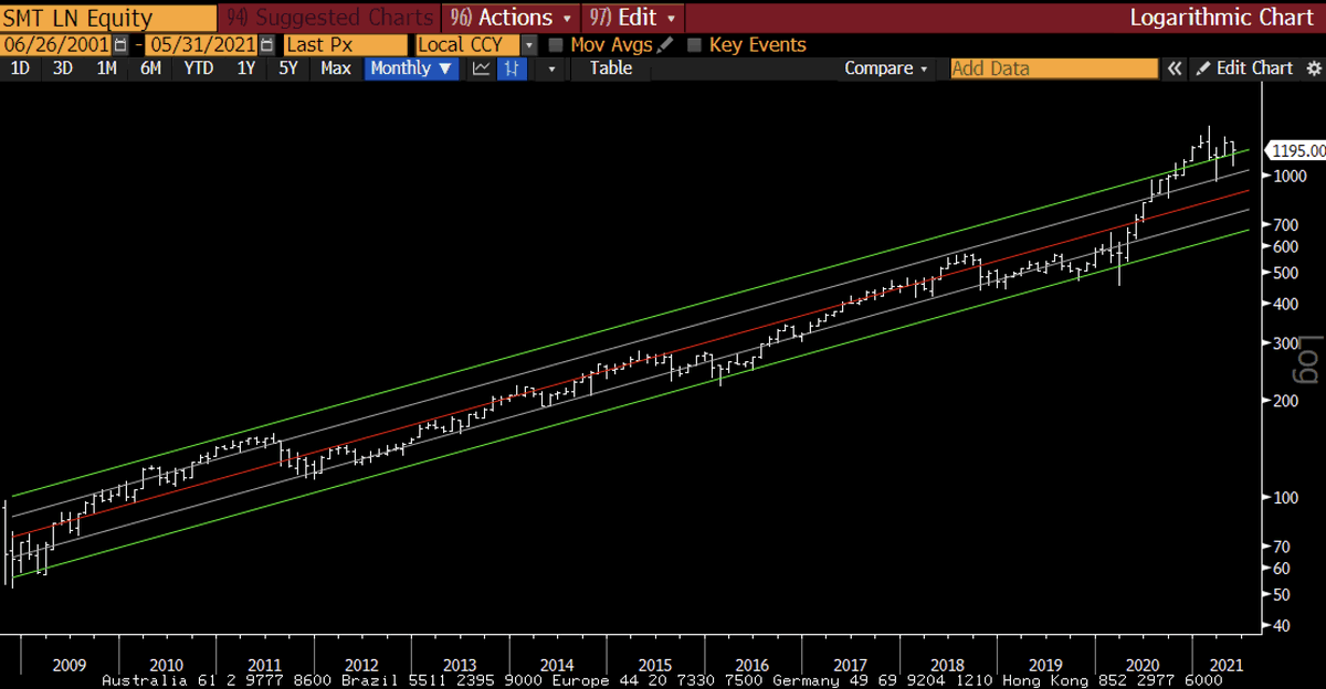
Here is the log chart parallel of BTC now vs 2013... still fits decently well. 1/
2/ And here is the non-log version... pretty much perfect from a contextualization standpoint.
And here is ETH now vs BTC in 2017... also pretty decent.
Regardless of the drama on Twitter - tEtHEr!, ChINa! EsG!, SHItCOin scAM! elOn! - everything is normal in crypto world and just moving along Metcalfe's Law adoption curve...
• • •
Missing some Tweet in this thread? You can try to
force a refresh
I know crypto chart takes are 2 a penny these days so mine are equally worthless, but... we all know that log charts are the right way to look at these...1/
Bitcoin seems to have negated the Head and Shoulders pattern, on-chain data suggest huge accumulation and better market dynamics, Metclafes Law valuations are increasing, and time and price have now met the log trend...2/
ETH has also reached the log trend in time and price and looks like it s forming a wedge.
Just adding to this thread.... the rise in the dollar and fall in bond yields is all about a moderation in growth. I think it might lead to a growth scare in Q4.
Macro is ruled by two assets - the US dollar and US treasuries. If they move together they are usually telling us something important. It is time to have them both on your radar screen... 1/
Using the Euro/$ as the proxy for the dollar...there is risk of a very large head and shoulder forming. The dollar tends to rally on economic weakness (and falling yields).
And 10 year rates look like they are going to test the uptrend. If my hunch that H2 is going to be weaker than expected is correct, this trend line will confirm. After all, bonds speak the economic truth.
If you are as fascinated by community tokens as I am (I think it is the future of business models) then this interview with @hendry_hugh and @KevinChou with @AshBennington is fabulous.