travellingtabby.com/uk-coronavirus…
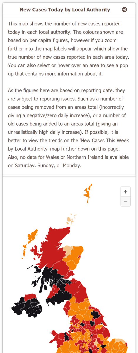
Four of the top six local authorities with the highest 7 day case rates in the UK right now are in Northern Ireland.
Cases are still rising quite a bit there, and are up 17% from this time last week.
#Covid19UK #coronavirusuk #DailyCovidUpdate


Four of the top six local authorities with the highest 7 day case rates in the UK right now are in Northern Ireland.
Cases are still rising quite a bit there, and are up 17% from this time last week.
#Covid19UK #coronavirusuk #DailyCovidUpdate


Also, all of these charts on the main UK page have been updated to the new style now!
For most of them, there hasn't really been many other changes, other than some small design adjustments.


For most of them, there hasn't really been many other changes, other than some small design adjustments.


This chart is a bit different though.
Instead of toggling between total and per 100k population figures, all of the data is now included on the same chart, so that you can switch between the different metrics easier.


Instead of toggling between total and per 100k population figures, all of the data is now included on the same chart, so that you can switch between the different metrics easier.


This chart has also been changed to a new style.
But unlike on the Scotland page, there is no way to separate eligible and ineligible 12-15 year olds for the UK as a whole. So all 12-15 year olds are in the eligible section, even though most technically aren't right now.
But unlike on the Scotland page, there is no way to separate eligible and ineligible 12-15 year olds for the UK as a whole. So all 12-15 year olds are in the eligible section, even though most technically aren't right now.

• • •
Missing some Tweet in this thread? You can try to
force a refresh


