Or I should say at least 2% currently have covid..
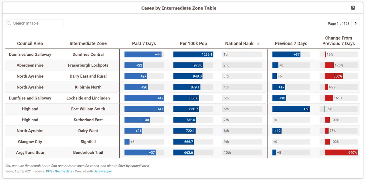
Also, I've changed around the intermediate zone map (again, sorry!) to now show per capita rates instead of whole numbers.
I think with cases rising again it'll be better to show it this way for now
Although I have now added in labels which appear when you zoom in, showing the whole numbers.
These don't necessarily work too well in the cities as there are lots of tiny areas, and they can also make the map a bit slower. So let me know if you don't like them!
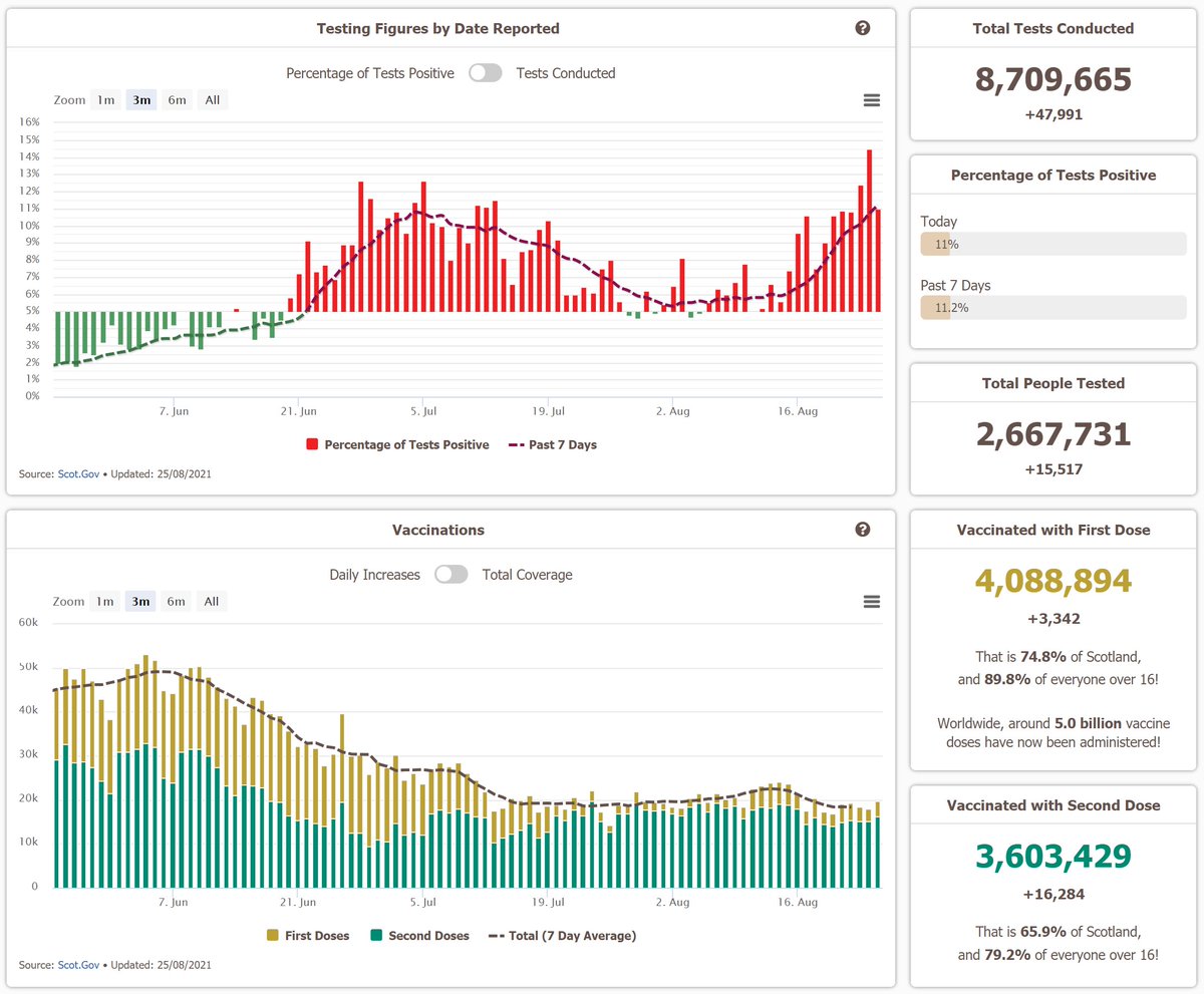
And here are some of the detailed vaccination figures for the day
• • •
Missing some Tweet in this thread? You can try to
force a refresh
As promised, here is a thread giving an overview of the Covid-19 situation in Scotland from over the past week!
First some figures on cases, which are still rising at a rapid pace. Our daily and 7-day average figures are now the highest they've been since the pandemic began. 👎
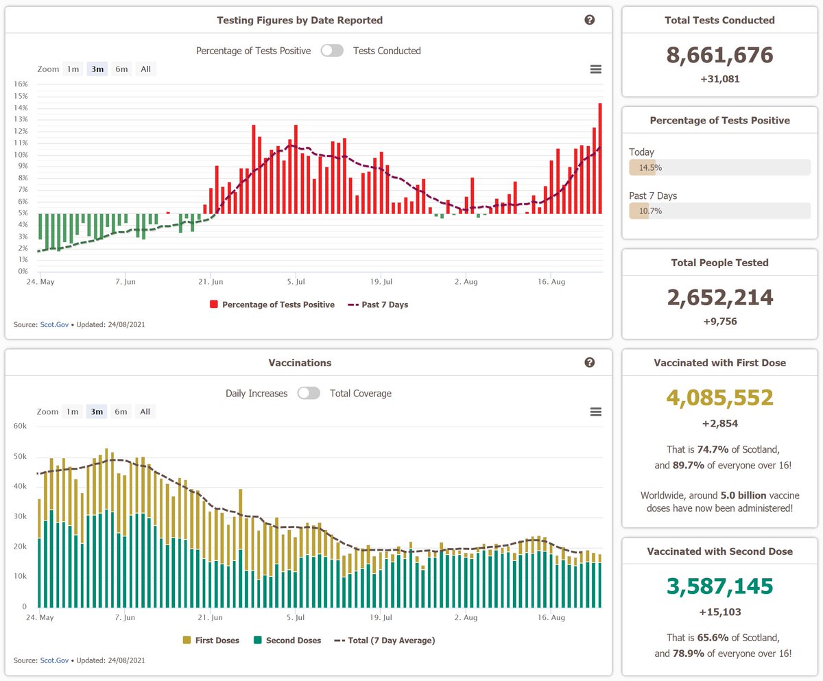
Yes, the amount of testing we are doing each day has increased by quite a bit.
But the rise in cases is outpacing that, which has resulted in the positivity rate rising quite steeply too.
Our 7-day positivity rate is now at 11.2%, which is up from 7.2% this time a week ago.
In terms of age, 15-24 year olds have the highest rates right now by some distance.
Although every age group is seeing a fairly sharp increase right now. Even the older ones, to a lesser extent.
Here are some more figures on the global vaccinations!
As expected, the rollout has not been equal. Europe for example has fully vaccinated nearly half of its entire population, whereas Africa is on just 3%.
And nearly 2 of those 5 billion vaccinations have been in China alone!
Also, I've changed these charts on the UK local page.
In addition to some design changes, the scales on the map have been updated to account for the rising cases, and the popups on it now give more information
On the table, you can now search for 'cities' to see just those!
Also, I've started making some changes on the UK local page now!
First, the cases and deaths by specimen chart here now shows 4 areas, along with some other design changes. And by default, it will now show these 4 cities, one for each nation.
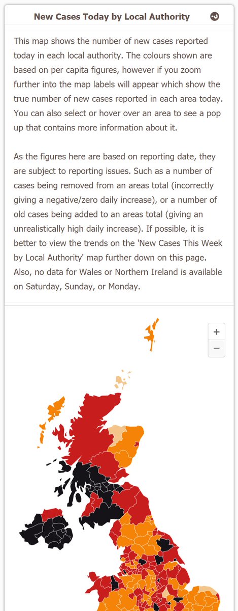
And second, I've added this map to show the number of new cases reported today in each local authority.
The colours are based on per capita figures, but you can zoom in to see a label that has the actual daily increase on it.
As promised, here is a thread covering the Scottish covid-19 situation over the past week!
First some figures on cases, which are unfortunately still rising, and have started doing so at an increased rate in the past few days.
This is especially true in the 15-24 age range.
At a local level cases are rising nearly everywhere now, although the areas in Grampian are doing relatively well in comparison to the rest of the country.
Dumfries and Galloway currently have the highest 7 day case rate in Scotland, after a sharp increase during the past week.
Scotland does still have the lowest 7 day case rate in the UK, although these figures do lag behind a little, so the increases seen in the past few days may not be fully reflected here yet.
Regardless, cases are rising across the UK, not just in Scotland.