travellingtabby.com/scotland-coron…
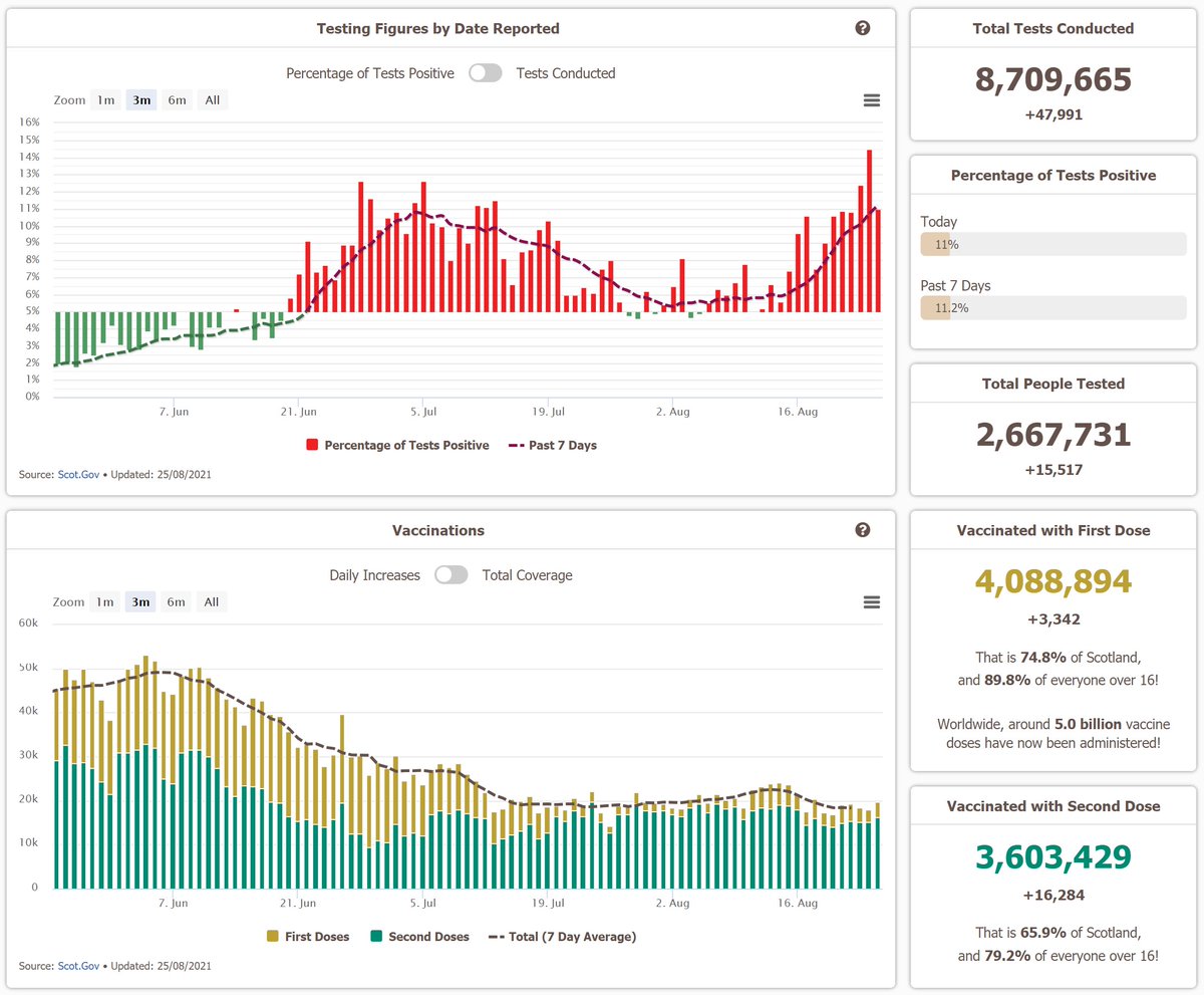
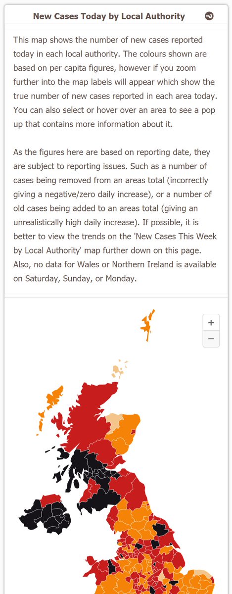
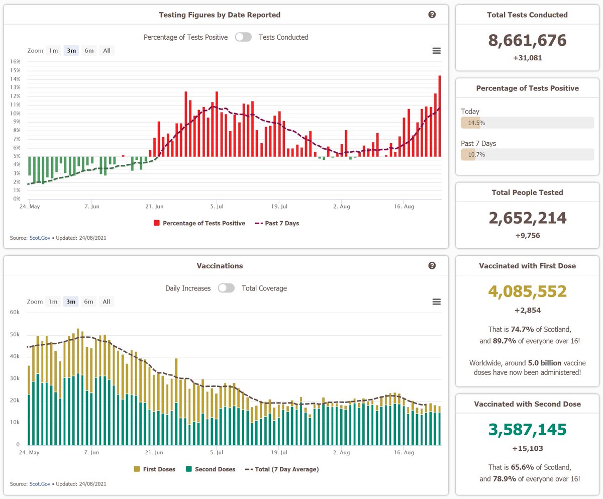
Another rise in cases today, with a daily increase of 1,815, which is the highest in close to a month.
The positivity rate of 10.6% is also the highest we've had in a day for over a month.
#covid19scotland #coronavirusscotland #DailyCovidUpdate


Another rise in cases today, with a daily increase of 1,815, which is the highest in close to a month.
The positivity rate of 10.6% is also the highest we've had in a day for over a month.
#covid19scotland #coronavirusscotland #DailyCovidUpdate


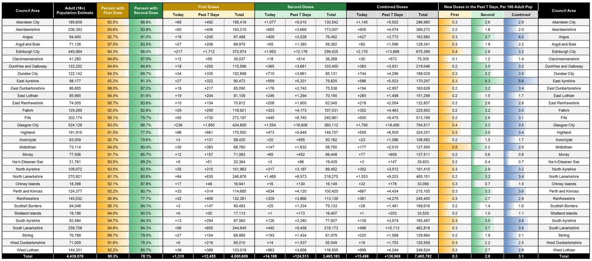
Here are some of the detailed vaccination figures too!
A couple of small changes were made to the page too, which I'll mention below!

A couple of small changes were made to the page too, which I'll mention below!

The first is that the case age trend chart here now shows the total number of cases over the past 7 days, per capita, rather than the average number of daily cases over the past 7 days, per capita.
The trends are still the same, but it just matches the other age chart now!

The trends are still the same, but it just matches the other age chart now!


And then the 20 day trends on the basic council area table are now a 12 week trend, showing the total number of cases/deaths each week for the past 12 weeks
Its not per capita, as I think having the total figures makes it easier to see the actual up/downward trend in each area

Its not per capita, as I think having the total figures makes it easier to see the actual up/downward trend in each area
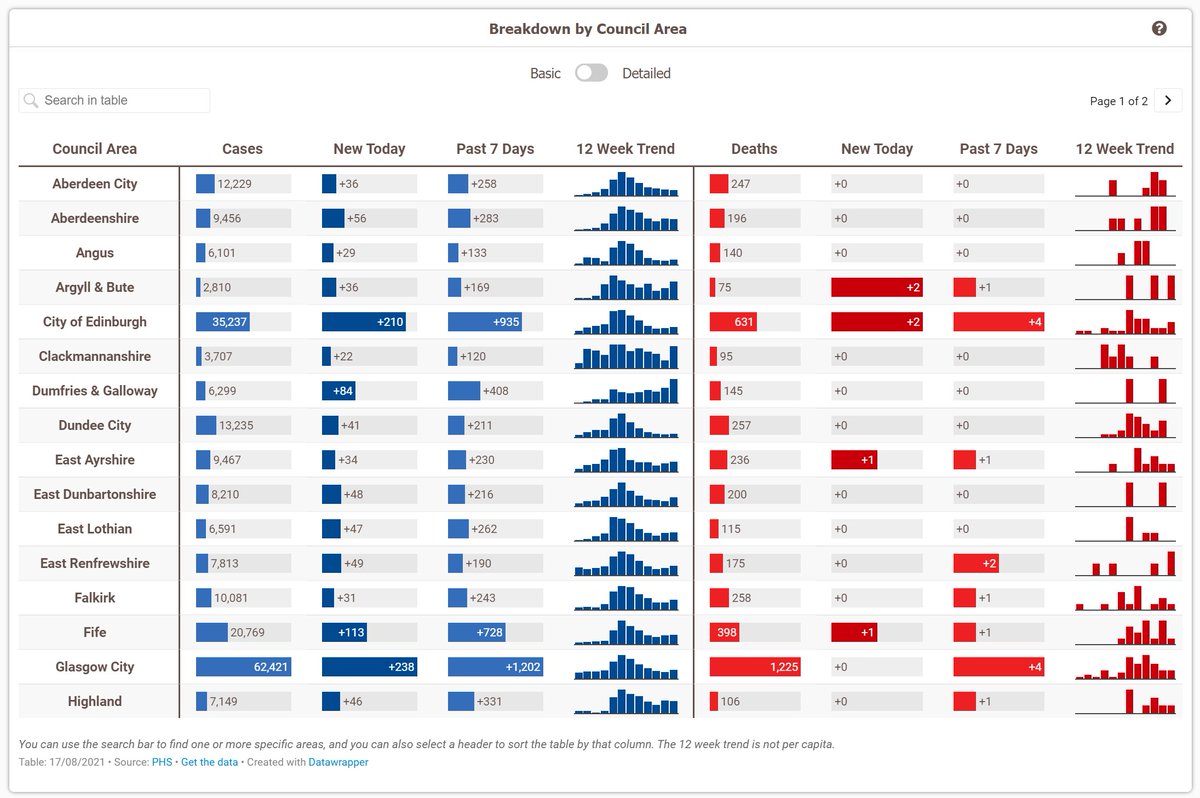
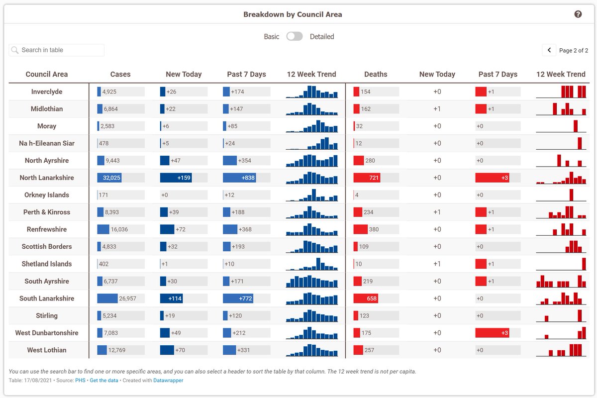
Although I've spent hours debating on whether I want it to be per capita, and whether I want it to be columns or lines (as below), so it may still change in the future 😅 

• • •
Missing some Tweet in this thread? You can try to
force a refresh


