travellingtabby.com/uk-coronavirus…
Unfortunately 170 new deaths were reported throughout the UK today, which is the highest in a day since early March.
#Covid19UK #coronavirusuk #DailyCovidUpdate


Unfortunately 170 new deaths were reported throughout the UK today, which is the highest in a day since early March.
#Covid19UK #coronavirusuk #DailyCovidUpdate


Also, I'll try to tweet out a thread later tonight covering some of the weeks figures, but for now here is an update on changes!
First is that the 20 day trend on this chart is now a 12 week trend, with each column representing a week (the most recent week is furthest right)
First is that the 20 day trend on this chart is now a 12 week trend, with each column representing a week (the most recent week is furthest right)

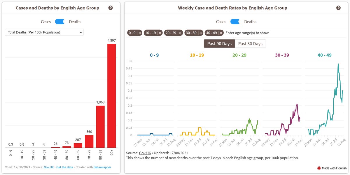
Then the charts showing English cases by age range were adjusted a little.
The 0-4 / 5-9 / 10-14 / 15-19 groups were amended to 0-9 / 10-19.
Also, the chart on the right is now just lines instead of columns, and you can select one or more groups to show via the search bar

The 0-4 / 5-9 / 10-14 / 15-19 groups were amended to 0-9 / 10-19.
Also, the chart on the right is now just lines instead of columns, and you can select one or more groups to show via the search bar


And I've also added in the same two charts showing English deaths by age range.
The weekly figures for cases / deaths by age group are now based on specimen date / date of death too, so they should show the trends better and be less prone to reporting issues!

The weekly figures for cases / deaths by age group are now based on specimen date / date of death too, so they should show the trends better and be less prone to reporting issues!


• • •
Missing some Tweet in this thread? You can try to
force a refresh


