
#Florida has finally been seeing dramatic improvements in its #COVID19 numbers.
It's been a while since I've done this, but it's warranted, so here goes a Florida update 🧵
Viz using covid19florida.mystrikingly.com
1/
It's been a while since I've done this, but it's warranted, so here goes a Florida update 🧵
Viz using covid19florida.mystrikingly.com
1/

New daily infections (cases) have been decreasing in September as rapidly as they increased during this #delta surge.
We're where we were in mid-July, with numbers also similar to where we were in early February.
Under 7,700 cases per day over the last 7 days.
2/
We're where we were in mid-July, with numbers also similar to where we were in early February.
Under 7,700 cases per day over the last 7 days.
2/
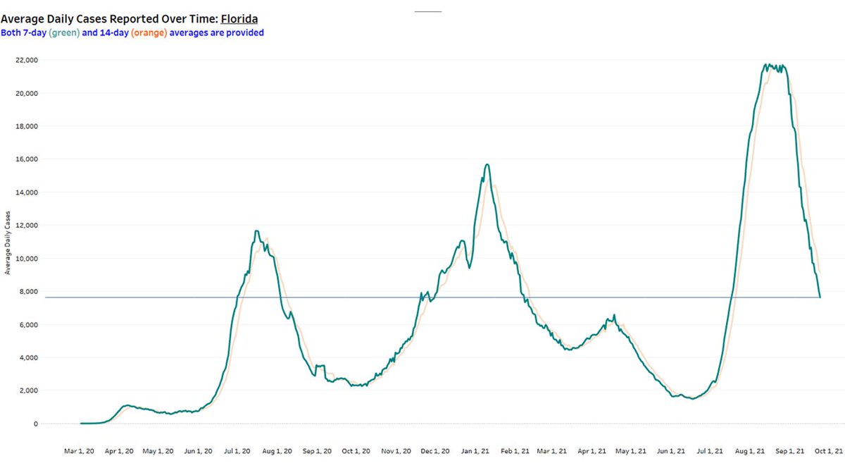
The chart below highlighting the past 8 weeks tells the story. After plateauing for 2 weeks towards the end of August, it's been 4 straight weeks of considerable decreases in cases.
We don't want to be at 7,000+ cases per day, but moving in the right direction...fast.
3/
We don't want to be at 7,000+ cases per day, but moving in the right direction...fast.
3/

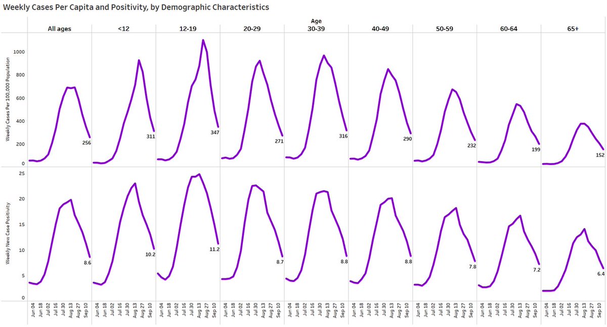
What's more is that the decrease in cases is being observed in every age group reported by @HealthyFla on their weekly reports.
This past week, the decrease in cases from the previous week had very little variability by age...all had a 22% to 29% decline.
4/
This past week, the decrease in cases from the previous week had very little variability by age...all had a 22% to 29% decline.
4/

Viz below shows the weekly age distribution of cases. Vaccines clearly helped to shift the age distribution towards younger ages, but this past week saw a higher % of cases among seniors.
Still decreases in absolute numbers.
5/
Still decreases in absolute numbers.
5/

The #COVID19 trends in #Florida is similar among the southeastern US that experienced such a serious surge from #delta.
Florida is down 42% in average daily cases from 2 weeks ago. Now, the only increases relative to 2 weeks ago are being seen in the north.
6/
Florida is down 42% in average daily cases from 2 weeks ago. Now, the only increases relative to 2 weeks ago are being seen in the north.
6/

What this means is after leading the nation during the worst of its #delta surge, #Florida now ranks 30th highest in their 7-day average daily cases in the most recent 7-day window.
#Alaska having a tough go right now.
7/
#Alaska having a tough go right now.
7/

For a while you heard that #Florida makes up about 6-7% of the US population, but made up >20% of new cases.
Well, now we make up about 7% of new daily #COVID19 cases, just a little more than the % of the population we make up.
8/
Well, now we make up about 7% of new daily #COVID19 cases, just a little more than the % of the population we make up.
8/

When you add in people who have previously tested positive (not included in FL numbers), we are still testing over 100,000 people each day.
Positivity has decreased from over 20% to 8.6%. Not where we'd like to be, but BIG improvement.
9/
Positivity has decreased from over 20% to 8.6%. Not where we'd like to be, but BIG improvement.
9/
And, again, positivity (bottom part of viz below) is decreasing in every age group. The lowest positivity (6.4%) is in the group at highest risk of severe illness - seniors.
10/
10/
New hospital admissions have also been taking a steep decent, though not quite as rapidly as they increased in July and August. Still, it's so great to see these crazily high numbers come down...
...for every age group.
11/
...for every age group.
11/

The number of adults "currently" in the hospital with confirmed COVID-19 has decreased 27 straight days, from 15,283 to 6,690, a 56% decrease.
New confirmed #COVID19 daily admissions (7-day average) down 39 straight days, from 2198 to 762, a 65% decrease.
12/
New confirmed #COVID19 daily admissions (7-day average) down 39 straight days, from 2198 to 762, a 65% decrease.
12/

We've even had 27 straight days with no increases in the number of adults currently in an #ICU bed with confirmed #COVID19, from 3559 to 1887, a 47% decrease.
These numbers are nowhere near where we'd like to have them, but again...progress.
13/
These numbers are nowhere near where we'd like to have them, but again...progress.
13/

This means that #Florida, which was worst in per capita new admissions for confirmed #COVID19 for quite some time recently, is now 17th highest among all ages 18+.
14/
14/

And for those at the highest risk, people 70+ years, we rank 24th highest.
15/
15/

Everyone wants to talk #COVID19 #deaths.
Clearly, when you have record hospitalizations in every age group (by far), you can expect mortality to be bad. It was the worst stint for #Florida during the pandemic.
wusfnews.wusf.usf.edu/health-news-fl…
16/
Clearly, when you have record hospitalizations in every age group (by far), you can expect mortality to be bad. It was the worst stint for #Florida during the pandemic.
wusfnews.wusf.usf.edu/health-news-fl…
16/
Everyone also wants to know where the peak will be, which is hard to gauge due to reporting lag.
My guess is first week in September once all reporting comes in.
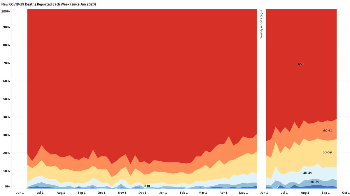
Viz below shows REPORTED deaths finally took a downturn and they tend to be closely tied to ACTUAL deaths.
17/
My guess is first week in September once all reporting comes in.
Viz below shows REPORTED deaths finally took a downturn and they tend to be closely tied to ACTUAL deaths.
17/

If you also look at in-hospital deaths (red line below), they have been predictive of ACTUAL #COVID19 deaths during each of our peaks thus far.
That 7-day avg of in-hospital deaths began decreasing around Sep 4.
So, ACTUAL deaths should have already peaked in early Sep.
18/
That 7-day avg of in-hospital deaths began decreasing around Sep 4.
So, ACTUAL deaths should have already peaked in early Sep.
18/

Just some numbers to go with the charts.
It's truly a tough pill to swallow to see this much mortality when we've had the vaccines available for all age groups for so long.
19/
It's truly a tough pill to swallow to see this much mortality when we've had the vaccines available for all age groups for so long.
19/

The viz below just illustrates the reporting lag. As each new update rolls in on Mondays and Thursdays (from @HealthyFla to @CDCgov, the back-fill increases the new 7-day high and shifts the date to the right.
20/
20/

The #COVID19 #vaccines have absolutely worked in shifting the age distribution of deaths to younger ages.
Why? Seniors are the most heavily vaccinated and therefore collectively realize the advantages of vaccines more than other age groups.
21/
Why? Seniors are the most heavily vaccinated and therefore collectively realize the advantages of vaccines more than other age groups.
21/
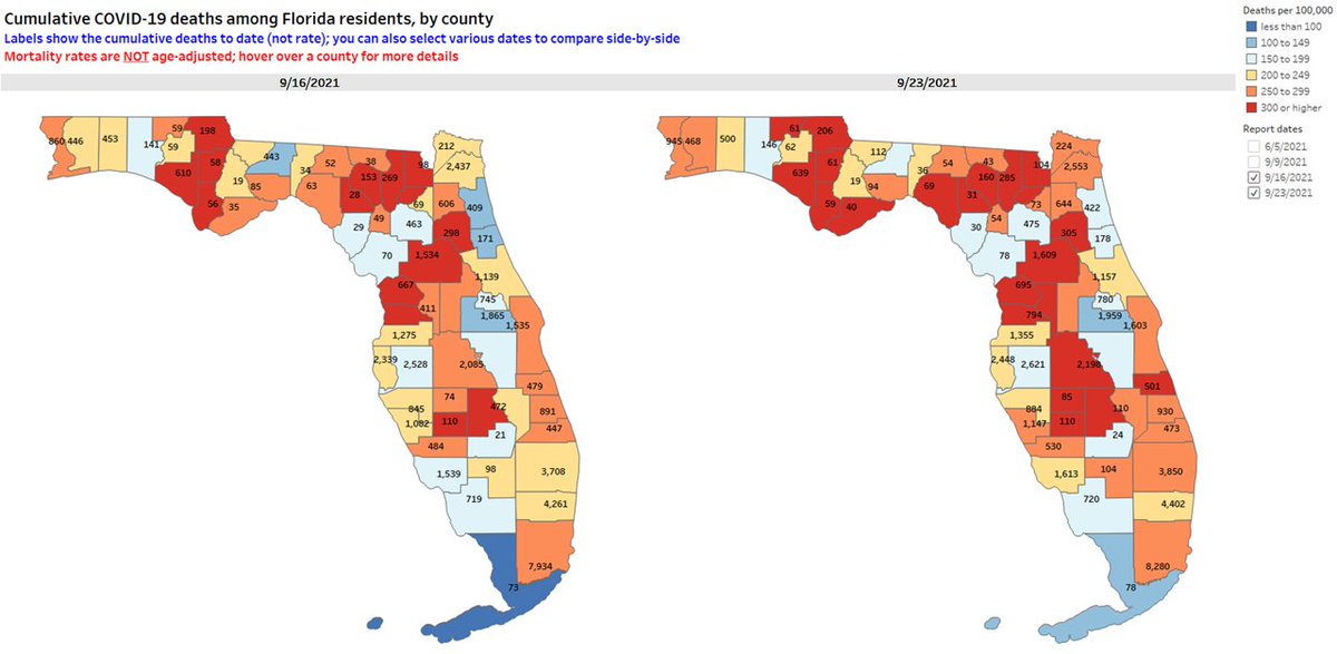
Don't forget - we are now receiving county-level deaths in #Florida. It appears to be updated once per week on the Community Profile Report from CDC.
I always give you county-level maps for the most recent two reporting days (and you can modify this).
22/
I always give you county-level maps for the most recent two reporting days (and you can modify this).
22/
PLEASE exercise caution when comparing states/counties on #COVID19 deaths when they have different age distributions.
For example, just comparing state-level cumulative mortality rates per capita shows FL in the top 15 (highest) and California in the thirties (lower).
23/
For example, just comparing state-level cumulative mortality rates per capita shows FL in the top 15 (highest) and California in the thirties (lower).
23/

Although many factors make states non-comparable, age is an important one.
JUST age-adjusting those cumulative mortality rates, and FL and CA have very similar rates, and are both in the middle of the pack.
Age-adjusted or age-stratified rates (at a minimum)!
24/
JUST age-adjusting those cumulative mortality rates, and FL and CA have very similar rates, and are both in the middle of the pack.
Age-adjusted or age-stratified rates (at a minimum)!
24/
And below are cumulative mortality numbers by age (5-year groups) and sex in the United States.
This using data from the federal government and only includes deaths with #COVID19 as the underlying or a contributing cause of death.
25/
This using data from the federal government and only includes deaths with #COVID19 as the underlying or a contributing cause of death.
25/

Another key metric is all-cause excess deaths. I like them for 3 reasons:
1. they are not affected by misclassification of #COVID19 deaths
2. the capture the direct and indirect toll of the pandemic
3. they better account for diffs in population characteristics
26/
1. they are not affected by misclassification of #COVID19 deaths
2. the capture the direct and indirect toll of the pandemic
3. they better account for diffs in population characteristics
26/
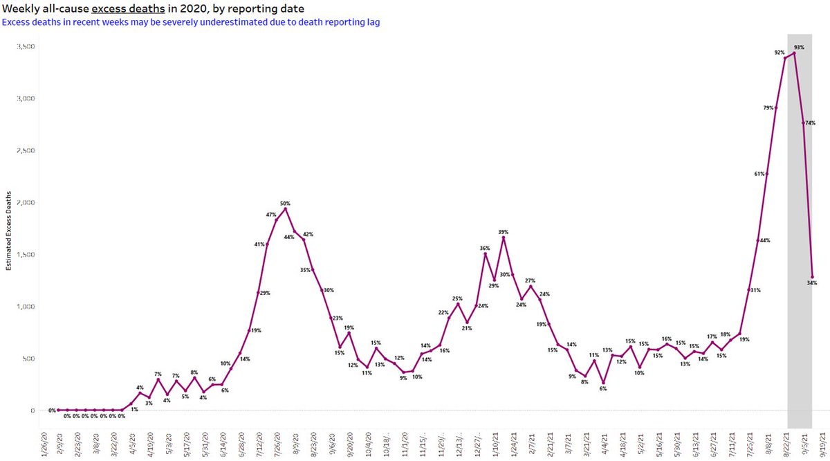
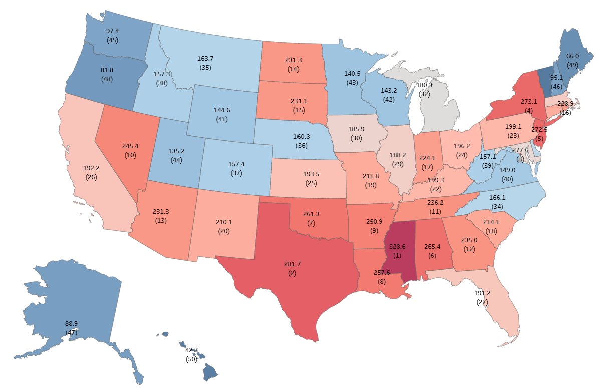
As expected based on #COVID19 deaths, #Florida had by far its worst all-cause excess deaths period, with nearly double the expected deaths for 2 weeks in August.
27/
27/

Messy figure below but shows:
1. on the right - Florida has led the nation in % excess deaths during the delta surge (so far)
2. on the left - other states have led the nation during the early 2020 (NY, NJ), late 2020 (the Dakotas), and early 2021 (CA) waves.
28/
1. on the right - Florida has led the nation in % excess deaths during the delta surge (so far)
2. on the left - other states have led the nation during the early 2020 (NY, NJ), late 2020 (the Dakotas), and early 2021 (CA) waves.
28/

In fact, the mortality during the delta wave has been so bad in FL, that they went from ranking ~30th highest from the beginning of the pandemic through June 2021 (left)
but now, for the entire pandemic, rank ~14th highest through the most current data reported (right)
29/
but now, for the entire pandemic, rank ~14th highest through the most current data reported (right)
29/

While other states may be facing the worst of their #delta surges soon, we need to continue focusing on breaking down barriers to vaccination, because the number of new people vaccinated weekly is decreasing in Florida.
30/
30/

And there remains over 800k children 12-17, nearly 5 million adults 18-64, and over 700k seniors who have yet to be fully vaccinated in the state.
Many may have natural immunity, but there are likely still people very vulnerable to adverse outcomes from COVID.
31/
Many may have natural immunity, but there are likely still people very vulnerable to adverse outcomes from COVID.
31/

On both the % of the entire population and the % of seniors who are fully vaccinated, Florida ranks in the 3rd quartile (better than most), but can still improve considerably.
32/
32/

For as long as I can, I'll try to keep providing complete, accurate, and timely data from the many disparate data sources out there and to people in as easy-to-understand a way as I can.
All the best to you and yours.
33/🏁
covid19florida.mystrikingly.com
All the best to you and yours.
33/🏁
covid19florida.mystrikingly.com
• • •
Missing some Tweet in this thread? You can try to
force a refresh


