📣 WEEKLY UPDATE: U.S. #COVID19 Vaccination levels by COUNTY & Partisan Lean:
acasignups.net/21/10/12/weekl…
acasignups.net/21/10/12/weekl…
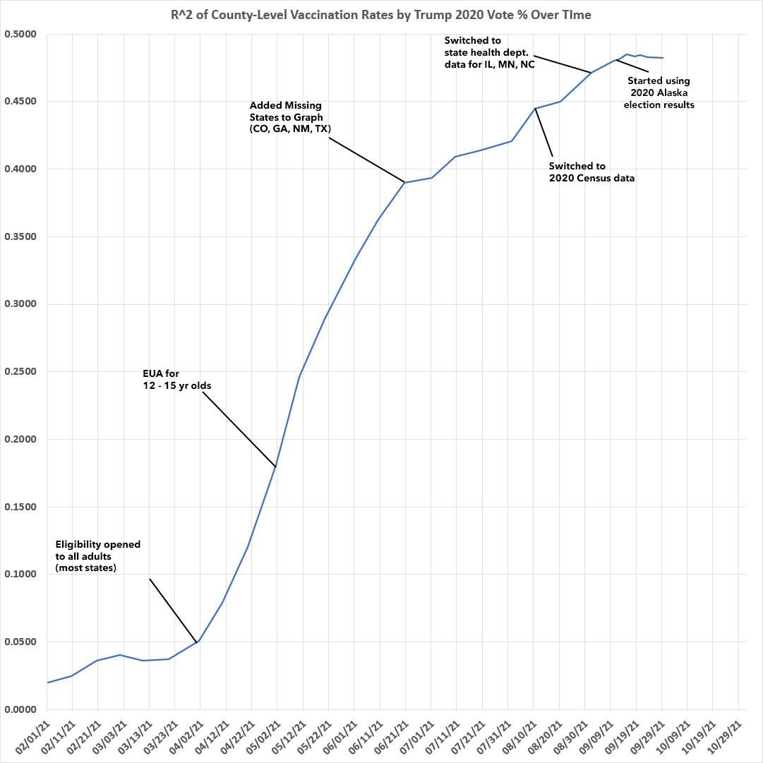
Having said that, it's worth noting that both the R2 and the Slope appear to have plateaued, and have even dropped slightly.
This was bound to start happening eventually as the most-vaxxed counties start bumping up against their thresholds (until 5-11 yr olds are eligible):

This was bound to start happening eventually as the most-vaxxed counties start bumping up against their thresholds (until 5-11 yr olds are eligible):


Here's the same data in bar graph format. As of today, the vaccination rate in the bluest tenth of the country by population is running 60% higher than in the reddest tenth. 

Items of Interest:
--Kalawao County, HI is still the only county with a 100% vaxxed rate (only 82 people live there.)
--Dukes & Nantucket, MA are both supposedly >90% fully vaxxed.
--Hudspeth County, TX is as well via official data. I seriously doubt this, though.
--Kalawao County, HI is still the only county with a 100% vaxxed rate (only 82 people live there.)
--Dukes & Nantucket, MA are both supposedly >90% fully vaxxed.
--Hudspeth County, TX is as well via official data. I seriously doubt this, though.
--Counties with >80% of their total populations vaccinated only have a combined population of 132,129 people.
--Slope County, ND has finally broken the 10% vaxxed threshold (71 out of 706 residents). Mazel Tov?
--Slope County, ND has finally broken the 10% vaxxed threshold (71 out of 706 residents). Mazel Tov?
--Of counties >100K pop., the top-vaxxed are Marin County, CA; Sumter County, FL and Montgomery County, MD, all at 75%+ vaccinated.
--Montgomery is also the top-vaxxed of counties with more than 1 million people.
--Wayne County, MI remains the least-vaxxed >1M people at 46.7%.
--Montgomery is also the top-vaxxed of counties with more than 1 million people.
--Wayne County, MI remains the least-vaxxed >1M people at 46.7%.
• • •
Missing some Tweet in this thread? You can try to
force a refresh


