THREAD. Encouraged by @fascinatorfun, I've been taking a look at NHS Test & Trace data on void PCR results, hoping this might shed light on how different regions have been affected by the #Immensa lab failure. TL;DR there is a problem affecting labs, but not just for the SW.
If you’ve taken a PCR test, it’s possible (though not likely) that you’ll have had one of these - a void result. It means that the lab wasn’t able to read the sample, or some other problem prevented a definitive result (so you need to do another test). nhs.uk/conditions/cor…
@fascinatorfun noted that voids “often give a clue as to whether there are equipment issues, training needs or overstretched capacity resulting in people rushing and taking short cuts”. And as @OliasDave has shown, the void data are weird.
https://twitter.com/fascinatorfun/status/1451914945076027396?s=20
These void results have been relatively uncommon, but the percentage of voids has varied over time, as you can see here for Oct 2020 to start of September 2021 (prior to Oct 2020 labs were producing more voids). 

In this version I’ve plotted the median (the blue dashed line, which is at 1.6% over this period), together with 5% and 95% intervals: 90% of the values fall within the shaded area. Going above the upper red line is a red flag🚩suggesting problems at the lab(s).

One thing that’s apparent in this plot is that labs were struggling in January, when cases were at their peak. That's understandable, I suppose, but also problematic, because it's particularly critical to have rapid accurate testing when prevalence is very high.

Now let's look at the graph for a different time period: the last month and a half (data are reported weekly, and the most recent report is for 7-13 Oct). I've kept the same shaded region to show where we'd expect 90% of values to be, if things were operating as normal.

Clearly things are *not* operating as normal. The percentage of voids/unknowns has shot up. In the most recent reporting week the % is about 3 times as high as the previous median value. Something's gone seriously wrong. That's not surprising, given the #Immensa scandal. But ...

Most of the focus of the Immensa fiasco has been its effect on SW England and Wales. So let's look at the voids data when we break it down by region.
First, here's that same initial period from Oct 2020 to Sept 2021 for London & the SE. Voids increased in both regions in January. Prior to that there's what might be an alpha effect hitting the SE first, then London. Other than that, looks OK (London gets a bit worse later on).

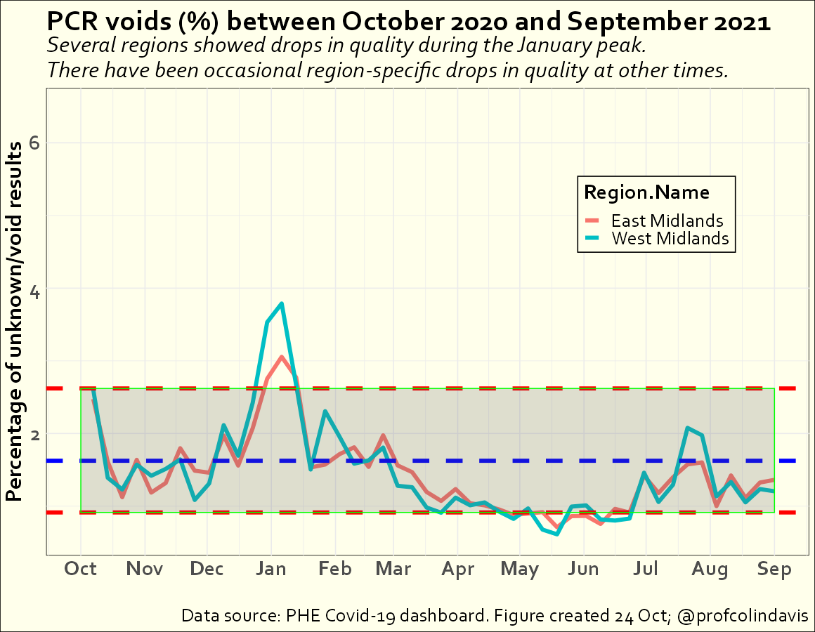
Here's the (East and West) Midlands for the same period. Same issue in January, but otherwise looks fine.
Here's regions in the north for Oct 20 - Sept 21. The percentage of voids did go up in January, but not alarmingly. In late March, though, there was a problem that affected the North East for 1 week (what was that?). Fortunately, cases were quite low at that point.

The last two regions for this time period are the SW and East of England. Something happened in the SW in mid-October (the number of tests was increasing then, but looks like something more specific). Both regions show a big increase in %voids at the start of September (Immensa?)

OK, so what's happened since the start of September across regions? Here are the SW and East of England. The SW has been particularly badly affected by the Immensa failure. But voids have been up in the East for most of this period also.

Here are regions in the North -- they're also showing very high void %s in the last 4 or 5 weeks (especially the North East). Is *that* because of the Immensa lab? Or a different lab?

There've also been increases in void %s in the Midlands, particularly in the most recent week of reporting.

Finally, here's London and the SE. Looks like there's a problem here as well. This might lead to underestimation of rates in London, but it can't explain why London is lower than other places.

Not sure what to make of all that. It seems to confirm that testing of samples from the SW has been affected by some problem, which has sharply increased the % of void results. But a similar problem is affecting most of the country. Some statement from UKHSA is required.
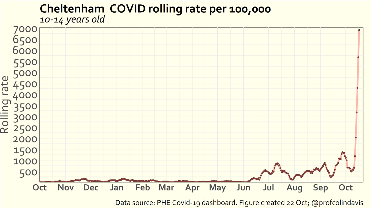
Possible evidence that problems with PCR testing have increased Covid levels:
If % of void tests is a proxy for how badly PCR testing is going, and bad tests->more infection, you'd expect the rolling rate to be correlated with % of void tests.
And it is (correl =.53, p<.005).
If % of void tests is a proxy for how badly PCR testing is going, and bad tests->more infection, you'd expect the rolling rate to be correlated with % of void tests.
And it is (correl =.53, p<.005).

Note also that the rolling rate isn't correlated with the total number of tests taken or the mean positivity, which might add confidence that the correl with % voids is meaningful. FWIW (poss. nothing), if the areas in Dorset are excluded, that correlation increases to .68.

• • •
Missing some Tweet in this thread? You can try to
force a refresh