Remember this from last night, on the front of pretty much every paper this morning?
The claim that Omicron is infecting 200,000 people every DAY.
There’s been a lot of speculation about whether the number is wrong, based on new data, or something else.
Well, I’ve worked it out🧵
The claim that Omicron is infecting 200,000 people every DAY.
There’s been a lot of speculation about whether the number is wrong, based on new data, or something else.
Well, I’ve worked it out🧵
https://twitter.com/skynews/status/1470537839502934020
TLDR it’s a back-of-an-envelope sum worked out by @UKHSA to illustrate where Omicron *might* be.
Not new data.
Not definitive.
This doesn’t mean it’s not a valid illustrative number.
But it’s not quite what everyone thought it was.
Let me show you how they came up with it.
Not new data.
Not definitive.
This doesn’t mean it’s not a valid illustrative number.
But it’s not quite what everyone thought it was.
Let me show you how they came up with it.
It starts with this.
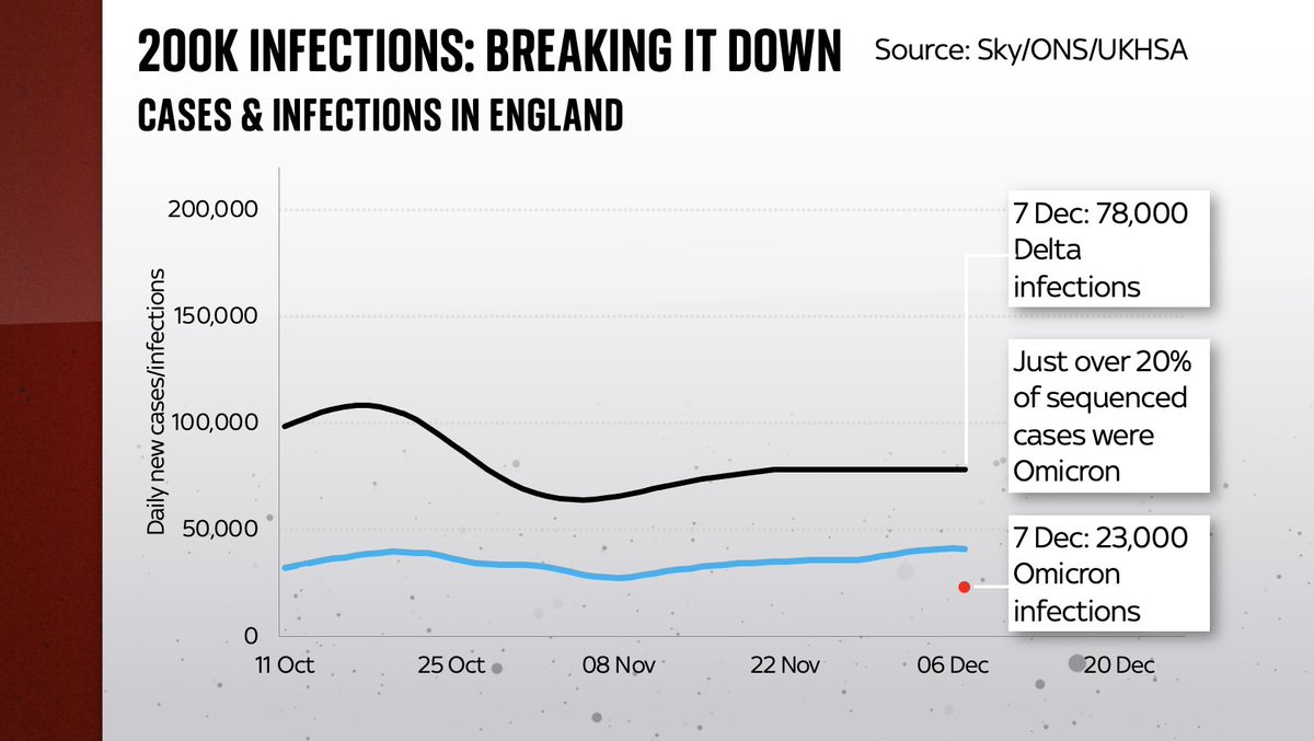
Infections (a modelled estimate of how many people catch Covid at any given time) are not the same as the number of cases (positive test results).
Infections are always higher cos not everyone gets symptoms/tested.
Eg on 21 Nov: 35k cases, 78k infections
Infections (a modelled estimate of how many people catch Covid at any given time) are not the same as the number of cases (positive test results).
Infections are always higher cos not everyone gets symptoms/tested.
Eg on 21 Nov: 35k cases, 78k infections

So @UKHSA started with that 78k from the ONS infections survey.
It assumed that fig was unchanged by 7 Dec (fair enough I guess).
It called those 78k infections Delta and then based on what we know from sequencing it assumed that must mean about 23k Omicron infections on 7 Dec…
It assumed that fig was unchanged by 7 Dec (fair enough I guess).
It called those 78k infections Delta and then based on what we know from sequencing it assumed that must mean about 23k Omicron infections on 7 Dec…

So now we’ve got 23k daily Omicron infections on 7 Dec.
How did they get from there to 200k by Dec 13, when @sajidjavid talked in the Commons?
Short answer: the wonders/terrors of exponential growth.
But how fast to increase that 23k?
Estimates of Omicron’s doubling time vary…
How did they get from there to 200k by Dec 13, when @sajidjavid talked in the Commons?
Short answer: the wonders/terrors of exponential growth.
But how fast to increase that 23k?
Estimates of Omicron’s doubling time vary…
Some put it as fast as doubling every 2 days. Super scary fast.
Some (inc the @UKHSA itself last week) say every 2.5 days. Others say slower.
Well to get to that 200k number the UKHSA actually went for a 1.9 day doubling time.
That’s crazy fast.
Some (inc the @UKHSA itself last week) say every 2.5 days. Others say slower.
Well to get to that 200k number the UKHSA actually went for a 1.9 day doubling time.
That’s crazy fast.

But that’s how they did it: a back-of-an-envelope sum which results in 207k new infections by Dec 13.
It would imply 300k new infections today.
And by the way note these figs are for England alone.
For the whole of the UK they would be a fair bit higher!
It would imply 300k new infections today.
And by the way note these figs are for England alone.
For the whole of the UK they would be a fair bit higher!

I have a few unanswered questions.
Eg: why did @UKHSA go for such a fast doubling time when they themselves said it was prob about 2.5 days last week? May not sound like much of a difference but look at these lines. 2.5 days wld mean 120k infections yday not 200k
Eg: why did @UKHSA go for such a fast doubling time when they themselves said it was prob about 2.5 days last week? May not sound like much of a difference but look at these lines. 2.5 days wld mean 120k infections yday not 200k

But the deeper problem with these kinds of back-of-envelope illustrations is they rapidly become ridiculous.
Consider: on the basis of the @UKHSA’s illustration, we will be seeing 1.3 million NEW Omicron infections on Saturday alone.
That’s one hell of a Saturday.
Consider: on the basis of the @UKHSA’s illustration, we will be seeing 1.3 million NEW Omicron infections on Saturday alone.
That’s one hell of a Saturday.

On the basis of the sums @sajidjavid’s 200k Omicron infections number came from, we’ll have 17 million new infections on Christmas Day.
Actually, the cumulative total of people in England who had caught Omicron by then wld be… the total population of England.
Not making this up.
Actually, the cumulative total of people in England who had caught Omicron by then wld be… the total population of England.
Not making this up.

Don’t take from this that there is no point in these kinds of exercises.
In the absence of solid data and in the face of an exponential threat, they serve a purpose.
But they have serious limitations & they’re v much NOT real data.
Pretending otherwise undermines trust in data.
In the absence of solid data and in the face of an exponential threat, they serve a purpose.
But they have serious limitations & they’re v much NOT real data.
Pretending otherwise undermines trust in data.
It’s quite possible the infection illustration cld be right - for a bit.
Latest case data (back to REAL data) is steepening.
In a few days we’ll prob have record nos.
Real question is less the black line than the red line (& deaths).
Do cases & hospitalisations keep diverging?
Latest case data (back to REAL data) is steepening.
In a few days we’ll prob have record nos.
Real question is less the black line than the red line (& deaths).
Do cases & hospitalisations keep diverging?

Evidence on that front from SA is promising.
Plus in SA infection doubling time has slowed too, down from 2 days earlier this month to 9 days now.
All of which is to say that the back-of-envelope sums used by @sajidjavid to get that scary number may already be out of date.
Plus in SA infection doubling time has slowed too, down from 2 days earlier this month to 9 days now.
All of which is to say that the back-of-envelope sums used by @sajidjavid to get that scary number may already be out of date.
You know that govt claim that 200k people are getting Omicron every DAY?
Turns out it’s actually closer to a guesstimate than definitive data.
Full video of me trying to explain this back-of-an-envelope figure (warning: contains charts):
Turns out it’s actually closer to a guesstimate than definitive data.
Full video of me trying to explain this back-of-an-envelope figure (warning: contains charts):
The working assumptions being used by the government - and cited by Chris Whitty to cabinet yday - imply over 400k new Omicron infections today and over a million on Saturday. Plausible? Pie in the sky? Make your own mind up. Here's my explanation about how their sums work:
https://twitter.com/skynews/status/1470886595620491264
Mon: 200k people catch Omicron
Tues 300k
Wed 400k
Thurs 600k
Fri 900k
Sat 1.3m
Etc
The remorseless logic of exponential growth.
But does it follow that we'll really face anything like that?
Some explanation on how @UKHSA came up with these big numbers: news.sky.com/story/covid-19…
Tues 300k
Wed 400k
Thurs 600k
Fri 900k
Sat 1.3m
Etc
The remorseless logic of exponential growth.
But does it follow that we'll really face anything like that?
Some explanation on how @UKHSA came up with these big numbers: news.sky.com/story/covid-19…
• • •
Missing some Tweet in this thread? You can try to
force a refresh


