What does the data tell us about #Omicron?
Frustratingly little, if we're being absolutely honest.
Much of what's being written about it at the moment is stabs in the dark, based on anecdote or at best small scraps of data.
No point in pretending otherwise
news.sky.com/story/covid-19…
Frustratingly little, if we're being absolutely honest.
Much of what's being written about it at the moment is stabs in the dark, based on anecdote or at best small scraps of data.
No point in pretending otherwise
news.sky.com/story/covid-19…
Here's a short video running through some of the data we do actually have on #Omicron.
As I say, uncertainty abounds.
We'll have a lot more data - more reliable, robust stuff - in a week or two. Not that that's all that much help in deciding what policy to enact now.
As I say, uncertainty abounds.
We'll have a lot more data - more reliable, robust stuff - in a week or two. Not that that's all that much help in deciding what policy to enact now.
https://twitter.com/skynews/status/1465415284290953219
Problem with charts like this (leaving aside fact that something being 500% higher is NOT the same as it being 500 times higher) is they imply considerably more certainty abt the growth rate of Omicron vs other variants than we really have. Consider…
https://twitter.com/carlquintanilla/status/1465470138254245898?s=21
If each of these lines began the moment a variant surpassed 1% of all samples in S Africa Omicron indeed looks astonishingly transmissible vs the rest.
But if you begin those lines when each surpassed 5% you get a different picture.👇
Omicron still fastest. But less dramatic.
But if you begin those lines when each surpassed 5% you get a different picture.👇
Omicron still fastest. But less dramatic.
The other point is that as of right now we have a VERY small sample pool of data. Those charts above are PERCENTAGES of samples logged with GISAID.
But the ABSOLUTE NUMBER of samples (of all variants) is v small now.
Bear in mind the chart below when considering the one above.
But the ABSOLUTE NUMBER of samples (of all variants) is v small now.
Bear in mind the chart below when considering the one above.

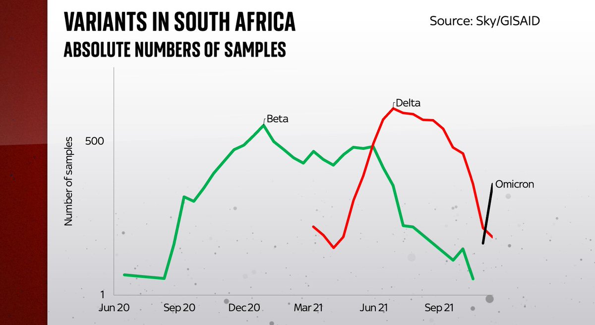
Now let's take the same data from that first chart and ponder ABSOLUTE numbers, not percentages. Omicron looks small vs the rest, because there are far fewer samples vs previous periods. That is changing. But for the time being this is the data we have. V small sample pool indeed 

But if there's one thing we've learnt from #Covid it's that thanks to exponential growth something that looks v small can soon become v big.
Just because omicron is small in absolute terms it could grow VERY quickly. Same data with log axis, better at depicting growth rates.
Just because omicron is small in absolute terms it could grow VERY quickly. Same data with log axis, better at depicting growth rates.

Now, it's certainly the case on the basis of the v early data #omicron looks like it spreads faster than other variants.
But let's not fool ourselves into believing we know precisely how fast.
And of all the known unknowns abt Omicron this is the bit we prob know most about!
But let's not fool ourselves into believing we know precisely how fast.
And of all the known unknowns abt Omicron this is the bit we prob know most about!
So. What data we have is scant. On other fronts (eg virulence, vaccine efficacy etc) we have NO data. Just anecdote.
Today's market-moving anecdote is from the FT interview with the Moderna CEO.
Excerpt here kind of sums it up. No data, mostly gut feeling ft.com/content/27def1…
Today's market-moving anecdote is from the FT interview with the Moderna CEO.
Excerpt here kind of sums it up. No data, mostly gut feeling ft.com/content/27def1…

No-one likes uncertainty.
Markets, policymakers, the media: these institutions can malfunction in the face of deep uncertainty.
Omicron is shrouded in deep uncertainty. That uncertainty will dissipate soon. But the next few weeks will be bumpy. More here: news.sky.com/story/covid-19…
Markets, policymakers, the media: these institutions can malfunction in the face of deep uncertainty.
Omicron is shrouded in deep uncertainty. That uncertainty will dissipate soon. But the next few weeks will be bumpy. More here: news.sky.com/story/covid-19…
The roller coaster continues... from fear this morning to hope this afternoon. Doubtless more bumps to come in the next few weeks
https://twitter.com/ariehkovler/status/1465777053597327375
• • •
Missing some Tweet in this thread? You can try to
force a refresh


