Quick #Christmas update on #omicron in #Florida following the @HealthyFla weekly report from yesterday.
I've borrowed an image for my dashboard that reflects how it seems spread has occurred (thanks Santa).
Let's have a quick walk-through.
1/15
I've borrowed an image for my dashboard that reflects how it seems spread has occurred (thanks Santa).
Let's have a quick walk-through.
1/15

Here's the overview of metrics.
- cases are surging, setting daily records, approaching new record over 7 days
- more testing than ever before
- both of the above likely underestimated between at-home tests and absence of reinfections in the daily numbers
- hosps increasing
2/15
- cases are surging, setting daily records, approaching new record over 7 days
- more testing than ever before
- both of the above likely underestimated between at-home tests and absence of reinfections in the daily numbers
- hosps increasing
2/15

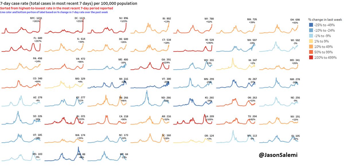
This county-level infection rate fig blows my mind.
Only 2 weeks separates the left and right maps.
I thought my home county's (Hillsborough) 507% increase was crazy.
But check out these 2-week increases:
- Dade: 1790% (19 times higher)
- Broward: 1437%
- Palm Bch: 1167%
3/15
Only 2 weeks separates the left and right maps.
I thought my home county's (Hillsborough) 507% increase was crazy.
But check out these 2-week increases:
- Dade: 1790% (19 times higher)
- Broward: 1437%
- Palm Bch: 1167%
3/15

As I mentioned, testing higher than ever in 1 week, and likely does not include a bunch of at-home tests...
But positivity had a huge increase because the increase in cases blew the increase in testing out of the water.
4/15
But positivity had a huge increase because the increase in cases blew the increase in testing out of the water.
4/15

Again, look at these crazy increases in positivity over the last 2 weeks:
- Dade: from 2.0% to 16.6%
- Broward: from 2.6% to 19.1%
- Palm Bch: from 2.6% to 17.1%
5/15
- Dade: from 2.0% to 16.6%
- Broward: from 2.6% to 19.1%
- Palm Bch: from 2.6% to 17.1%
5/15

And when we fade back out to the state level, the comparison to 2 weeks ago is just striking.
Florida's 7-day average daily cases is 956% higher with 19,124 MORE daily cases than two weeks ago.
6/15
Florida's 7-day average daily cases is 956% higher with 19,124 MORE daily cases than two weeks ago.
6/15

Not only do we have the most pronounced increase over the last 2 weeks, but we now also have the 8th highest cases per capita over the past 7 days.
7/15
7/15
The recent increases are seen in every age group, but the biggest driver has been those 20-39.
In people 20-29, the rate is higher than it's ever been, including during the delta surge.
8/15
In people 20-29, the rate is higher than it's ever been, including during the delta surge.
8/15

For perspective, it took about 36 days from the initial increase in cases until we eclipsed 21,100 average daily cases during #delta.
It's happened in one-third of that time - 12 days - during #omicron.
Our 7-day avg right now is only ~500 cases below our all-time high.
9/15
It's happened in one-third of that time - 12 days - during #omicron.
Our 7-day avg right now is only ~500 cases below our all-time high.
9/15

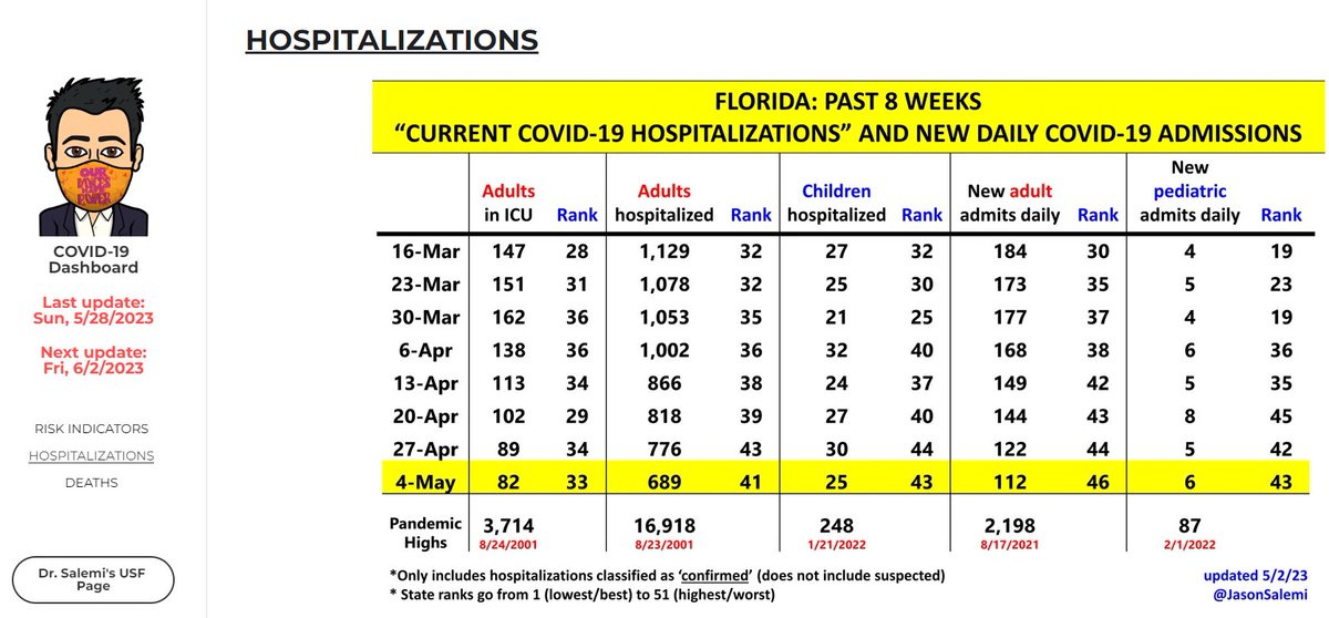
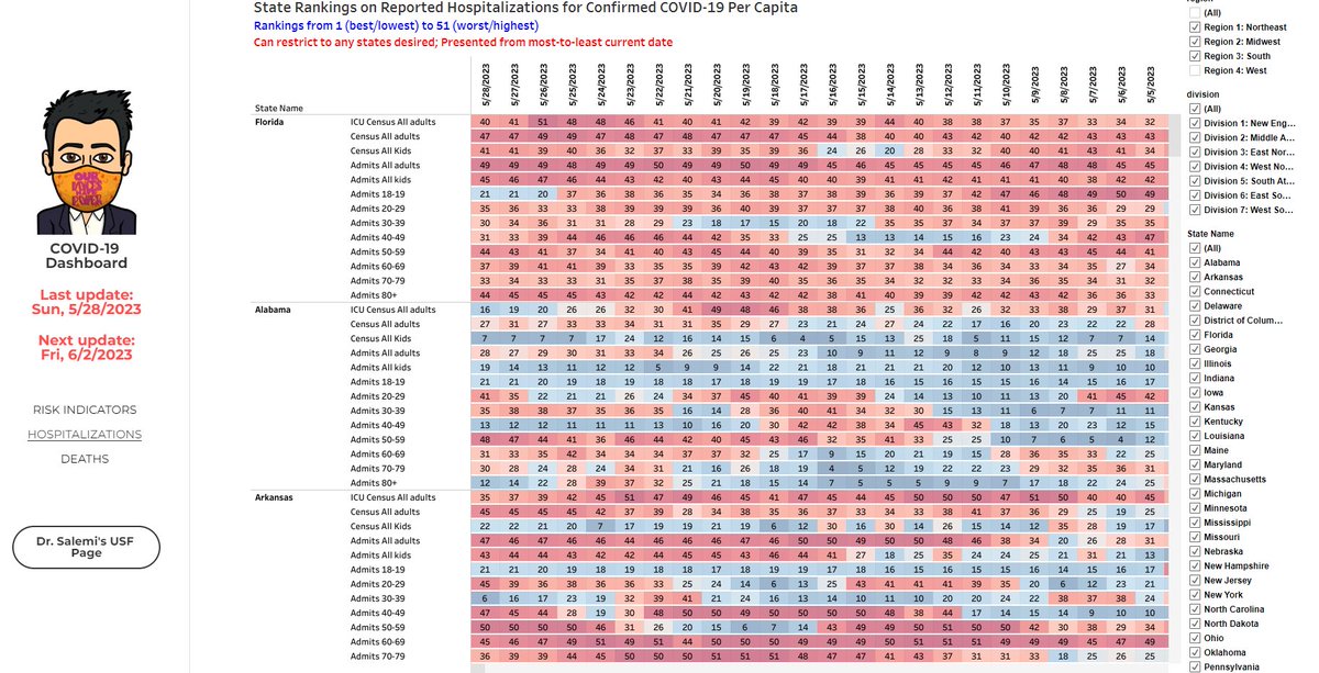
Hospitalizations for COVID are going up.
But first some all-important context.
As you can see in the figure, we are nowhere near #delta's astonishing levels.
Not yet and hopefully not ever.
10/15
But first some all-important context.
As you can see in the figure, we are nowhere near #delta's astonishing levels.
Not yet and hopefully not ever.
10/15

As @nataliexdean articulated, this may be due to #omicron having:
- younger lower-risk ppl comprise higher % of cases
- higher % of re-infections & breakthrough cases, also less likely to result in severe illness
Also, not enough time has passed.
11/15
- younger lower-risk ppl comprise higher % of cases
- higher % of re-infections & breakthrough cases, also less likely to result in severe illness
Also, not enough time has passed.
https://twitter.com/nataliexdean/status/1474074539940274213
11/15
But if we zoom in to just the month of December, avg daily admissions for confirmed COVID-19 have increased by:
- 138% in those 80+
- 110% in those 70-79
- 113% in those 60-69
- 133% in those 50-59
- 250% in those 40-49
- 225% in those 30-39
you get the idea...
12/15
- 138% in those 80+
- 110% in those 70-79
- 113% in those 60-69
- 133% in those 50-59
- 250% in those 40-49
- 225% in those 30-39
you get the idea...
12/15

Again, you can see, whether the # of adults/children currently hospitalized...
...or the # of avg daily admissions...
Regardless of #omicron's intrinsic severity, tons of new cases = a significant # of people sick enough to be hospitalized.
That ICU # also increasing.
13/15
...or the # of avg daily admissions...
Regardless of #omicron's intrinsic severity, tons of new cases = a significant # of people sick enough to be hospitalized.
That ICU # also increasing.
13/15

One final look at age.
LEFT has age distribution of cases since 7/1/2021
RIGHT has age distribution of hosp patients with COVID since 7/1/2021
Significant shift to younger ages during the #omicron surge.
Hoping this, in part, reflects vax + booster effectiveness.
14/15
LEFT has age distribution of cases since 7/1/2021
RIGHT has age distribution of hosp patients with COVID since 7/1/2021
Significant shift to younger ages during the #omicron surge.
Hoping this, in part, reflects vax + booster effectiveness.
14/15

No publicly available data on metric breakdown by vax or prior infection status.
No updates on vax progress on CDC site since 12/23.
So that's all for now.
Hope everyone is having a safe but still wonderful Christmas.
15/15
No updates on vax progress on CDC site since 12/23.
So that's all for now.
Hope everyone is having a safe but still wonderful Christmas.
15/15
• • •
Missing some Tweet in this thread? You can try to
force a refresh