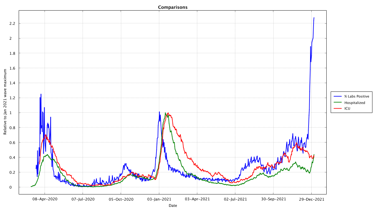
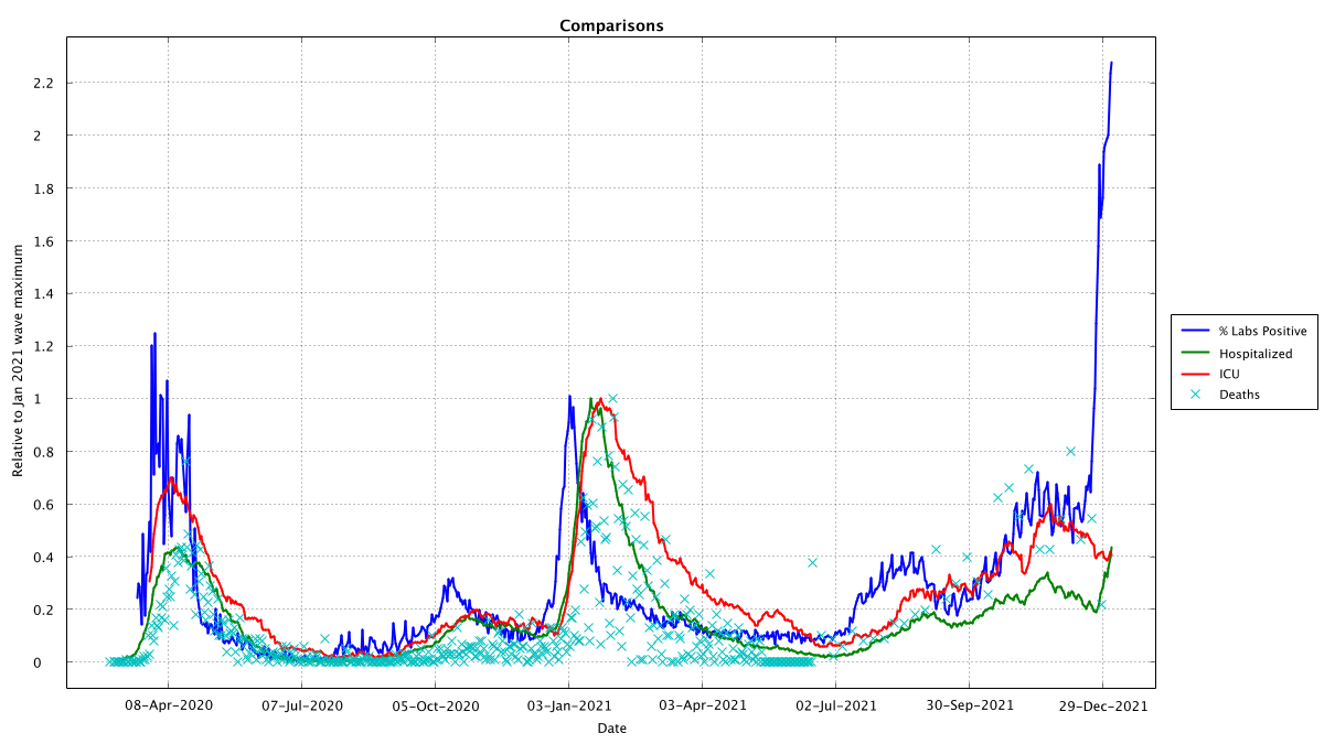
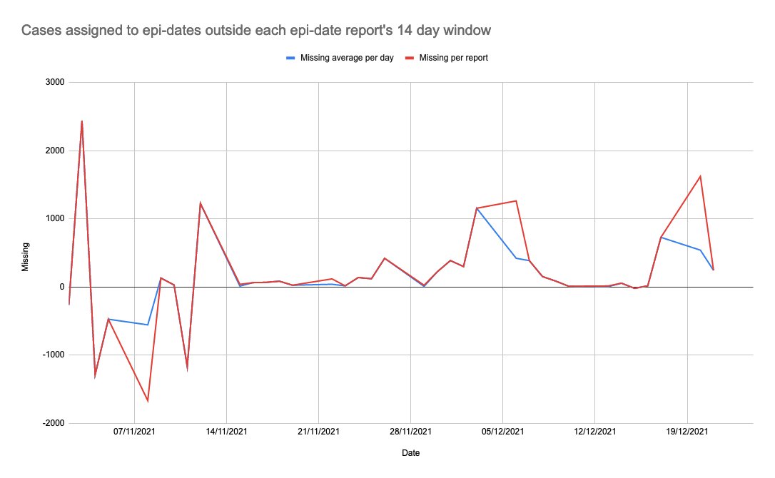
Since Conor is gone I thought I'd set up a bot to generate graphs of hospital admissions for Ireland from the Geohive data... so as an FYI wer are still less than half the level of hospitalization at the peak of 2021. Roughly similar to 2020's peak @EwanMacKenna@RealEddieHobbs
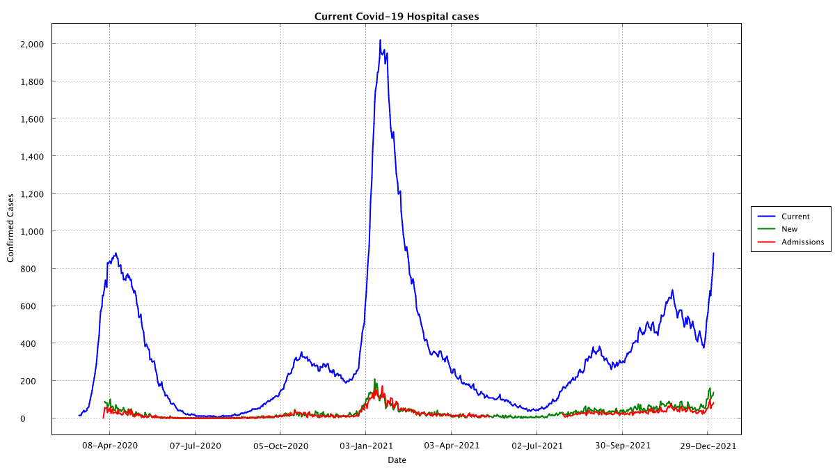
If we keep a running total (light blue) of the Covid admissions and discharges we see that the numbers in hospital seem to have about 50% admissions of Covid positive and 50% covid detected post admission, also appears to be some recovery but still in hospital during 2021?
In case it's non-obvious why I'm saying 50% tested positive after admission, it's these Oct 2020 and Jan 2021 differences between the dark blue curve (total in hospital) and the light blue curve (running sum of admissions with Covid minus discharges with Covid)
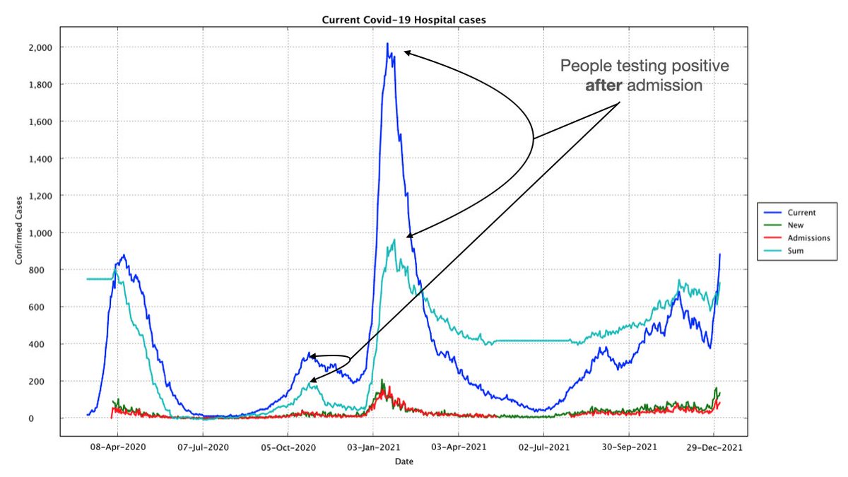
That the light blue line doesn't go back to 0 is because those people were not discharged while Covid positive
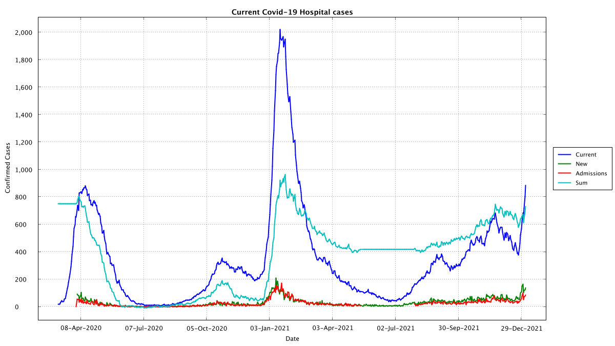
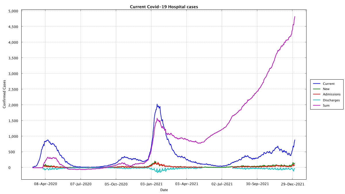
If we plot a different running sum, this time light blue is the discharges while covid positive and purple is the sum of new covid cases minus discharges. We are missing data on discharges from April 2021 to July 2021, but we can say something from this graph
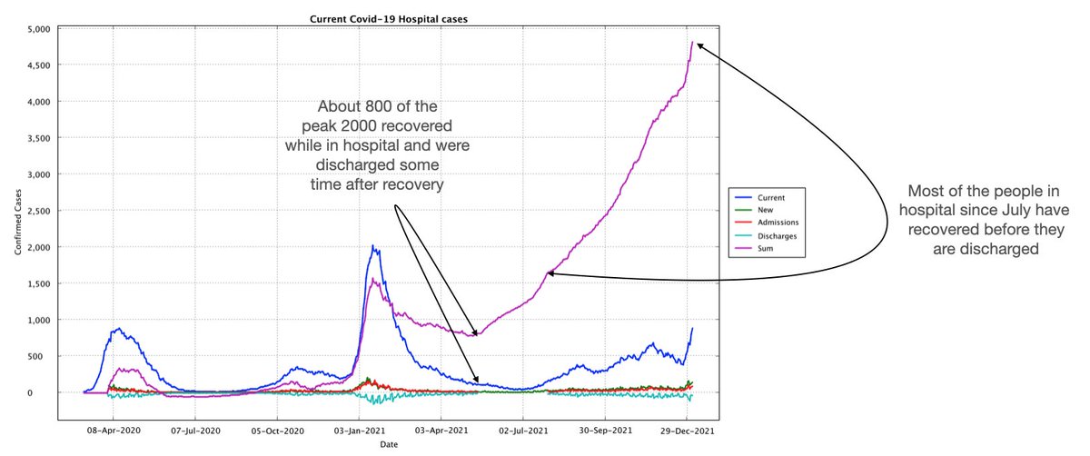
During the Dec 2020-Apr 2021 wave, about 800 people were discharged while still Covid positive. This current wave, however, we have been able to keep those people in hospital after they have recovered from Covid... unclear if that is because Covid was incidental or not...
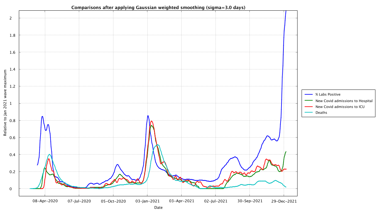
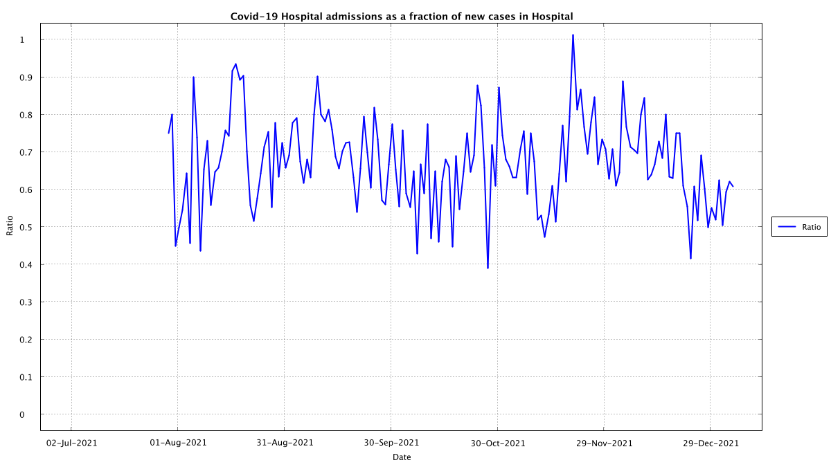
Here's admissions with a confirmed covid positive as a fraction of all new covid positives in hospital, this seems to be running about 70% but has been trending down towards 50% since November
Here's the graph for ICU, which thankfully seems to be trending downward in the current wave and we are less than half the levels we saw during the Dec 2020-April 2021 wave... that would seem to be good news
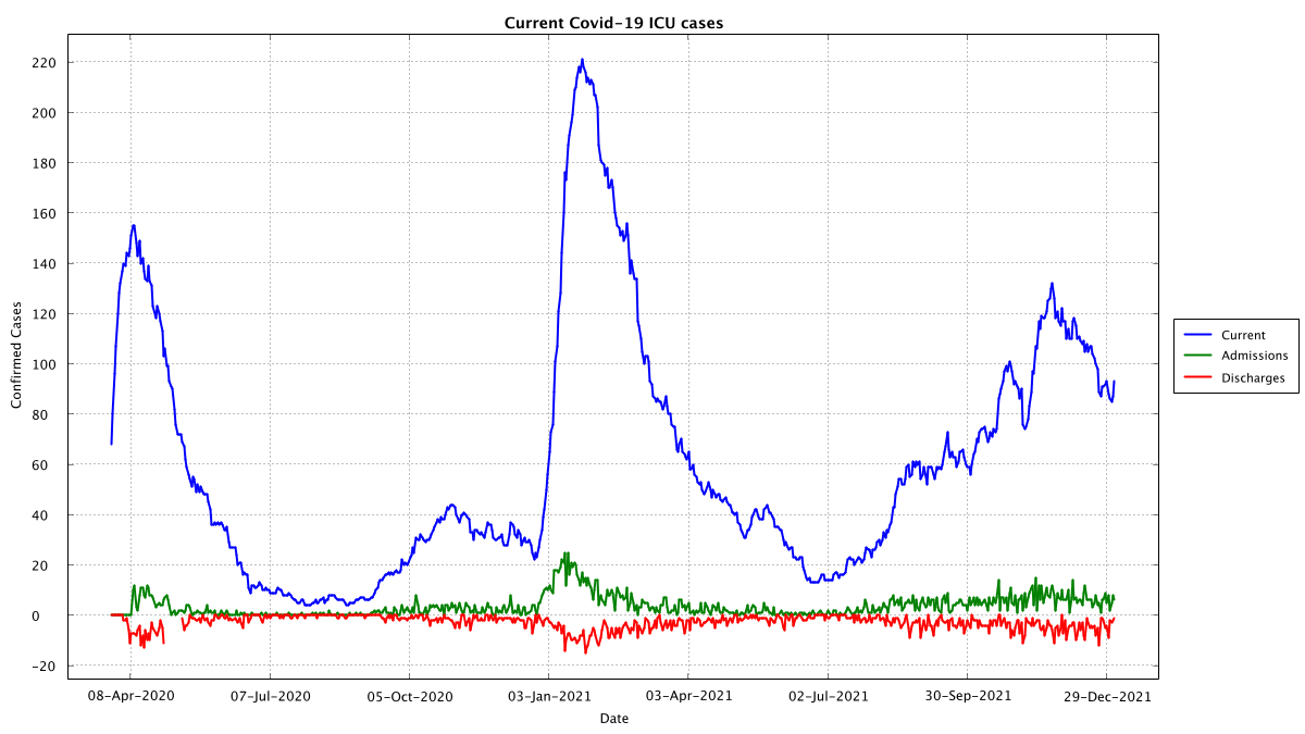
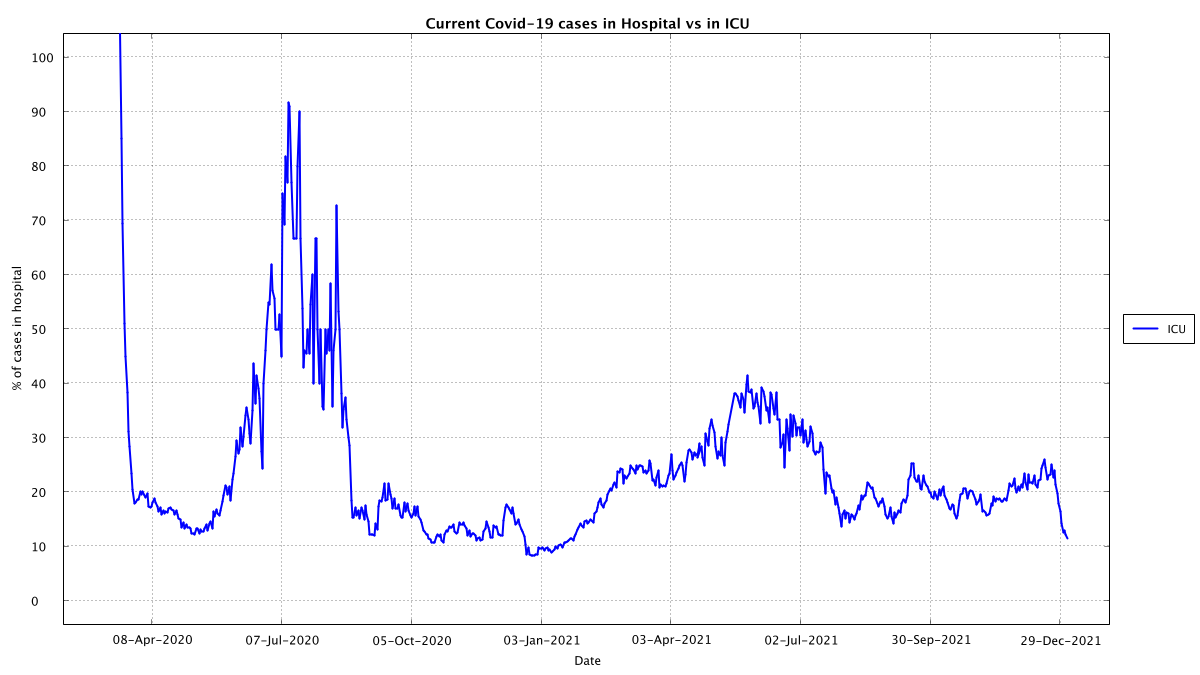
Here's another interesting graph. This is the percentage of hospitalized cases that are in ICU, which seems to have lowered significantly. There could be many reasons but given we have approx 300 ICU beds and only 1/3rd of them are Covid positive, probably not ICU pressure
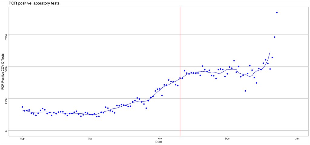
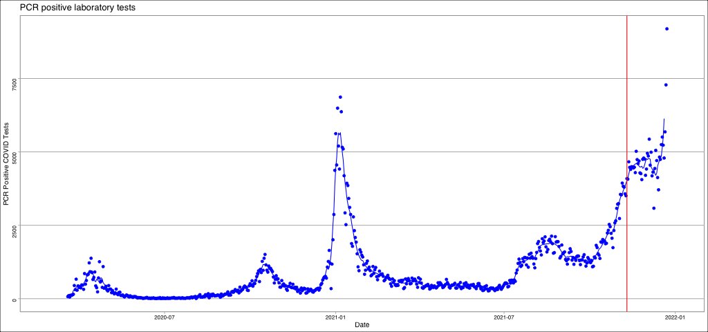
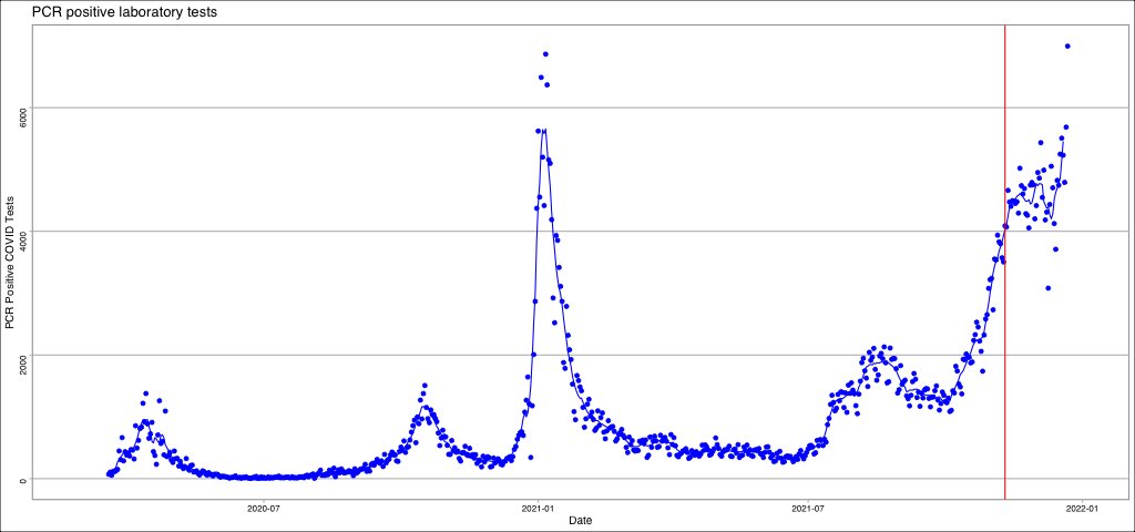
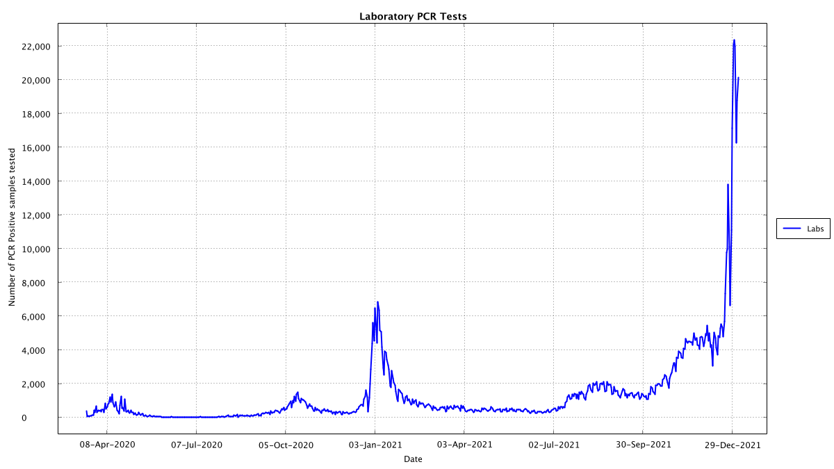
Here's lab positives... today is 20154 on the back of 35402 tests
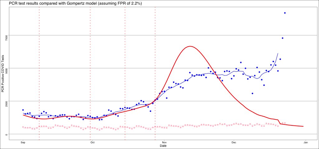
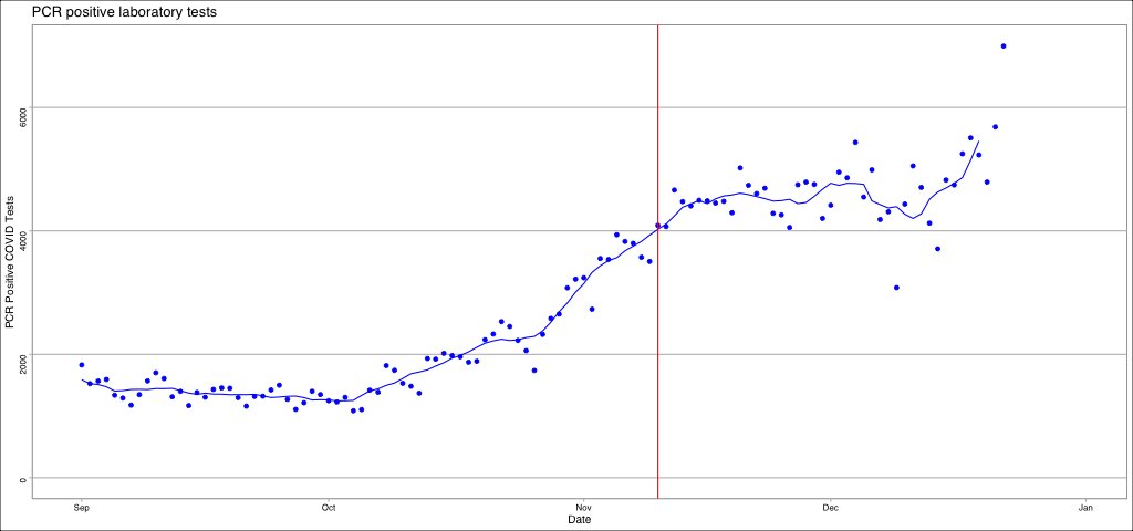
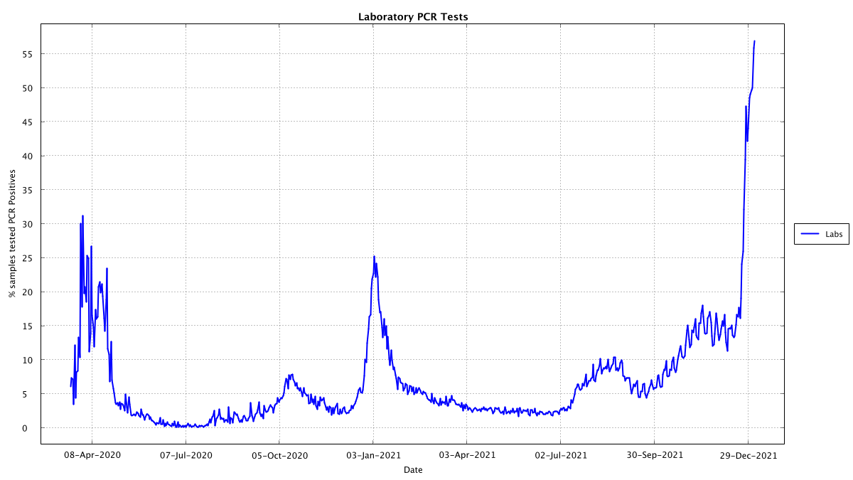
Here is the percentage of tests showing pcr positive. I think this may provide an explanation of the plateau of around 4k positives that we were seeing since Nov 11th... essentially it may just be that the number of tests done exactly rose at a rate to keep positive count at 4k!
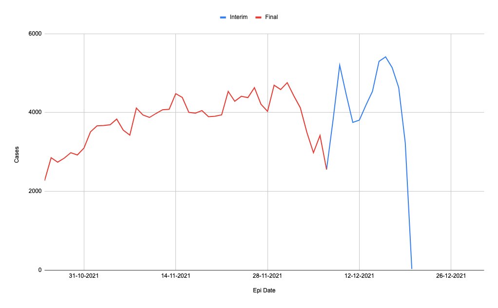
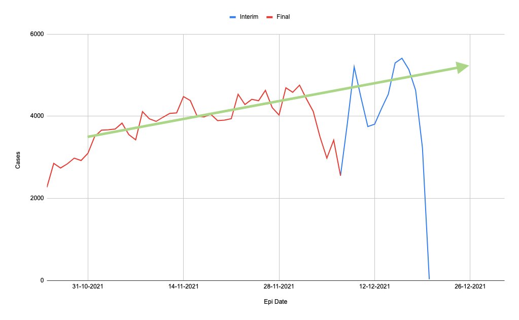
These graphs are setup now to update at 4:10pm every day and you can find them at github.com/stephenc/2021-… which will always have the latest graphs (though it is dependent on how often geohive gets updated)
• • •
Missing some Tweet in this thread? You can try to
force a refresh
Here's animation of all the irish data since the start. The deaths have a minimum Gaussian smoothing of 5 days to correct for the now weekly reporting of deaths since July in case you were wondering why the light blue line starts smooth
Here's the graph with a Gaussian weighted smoothing of 3 days (deaths using 5 days):
* After each wave, we seem to have a raise in the baseline for PCR tests, e.g. in 2020 the baseline was close to 0 (on this scale), in 2021 until July it was 0.1, after july maybe 0.2
* If we assume the baseline has changed then hospital and ICU admissions seem to mirror PCT testing positivity exactly, with just an approximate 9 day lag.
I haven't automated it yet as it likely needs a moving average so that I can include the deaths data... (as deaths are only reported once a week now which makes them look bigger than they are, although here you can see just how comparable they are even if the data is more messy
I should caution that if this year's wave is like last years wave then the hospitalization occupancy peak will be around the 18th/19th of Jan... I'll have to tack a fit onto hospitalization @USMortality@MLevitt_NP2013 as that should allow forecasting I suspect
Ok didn't get to the computer until now. Here's the graphs, I'll try and do an analysis tomorrow as it looks too steep for now to get a reliable fit to predict with @RiochtConor2@RealEddieHobbs
Looking at my previous prediction, this jump is faster than that so I'll need to do a full fit rather than just replay the fit from previous waves. This is either more infectious or has jump started on the back of an existing infection level
Here's the epi-date report, note that by my analysis 2203 of the positives that should be in today's report were missing from the 14 day graph (which probably means they got moved to days earlier than the 8th of Dec)
Ok today's 6994 after yesterday's 5684 does look like the start of something. I'll need another 2-3 days to get a reliable estimate where this is going and when it *should* peak... though I was wrong on the October 22nd->Nov 12th rise so 🤷♂️ @RiochtConor2@RealEddieHobbs
Here's the epi-date data (which is up to yesterday, we'll need to wait for tomorrow to see the effect of today's bumper tests) The second graphs shows the kind of trend we've been tracking, a very slow and steady linear growth of about 25 cases per day on top of a base of 4000
About 2500 cases in the past three epi-date reports were moved to dates before each report's 14 day window, 244 of those cases were for the most recent report published today
Since the 11th of March 2020, every day, almost without fail, my wife has gone to the RTE website and noted down the COVID figures. Finally last night I got her to forward the text file to me and I moved it to a Google Sheet. Here is the link for you. docs.google.com/spreadsheets/d… 1/n
Now there were a few minor issues: 1. She had typed in 186 positives from the German labs on the 11th of April when RTE reported it as 286 2. She had got slightly out of sync between the 18th and 29th of June this year, but I was able to repair the data 2/n
Otherwise, a very interesting data set. We can use this data set to compare with the government's record of COVID cases: covid-19.geohive.ie/datasets/d8eb5… So I imported that into a sheet and compared the two of them. There is a very interesting thing to note, though 3/n
Here is a real world example of why it is important to know what kind of shape an epidemic curve is. I will take Ireland in late 2020 as an example. Some background that is important to know. Late in Dec 2020 Ireland's system for detecting duplicate positives was overloaded 1/n
As a result, the test numbers reported by day were "limited" for a week or so while they scaled up capacity and then worked through the backlog. The backlog was cleared by around Jan 7th. Where exactly this effect kicked in depends on which data set you look at 2/n
I am sad that this happened as it would have been a perfect chance to see if there was any effect of the lockdown that was rolled out from Dec 26th. Anyway just remember the case reporting dates from Dec 20th until Jan 7th were subject to delay 3/n