Here's animation of all the irish data since the start. The deaths have a minimum Gaussian smoothing of 5 days to correct for the now weekly reporting of deaths since July in case you were wondering why the light blue line starts smooth
Here's the graph with a Gaussian weighted smoothing of 3 days (deaths using 5 days):
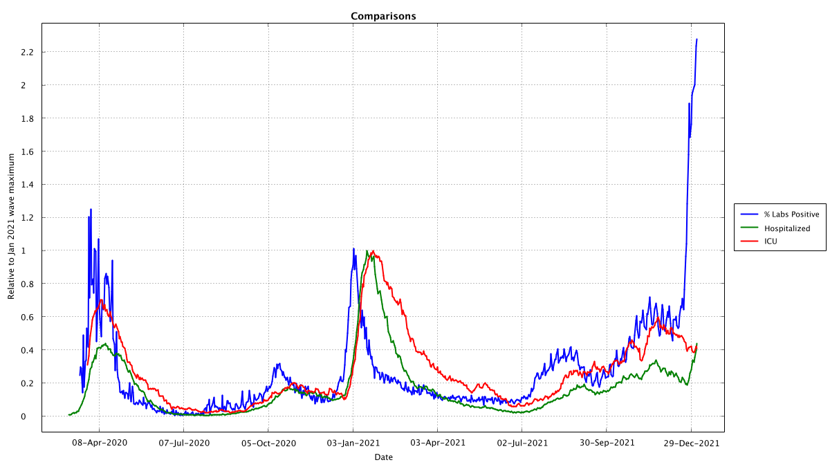
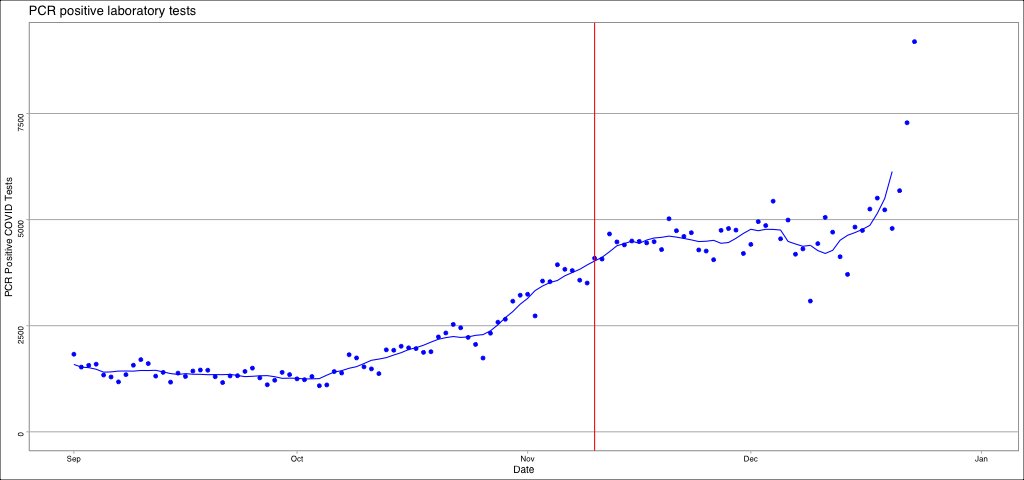
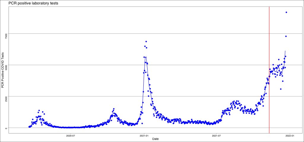
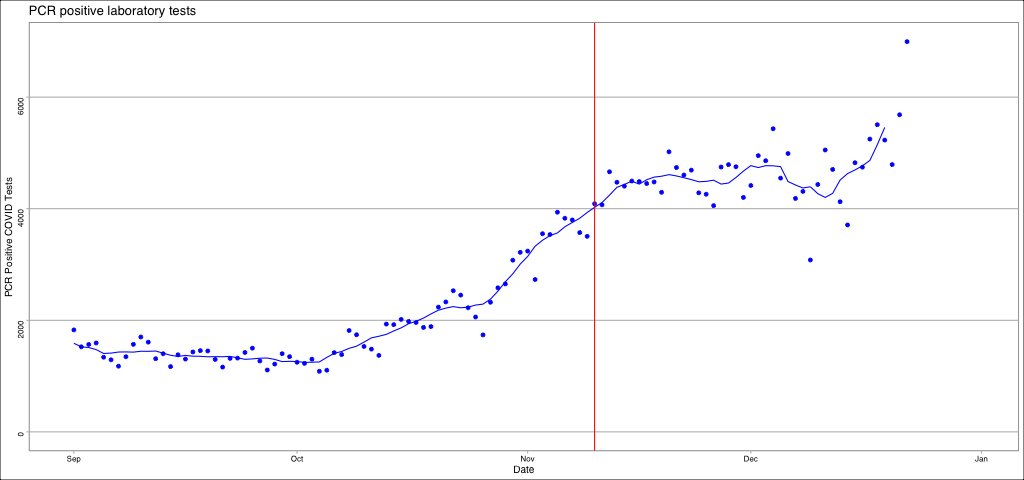
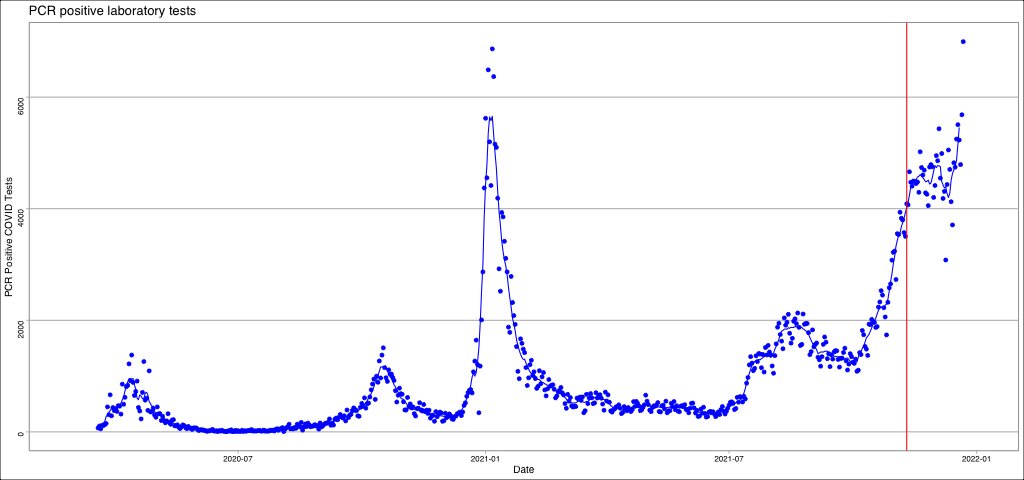
* After each wave, we seem to have a raise in the baseline for PCR tests, e.g. in 2020 the baseline was close to 0 (on this scale), in 2021 until July it was 0.1, after july maybe 0.2
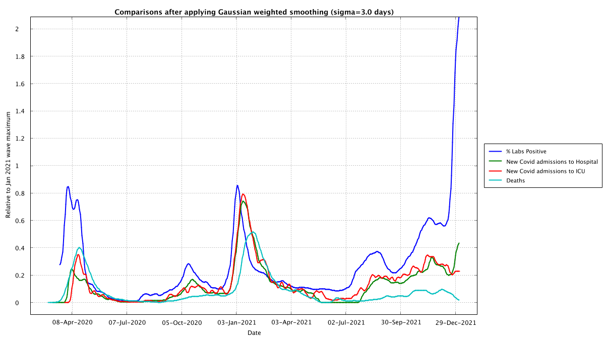
* If we assume the baseline has changed then hospital and ICU admissions seem to mirror PCT testing positivity exactly, with just an approximate 9 day lag.
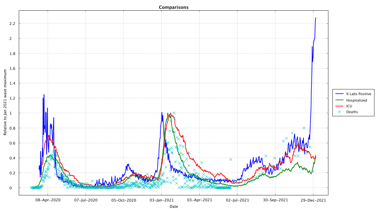
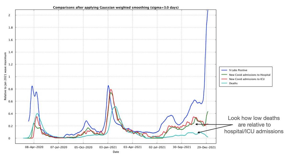
* Deaths for the first wave were at a similar level to hospital/ICU admissions. For the Jan 21 wave they were half. Now they seem to be even lower again.
* This would seem to be a good thing. The root causes are harder to unpick:
- vaccine?
- better treatment?
- more testing?
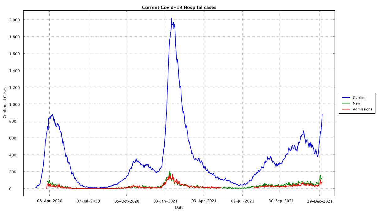
* For the very first wave, we were not testing as many people so there would be expected to be fewer people admitted where their covid status was already known. Now we are testing lots and lots, so a lot more would be expected to be admitted with covid (as distinct to from covid)
* The vaccine is claimed to reduce risks, so that could also explain the lower deaths
* Our medical staff have a lot more experience treating Covid, that has got to have an effect on improving outcomes

In my opinion, it's probably a mixture of effects, but it's good news anyway!
What does all this mean for Ireland?
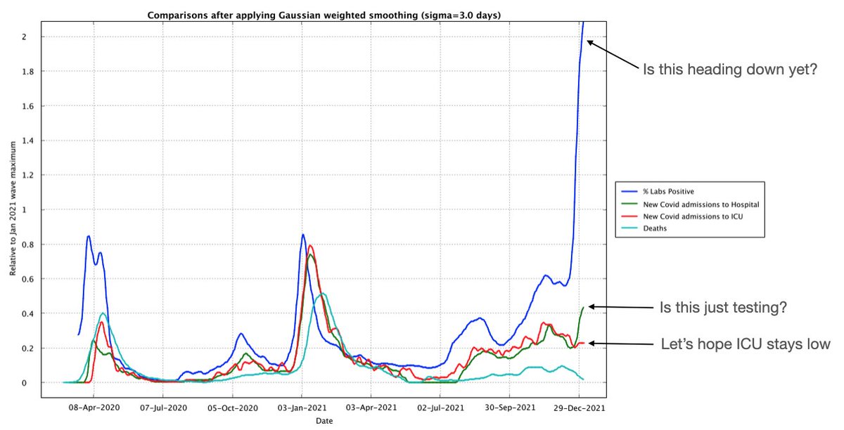
* Well it's unclear if PCR tests have peaked yet
* There may be signs of Hospital Covid admissions rising, but ICU isn't, just a testing side-effect?
* ICU admissions are what lead to deaths, so 🤞 that doesn' trend up
* 🤞 deaths stay low
@RealEddieHobbs @BBN_Ireland @EwanMacKenna @karldeeter @MLevitt_NP2013 @FatEmperor @USMortality @orwell2022 @rtenews @VirginMediaIE @gavreilly @FergalBowers @griptmedia Ok inspired by a tweet I saw from somebody in Israel, here's the same animation but I have shifted the deaths 23 days and the hospital admissions 9 days. The March 202 wave is not aligning probably because of low test capacity, but most of the other peaks align
Static graph for anyone who wants to look at the sigma=3days case
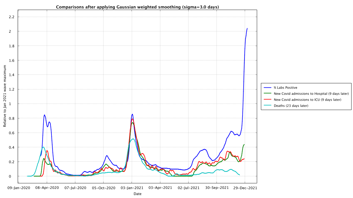
What I like about this is that the peaks are very clearly all the exact same shape and width. Anyone saying there is no relationship needs to craft a very careful explanation and avoid Occam's razor
Having said that, this is need not be a causal relationship, it could just reflect the general population having an incidental infection rate as detected by testing and a certain proportion get admitted to ICU and a certain proportion of those end up dying...
Occam's razor, to my mind though, says that the people who are Covid positive on admission to hospital and go straight to ICU as a Covid admission and then die on the balance of probabilities died from Covid as distinct from with.
Here's the same shifted graph but where I remove the minimum smoothing on deaths... as an animation it works well but for a staic graph you need it to be at least 5 days of a smoothing window

• • •

Missing some Tweet in this thread? You can try to force a refresh
 

Keep Current with 😀 Stephen Connolly

😀 Stephen Connolly Profile picture

Stay in touch and get notified when new unrolls are available from this author!

Read all threads

This Thread may be Removed Anytime!

PDF

Twitter may remove this content at anytime! Save it as PDF for later use!

Try unrolling a thread yourself!

how to unroll video
  1. Follow @ThreadReaderApp to mention us!

  2. From a Twitter thread mention us with a keyword "unroll"
@threadreaderapp unroll

Practice here first or read more on our help page!

More from @connolly_s

4 Jan
Here's an interesting graph @BBN_Ireland @RealEddieHobbs @karldeeter @FatEmperor @EwanMacKenna
I have scaled Lab test positivity rate, hospitalization level and ICU occupancy relative to the Jan 2021 max. This clearly shows the case progression
I haven't automated it yet as it likely needs a moving average so that I can include the deaths data... (as deaths are only reported once a week now which makes them look bigger than they are, although here you can see just how comparable they are even if the data is more messy
I should caution that if this year's wave is like last years wave then the hospitalization occupancy peak will be around the 18th/19th of Jan... I'll have to tack a fit onto hospitalization @USMortality @MLevitt_NP2013 as that should allow forecasting I suspect
Read 4 tweets
4 Jan
Since Conor is gone I thought I'd set up a bot to generate graphs of hospital admissions for Ireland from the Geohive data... so as an FYI wer are still less than half the level of hospitalization at the peak of 2021. Roughly similar to 2020's peak @EwanMacKenna @RealEddieHobbs
If we keep a running total (light blue) of the Covid admissions and discharges we see that the numbers in hospital seem to have about 50% admissions of Covid positive and 50% covid detected post admission, also appears to be some recovery but still in hospital during 2021?
In case it's non-obvious why I'm saying 50% tested positive after admission, it's these Oct 2020 and Jan 2021 differences between the dark blue curve (total in hospital) and the light blue curve (running sum of admissions with Covid minus discharges with Covid)
Read 12 tweets
24 Dec 21
Ok didn't get to the computer until now. Here's the graphs, I'll try and do an analysis tomorrow as it looks too steep for now to get a reliable fit to predict with @RiochtConor2 @RealEddieHobbs
Looking at my previous prediction, this jump is faster than that so I'll need to do a full fit rather than just replay the fit from previous waves. This is either more infectious or has jump started on the back of an existing infection level
Here's the epi-date report, note that by my analysis 2203 of the positives that should be in today's report were missing from the 14 day graph (which probably means they got moved to days earlier than the 8th of Dec)
Read 12 tweets
22 Dec 21
Ok today's 6994 after yesterday's 5684 does look like the start of something. I'll need another 2-3 days to get a reliable estimate where this is going and when it *should* peak... though I was wrong on the October 22nd->Nov 12th rise so 🤷‍♂️ @RiochtConor2 @RealEddieHobbs ImageImage
Here's the epi-date data (which is up to yesterday, we'll need to wait for tomorrow to see the effect of today's bumper tests) The second graphs shows the kind of trend we've been tracking, a very slow and steady linear growth of about 25 cases per day on top of a base of 4000 ImageImage
About 2500 cases in the past three epi-date reports were moved to dates before each report's 14 day window, 244 of those cases were for the most recent report published today Image
Read 8 tweets
22 Nov 21
Since the 11th of March 2020, every day, almost without fail, my wife has gone to the RTE website and noted down the COVID figures. Finally last night I got her to forward the text file to me and I moved it to a Google Sheet. Here is the link for you. docs.google.com/spreadsheets/d… 1/n
Now there were a few minor issues:
1. She had typed in 186 positives from the German labs on the 11th of April when RTE reported it as 286
2. She had got slightly out of sync between the 18th and 29th of June this year, but I was able to repair the data 2/n
Otherwise, a very interesting data set. We can use this data set to compare with the government's record of COVID cases: covid-19.geohive.ie/datasets/d8eb5… So I imported that into a sheet and compared the two of them. There is a very interesting thing to note, though 3/n
Read 27 tweets
6 Nov 21
Here is a real world example of why it is important to know what kind of shape an epidemic curve is. I will take Ireland in late 2020 as an example. Some background that is important to know. Late in Dec 2020 Ireland's system for detecting duplicate positives was overloaded 1/n
As a result, the test numbers reported by day were "limited" for a week or so while they scaled up capacity and then worked through the backlog. The backlog was cleared by around Jan 7th. Where exactly this effect kicked in depends on which data set you look at 2/n
I am sad that this happened as it would have been a perfect chance to see if there was any effect of the lockdown that was rolled out from Dec 26th. Anyway just remember the case reporting dates from Dec 20th until Jan 7th were subject to delay 3/n
Read 23 tweets

Did Thread Reader help you today?

Support us! We are indie developers!


This site is made by just two indie developers on a laptop doing marketing, support and development! Read more about the story.

Become a Premium Member ($3/month or $30/year) and get exclusive features!

Become Premium

Too expensive? Make a small donation by buying us coffee ($5) or help with server cost ($10)

Donate via Paypal

Or Donate anonymously using crypto!

Ethereum

0xfe58350B80634f60Fa6Dc149a72b4DFbc17D341E copy

Bitcoin

3ATGMxNzCUFzxpMCHL5sWSt4DVtS8UqXpi copy

Thank you for your support!

Follow Us on Twitter!

:(