today's disinformation from Ontario Science Table. Local to me, but prob representative of science advice elsewhere. Left- ACTUAL hospitalization data by vax status. Right - hospitalization infographic from Science Table. Look at difference, 

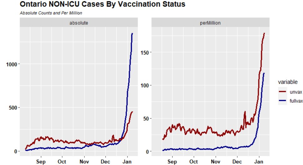
2/ up to mid-Dec, actual COVID hospitalizations were dominantly unvax, with only handful of full_vax. In last 3 weeks, reported hosp'ns exploded, with vast majority being two-plus vax. While unvax proportion is higher, "problem" arises from absolute count. Which is now mostly vax

3/ SciTable infographic implies that onslaught of hospitalizations is coming from unvax, with vax hospitalizations making only a minor contribution. No wonder politicians are demonizing unvax. While unvax "over-contribute", they are not driving the increase. Contrary to SciTable

4/ but, as they say in infomercials, there's more. Below is a comparison of Science Table Per Million Hospitalization graphic to a plot from government data, which shows similar relative increase in unvax and full_vax. Not an explosion of unvax.

5/ the difference in graphics is very relevant to the expected reaction of policy-makers. If increase is similar for vax and unvax, it suggests one sort of policy; if increase is portrayed as driven more or less entirely by unvax, drives policy a different way.

6/ so what accounts for the difference?
I calculated unvax, full_vax (and partial) populations from official case data
data.ontario.ca/dataset/752ce2… which gave both case counts and cases per 100K.
Hospitalizations from
data.ontario.ca/dataset/752ce2…
Routine data analysis to get per million
I calculated unvax, full_vax (and partial) populations from official case data
data.ontario.ca/dataset/752ce2… which gave both case counts and cases per 100K.
Hospitalizations from
data.ontario.ca/dataset/752ce2…
Routine data analysis to get per million
7/ Science Table's calculation appears to do an "age adjusted" comparison. No details are provided on how they did their "age adjustment".
8/ Nor is it clear why "adjusted" per million data is more relevant to policy-makers and public than unadjusted absolute counts - which are what hospitals are actually experiencing.
9/ in Ontario, there is virtually no unvax population among seniors. Full_vax rates among 80+ are 99.99% and from 70-79 are 99.9% at least one, and 98.5% at least two. To get to their "age adjusted" comparison, my guess is that SciTable uses a MODEL containing unvax seniors
10/ and in this model population with unvax seniors, they calculate much higher "age adjusted" hospitalizations of unvax than actually observed. Given that virtually all seniors are fully vaccinated, this is an irrelevant calculation for policy-makers.
11/ maybe such a calculation has a purpose when arguing with an ultra-dogmatic vaccine skeptic, but it is not relevant to a government trying to manage hospitals.
12/ Science Table "infographic" on cases implies to policymakers tht new unvax cases exceed new fully-vax cases. In actual count, fully vax currently make up 85% from this pairing. Very different from 6 weeks ago. Sleight-of-hand is part use of relative data and part "adjustment"

13/ Left - absolute case data, middle - per million; right - SciTable "adjusted" per million.
5.8 times as many full-vax cases as unvax cases today (vs 4.4 times as many full-vax to unvax.) Before adjustment, full-vax case rate higher than unvax; reversed after adjustment
5.8 times as many full-vax cases as unvax cases today (vs 4.4 times as many full-vax to unvax.) Before adjustment, full-vax case rate higher than unvax; reversed after adjustment

14/ both manipulations matter. For policy purposes, selection and exclusive use of relative data WITHOUT also showing absolute data contributes majority of false impression that unvax are the "problem". It would be simpler if that was true. But "adjustment" is sneaky as well.
15/ here's a smaller detail of adjustment impact. Notice the closing uptick in SciTable graphic for unvax cases per MM, whereas actual data peaked about 10 days ago. Michael Mann's "Nature trick" (climate readers will understand) also obtained uptick when data had slight downtick

16/ there's another big issue with SciTable's mysterious "age adjustment" to case data. We KNOW that COVID impact on different age groups is very different. SciTable purported to make "age adjusted" average. But why not look first or accompanied by data for individual age groups:

17/ for example, for the 18-39yrs age group, full vax case infection rates are higher than for unvax. Even SciTable's "age adjustment" can't undo this. This changed VERY quickly with Omicron. Prior views are obsolete.

18/ here's another figure comparing SciTable "adjusted" infographic of cases per MM to corresponding figure for 12-17,18-39 and 40-59. Ie age groups most impacted by mandates. In all three agegroups, full_vax case rates skyrocketed in mid-Dec and now exceed unvax case rates.

19/ to the extent that mandate argument is premised on premise that Pfizer vaccines limited spread of disease in persons in workplace, it may well have been true with Delta and COVID Classic, but it is NOT true with Omicron. They're fighting the last war, not the present one.
20/ graphic also raises questions about how SciTable "adjustment" functions. Because full-vax case rates presently exceed unvax case rates in all age groups from 12-60 (majority of population), there needs to be massive opposite surplus in other age groups.
Mail-in COVID maybe?
Mail-in COVID maybe?

21/ it seems that New York City also published
https://twitter.com/cliffordlevy/status/1480184928054779905a chart interpreted to show that increased Omicron hospitalizations due to huge impact on unvax. There are three tricks here.

22/ two of the tricks we've discussed already for Ontario a) questionable age adjustment that reverses relative order of unvax and full vax rates; b) use of per million data when relative population of vax is many times population of unvax.
Third: note the ending date
Third: note the ending date
23/ in Ontario, the impact of Omicron has taken place between Dec 20 and the present. It reversed previous patterns. Amazingly quickly.
The NYC plot shown above ends on Dec 18. It's TOTALLY irrelevant to analysis of Omicron.
The NYC plot shown above ends on Dec 18. It's TOTALLY irrelevant to analysis of Omicron.
24/ AOC is an example of the very large class of fully vax people who are catching COVID in greater proportion than unvax.
News release was before "age adjustment". Whether AOC had age-adjusted COVID is not decided. CDC is waiting for mail-in COVID samples before final result
News release was before "age adjustment". Whether AOC had age-adjusted COVID is not decided. CDC is waiting for mail-in COVID samples before final result

New York City data coronavirus.health.ny.gov/covid-19-break… here is more up-to-date and indicates very different pattern than Ontario - in NYC, case protection is said to remain high for vaxed.
• • •
Missing some Tweet in this thread? You can try to
force a refresh