in response to recent threads in which I showed actual vax and unvax case counts (not just per million), I've been abused by many commenters for my supposed failure to understand "data science 101" - that ONLY per million matters and only a moron would look at counts.
2/ I suspect that most of the abusive commenters are much younger than me and thus fail to consider why actual counts of fully-vax cases are of particular concern to someone who is fully vax and in a vulnerable age group (like me.)
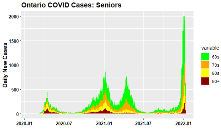
3/ Nearly every 80+ and 70+ in Ontario was fully vax in Dec; yet there was unprecedented explosion of cases among seniors in mid-Dec. This is NOT due to almost non-existent unvax seniors. I wish it were. Yes, the few unvax are at more risk. But they arent causing senior caseload
4/ while there is always much publicity whenever a young person dies of COVID, nearly all COVID deaths come from seniors. Similarly with ICU occupancy, though it is skewed somewhat younger.
5/ So the increase in senior COVID cases is a metric that is very policy relevant, given the ostensible concern about ICU crowding and deaths.
6/ complicating analysis in Ontario is that, despite Omicron publicity, there appears to have a Delta sub-wave, which, through December 25, had caused nearly ALL severe results, despite as much or more Omicron cases. An excellent study by Ontario govt:
publichealthontario.ca/-/media/docume…
7/ this careful and professional study by Ontario govt ministry has received far less attention than COVID doomcasting from Science Table academics. Fortunately @rupasubramanya wrote excellent article in National Post nationalpost.com/opinion/rupa-s…
8/ @rupasubramanya noted that ICUs in UK were not being stressed - even slightly - by Omicron, despite case levels per capita that were up to 4 times higher than in Ontario. So why were Ontario ICUs under stress not being experienced in UK? A question relevant to some US states.
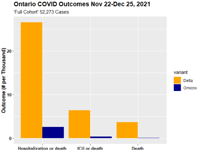
9/ she found answer on Table 1 of the Ontario govt study mentioned above. It examined 52,273 cases between Nov 22 and Dec 25, 2021 (22679 Delta; 29594 Omicron). This was more than 50% of all cases in that period. I'm interested for now in "full cohort" comparison.
10/ Now look at the reported outcomes: hospitalizations, ICU and deaths were 10x, 28x and 36x more prevalent with Delta than Omicron in the "full cohort". These ratios were much reduced in the "matched" cohort, but still ranged from 3-7x.
11/ another important observation in technical article (not specifically discussed in Nat Post article): unvax constituted 13.5% of Omicron cohort (close to their proportion of Ontario adults) but 45.2% of the Delta cohort.
12/ there's lots to digest here. The situation has changed dramatically over past three weeks. This study only gets a first glimpse of the present wave. Without similar data up to date, we don't know whether present ICU pressure is due to continuation of a Delta sub-wave
13/ Delta sub-wave, or whether it's due to greater virulence of omicron than observed in this study (and in other jurisdictions.)
13/ here's a simple bar chart illustrating the difference in severe outcomes between Delta and Omicron in full cohort in Ontario study. Outcome expressed as # per thousand cases.
14/ this shows distributions of Delta and Omicron cases Nov 22-Dec 25 by vax status, relative to vax status of adult population. Omicron distribution fairly close to population dist'n (i.e. little case protection), but significant case protection against Delta.

• • •

Missing some Tweet in this thread? You can try to force a refresh
 

Keep Current with Stephen McIntyre

Stephen McIntyre Profile picture

Stay in touch and get notified when new unrolls are available from this author!

Read all threads

This Thread may be Removed Anytime!

PDF

Twitter may remove this content at anytime! Save it as PDF for later use!

Try unrolling a thread yourself!

how to unroll video
  1. Follow @ThreadReaderApp to mention us!

  2. From a Twitter thread mention us with a keyword "unroll"
@threadreaderapp unroll

Practice here first or read more on our help page!

More from @ClimateAudit

11 Jan
the actual operating problem for Ontario govt - what puts pressure on hospitals and ICUs - is most likely the dramatic resurgence of cases among Ontario seniors, even including 99.99% fully-vax 80+s.
2/ it is well known that hospitalization and ICU rates for senior COVID cases are FAR higher than younger cohorts. In Toronto, where fine-grained data is available, 34% of cases among 80-90s are hospitalized; 25% of cases among 70-79s hospitalized, 5.8% into ICU
3/ in November, the priority of federal government and Science Table appears to have been vaccinating 5-11 year olds, as opposed to boosting seniors. "Younger" seniors (60s and 70s) mostly wer not eligible for boosters until December due to 6-month federal regulation.
Read 4 tweets
10 Jan
today's Ontario cases are down almost 50% from Jan 1 max. Fully-vax cases accounted for ~85% of all cases; on a per million basis, fully vax cases still are higher than unvax cases. SciTable shows increasing cases, with "adjusted" unvax cases exceeding vax cases on per MM basis.
2/ here is today's NON-ICU hospitalizations, absolute and per million, by status. About 75% of non-ICU hospitalizations are full vax, flipping ratio that applied earlier in pandemic. Relative unvax rates remain higher.
3/ to estimate "excess" unvax non-ICU occupancy, I calculated what non-ICU numbers for unvax "should have been" if they had same relative occupancy as full-vax. It was ~100 extra for most of 2021, now ~150. This is 8% of present 1925 non-ICU occupancy.
Read 15 tweets
9 Jan
today's disinformation from Ontario Science Table. Local to me, but prob representative of science advice elsewhere. Left- ACTUAL hospitalization data by vax status. Right - hospitalization infographic from Science Table. Look at difference,
2/ up to mid-Dec, actual COVID hospitalizations were dominantly unvax, with only handful of full_vax. In last 3 weeks, reported hosp'ns exploded, with vast majority being two-plus vax. While unvax proportion is higher, "problem" arises from absolute count. Which is now mostly vax
3/ SciTable infographic implies that onslaught of hospitalizations is coming from unvax, with vax hospitalizations making only a minor contribution. No wonder politicians are demonizing unvax. While unvax "over-contribute", they are not driving the increase. Contrary to SciTable
Read 25 tweets
8 Jan
Here's a startling graph illustrating a point that people are beginning to talk about, but not visualizing well. And showing that concepts from 6 weeks ago aren't applying. Changes in ratio of new cases PER 100K of fully vax to unvax. Image
data is from Ontario, but it sounds like US experience is at least directionally similar. Vaccines were doing excellent (even if not perfect) job against cases, not just against ICU and hospitalization. In midDecember, with arrival of omicron, advantage disappeared, then reversed Image
the erosion of relative advantage of fully vax to unvax in respect to non-ICU hospitalization also began in mid-December, eroding rapidly. Opinions based on data prior to mid-December are no longer valid. Image
Read 19 tweets
7 Jan
To give perspective on difficulties for policy-makers, this graph shows the ratio of full vax non-ICU hospitalizations per MM to unvax non-ICU hospitalizations. Very very rapid erosion of advantage.

Nothing in SciTable Dec 16 briefing even hints at such a possibility.
SciTable and other perpetual government critics like to claim that if only govt had listened to them, none of this would have happened. Then Trudeau and others blame unvax for tribulations.
I'm pro-vax, but the problem that govt is facing right now isnt from the unvax, but from infections and hospitalizations among the fully vax as relative protection of fully vax has eroded.
Read 6 tweets
7 Jan
Three weeks ago, Ontario Science Table covid19-sciencetable.ca/wp-content/upl… challenged claims of lower Omicron severity using data from Gauteng (population 15 MM) shown below.

SciTable are supposed to be non-partisan SCIENCE advisors.
here's a comparison of actual Gauteng data up to Dec 16 (github.com/dsfsi/covid19z…). The boxes on right correspond to the excerpts shown in the SciTable figure. In full context, data shows exactly the opposite of SciTable claim. ICU and deaths had risen FAR less than previous waves
if the entire data for pandemic had been shown, together with corresponding case data, Ontario politicians and policy-makers would probably have drawn logical conclusion: that data showed Omicron as less severe. But SciTable didn't show them the full story.
Read 6 tweets

Did Thread Reader help you today?

Support us! We are indie developers!


This site is made by just two indie developers on a laptop doing marketing, support and development! Read more about the story.

Become a Premium Member ($3/month or $30/year) and get exclusive features!

Become Premium

Too expensive? Make a small donation by buying us coffee ($5) or help with server cost ($10)

Donate via Paypal

Or Donate anonymously using crypto!

Ethereum

0xfe58350B80634f60Fa6Dc149a72b4DFbc17D341E copy

Bitcoin

3ATGMxNzCUFzxpMCHL5sWSt4DVtS8UqXpi copy

Thank you for your support!

Follow Us on Twitter!

:(