1/7
I typically do not get into the weeds with short term outlooks. But in this 🧵I will make an exception.
I see the SPX at an inflection point, right here. If the trend is still up; the decline stops NOW.
If not, the next break marks a full-blown bear market.
I typically do not get into the weeds with short term outlooks. But in this 🧵I will make an exception.
I see the SPX at an inflection point, right here. If the trend is still up; the decline stops NOW.
If not, the next break marks a full-blown bear market.
2/7
In the last 48-hours, we are finally starting to see a bond "risk-off" rally.
Since Wednesday peak at 1.90%, the 10-year yield is down 16 basis points (chart).
The 2-year (not shown) traded down less, just 6 bps and the yield curve is flattening again, back to 74 bps.
In the last 48-hours, we are finally starting to see a bond "risk-off" rally.
Since Wednesday peak at 1.90%, the 10-year yield is down 16 basis points (chart).
The 2-year (not shown) traded down less, just 6 bps and the yield curve is flattening again, back to 74 bps.

3/7
I take this as a signal that now the bond market is getting "worried" about the stock market, so a risk-off bond rally is underway.
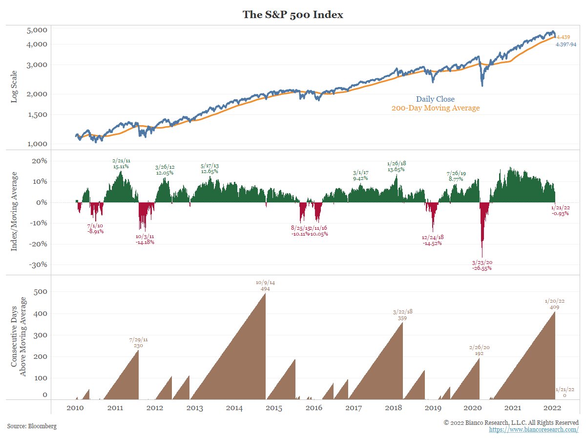
So, we have arrived at an inflection point, which coincides with the SPX breaking the 200d MA for the first time in 409 days
I take this as a signal that now the bond market is getting "worried" about the stock market, so a risk-off bond rally is underway.
So, we have arrived at an inflection point, which coincides with the SPX breaking the 200d MA for the first time in 409 days
5/7
If stocks are still in a bull market, when the bond risk-off rally emerges, that is the end of the stock market decline. It should be over now.
The story is fund managers are correct and the Fed does less than the market has prices in (4+ hikes into Spring 2023 and QT).
If stocks are still in a bull market, when the bond risk-off rally emerges, that is the end of the stock market decline. It should be over now.
The story is fund managers are correct and the Fed does less than the market has prices in (4+ hikes into Spring 2023 and QT).
6/7
If this is a new bear market, the bond risk off rally means this are about to get really ugly and a full-blown equity bear (<-20%) is underway.
If so, the Fed is about to unleash tightening to stop inflation, and if that means sacrificing the stock market, then so be it.
If this is a new bear market, the bond risk off rally means this are about to get really ugly and a full-blown equity bear (<-20%) is underway.
If so, the Fed is about to unleash tightening to stop inflation, and if that means sacrificing the stock market, then so be it.
7/7
I think the Fed is going to get really aggressive (enormous political pressure, Biden told us he approved them tightening!)
So instead of siding with the bears, now that we are at this inflection point, let the market tell me what's coming next.
I think the Fed is going to get really aggressive (enormous political pressure, Biden told us he approved them tightening!)
So instead of siding with the bears, now that we are at this inflection point, let the market tell me what's coming next.
https://twitter.com/BloombergTV/status/1483920422915784705?s=20
• • •
Missing some Tweet in this thread? You can try to
force a refresh