
SMC - 1
As promised I will share some general ideas about SMART-MONEY CONCEPTS, consider this as the first installment of that.
In this, I will discuss the following
⚡How to assess the HTF structure?
⚡How to develop a directional bias?
⚡How to refine your entry-exits?
As promised I will share some general ideas about SMART-MONEY CONCEPTS, consider this as the first installment of that.
In this, I will discuss the following
⚡How to assess the HTF structure?
⚡How to develop a directional bias?
⚡How to refine your entry-exits?

The simplest form of doing trades based on trend alignment is to decide and stick to the decided TIME FRAME.
For Eg.
For deciding HTF structure - Check 1 Hour chart
For developing directional bias - Check 15 Min chart
For refining your entry - exits - Check 5 Min chart
For Eg.
For deciding HTF structure - Check 1 Hour chart
For developing directional bias - Check 15 Min chart
For refining your entry - exits - Check 5 Min chart
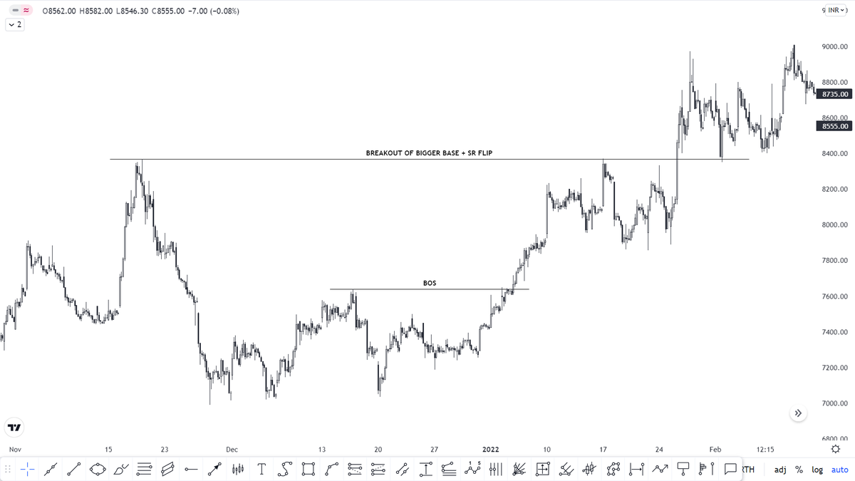
On this H1 chart, it is evident that the stock is breaking out of multiple bases and is holding above the key SR flip level. So far things are looking bullish. So what we should do is mark out the key levels and zones on the H1 chart to get a better view
Cont..
Cont..
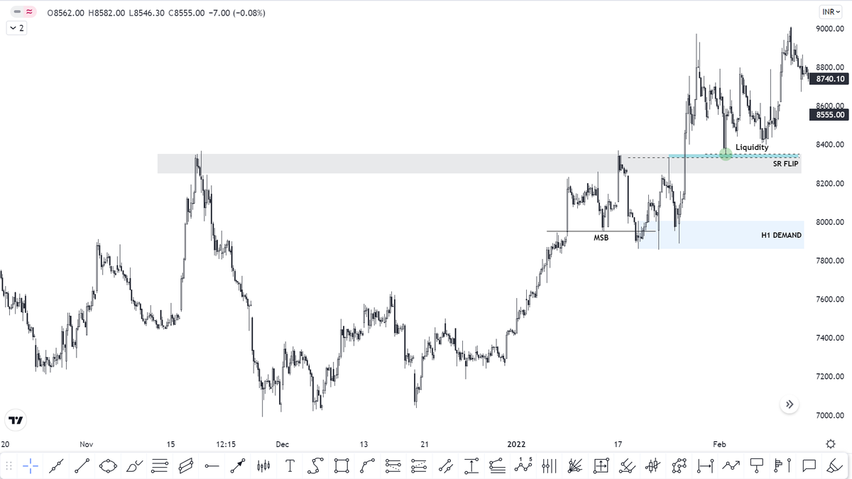
On this chart, we can see the following aspects
⚡A significant SR FLIP zone which has led to even break in structure and tested multiple times
⚡A swing low below which there is a good amount of liquidity (green dot)
⚡A liquidity gap lying just below the swing low (blue box)
⚡A significant SR FLIP zone which has led to even break in structure and tested multiple times
⚡A swing low below which there is a good amount of liquidity (green dot)
⚡A liquidity gap lying just below the swing low (blue box)
⚡A significant demand zone which has led to a break in market structure on the upside
Now we go down to the M15 chart to get a confluence because when H1 is bullish we need M15 to also show the same then only we can take LONG trades on M5
On M15 the same is getting reflected
Now we go down to the M15 chart to get a confluence because when H1 is bullish we need M15 to also show the same then only we can take LONG trades on M5
On M15 the same is getting reflected
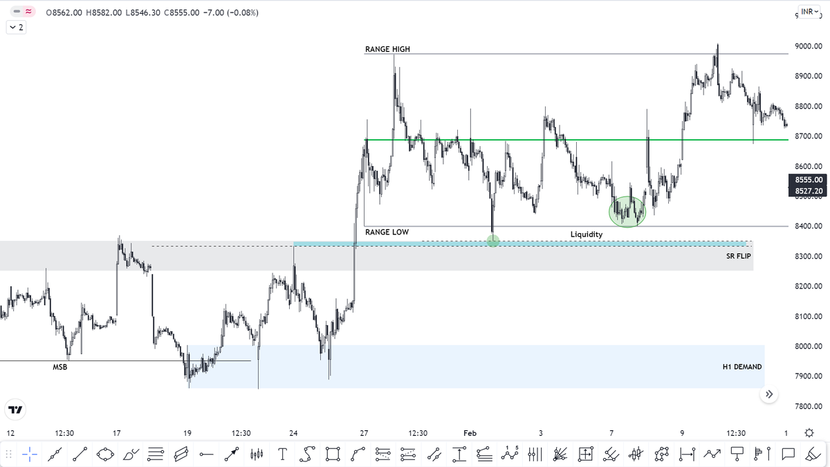
On M15 the range is visible in a much better manner, so it also plotted
It is also evident from M15 that it is prudent to buy from the demand zone rather than looking for shorts in form of scalps
If you are interested in knowing 'WHY I HAVE PLOTTED A GREEN CIRCLE?'
Read On..
It is also evident from M15 that it is prudent to buy from the demand zone rather than looking for shorts in form of scalps
If you are interested in knowing 'WHY I HAVE PLOTTED A GREEN CIRCLE?'
Read On..
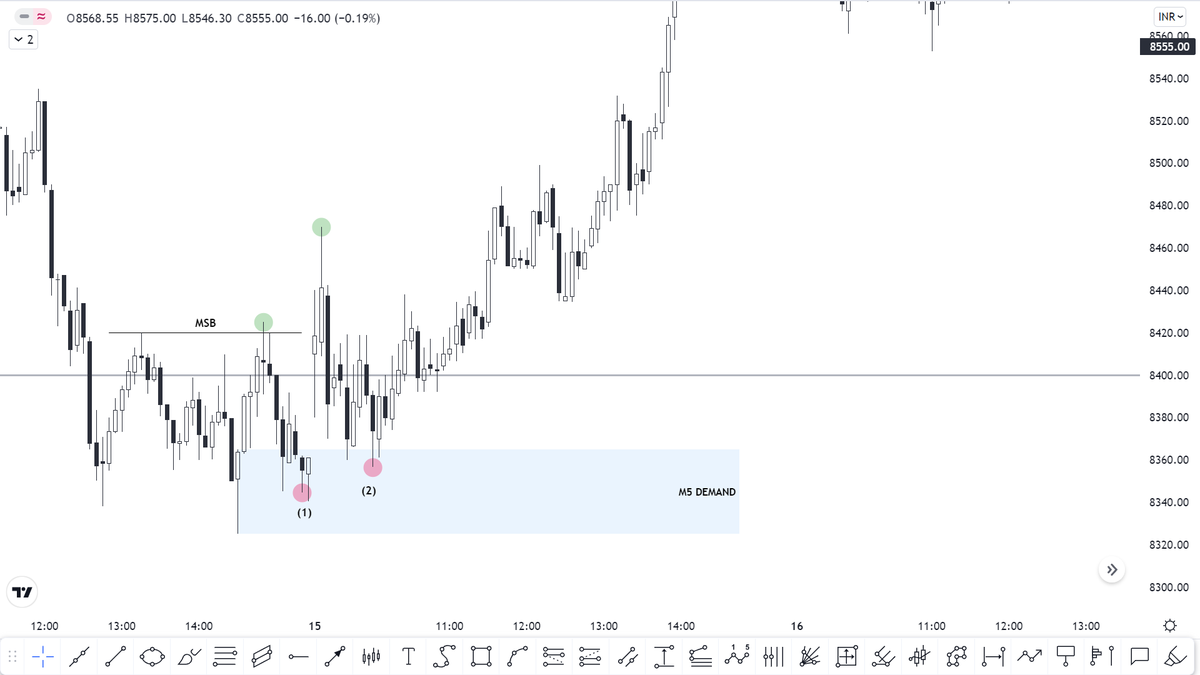
On M5 I have separated the trading day with a purple vertical line. So here the stock does the following
⚡Breaks the 'Market Structure'
⚡Falls back into the demand zone
🟢GREEN SIGNAL TO GO LONG
Now let's understand these👆
⚡Breaks the 'Market Structure'
⚡Falls back into the demand zone
🟢GREEN SIGNAL TO GO LONG
Now let's understand these👆
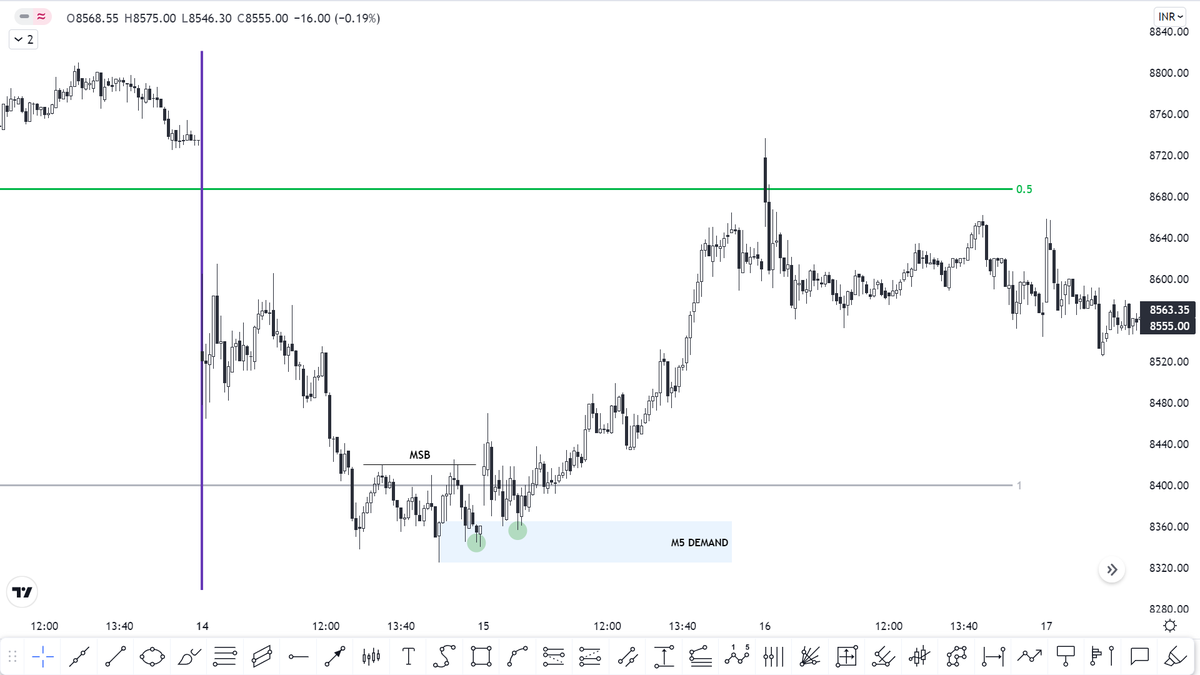
⚡The reason why I have not marked any demand zone in that green circle zone is that under it there is liquidity and there are good chances that the liquidity will be taken off
⚡The reason why demand zone is marked out on M5 below the range is one there is liquidity (swing low)
⚡The reason why demand zone is marked out on M5 below the range is one there is liquidity (swing low)
and second, there is a liquidity gap is required to be filled
So what I was looking for
Liquidity Grab + Liquidity Fill → Formation Demand Zone → Tap into the Demand Zone = LONG
So what I was looking for
Liquidity Grab + Liquidity Fill → Formation Demand Zone → Tap into the Demand Zone = LONG
There is one more thing which you should not miss out is, everything is happening above the SR FLIP ZONE
NOTE THIS👇
⚡Consider only that DEMAND ZONE / OB which leads to a break in market structure (MSB)
⚡Trades should be taken during the first/second test of the zone
NOTE THIS👇
⚡Consider only that DEMAND ZONE / OB which leads to a break in market structure (MSB)
⚡Trades should be taken during the first/second test of the zone
Now there are many aspects which are required to be discussed
⚡Zones / OB
⚡Liquidity
⚡Ranges
⚡Equilibrium...
which I will discuss in the upcoming parts seeing the response on this thread
If found interesting 'LIKE' and 'RETWEET'
⚡Zones / OB
⚡Liquidity
⚡Ranges
⚡Equilibrium...
which I will discuss in the upcoming parts seeing the response on this thread
If found interesting 'LIKE' and 'RETWEET'
• • •
Missing some Tweet in this thread? You can try to
force a refresh


