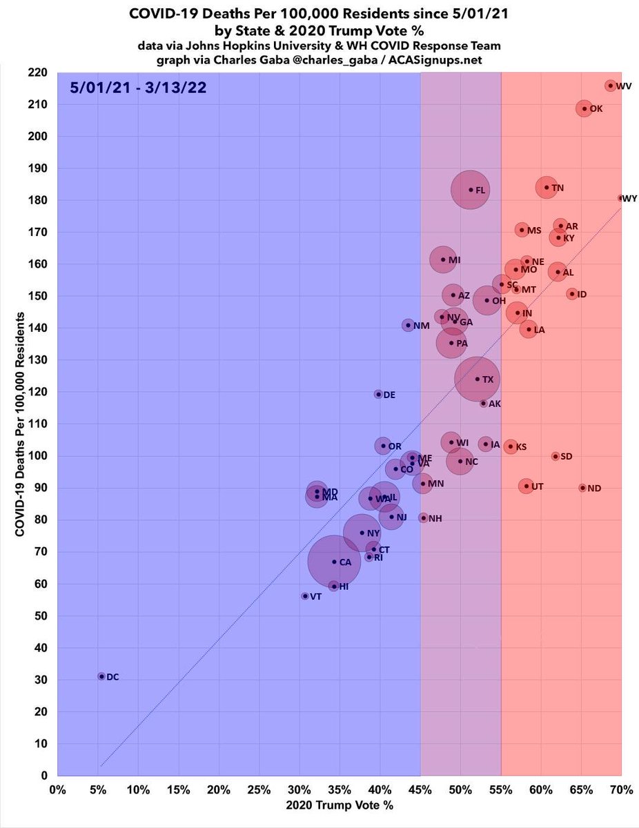
Of all the graphs & charts I've done over the past couple of years, this one includes the single eeriest coincidental data point.
(By “coincidental” I don’t mean the overall pattern, I mean the fact that the crossover happened on that EXACT date as opposed to a week or two earlier or later.)
The crossover date does shift around a bit if you use the reddest/bluest 20% or 30%, but at 10%, which is what I’ve been using in a lot of my work, it’s right on the nose.
For those wondering, on 1/20/21, the official cumulative COVID death rate in both the reddest and bluest tenths of the U.S. was right around 138.4 per 100K residents (roughly 45,800 apiece).
And yes, the exact date itself is a coincidence—the narrowing trend clearly started around mid-July 2020 as the blue urban centers had gotten things under control while the red rural areas weren’t doing much of anything and Trump was holding his massive superspreader rallies.
NOTE: This is kind of blowing up; I'll be posting a blog entry about it in a little bit with full sources/methodology etc...
It's also worth noting just how wide the urban/rural divide is politically: There's as many people living in the 63 bluest counties of the U.S. as there are in the 1,341 reddest counties.
UPDATE: As noted upthread, the Inauguration Day timing is indeed just a weird coincidence; if you use the reddest/bluest 20% the "crossover" date is 3 weeks later, and if you use the reddest/bluest 30% the lines cross 2 months *earlier*, in mid-November:
Remember when I pointed this out and got a bunch of backlash from people upset that I didn’t adjust for race even though that doesn’t change the fact that a shitload of white people are dying of their own stubbornness?
As I said at the time, “adjusting for race” IS important when trying to liking at inequity and deciding where to focus resources. Native Americans, for instance, are still dying of COVID at a disproportionately high rate relative to their share of the population. HOWEVER…
…pretending that the WHITE death rate hasn’t increased relative to ITS population just because it’s still *below* its proportion of the total population doesn’t stop it from being true, and those dying still won’t be able to vote in future elections no matter how you adjust it.
Many people have asked me why the Biden Admin didn’t move on this LAST year. There’s two reasons I can think of: First, the process is a long & convoluted one; it might simply have taken a full year to get to this point. 1/
The other is more pragmatic: They were hoping to have #BuildBackBetter passed and signed into law by now. The CBO score *without* the family glitch will likely be billions of dollars higher than with it still in place. They might’ve been hoping to lock in ARP legislatively first.
With the #FamilyGlitch fixed, up to 5.1 million more Americans would become eligible for #ACA subsidies. Assuming half of them took this up, that’d increase enrollment by another ~18% or so. CBO scored permanent ARP subsidies at ~$220B over a decade, so that’d go up ~$40B or so.
📣 On anniversary of the #ARP, Biden-Harris Admin highlights health insurance subsidies that promoted critical increases in enrollment & savings: acasignups.net/22/03/11/durin…
📣 REMINDER: Thanks to the enhanced financial subsidies, increased outreach, expanded assister resources and the elimination of the dreaded #SubsidyCliff, a record-breaking *15.5 MILLION* Americans enrolled in TRULY affordable #ACA coverage for 2022.
📣 #ACA enrollment increased by 21% y/y nationally. It's up across 47 states, with 16 states seeing enrollment increase by 25% or more, and some going up by as much as a whopping 42%!
Millions of #ACA enrollees are saving an average of $800 apiece this year thanks to the #ARP.
~15K miles x ~331M people = ~5 trillion miles/yr driven nationally.
My Kia Niro EV, which is pretty typical of 2022 EVs I believe, gets ~250 miles/charge on a 64 kWH battery.
5T miles / 250 = ~20 billion full charges.
20B x 64 kWH = ~1.3 trillion kWH, or ~1.3B MWh per year. 2/
via the U.S. EIA, the *smallest* nuclear power plant in the U.S. produced 4,727,764 MWh in 2021.
It would take around 275 *small* nuclear power plants to produce enough electricity to power every EV assuming all 331M Americans used them. 3/ eia.gov/tools/faqs/faq…