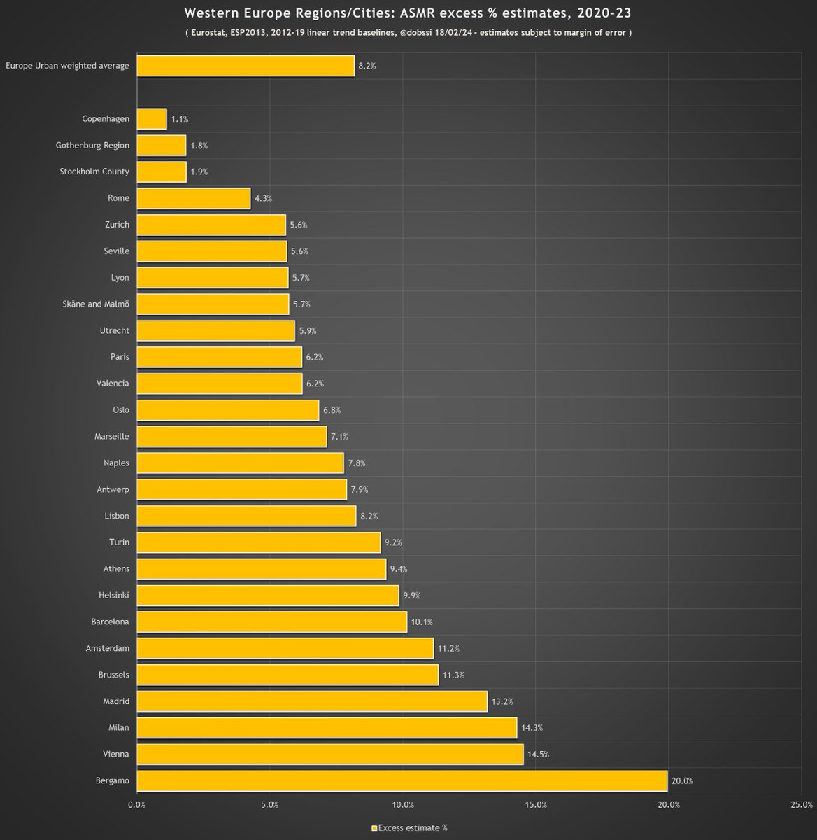
My pandemic excess mortality estimate update, age standardised using 5, 7 and 8 year linear trend baselines.
#NewZealand and #Denmark the clear winners so far. #Sweden clearly establishing as next best....at least in Europe anyway.
1/
Data from @HMDatabase and @EU_Eurostat.
#NewZealand and #Denmark the clear winners so far. #Sweden clearly establishing as next best....at least in Europe anyway.
1/
Data from @HMDatabase and @EU_Eurostat.


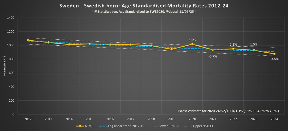
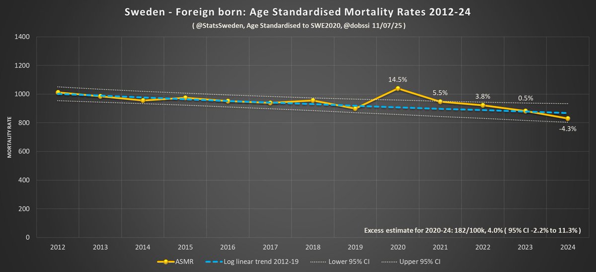
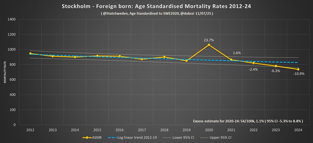
#Sweden's infamous ~3% of deaths with unknown date sourced from @EU_Eurostat for all charts.
Adding those in more detail than before has the slightly paradoxical effect of reducing their excess by 20-25% as it makes their downward trend less steep.
2/
ec.europa.eu/eurostat/cache…
Adding those in more detail than before has the slightly paradoxical effect of reducing their excess by 20-25% as it makes their downward trend less steep.
2/
ec.europa.eu/eurostat/cache…
Results per 100k:
3/
3/


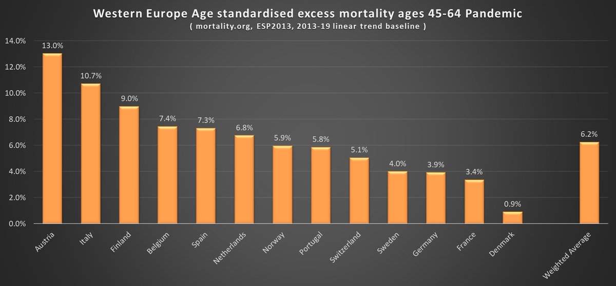
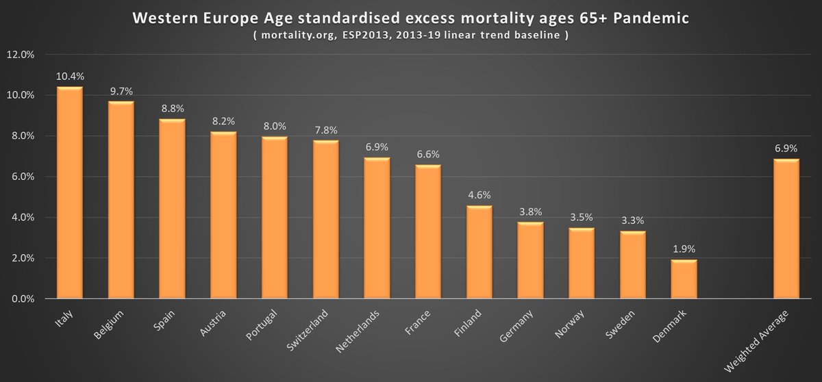
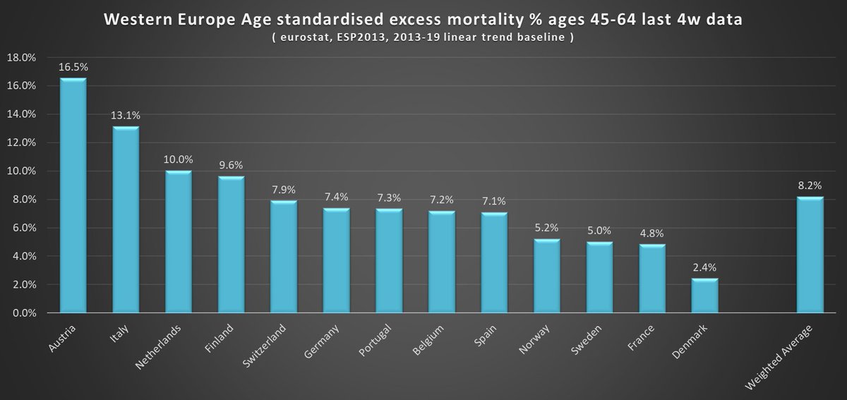
And now focusing on narrower age groups as the Eurostat data is provided in 5/10 year bands. I used 10yr bands for 0-39 and 5yr for 40+ to get the highest resolution.
Thoughts:
#Sweden excelling for 20-44.
#Denmark for 45-64.
#Finland 45-64 not good.
#Austria a mess.
5/
Thoughts:
#Sweden excelling for 20-44.
#Denmark for 45-64.
#Finland 45-64 not good.
#Austria a mess.
5/

And now yearly comparisons by age group:
2020 was worst for 65+ and overall.
2021 worst for middle aged 45-64.
2022 worst so far for the young 20-44.
6/
2020 was worst for 65+ and overall.
2021 worst for middle aged 45-64.
2022 worst so far for the young 20-44.
6/


Younger ages have fared worst in recent weeks. Which is not good and needs further analysis. But less so in Nordics who have had life back to normal longest and no longer generally recommend testing.
NB most of these countries most recent 4 week data is for Sept/Oct.
7/
NB most of these countries most recent 4 week data is for Sept/Oct.
7/


An irony of all this is that the country in Western Europe with the highest mortality rates over the last decade or so, #Denmark, have the lowest pandemic excess.
8/
8/

Links to data:
ec.europa.eu/eurostat/datab…
ec.europa.eu/eurostat/datab…
ec.europa.eu/eurostat/datab…
ec.europa.eu/eurostat/cache…
mortality.org/Data/STMF
For Eurostat dataset population denominators I used midpoint of the either side year estimates as that matches HMD's methodology best.
9/
ec.europa.eu/eurostat/datab…
ec.europa.eu/eurostat/datab…
ec.europa.eu/eurostat/datab…
ec.europa.eu/eurostat/cache…
mortality.org/Data/STMF
For Eurostat dataset population denominators I used midpoint of the either side year estimates as that matches HMD's methodology best.
9/
A couple of requests for the main graphs to start at 0 on the X axis....
10/
10/


By variant/wave....for all ages.
11/
11/

And combining the 3 baselines. Eurostat prioritized as higher resolution age data, followed by HMD 8 year then HMD 5 year.
What do people think of this format?
12/
What do people think of this format?
12/


And a bonus as I just stumbled upon it. The Economist now has "Demography adjusted" numbers per 100k. Very similar to mine at the low end, but in the middle and high end a lot lower. Unsure what baseline, population data they use, but worth posting:
economist.com/graphic-detail…
13/
economist.com/graphic-detail…
13/

• • •
Missing some Tweet in this thread? You can try to
force a refresh