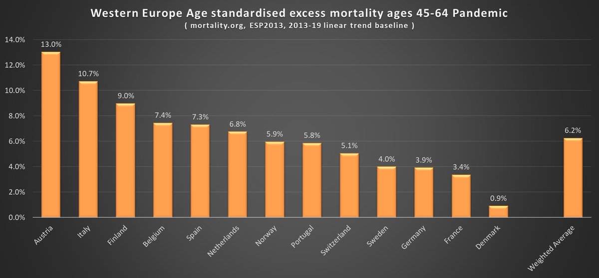
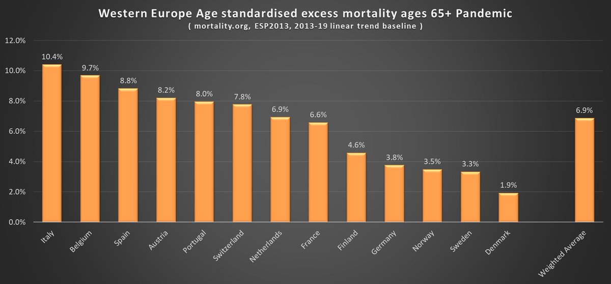
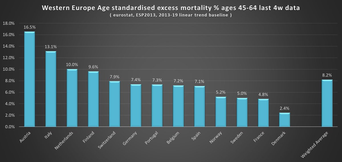
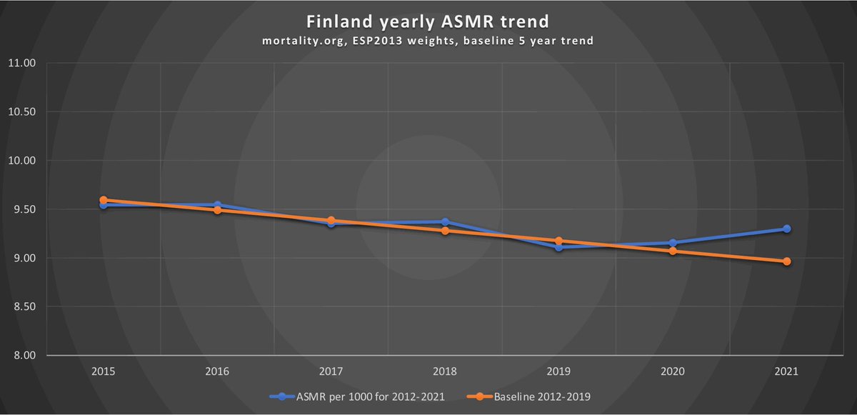
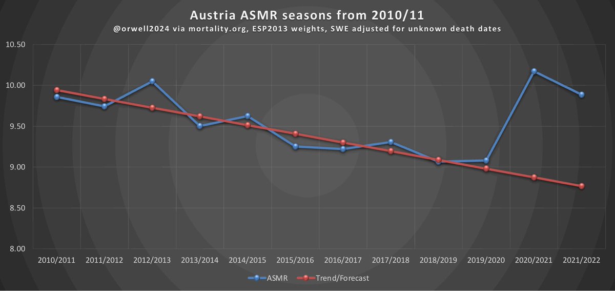
My pandemic excess mortality estimate update, age standardised using 5, 7 and 8 year linear trend baselines.

#NewZealand and #Denmark the clear winners so far. #Sweden clearly establishing as next best....at least in Europe anyway.

1/

Data from @HMDatabase and @EU_Eurostat. ImageImageImage
#Sweden's infamous ~3% of deaths with unknown date sourced from @EU_Eurostat for all charts.

Adding those in more detail than before has the slightly paradoxical effect of reducing their excess by 20-25% as it makes their downward trend less steep.

2/

ec.europa.eu/eurostat/cache…
Results per 100k:

3/ ImageImageImage
Since the #vaccines arrived:

4/ ImageImageImage
And now focusing on narrower age groups as the Eurostat data is provided in 5/10 year bands. I used 10yr bands for 0-39 and 5yr for 40+ to get the highest resolution.

Thoughts:

#Sweden excelling for 20-44.
#Denmark for 45-64.
#Finland 45-64 not good.
#Austria a mess.

5/ ImageImageImage
And now yearly comparisons by age group:

2020 was worst for 65+ and overall.

2021 worst for middle aged 45-64.

2022 worst so far for the young 20-44.

6/ ImageImageImageImage
Younger ages have fared worst in recent weeks. Which is not good and needs further analysis. But less so in Nordics who have had life back to normal longest and no longer generally recommend testing.

NB most of these countries most recent 4 week data is for Sept/Oct.

7/ ImageImageImageImage
An irony of all this is that the country in Western Europe with the highest mortality rates over the last decade or so, #Denmark, have the lowest pandemic excess.

8/ Image
Links to data:

ec.europa.eu/eurostat/datab…

ec.europa.eu/eurostat/datab…

ec.europa.eu/eurostat/datab…

ec.europa.eu/eurostat/cache…

mortality.org/Data/STMF

For Eurostat dataset population denominators I used midpoint of the either side year estimates as that matches HMD's methodology best.

9/
A couple of requests for the main graphs to start at 0 on the X axis....

10/ ImageImageImageImage
By variant/wave....for all ages.

11/ Image
And combining the 3 baselines. Eurostat prioritized as higher resolution age data, followed by HMD 8 year then HMD 5 year.

What do people think of this format?

12/ ImageImage
And a bonus as I just stumbled upon it. The Economist now has "Demography adjusted" numbers per 100k. Very similar to mine at the low end, but in the middle and high end a lot lower. Unsure what baseline, population data they use, but worth posting:

economist.com/graphic-detail…

13/ Image

• • •

Missing some Tweet in this thread? You can try to force a refresh
 

Keep Current with Paul Collyer 🏴󠁧󠁢󠁥󠁮󠁧󠁿🇸🇪

Paul Collyer 🏴󠁧󠁢󠁥󠁮󠁧󠁿🇸🇪 Profile picture

Stay in touch and get notified when new unrolls are available from this author!

Read all threads

This Thread may be Removed Anytime!

PDF

Twitter may remove this content at anytime! Save it as PDF for later use!

Try unrolling a thread yourself!

how to unroll video
  1. Follow @ThreadReaderApp to mention us!

  2. From a Twitter thread mention us with a keyword "unroll"
@threadreaderapp unroll

Practice here first or read more on our help page!

More from @dobssi

Nov 20
The more I look at this the more it jumps out as a big deal. What’s going on with 20-44 and why are Sweden such an outlier in Western Europe?

1/ Image
@OS51388957 @rpezer1 can you reproduce?

It’s 0-9, 10-19, 20-29, 30-39 and 40-44 Eurostat age bins.

Plus W99 unknowns with 2022 a linear extrapolation of 17-21.

Using halfway point of population 1/1/Y and 1/1/Y+1 as denominators.

It’s such an outlier….something I missed?
Might this shed some light? The better the trend the easier to see excess from less…. ImageImageImageImage
Read 7 tweets
Sep 8
#Sweden covid update:

Update to deaths *from* covid, as reported by death certificate, weekly and with wave/variant peaks labelled:

Currently 17107 to week 35.

1/ Image
This compares to 19944 covid deaths within 30 days of a positive test.

The two numbers tracked closely through 2020 and 2021 but diverged dramatically in 2022 with Omicron.

2/ Image
In terms of excess deaths there has been a bit of a lag in data since summer. @HMDatabase last update was for week 28.

Up to then there has been nothing of note for 2022, or indeed 2021. So due some excess death which I expect this wave will provide given it is summer.

3/
Read 6 tweets
Sep 4
This seems to have gained a lot of traction - the implication that excess mortality has increased since the vaccine rollout.

It seems wide of the mark to me.

1/
Taking data from my thread about infection estimates vs excess deaths vs covid deaths etc we have these trends for Western Europe:

Not really showing what Alex infers, in one the most highly vaccinated regions of the world. Broken into quarters.

2/

ImageImageImage
And then using this thread's data, where I tried out different length linear trend baselines on the @HMDatabase dataset, we can see below:

Again, suggests things are not getting worse.

3/

ImageImage
Read 5 tweets
Sep 4
What’s going on in Finland? @MarkkuPeltonen this looks like more than mortality deficit correction?
Going on yearly ‘excess’ clearly the longer trend makes 🇫🇮🇩🇰 look worse…..
Here in visual form.

Remember through the pandemic the ‘standard’ baseline seems to have been 5 years… ImageImage
Read 5 tweets
Aug 26
An alternative take on pandemic excess mortality - going by ‘flu season’, age adjusting, and looking back 9 seasons….big credit to @orwell2022

1/ ImageImageImage
Some trends and the 9 year pre pandemic baseline….

2/ ImageImageImageImage
Nordics:

3/ ImageImageImageImage
Read 11 tweets
Jul 23
Follow up on vaccines, masks and mobility vs infection rates and excess mortality:

I took 50 countries and found that in highly vaccinated ones there has been a clear trend of reduced excess mortality per infection over time.

1/


ImageImageImage
I took excess death estimates per 100k from the Economist excess mortality model and infection estimates, vaccination rates, mask use and mobility change vs 2019 from the IHME reference scenarios database.

2/

economist.com/graphic-detail…

healthdata.org/covid/data-dow… ImageImage
I split it all into years and then quarter years to see a bit more detail and trend.

I then split the countries into two groups of 25 - basically the 25 with highest vaccination score ( % vaccinated weighted towards earlier vaccination ) in one group and the rest in another.

3/ ImageImage
Read 25 tweets

Did Thread Reader help you today?

Support us! We are indie developers!


This site is made by just two indie developers on a laptop doing marketing, support and development! Read more about the story.

Become a Premium Member ($3/month or $30/year) and get exclusive features!

Become Premium

Don't want to be a Premium member but still want to support us?

Make a small donation by buying us coffee ($5) or help with server cost ($10)

Donate via Paypal

Or Donate anonymously using crypto!

Ethereum

0xfe58350B80634f60Fa6Dc149a72b4DFbc17D341E copy

Bitcoin

3ATGMxNzCUFzxpMCHL5sWSt4DVtS8UqXpi copy

Thank you for your support!

Follow Us on Twitter!

:(