Usability pitfalls of disabled buttons

Disabled buttons can cause users to get blocked without knowing why, causing abandonment and frustration.

Tips on how to deal with disabled buttons from @vitalyf's video course - Smart Interface Design Patterns 👇

#design #ui #ux #uxui
Always keep buttons enabled by default

Always keep buttons enabled by default and allow users to interact with them. Disabled buttons can cause users to get blocked without knowing why causing abandonment and frustration.
Point to errors on submit

On submit, explain to users why they can’t proceed, and how to fix errors:

• For a single error, point users to the invalid input via a text link.
• For multiple errors, display an error summary at the top and link to it.
Add an explanation next to disabled buttons

If you can’t avoid disabled buttons, at least provide an explanation to guide people towards the most likely solution.

Help customers when they need help, rather than leaving them out there in the wild all by themselves.
When disabled buttons (and states) work well

Temporarily disable buttons to avoid wrong purchases, double booking or to validate magic sign-in/SMS code. Even then, make sure that the color contrast is sufficient (4.5:1) for the text to be legible.
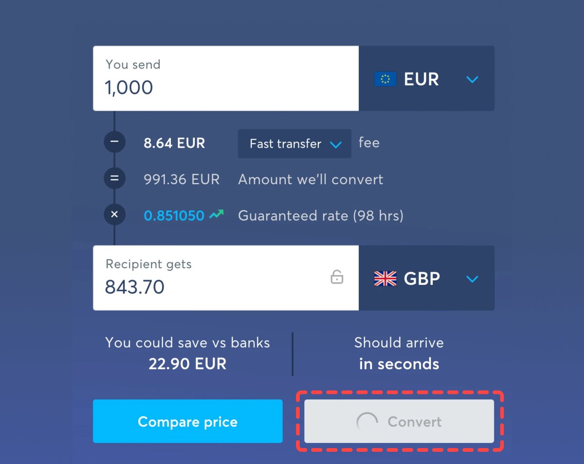
Make disabled buttons more inclusive:

✅ Change the cursor to “cursor: not-allowed”
✅ Prevent the click via JavaScript
✅ Avoid the “disabled” attribute in HTML and use “aria-disabled” instead
✅ Use ARIA live regions to announce dynamic content
Check out the full disabled button checklist 👇

smashingmagazine.com/2021/08/frustr…
Learn about other interface design patterns in the full course:

• 30 video lessons (9 hours)
• 4-weeks UX training

100s of real-life examples and tons of practical takeaways.

👉 smart-interface-design-patterns.com

• • •

Missing some Tweet in this thread? You can try to force a refresh
 

Keep Current with Adham Dannaway

Adham Dannaway Profile picture

Stay in touch and get notified when new unrolls are available from this author!

Read all threads

This Thread may be Removed Anytime!

PDF

Twitter may remove this content at anytime! Save it as PDF for later use!

Try unrolling a thread yourself!

how to unroll video
  1. Follow @ThreadReaderApp to mention us!

  2. From a Twitter thread mention us with a keyword "unroll"
@threadreaderapp unroll

Practice here first or read more on our help page!

More from @AdhamDannaway

Dec 20, 2022
🔥 100 Landing page hot tips
By @robhope

Improve your landing page designs with these quick and actionable tips.

Here are a few of my faves 👇

#landingpagedesign #design #uxdesign #webdesign #uxui
🔥 Spice up those Call-To-Action (CTA) buttons.

You are excited to share your product/service.

🚫 Click Here
🚫 Sign Up

Use actionable phrases.

✅ Discover the wonders of science
✅ Request a call from our agents
✅ Unlock creativity for only $19
🔥 When in doubt, double the padding.

"Whitespace" is not just breathing room for your content but breathing room for the visitor.

Digestible content improves focus and allows for a better understanding of your offering.
Read 6 tweets
Nov 23, 2022
⚡️ UI design tip

I’ve been doing buttons wrong! 😱 Have you? 🤔

After nearly 2 decades looking at buttons, I've noticed that most of them have usability and accessibility issues.

Here are some quick and practical tips to avoid common mistakes 👇

#design #uidesign #uxdesign Image
✅ Define 3 buttons styles (primary, secondary and tertiary) to display actions of varying importance.

✅ Ensure buttons have a clear visual hierarchy that isn't reliant on colour alone.
✅ Ensure contrast ratio of the button shape is at least 3:1 to meet WCAG 2.1 level AA accessibility requirements.

✅ Ensure button text contrast ratio is at least 4.5:1.

✅ Use a large target area (at least 48pt by 48pt) to ensure people can easily select buttons.
Read 4 tweets
Nov 21, 2022
⚡️ UI design tip - Use the inverted pyramid

The inverted pyramid is a writing structure in which the most important information is placed at the start, followed by supporting information and smaller background details.

Learn why it's great for interface text 👇

#uidesign #uxui Image
✅ It gets to the point quickly, helping people understand information and make decisions faster.

✅ People who quickly skim the first sentence will still get the main point.

✅ Additional information is there for those who need it.
📘 PS If you like this tip, you’ll like my UI design book.

It's being released on 28 Nov 2022 (8am ET) 🥳.

Subscribe to get a discount code once the book's released
👉 practical-ui.com
Read 4 tweets
Nov 1, 2022
📍 Product/UX design methods mindmap

A handy guide to help you decide when to use what UX methods.

1️⃣ Understand
2️⃣ Define
3️⃣ Ideate
4️⃣ Execute
5️⃣ Validate

🧵 A thread

via @Mei_big_eyes #design #uxdesign #uxui #productdesign
1️⃣ Understand

In the understand phase, we put ourselves in the users’ shoes and understand their likes & dislikes, context, needs, pain points, etc.

Meanwhile, we learn about the business: What is the money-making model? What are the metrics to measure business success?
2️⃣ Define

In the Define phase, we work with the team, especially the product manager to discover problems and opportunities.

The ability to gather insights, synthesize data, and abstract input to a problem is very important.
Read 7 tweets
Sep 13, 2022
📌 21 Laws of UX

Best practice psychological principles to design more intuitive, human centred products and experiences.

By @JonYablonski

🧵 A thread
1. Aesthetic-Usability Effect

Users often perceive aesthetically pleasing design as design that’s more usable.
2. Doherty Threshold

Productivity soars when a computer and its users interact at a pace (<400ms) that ensures that neither has to wait on the other.
Read 24 tweets
Feb 7, 2022
⚡️ UI design tip - Decrease usability risks

Many of my design decisions are based on risk. The risk that someone could have difficulty using an interface.

In this example, we’ll fix elements that pose a potential risk to usability using practical UI design principles.

1/4 🧵 Image
❌ Usability risks

We’re not after subjective thoughts on aesthetics, but objective issues that could negatively affect usability and accessibility.

I've pointed out 8 potential risks to usability.

Next we'll fix them 👇 Image
✅ Updated design

Each design decision is supported by logical reasoning, so we’re not just relying on “gut feeling” or what looks pretty ✨.

Most of my design decisions are governed by simple, timeless design principles 👇 Image
Read 4 tweets

Did Thread Reader help you today?

Support us! We are indie developers!


This site is made by just two indie developers on a laptop doing marketing, support and development! Read more about the story.

Become a Premium Member ($3/month or $30/year) and get exclusive features!

Become Premium

Don't want to be a Premium member but still want to support us?

Make a small donation by buying us coffee ($5) or help with server cost ($10)

Donate via Paypal

Or Donate anonymously using crypto!

Ethereum

0xfe58350B80634f60Fa6Dc149a72b4DFbc17D341E copy

Bitcoin

3ATGMxNzCUFzxpMCHL5sWSt4DVtS8UqXpi copy

Thank you for your support!

Follow Us on Twitter!

:(