
💥 16 little UI design rules that make a big impact
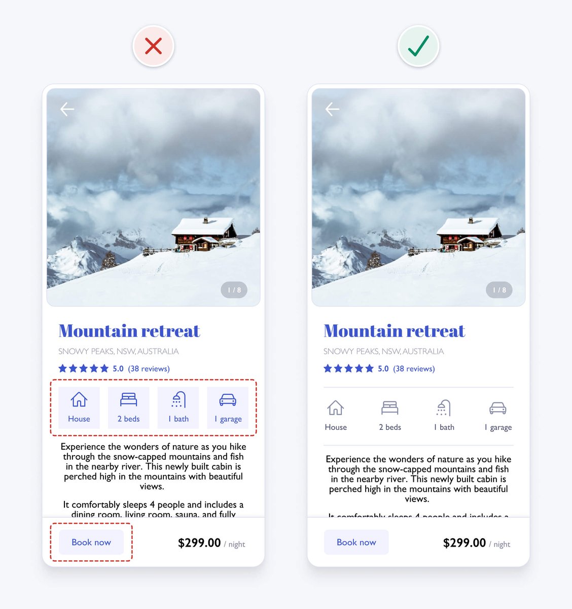
UI design might appear to be a magical art form, but a lot of it is made up from logical rules or guidelines.
We’ll redesign an example interface using 16 of 100+ guidelines from my book - @PracticalUI
A mega thread👇
UI design might appear to be a magical art form, but a lot of it is made up from logical rules or guidelines.
We’ll redesign an example interface using 16 of 100+ guidelines from my book - @PracticalUI
A mega thread👇

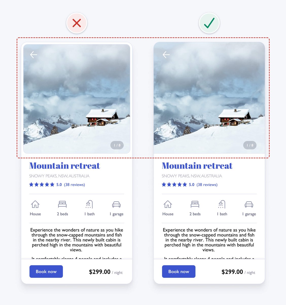
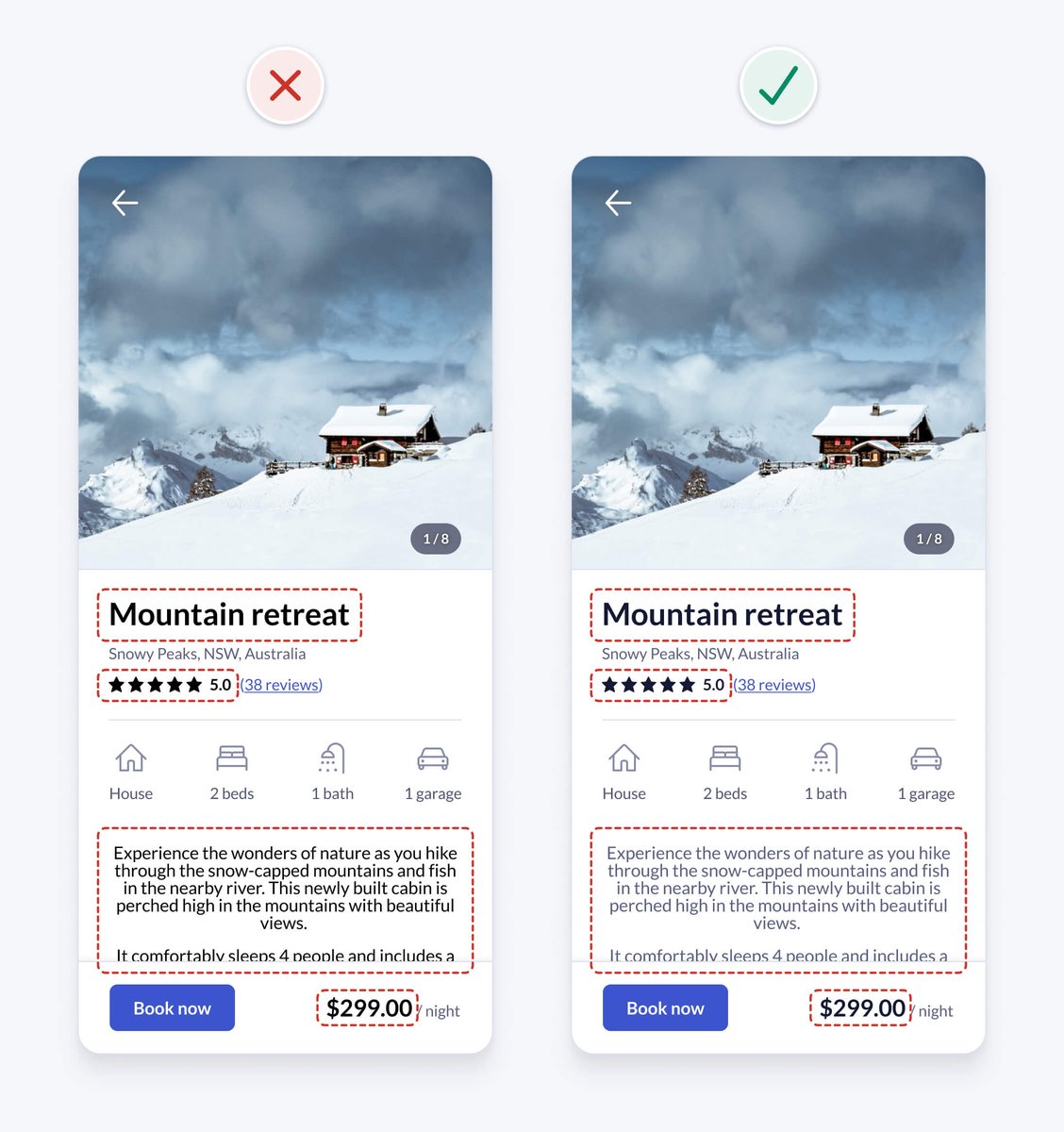
1. Use space to group related elements
The lack of space between content makes the design look cluttered and difficult to understand. Increasing spacing helps to clearly group content, making it more organised and easier to understand.
The lack of space between content makes the design look cluttered and difficult to understand. Increasing spacing helps to clearly group content, making it more organised and easier to understand.

2. Be consistent
Similar elements should look and work in a similar way. This should be true both within your product and when compared with others.
This predictable functionality improves usability and reduces errors, as people don't need to keep learning how things work.
Similar elements should look and work in a similar way. This should be true both within your product and when compared with others.
This predictable functionality improves usability and reduces errors, as people don't need to keep learning how things work.

In our example, the icon styles are inconsistent, as some are filled and others aren’t. Outlining all icons with a 2pt stroke weight and rounded corners improves consistency and gives each icon a similar visual weight.
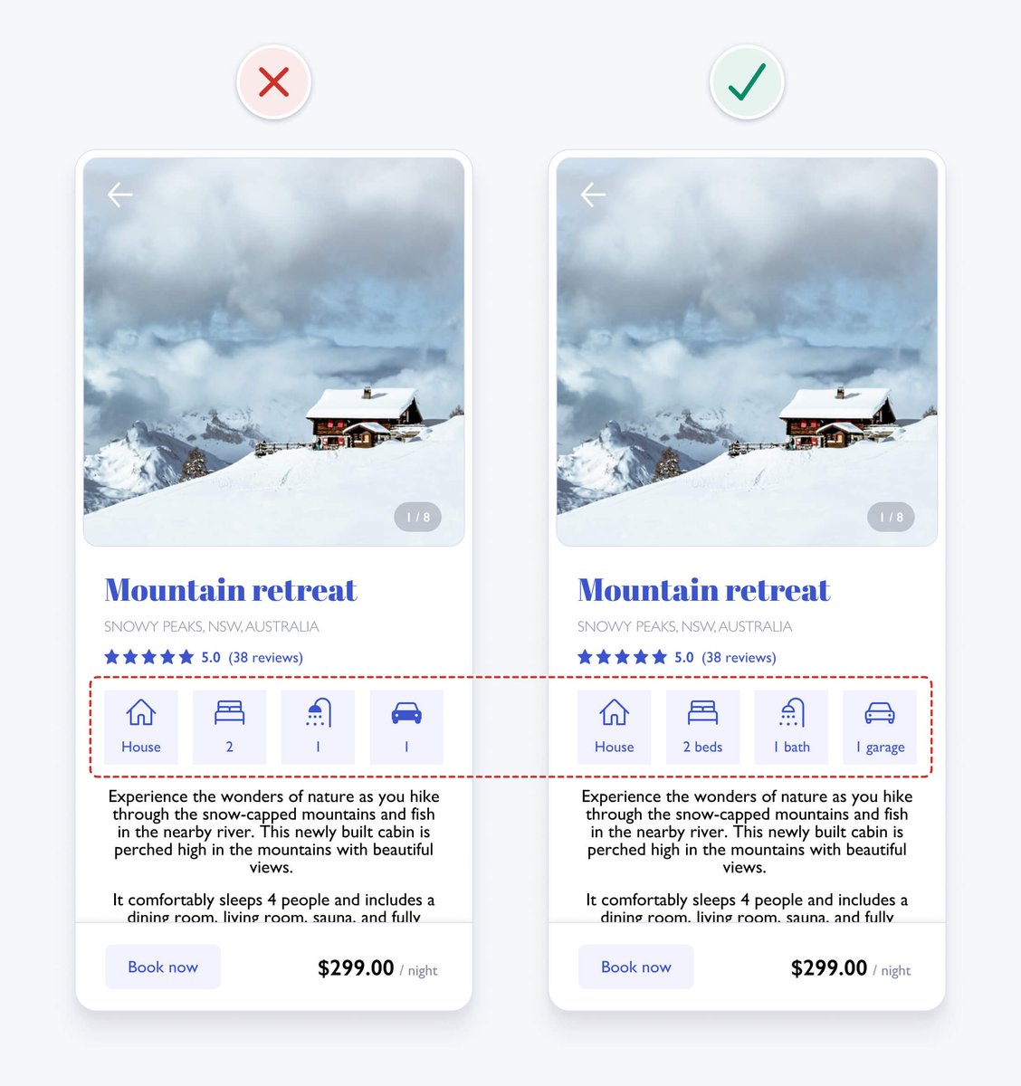
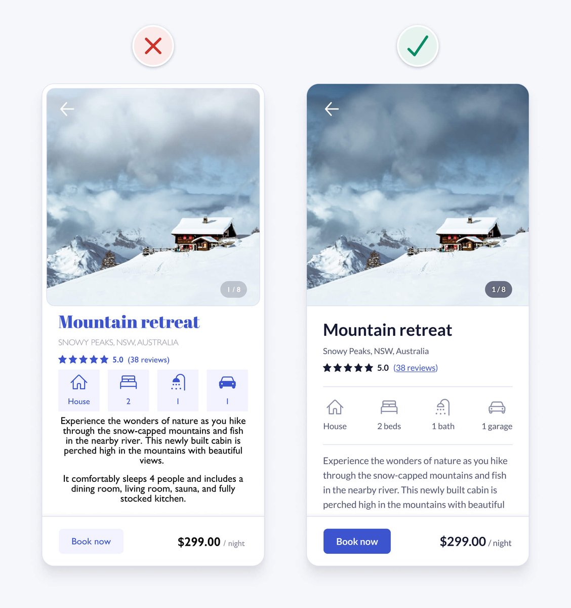
3. Ensure similar looking elements function similarly
The icon containers have a similar visual style to the “book now” button. This makes them seem interactive. Differentiating their styles helps avoid confusion.
The icon containers have a similar visual style to the “book now” button. This makes them seem interactive. Differentiating their styles helps avoid confusion.
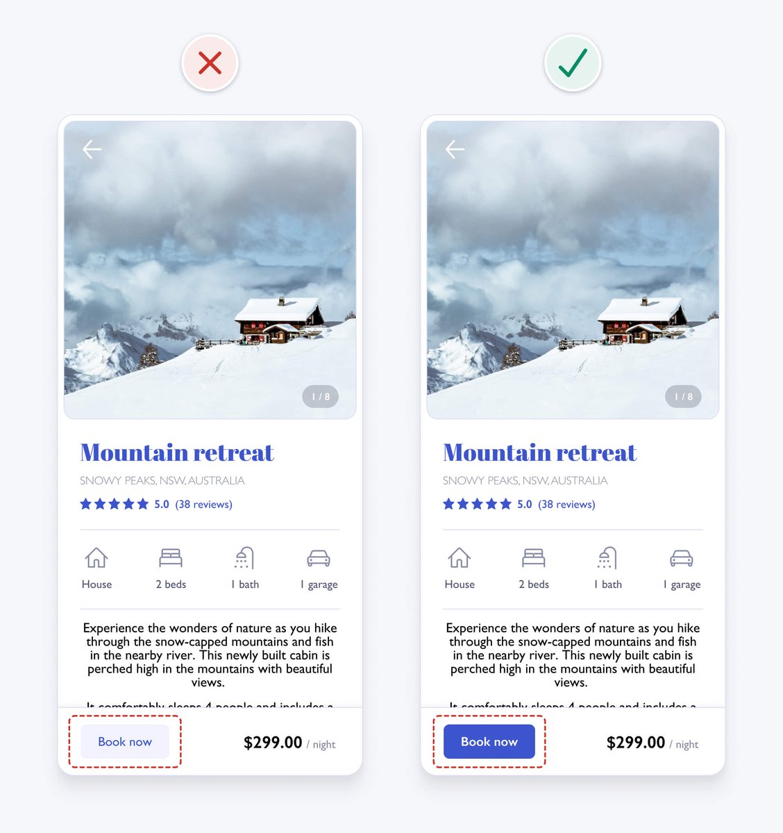
4. Create a clear visual hierarchy
Present information in order of importance by making important elements more prominent using variations in size, colour, contrast, spacing, position, and depth.
It helps people scan information faster and improves aesthetics by creating order.
Present information in order of importance by making important elements more prominent using variations in size, colour, contrast, spacing, position, and depth.
It helps people scan information faster and improves aesthetics by creating order.
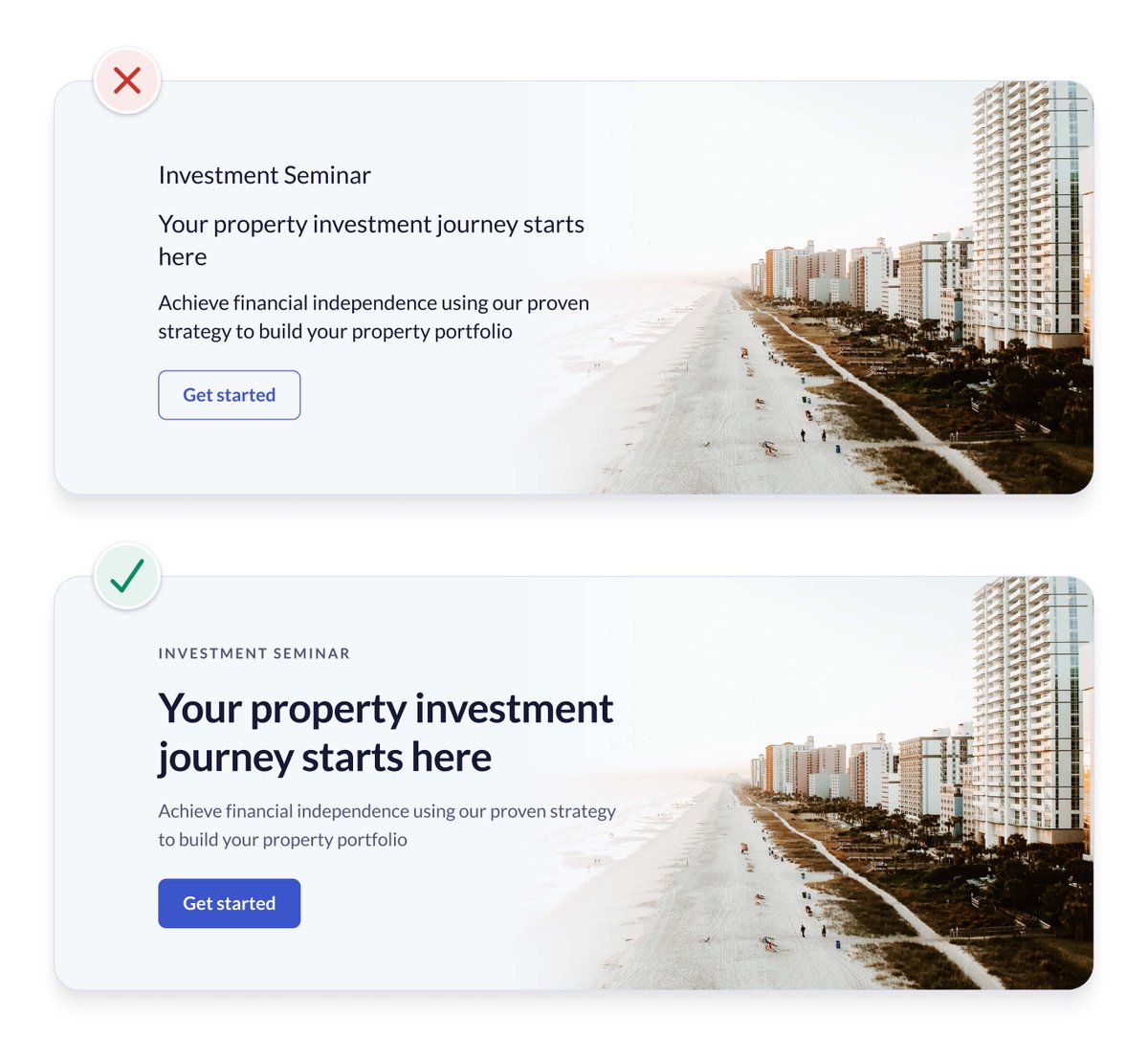
The primary action should generally be the most prominent element on an interface. Giving it a high contrast background colour and bold font weight helps achieve this.
This also fixes an accessibility issue with the low contrast button, which we’ll look into later.
This also fixes an accessibility issue with the low contrast button, which we’ll look into later.
5. Remove unnecessary styles
The white space and borders around the image in the original design add unnecessary visual complexity. This can be distracting and can increase cognitive load. Removing unnecessary elements helps to simplify the design.
The white space and borders around the image in the original design add unnecessary visual complexity. This can be distracting and can increase cognitive load. Removing unnecessary elements helps to simplify the design.
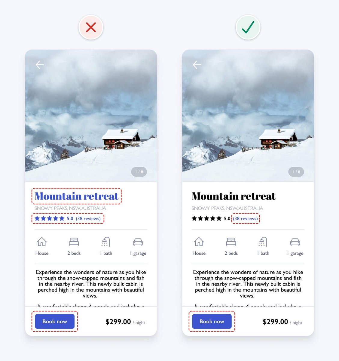
6. Use colour purposefully
The blue heading might look nice, but it makes the text seem interactive. To help avoid confusion, we remove the blue colour and ensure it’s only applied to interactive elements like text links and buttons.
The blue heading might look nice, but it makes the text seem interactive. To help avoid confusion, we remove the blue colour and ensure it’s only applied to interactive elements like text links and buttons.
7. Ensure interface elements have a 3:1 contrast ratio
To help ensure people with vision impairments can see interface details, aim to meet WCAG 2.1 level AA requirements.
User interface elements, like form fields and buttons, need to have at least a 3:1 contrast ratio.
To help ensure people with vision impairments can see interface details, aim to meet WCAG 2.1 level AA requirements.
User interface elements, like form fields and buttons, need to have at least a 3:1 contrast ratio.
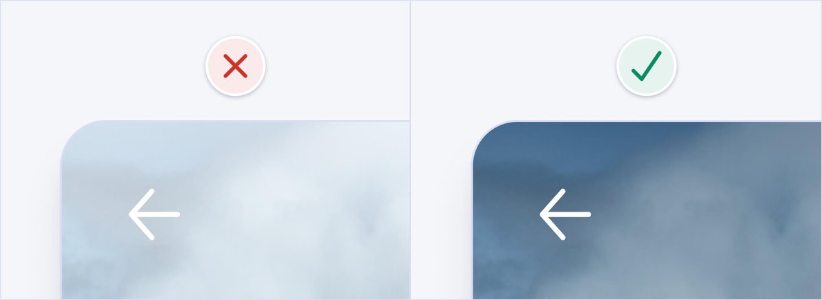
In our example, the arrow icon contrast is too low. Adding a shadow to the icon and a gradient overlay on the top third of the image gives the icon sufficient 3:1 contrast, regardless of the image it sits on.
8. Ensure text has a 4.5:1 contrast ratio
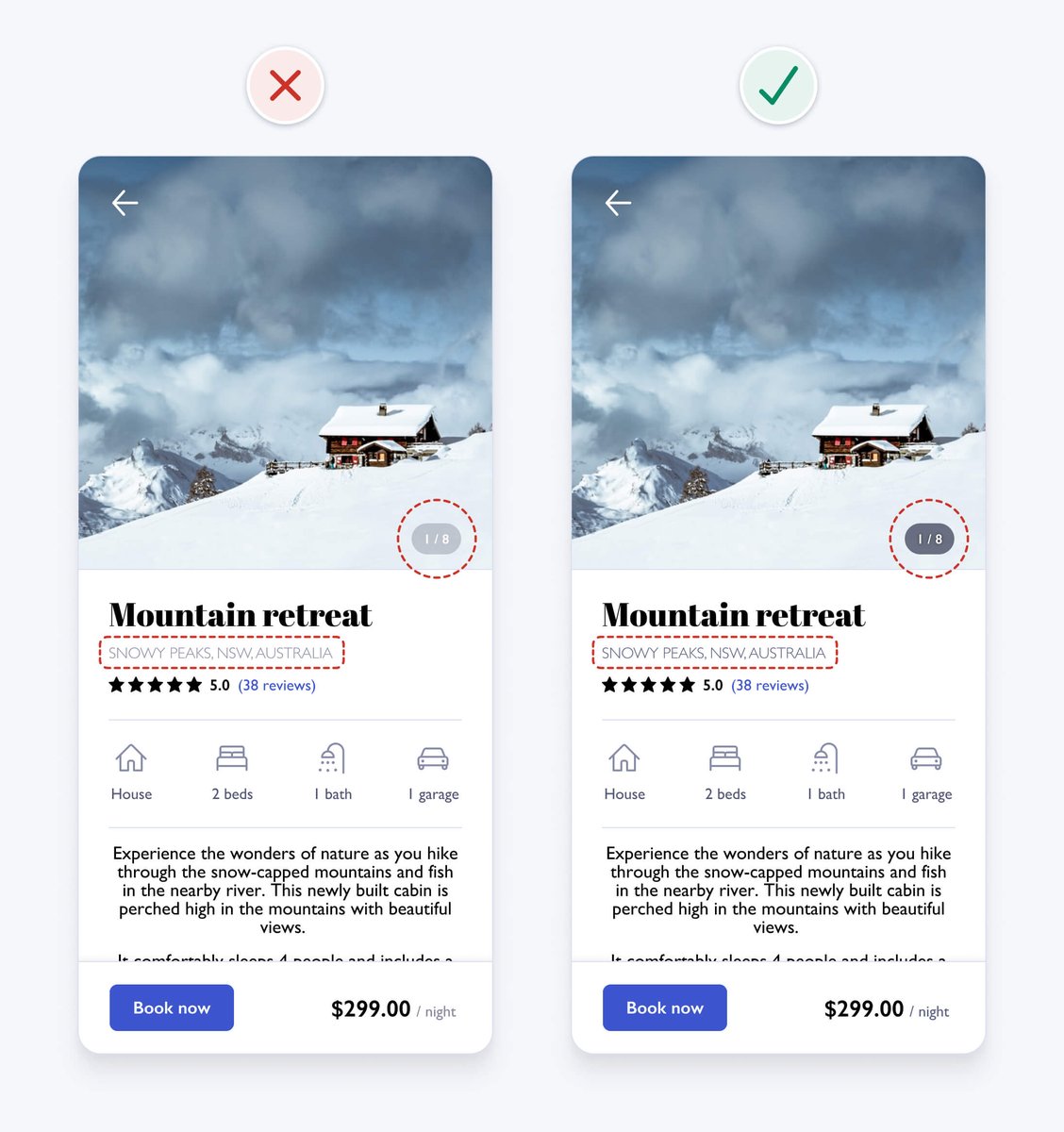
In order to help people with vision impairments read small text (18px and under), it should have 4.5:1 contrast to meet WCAG 2.1 level AA requirements. The photo count and location text both have insufficient contrast.
In order to help people with vision impairments read small text (18px and under), it should have 4.5:1 contrast to meet WCAG 2.1 level AA requirements. The photo count and location text both have insufficient contrast.
9. Don’t rely on colour alone as an indicator
To ensure an interface is accessible to those who are colour blind, you can’t rely on colour alone to convey meaning or distinguish visual elements. You need to use additional visual cues to differentiate interface elements.
To ensure an interface is accessible to those who are colour blind, you can’t rely on colour alone to convey meaning or distinguish visual elements. You need to use additional visual cues to differentiate interface elements.
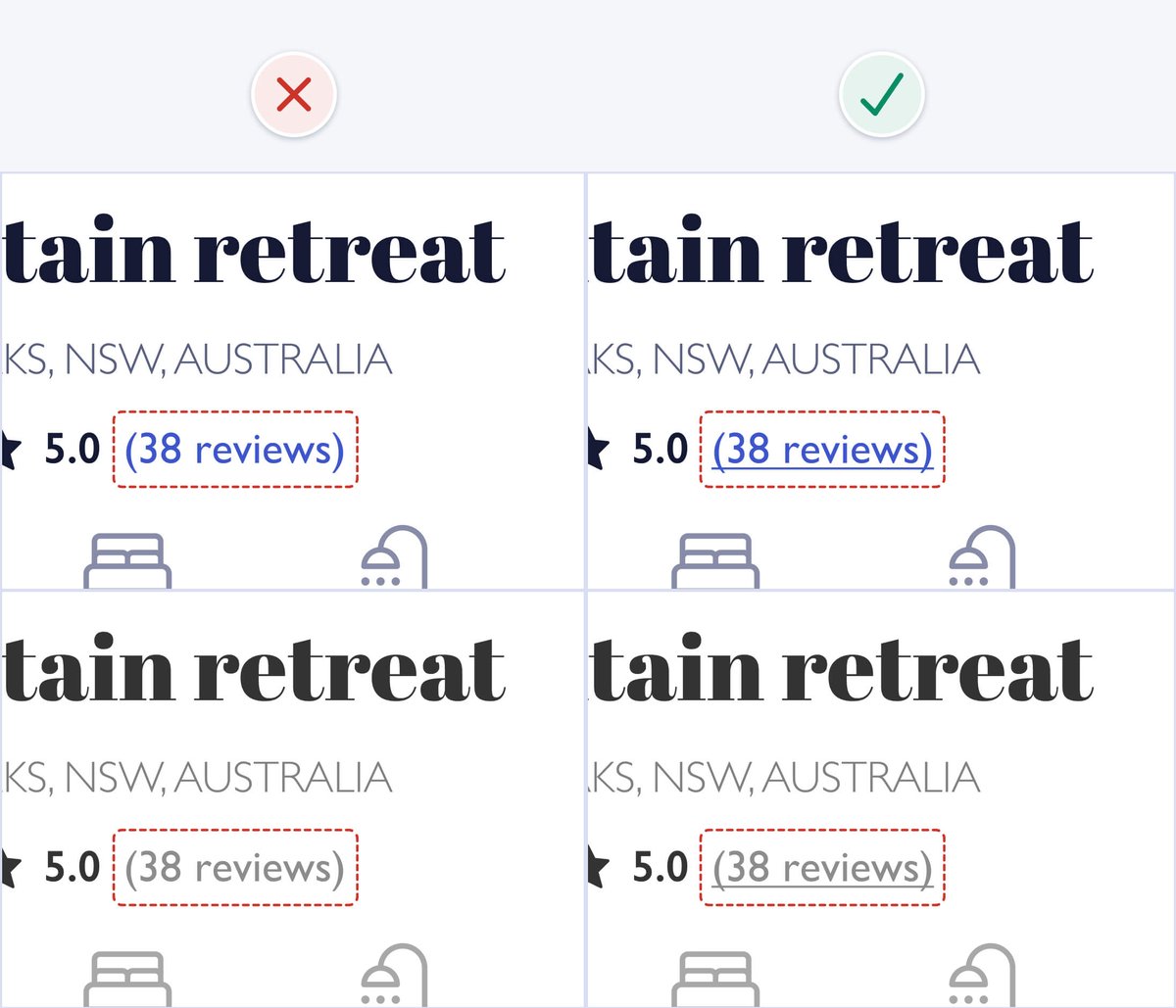
In our example, the colour blue is used on the "reviews" text to indicate that it's a link. If colour is removed, the link text looks the same as other text, so the colour blind can't tell it's a link. Underlining the link text clearly differentiates it from other text.

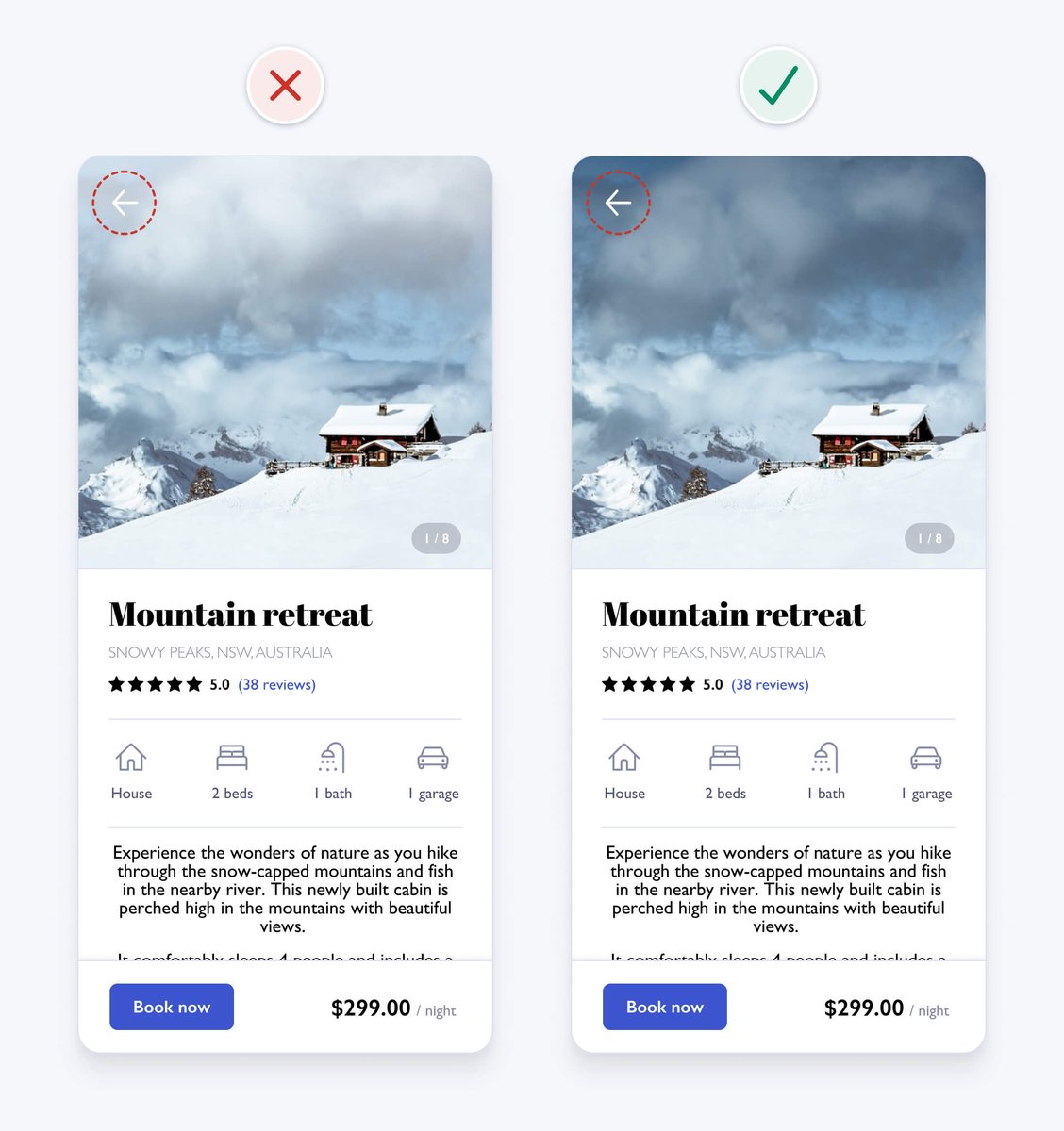
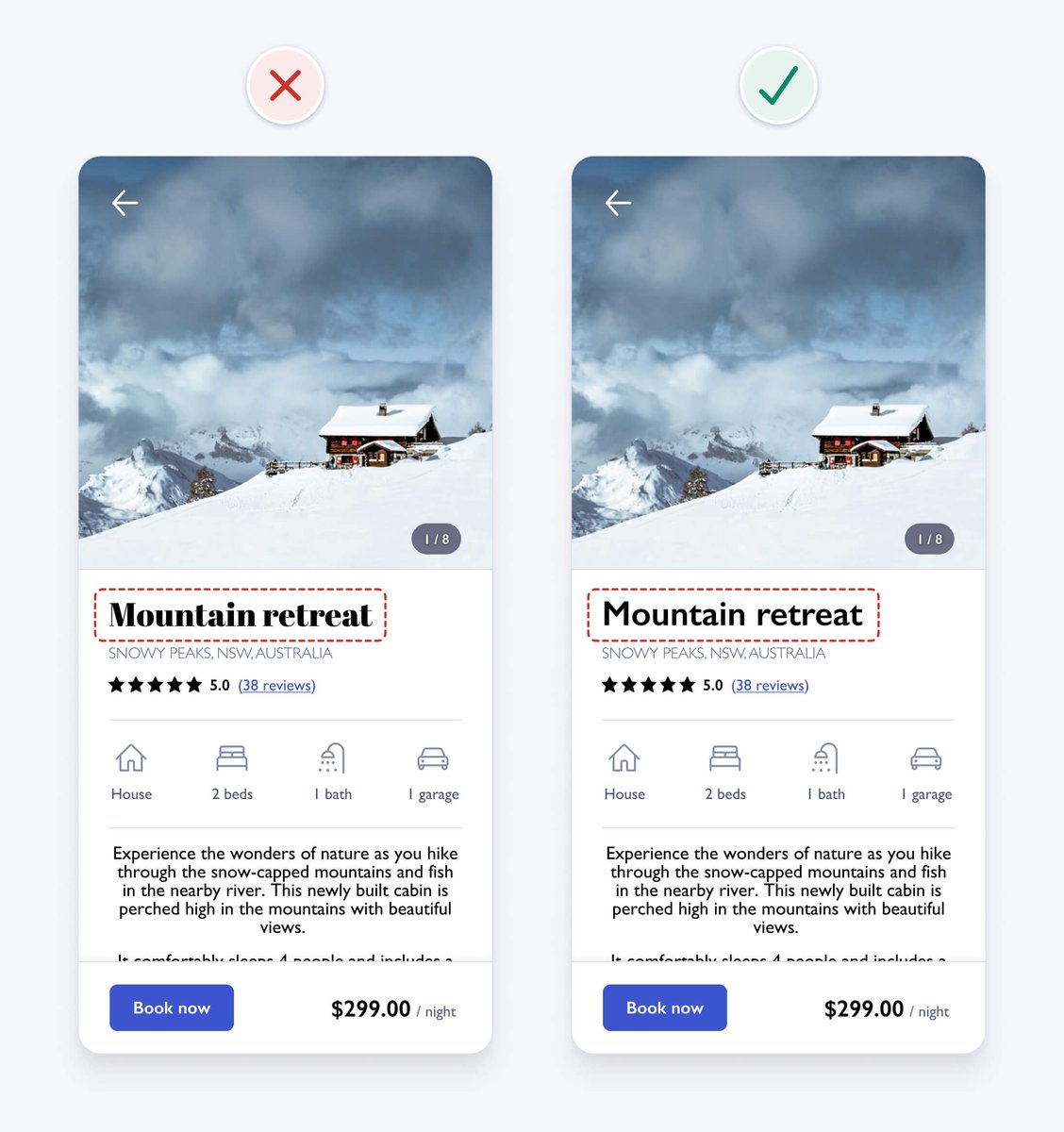
10. Use a single sans serif typeface
It’s safest to use a single sans serif typeface for interface design, as they’re generally the most legible, neutral, and simple. This detailed serif typeface is a bit difficult to read, has a strong personality, and could be distracting.
It’s safest to use a single sans serif typeface for interface design, as they’re generally the most legible, neutral, and simple. This detailed serif typeface is a bit difficult to read, has a strong personality, and could be distracting.
11. Use a typeface with taller lower case letters
Look for typefaces with taller lower case letters and greater letter spacing, as they’re generally more legible at small sizes. The height of lowercase letters in a typeface is known as the x-height.
Look for typefaces with taller lower case letters and greater letter spacing, as they’re generally more legible at small sizes. The height of lowercase letters in a typeface is known as the x-height.
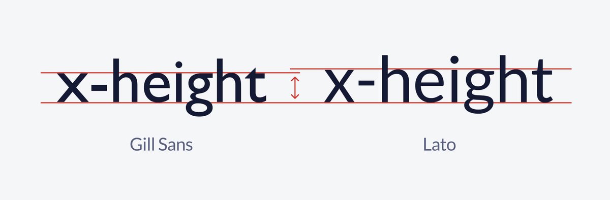
Our example uses the Gill Sans typeface, which has a relatively low x-height. Changing the typeface to one with a larger x-height, like Lato, helps to improve readability.

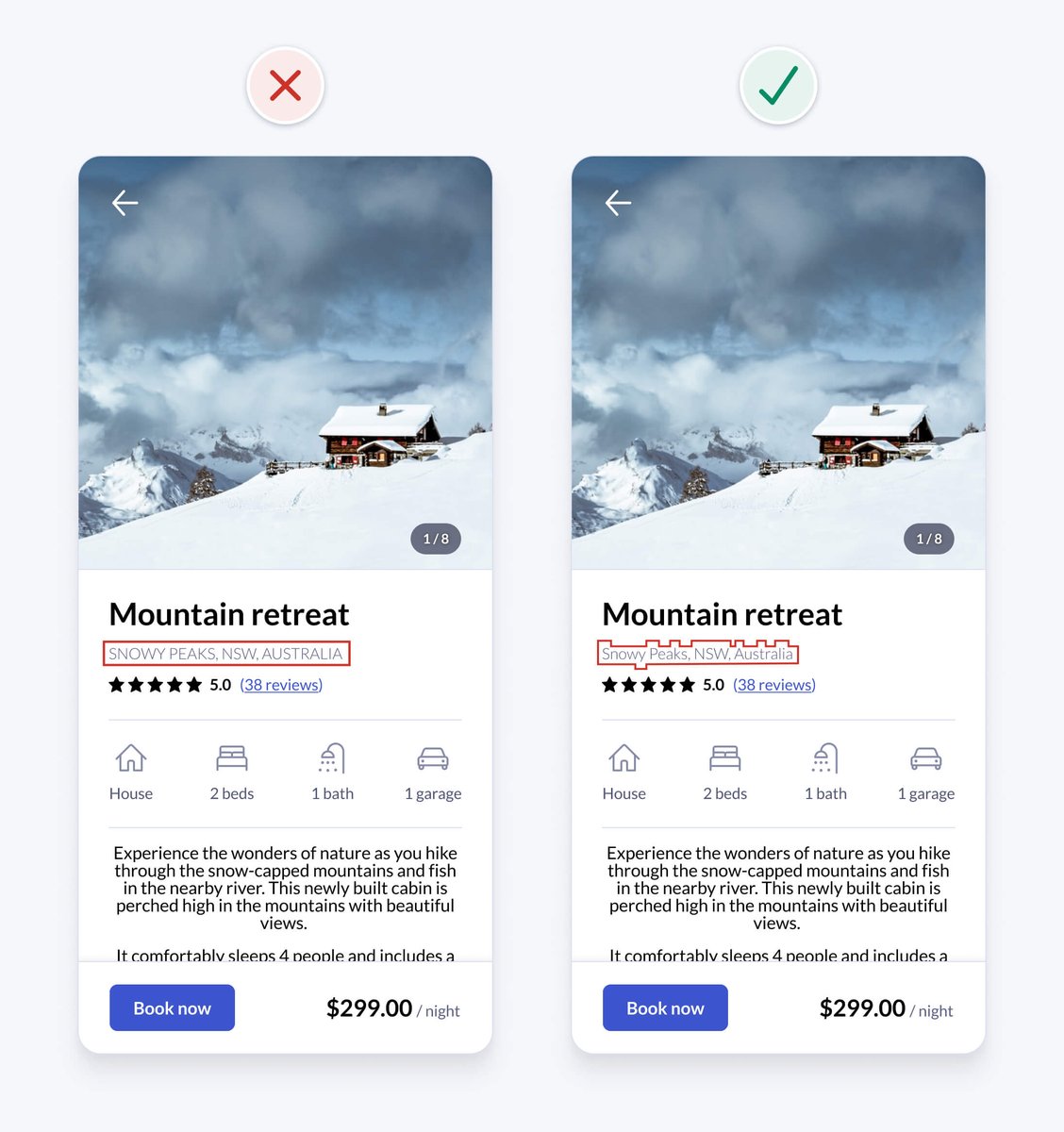
12. Limit the use of uppercase
There aren’t many valid reasons to use uppercase. IT’S LOUD AND DIFFICULT TO READ.
The shape of words help you quickly recognise them. Uppercase words all have the same rectangular shape, forcing you to read letters one by one.
There aren’t many valid reasons to use uppercase. IT’S LOUD AND DIFFICULT TO READ.
The shape of words help you quickly recognise them. Uppercase words all have the same rectangular shape, forcing you to read letters one by one.
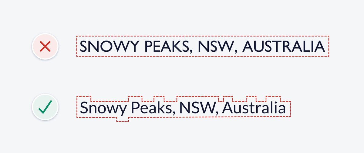
In our example, the location text uses uppercase. Changing it to sentence case, where only the first word and proper nouns (names of people, places or things) are capitalised, helps to improve readability.
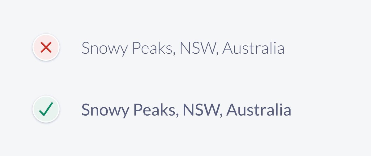
13. Use regular and bold font weights only
Using lots of different font weights can add noise and clutter and thin or thick weights can be difficult to read at small sizes.
• Use bold font weight for headings to emphasise them
• Use regular font weight for other small text
Using lots of different font weights can add noise and clutter and thin or thick weights can be difficult to read at small sizes.
• Use bold font weight for headings to emphasise them
• Use regular font weight for other small text
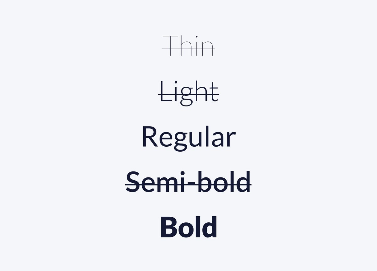
In our example, the location text uses a light font weight. Even though the contrast is sufficient, the thin characters could still be difficult for some to read. Increasing the font weight to regular helps improve readability.
14. Avoid pure black text
It’s generally safest to avoid pure black, as it has a very high contrast against white. This high contrast can cause eye strain and fatigue when reading text. Changing pure black to a dark grey helps to improve readability.
It’s generally safest to avoid pure black, as it has a very high contrast against white. This high contrast can cause eye strain and fatigue when reading text. Changing pure black to a dark grey helps to improve readability.
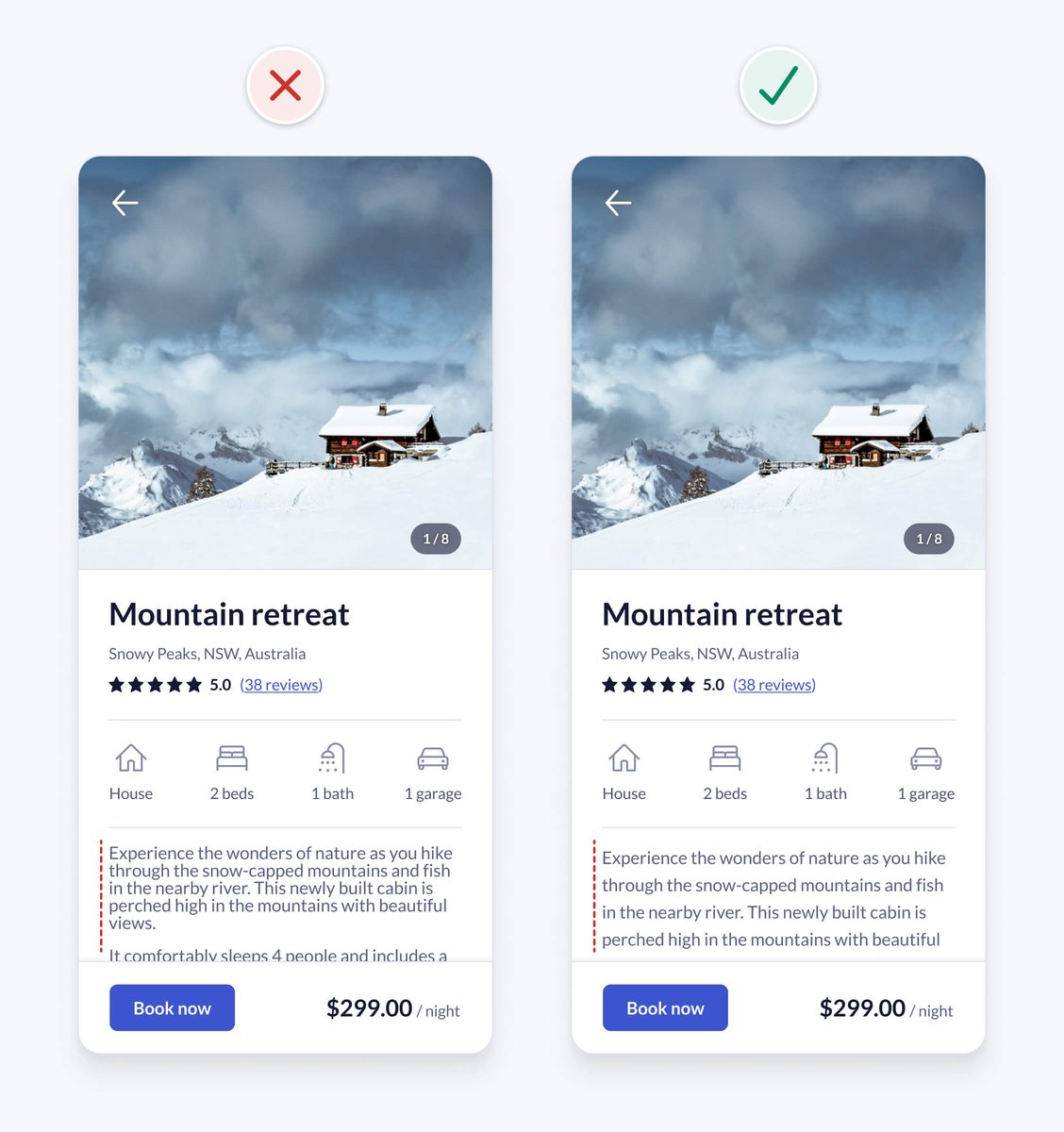
15. Left align text
English is read from left to right, downwards in an F-shaped pattern. Keep text left aligned for optimal readability.
Centre alignment is harder to read, because your eyes need to work harder to find the constantly changing starting point of each line.
English is read from left to right, downwards in an F-shaped pattern. Keep text left aligned for optimal readability.
Centre alignment is harder to read, because your eyes need to work harder to find the constantly changing starting point of each line.

In our example, the property description text is centre aligned. Left aligning the text improves readability and is also consistent with the left aligned text above.

16. Use at least 1.5 line height for body text
For accessibility and readability, especially for long body text, ensure that line height is at least 1.5 (150%).
Keeping line height between 1.5 and 2 generally works well.
For accessibility and readability, especially for long body text, ensure that line height is at least 1.5 (150%).
Keeping line height between 1.5 and 2 generally works well.
We fixed it! 🙌
UI design might appear to be a magical art form, but a lot of it is made up from logical rules like the ones we just learned.
These are just a few of over 100 design guidelines you’ll find in the book.
UI design might appear to be a magical art form, but a lot of it is made up from logical rules like the ones we just learned.
These are just a few of over 100 design guidelines you’ll find in the book.
PS My book is live on Product Hunt today and I’d love your feedback and support 🥳
👉 producthunt.com/posts/practica…
Creating the book was a labour of love over a year and a half.
Thanks for all the positive feedback so far 🙏
👉 producthunt.com/posts/practica…
Creating the book was a labour of love over a year and a half.
Thanks for all the positive feedback so far 🙏

• • •
Missing some Tweet in this thread? You can try to
force a refresh


