
Entrepreneur. Epidemiologist. IT guy. Australian in Sweden and Ukraine.
#plantpowered 🌱 #kyokushin 🥋 #longcovid (recovered)

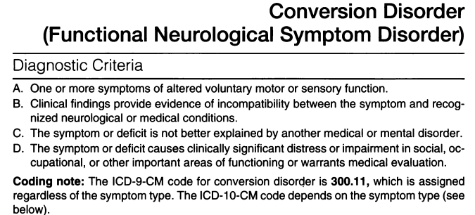 @FndPortal @AlanCarson15 @zalaly It's interesting to trace it back. Here it is in DSM IV as just "Conversion Disorder".
 (1) The graph assumes that risk from any particular infection neither increases nor decreases. Much like the odds of rolling a 6 remain the same each dice roll, but the more you roll, the more likely you'll eventually get a six. I've seen studies supporting both directions.
 @Aftonbladet Apparently it is mentioned right at the end! (we were reading it in a supermarket checkout)


 (The odd gap is when they stopped reporting because the pandemic was over.🫤)
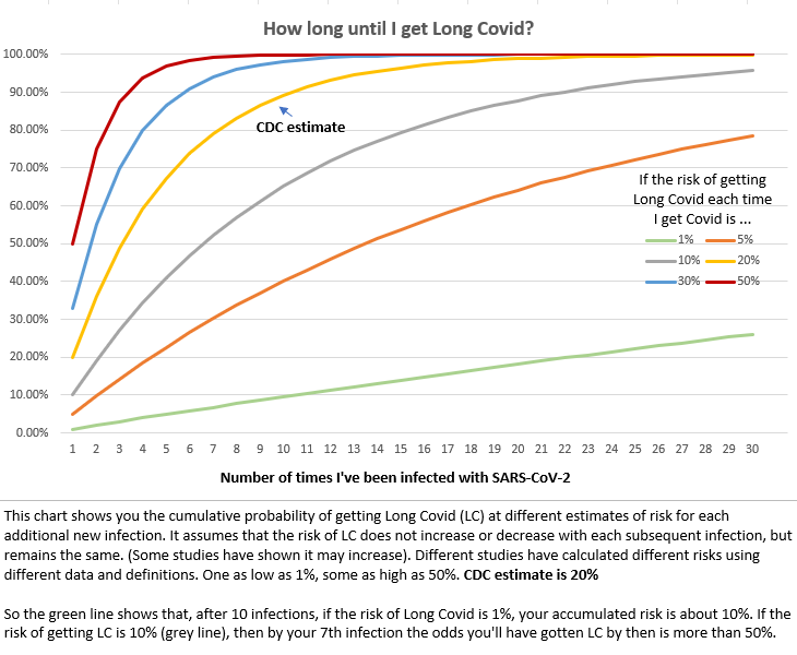 With current estimates of the risk of Long Covid at approx 20% at each infection (yellow line), and policies leading to an expected 2-3 infections per year, **the vast majority of people can expect to have suffered some form of Long Covid within the next 2-3 years**


 It's been reposted by Nobel Prize winning virologists