,
20 tweets,
12 min read
Read on Twitter
I’m not gonna lie, this is a megathread. The main takeaways are in the first 3 tweets (you’re welcome 🤣), while the rest visually explains the reasoning behind these actions. Either way, I promise you’ll find a way to improve your team after reading along.
Let’s get started!
Let’s get started!

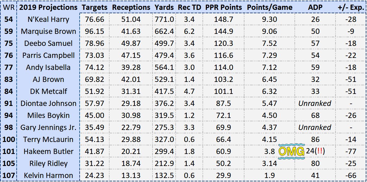
Using tools I’ve created that are mentioned later on, here are the players my WR model (check my last thread) likes and dislikes the most when compared to April @DLFootball ADP (thanks, @RyanMc23!)
I separated the charts by top 20/50/51+ ADP, to show value based on each tier:
I separated the charts by top 20/50/51+ ADP, to show value based on each tier:
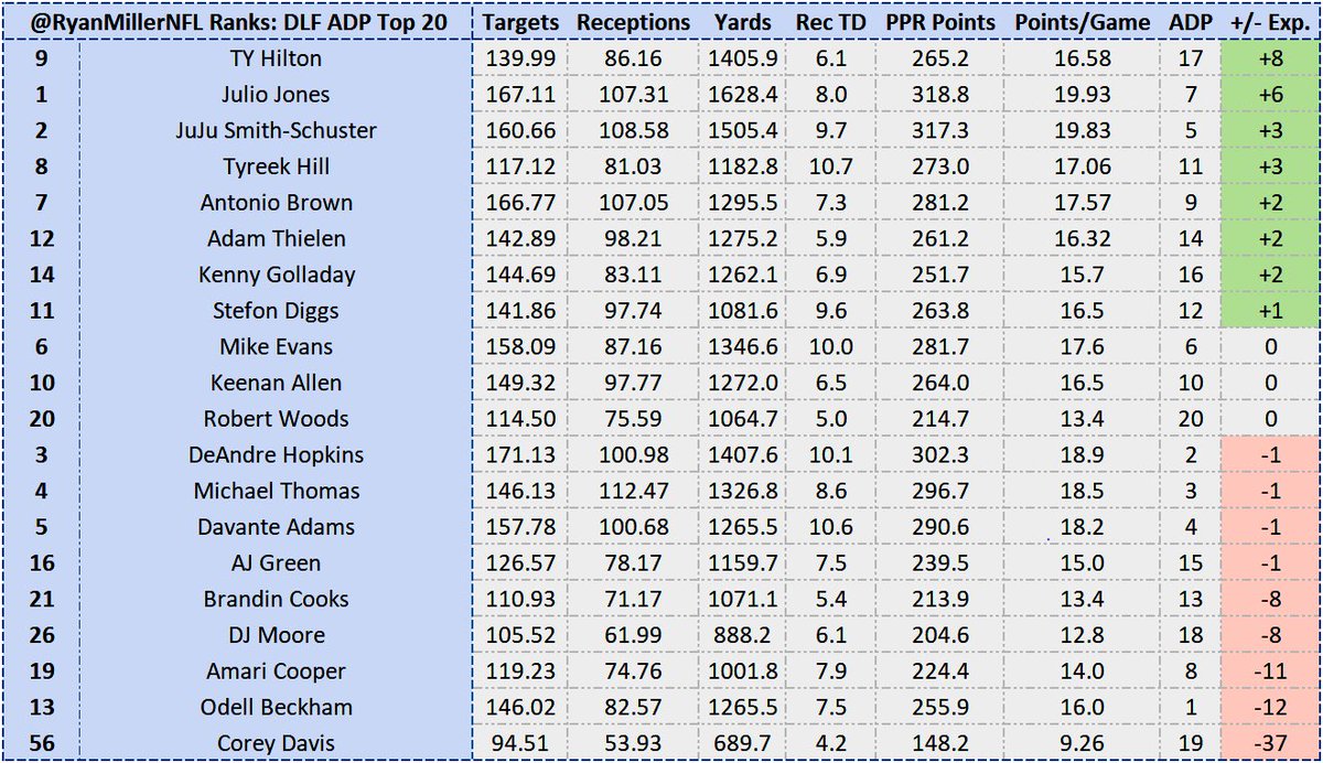
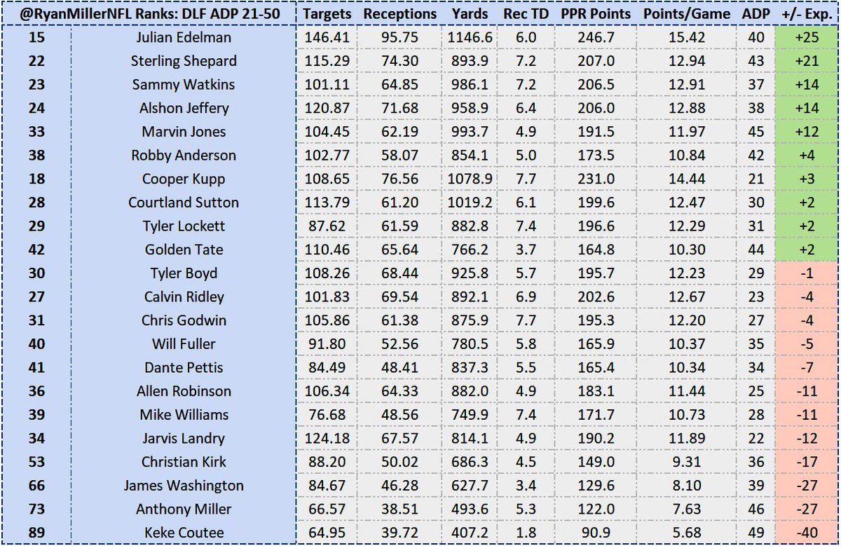

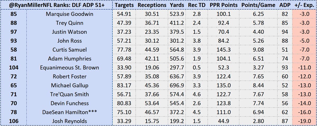
Green player are those you should considering looking to trade for, while those in red are players that I believe are being overvalued. Since these are dynasty ranks, however, be sure to give slight tweaks to my differences to account for age, since my ranks are STRICTLY for 2019
One aspect of dynasty ranks vs. redraft leagues is that rookies are obviously worth more in dynasty, since it’s an investment in a certain player. I omitted rookies up above for that reason, which is visualized below.
HOW IS HAKEEM BUTLER BEING DRAFTED BEFORE N’KEAL @pahowdy
HOW IS HAKEEM BUTLER BEING DRAFTED BEFORE N’KEAL @pahowdy
⚠️WARNING: End Of Advice. Rest of this thread is the reasoning behind these differences in opinion⚠️
To those enduring on for the next ~10 *BRIEF* tweets, one thing I always want to do as a data analyst is make the info intuitive to all readers & show natural conclusions..
To those enduring on for the next ~10 *BRIEF* tweets, one thing I always want to do as a data analyst is make the info intuitive to all readers & show natural conclusions..
...& I created a tool to help. Here is an attempt to show why I believe certain WR are set up better than others to succeed in ‘19, based on QB skill set.
#1: OBJ must adjust to being on Baker’s dominant side, but 👍🏼 for 2019. It may just take a little for them to get a rhythm.
#1: OBJ must adjust to being on Baker’s dominant side, but 👍🏼 for 2019. It may just take a little for them to get a rhythm.


#2: Based on Flacco’s 2018, we can see 1) where the most yards are accounted for and 2) which zones he’s most efficient
Comparing what Flacco has left w/ the zones Broncos WRs own the most, who do you want in 2019? If Sanders plays all 16 games, this is why I have him as WR17
Comparing what Flacco has left w/ the zones Broncos WRs own the most, who do you want in 2019? If Sanders plays all 16 games, this is why I have him as WR17


#3: TY Hilton and Andrew Luck will be just as great in 2019
I have TY as WR9 (WR17 in dynasty ADP), and seeing his expertise lined up with Luck’s in the new Colts Offense (and driven by my projection model) has me just as excited next season
I have TY as WR9 (WR17 in dynasty ADP), and seeing his expertise lined up with Luck’s in the new Colts Offense (and driven by my projection model) has me just as excited next season


#4: Giving up on Corey Davis?
Aside from one passing zone (Deep Left), Mariota’s passer rating is worse when throwing to Davis than the rest of his teammates. After enough years being disappointed, I’m selling at his WR19 price tag anywhere I can
Aside from one passing zone (Deep Left), Mariota’s passer rating is worse when throwing to Davis than the rest of his teammates. After enough years being disappointed, I’m selling at his WR19 price tag anywhere I can


#5: Antonio Brown- Holding Steady
One thing I love about this tool is it seamlessly can show how a player stepping onto a new team, under a new QB, fits from the get go. Carr is no Big Ben, but the two should have plenty of volume to hold his value steady.
One thing I love about this tool is it seamlessly can show how a player stepping onto a new team, under a new QB, fits from the get go. Carr is no Big Ben, but the two should have plenty of volume to hold his value steady.


#7: Brady ❤️❤️ Edelman
It may be harder after extension talks came out today, but he’s my WR15 next season and is a fantastic value at WR40, even if he only has 2-3 years left.
It may be harder after extension talks came out today, but he’s my WR15 next season and is a fantastic value at WR40, even if he only has 2-3 years left.


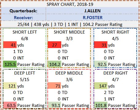
#8: Robert Foster: Great Fit, Bad Offense
Unwilling to take a side on this one. Talent is okay, fit is great, but I don’t see much out of Buffalo’s Offense any time soon...
Unwilling to take a side on this one. Talent is okay, fit is great, but I don’t see much out of Buffalo’s Offense any time soon...

#9: Not Buying Pettis
Can’t see it clear enough to go out and buy Pettis right now. Deebo has the draft capital, and Hurd nearly broke my WR model
Can’t see it clear enough to go out and buy Pettis right now. Deebo has the draft capital, and Hurd nearly broke my WR model


#10: Resurrect Sammy Watkins!
If anyone is replacing Tyreek this season, my money is absolutely on Watkins over Hardman. Comparing their success rates, their efficiency was nearly identical, albeit Watkins’ yards were much less. A great buy right now
If anyone is replacing Tyreek this season, my money is absolutely on Watkins over Hardman. Comparing their success rates, their efficiency was nearly identical, albeit Watkins’ yards were much less. A great buy right now


#11: Selling Anthony Miller
I know this is against most of the dynasty Twitter community, but no matter how hard I try I can’t seem to buy into Anthony Miller in Nagy’s offense as their roster stands.
I know this is against most of the dynasty Twitter community, but no matter how hard I try I can’t seem to buy into Anthony Miller in Nagy’s offense as their roster stands.


#12: out on Funchess
Comparing what’s available after Hilton/Ebron/Doyle targets are gone (left) with Funchess, I’d rather take Campbell and move on.
Comparing what’s available after Hilton/Ebron/Doyle targets are gone (left) with Funchess, I’d rather take Campbell and move on.


#13: Doctson a sneaky value??
Not sure what WAS will look like, but Doctson wasn’t as awful as people like to say he was. Keenum did well with Thielen/Diggs in short range too 👀
Not sure what WAS will look like, but Doctson wasn’t as awful as people like to say he was. Keenum did well with Thielen/Diggs in short range too 👀


I am so sorry for such a long thread, but this felt like information y’all deserve to see! To those who read all of it, wow 🙏🏼 to those who read the top 3 tweets, thanks as well!! Hope you found something useful in here and can go create some value in your league 🤓