We've all seen these #FlattenTheCurve graphs. I liked it too, at first. But at second thought it has two problems.
1. Wrong proportions, which seriously downplay the #CoronaCrisis.
2. A "solution" that we can't possibly want.
1. Wrong proportions, which seriously downplay the #CoronaCrisis.
2. A "solution" that we can't possibly want.
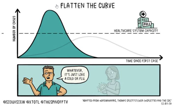
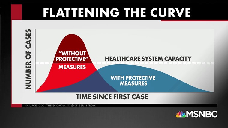
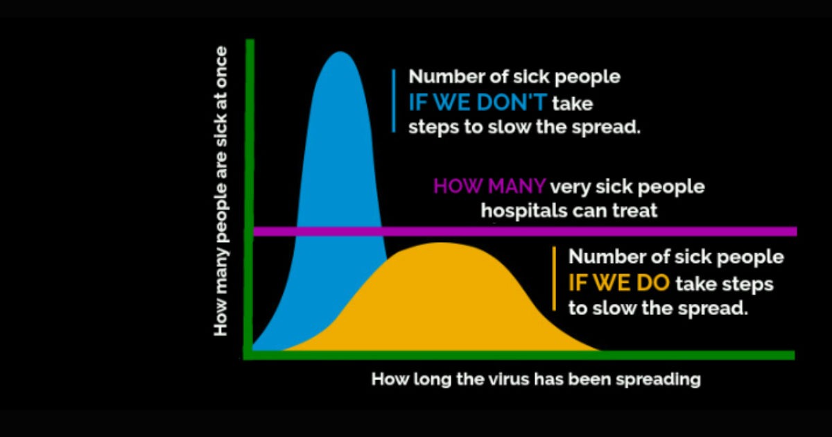
About 1: the graphs look as if an unmitigated epidemic would overstretch the health system capacity by a factor of 2 or 3. That's not what epidemiological modelling shows, as you can check yourself with this interactive model: gabgoh.github.io/COVID/index.ht…
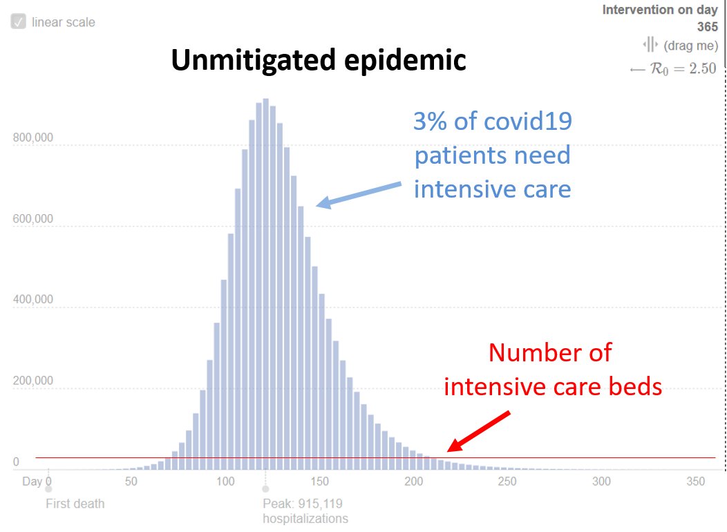
The assumptions here are realistic for Germany with its 82 million inhabitants (following the German epidemiological society), but would be optimistic for most countries (we have over 30 critical care beds per 100,000 people). But exact numbers are not the point.
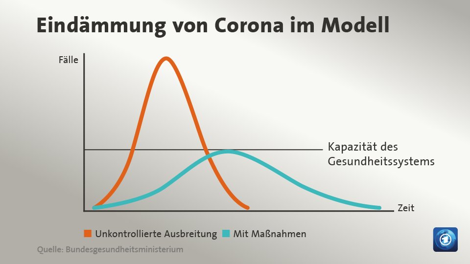
About 2: the "flattened" curve in those graphs is merely stretched, with similar area under the curve, i.e. number of infected people. That means: the epidemic ends by herd immunity, after 50-70% of the population were infected and are immune.

There is 2 problems with that. The epidemic would need to be stretched extremely in time - it would last for years. And a huge number of people would die. Nobody can want that.
Much better: lower the reproduction rate R below 1 to stop the spread and thus the epidemic. Far fewer people get ill or die, the epidemic is over much faster. That is the strategy of Germany and most European countries. A few (Holland, Britain) have flirted with herd immunity.

These 3 graphs on the same scale show the power of exponential dynamics. There is a tipping point at R=1. Why go for R=1.1 if a little extra effort gets you to R=0.8? Germany is now at R=0.9. rki.de/EN/Home/homepa…
How can we stay at R<1 until a vaccine is here? First massively reduce the case number, then intensive testing and tracking, as detailed by @tomaspueyo a month ago: medium.com/@tomaspueyo/co…
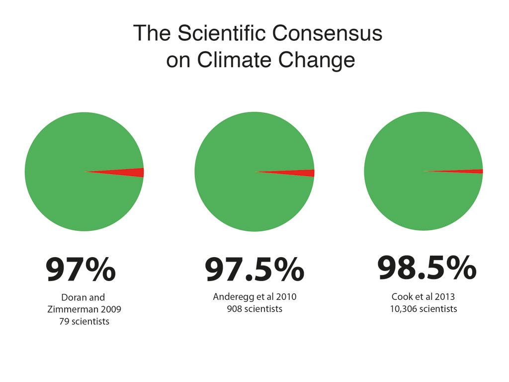
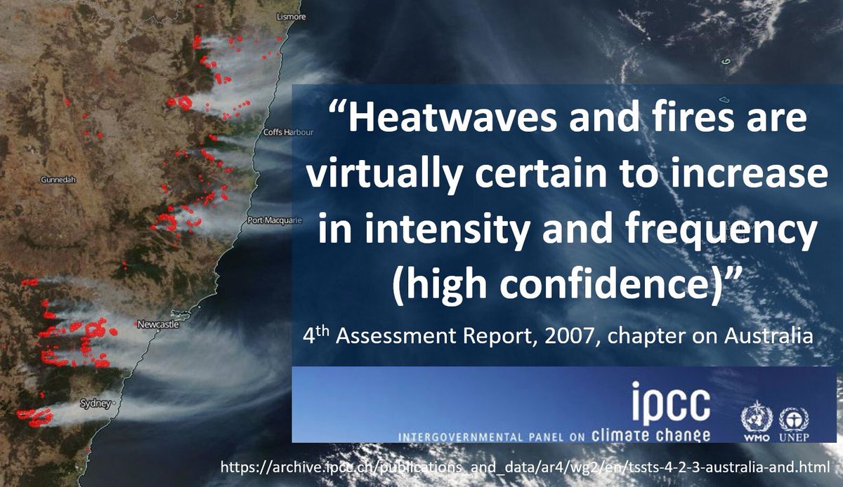
The questionable #FlattenTheCurve graphs are as if we climate scientists were showing graphs that make it look like we just need to flatten CO2 emissions a little to get the #ClimateCrisis under control. We tend to show schematics with realistic numbers. science.sciencemag.org/content/355/63…
Conclusion: let's not stop social distancing too soon, or we risk losing all we have gained so far. Else we might end up like the dumb man in the cartoon by @johnfocook...
..
..
p.s. Today I found an article which pretty much made the same points as I do in this thread, already on March 14: medium.com/@joschabach/fl…