Data nerd alert 🤓
Q: If I want to look at graphs of #COVID19 cases and compare across countries, should I look at graphs that are adjusted for country population size (for example, number of cases per 100,000 people) or just the total number of cases?
Q: If I want to look at graphs of #COVID19 cases and compare across countries, should I look at graphs that are adjusted for country population size (for example, number of cases per 100,000 people) or just the total number of cases?
A: Hey, whatever floats your boat, we won't judge, but there's a good argument for the total number of cases (*not* adjusted for country population size) graph providing more useful information.
@jburnmurdoch, Senior Data-Visualisation Journalist (cool title!) at the @FinancialTimes is a strong proponent of the total cases approach, seen here: 
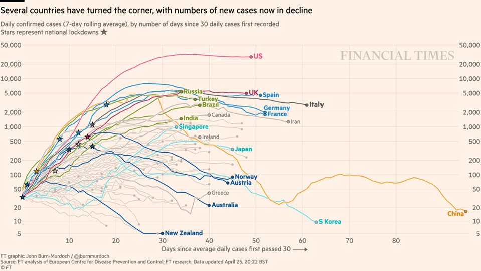
He supports this choice with this scatterplot, which shows almost no relationship between country population size and number of cases.
"Population does not affect pace of #spread. All per-capita figures do is make smaller countries look worse", he tweeted a few weeks ago.
"Population does not affect pace of #spread. All per-capita figures do is make smaller countries look worse", he tweeted a few weeks ago.
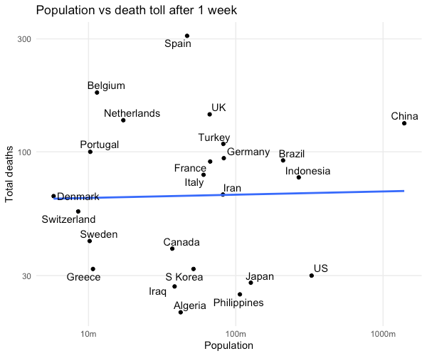
"Plenty of things _indirectly related to population_ can make a difference:
• Pop density can increase rate of spread
• Countries with many major travel hubs may end up with multiple outbreaks
But pop alone is a bad thing to adjust for if wanting assess how bad an outbreak is."
• Pop density can increase rate of spread
• Countries with many major travel hubs may end up with multiple outbreaks
But pop alone is a bad thing to adjust for if wanting assess how bad an outbreak is."
@jburnmurdoch also announced today that @FT will be shifting its focus on reporting #COVID_19 mortality to *excess* mortality experienced by countries and regions during this period compared to earlier periods. Stay tuned for a follow-up on this metric.
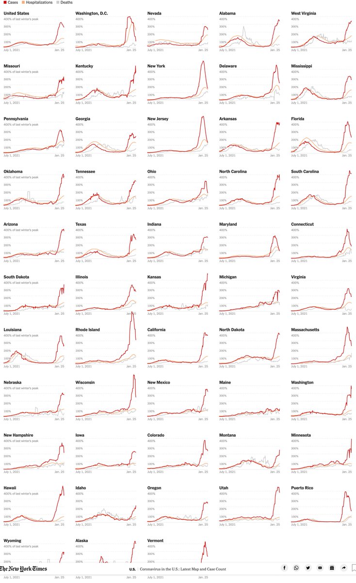
The Financial Times has made much of their #coronavirus coverage free to read, and it's a great source of clear and compelling "data viz".
ft.com/coronavirusfree
ft.com/coronavirusfree
• • •
Missing some Tweet in this thread? You can try to
force a refresh