Updated chart of #BHEL .... The current pattern do not look like the one made during Sep-Oct 2019. The current move has much more accumulation signals than before. However, now the negation point is 30 SMA. (in previous upmove stock tested 200 SMA.. that probability is high now)
Updated chart of #BHEL .. stock tests 200 SMA today as highlighted earlier as high probability.
30 SMA was never broken.
4th Higher High formation
No weakness in volume to assist divergence
20Day ATR now 250pts (ATR falling means low volatile zone in an Uptrend which is bread butter for Trend Followers)
My view: Bullish as there is no sign of weakness yet.
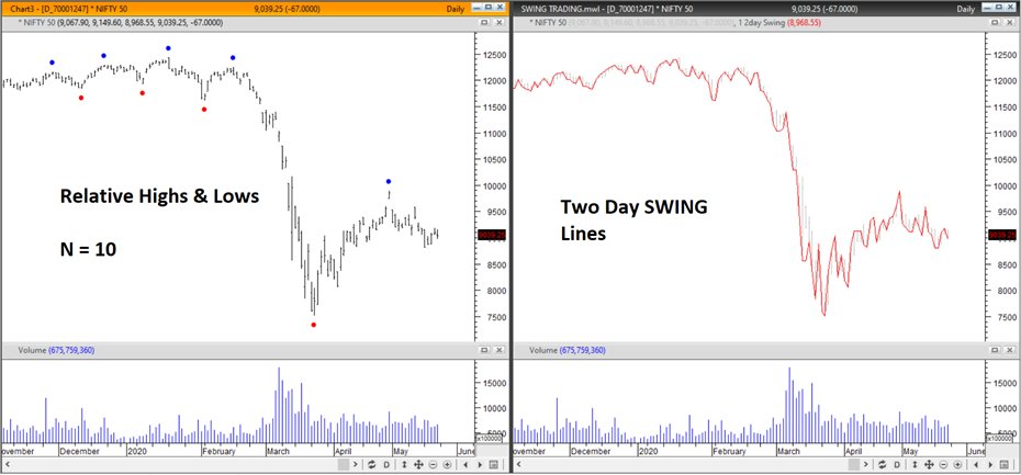
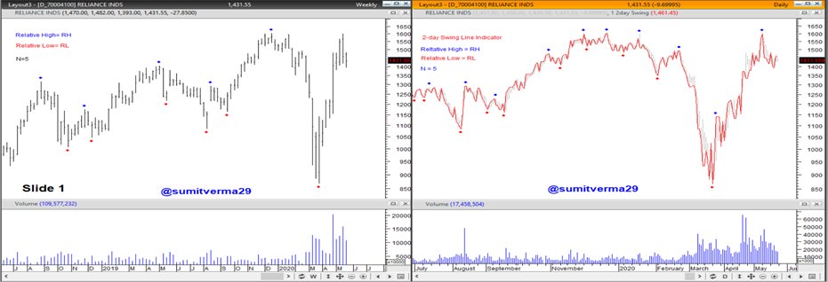
Earlier I explained how to make charts cleaner by using Two day Swing Lines & today I explained how to identify Relative Highs & Relative Lows in an objective manner
Link1:
A thread on how to Define correct Swing Highs / Lows for the purpose of Dow Theory analysis or drawing Trendlines:
Thomas DeMark in his book "The New Science of Technical Analysis" said that drawing
of trend lines is a highly arbitrary process. 1/n
A trend line is typically intended to connect
several Relative Highs or Relative lows. If there are two or more such points, the trend line can be drawn
precisely. (notes from Jack Schwager's book "The Complete Guide to the Futures Market").. 2/n
Relative high is a High that is higher than high on the N prior & N succeeding bars.
where N is a number of bars (can be anything as per individual's setup 5 / 10 / 20...)
if N = 5, Relative High is Current High > last 5 days & succeeding 5 days. Viceversa for Relative Low.. 3/n
Further to my initiative of #LetsLearn where my objective is to de-code complex things & make things simple and available for analysis...
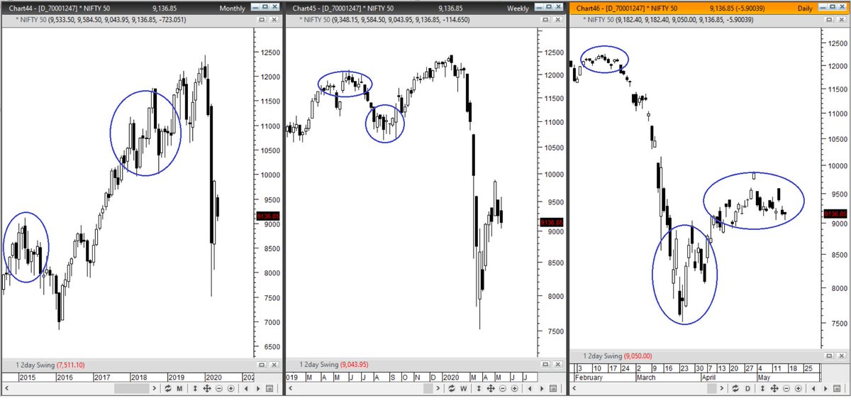
Today, I will try to make a complex looking chart into a clean & simple one (only useful for people who are PATTERN based trader/analyst)..1/n
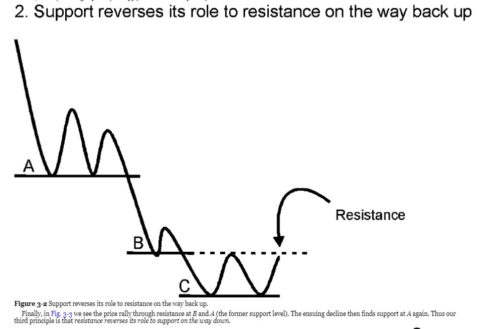
Further as disclaimer, the presented way will be more useful for people who have followed Martin Pring's book on chart patterns.. (images taken from Kindle version of the book)
The below are Candlestick charts of #NIFTY50.. a lot of times market moves inside a range throwing multiple Bullish/Bearish candlestick patterns and adds up the clutter in analysis (Pro Candlestick / Bar / short term traders wont have a problem) but for others it is a confusion..