Here is my thread showing my new heatmaps for detected cases, positivity, hospital and ICU admissions.
We have reached the grim milestone of over 200 cases per 100,000 in the over-80s. There were 8 cases per 100,000 in this age group in August.
Not all cases are detected.
We have reached the grim milestone of over 200 cases per 100,000 in the over-80s. There were 8 cases per 100,000 in this age group in August.
Not all cases are detected.

Positivity of tests for males in Pillar 2. Positivity is the number of people testing positive divided by the number of people tested. Greater than 5% means that not enough testing is being done.
Each age group for males exceeds 5% positivity.
Each age group for males exceeds 5% positivity.

Positivity of tests for females in Pillar 2. Positivity is the number of people testing positive divided by the number of people tested. Greater than 5% means that not enough testing is being done.
Each age group for females exceeds 5% positivity (except over 80s).
Each age group for females exceeds 5% positivity (except over 80s).

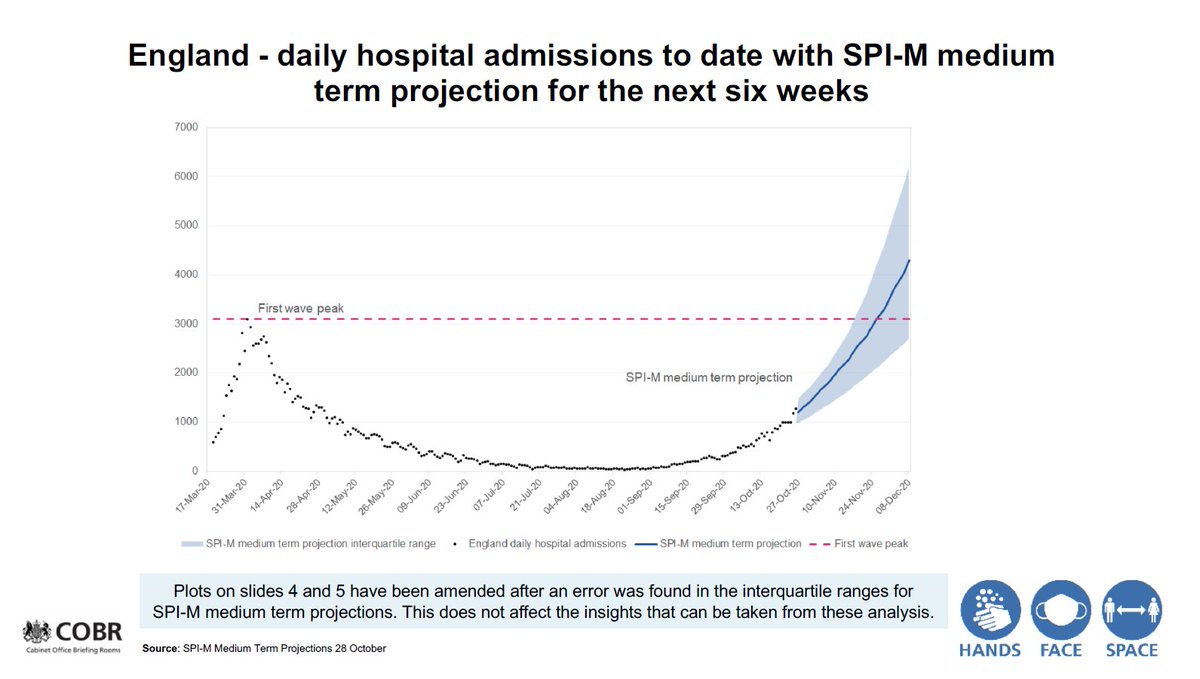
Hospital admissions by age group.
130 per 100,000 (0.1%) of over-85 year olds were hospitalised with Covid last week.
130 per 100,000 (0.1%) of over-85 year olds were hospitalised with Covid last week.

• • •
Missing some Tweet in this thread? You can try to
force a refresh


