Here is my latest heatmap of detected Covid-19 cases in England. Data from @PHE_uk
*** 177 *** cases per 100,000 in the over-80s.
There were **8** cases per 100,000 in the over-80s in late August.
See the positivity chart in this thread to show that many cases go undetected.
*** 177 *** cases per 100,000 in the over-80s.
There were **8** cases per 100,000 in the over-80s in late August.
See the positivity chart in this thread to show that many cases go undetected.

Colourblind-safe heatmap of detected Covid-19 cases in England. Data from @PHE_uk 

Positivity of tests for males in Pillar 2. Anything above 5% means we are not testing enough people.
*All* age groups in males are not tested sufficiently.
There is a significant issue with males not being tested sufficiently.
*All* age groups in males are not tested sufficiently.
There is a significant issue with males not being tested sufficiently.

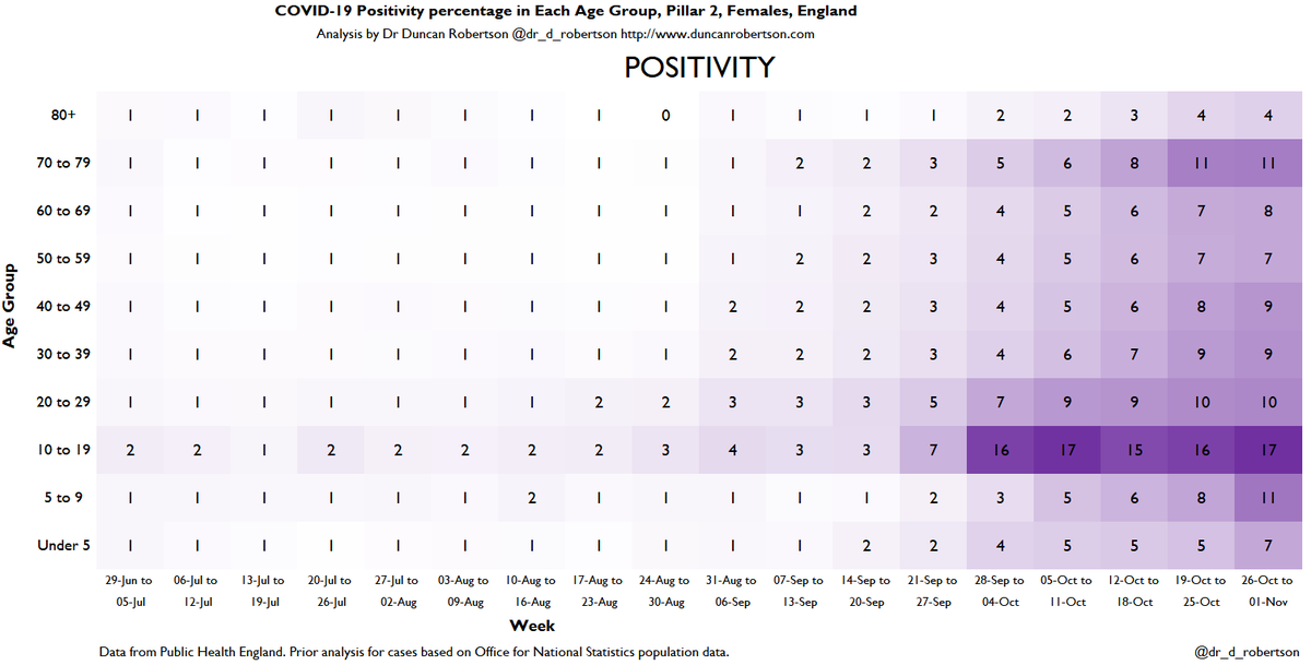
Positivity of tests for females in Pillar 2.
*All* age groups in females (with the potential exception of over-80s) are not tested sufficiently.
*All* age groups in females (with the potential exception of over-80s) are not tested sufficiently.
Hospitalizations increasing in every 15+ age group.
110 per 100,000 over 85-year-olds
61 per 100,000 75-84-year-olds
27 per 100,000 65-74-year-olds
110 per 100,000 over 85-year-olds
61 per 100,000 75-84-year-olds
27 per 100,000 65-74-year-olds

ICU/HDU admissions.
65-74 year olds are have the greatest proportion of ICU/HDU (Intensive Care Unit / High Dependency Unit) admissions across age groups.
65-74 year olds are have the greatest proportion of ICU/HDU (Intensive Care Unit / High Dependency Unit) admissions across age groups.

• • •
Missing some Tweet in this thread? You can try to
force a refresh


